Categories
Graded Unit

GRADED UNIT – PRT. 4

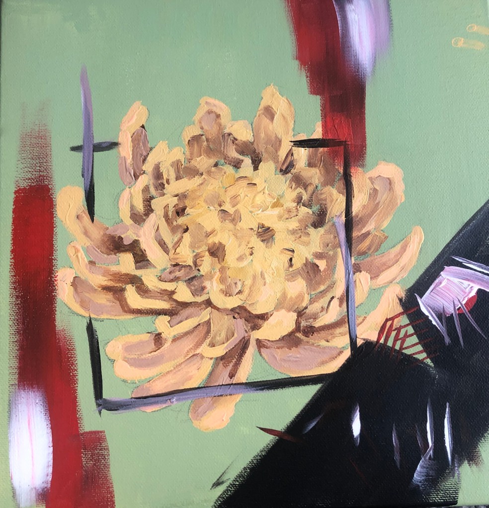
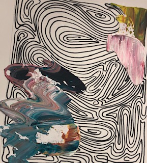
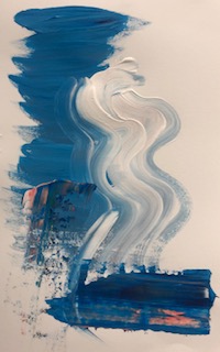
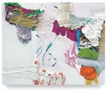
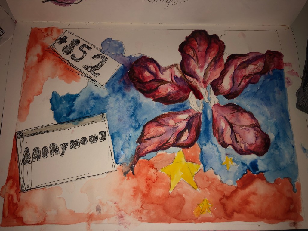
This piece, I feel did not turn out as planned and it was unsuccessful. I do like the centre of this painting with the flower and the box surrounding it, however I feel the bottom right of the painting ruins it, due to black I that used.

I originally painted the flower on its own as a decoration piece for my house when the lockdown started. Couple of weeks into the lockdown, I decided to paint a square around the flower to show how I personally, feel trapped in the house. I decided to paint the creature to show frustration, but regretted it immediately. However, I have learned that if I want to add dark colours into a painting, maybe start off with lighter colours that can be coverable and maybe use darker blues, instead of black.

Categories
MajorProject1

M.P 1 – PRT 5

I started to experiment with Linocut. I decided to make prints with the rules of composition. I first tried with the golden ratio rule and as a background of the prints, I decided to have a block square of colour, as I want to introduce geometrical shapes.

I then went on to add different shapes in the background of the prints in different colours, which I feel made the prints more effective. I also made the shapes more geometrical in the style of Frank Stella. I like the outcome, however I feel I want more shapes added and them to be the foreground as well, so I plan to make Lino prints of shapes.

I did some experiments with mono and used a tissue to transfer pattern onto toe prints. I drew composition rules and shapes in the mono prints in different colour of ink. I liked the outcome and feel these pieces could be good as a background for painting.

Categories
2DPractice

2D COLLAGE – PRT 2

I started off with just doing simple collage compositions with magazine cut outs onto paper. I wanted to incorporate my current theme with collage, so I cut out acrylic brushstrokes that I prepared the other day and used them. The cut out brushstrokes gave the collage pieces a photoshop look and gave the pieces depth. I then went on to use the line drawings as background and then brushstrokes as a foreground, but I feel it didn’t look great, just messy. Maybe if I do a less detailed line drawing it might be more effective. I did however like the thick layered acrylic as a background and it looked very effective and I will definitely be using this in the future.

Categories
2DPractice

2D COLLAGE – PRT 1

This week we are looking at collage. I started off with creating small line drawings for the foreground of the pieces. I then decided to layer that print on top of a piece I did when we were experimenting with printmaking. I really like the effect of the line patterns and the colour of the print in the background, it would be interesting if it was turned negative. I then went on to create bases with acrylic paint and layered them with the patterns created. I noticed however that my collage pieces had a acrylic background and a pattern in the foreground, I wandered what would happen if I switched it around. For this I created line drawings as bases and tomorrow I plan to experiment with the negative printer techniques and switching the patterns and acrylic. I feel I was very successful today and started off well.

Categories
2DPractice

Pia Fries

One artist that I’ve been looking into is Pia Fries. A lot of her work consists of thick layers of paint and negative space. She also uses watercolour and sharp quick brushstrokes. When it comes to colour Pia uses vibrant, contrasting colours. With the backgrounds of her work being white her work is very eye-catching. She has also used collage and it can sometimes seem like a painting, I would like to try and create collages that seem like paintings. I like how she uses negative space and the loose patterns in her work. The sharp brush strokes with thick layers of paint create depth and texture. When experimenting with my work, especially with acrylic I try to thick of Pia Fries, especially with her use of negative space.

Categories
Daytodaypart2

DAY TO DAY PART 2

For the final brief of The Day Today I was away on holidays so I didn’t stick to the brief I instead wanted to see what would inspired me while on holiday. I noticed the loose patterns and shapes that the water created and I decided I wanted to explore more of that. I started of with some loose patterns and found the repeating circular lines really effective, so experimented with larger circular brush motions in acrylic, I like how the brush hair created lots of lines. I then went on to draw onto of the circle with a stick to create some sort of line drawing of the waves. I found this really effective and tried it out with different colours and layered it, however once doing that I found it quite messy. I then did multiple circles in blue tones and then with printer copied some lines onto it. I found this really effective and interesting as you can change the colour of the paint in the printer. I definitely would to use this in future pieces. I would like to do more layering with paint and with the printer. I feel this could become an interesting sculpture piece, if I was to use light, thin materials and maybe to try using sound? I really enjoyed doing this I feel I could really experiment more with the piece I have.

Categories
Daytoday

THE DAY TODAY 5

For the final of day of the week long project “The Day Today”, I decided to do a piece based on an article about LGBT asylum claimers being rejected. By the list given in the article of what countries the LGBT claimers were from, many of the flags of said countries had green in them, so I painted the background green. I personally don’t like the outcome of this piece as I feel it’s too literate and the composition is boring. If I was to do this again, I would like to have add more colours to the background and more layering to add texture. To delve more into LGBT flags would also be interesting.

Categories
Daytoday

THE DAY TODAY 4

As I was reading the newspaper for todays article I noticed a page with a man saying how he eats red meat everyday, and the benefits of this. Underneath this article there was a smaller Coolum about how being vegan has a 22% chance of heart disease and where meat eaters are at higher risk. Turning a page there was a advert for chicken at cheap prices. I decided to just start making objects with wire straight instead of planing. With wire and tape I attempted to make a heart, but didn’t like the final outcome. With seeing the Cut and Paste Exhibition yesterday I wanted to do collage so I painted the background green, since the colour is associated with health and yet disease. I wanted to show the irony and the ways of consumerism in the media when it comes to being healthy and what to eat. I was going to attach the heart I made to the centre of the collage piece, but decided against it and instead painted a pepper, but it could also possibly be a heart. This would have to be my most least liked piece I’ve done this week. I don’t like the colours or composition, and I feel it would of been better if I made a larger heart and collaged on the heart instead of just a piece of paper. It was however good to go out of my comfort zone from planning and just creating, I do feel it helped me to experiment more open minded and would like to start working that way more often.

Categories
Daytoday

THE DAY TODAY 3

For the third day of the current project “The Day Today” I choose an article about the riots happening in Hong Kong and how the bill has been lifted. As I was reading the article I started to doodle things that first came to mind, that being the outline of china and the Bauhinia Blakeana flower, which you can see on Hong Kong’s flag. I then went into a more detailed flower with the outline of china, however I decided to paint the land blue, due to police spraying rioters with blue dye. With the blue contrasting with the colours of the flower, it makes the piece stand out. As many people in Hong Kong were trying to hide their identity, I decided to write “Anonymous”, I wanted to try and recreate a young Childs’ writing to represent that the majority of the rioters were youths. For a final detail and to show technology and connecting with the rest of the world, I decided to add the dial code. If given the chance I would like to retcreate this piece and do it as a collage, with a real Bauhinia Blakeana flower and add recites to it, as Hong Kong is known for technology and shopping. It would also be more effective I feel if it were a larger scale. The current final outcome however, I do like even as a sketch to base of a piece from in the future.

Categories
Daytoday

THE DAY TODAY 2

For the second day of our week long project “The Day Today”, I read an article regarding obesity in children of around the ages four and five. In the article, many parents blamed the “Buy One Get One Free” deals that are popular in Uk supermarkets. Most of these deals are associated with unhealthy foods like crisps, chocolate, ect. The first thing that caught my eye was the shapes of the unhealthy snacks. I started to simplify them and colour them in frequent used colours in snack packaging. By overlapping, I was hoping to recreate the amount of deals you see in supermarkets, however I liked the outline shape that the shapes made. With only then focusing on what the outline was and then colouring them I feel the final shapes reminded me of jigsaw pieces. With this project I experimented more, rather than focusing too much on having a final pice, which I feel helped me develop my ideas more. I would have liked to further go on and look into logos and how we see them as shapes. I feel this turned successful and I could further develop this into an interesting piece.

Design a site like this with WordPress.com
Get started