Categories
cap2 StudioProjects2

SELF GEN PROJECT PRT5

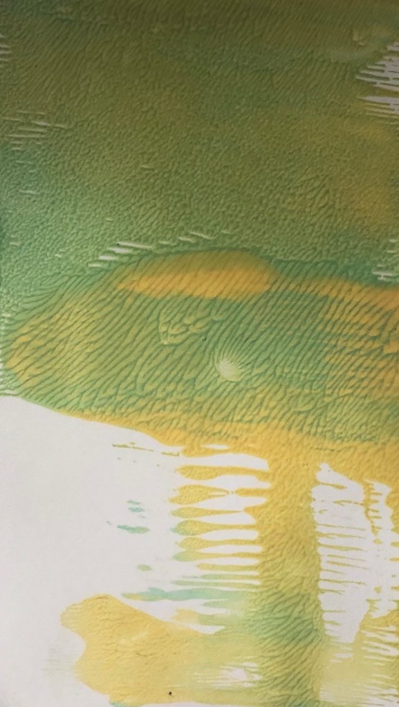
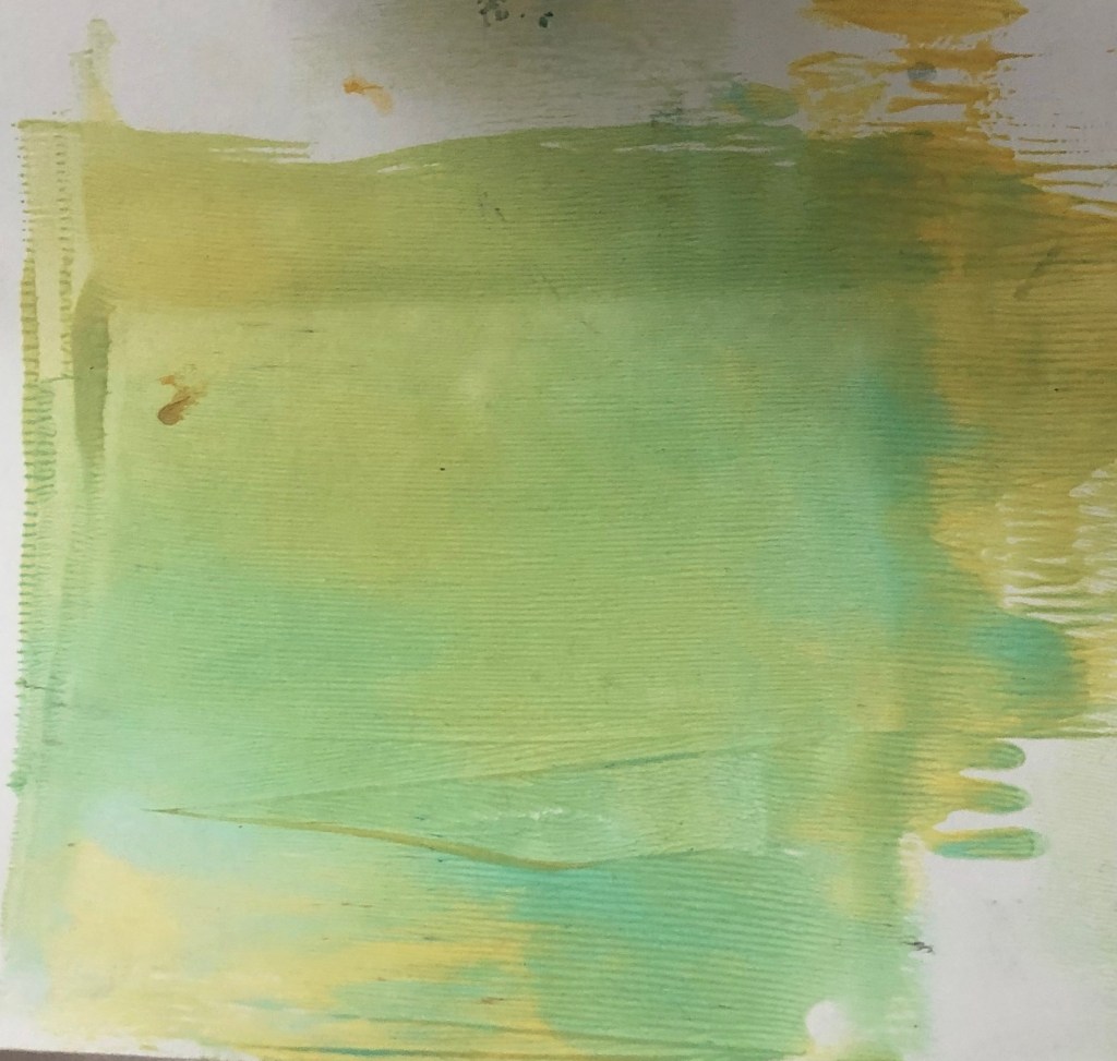
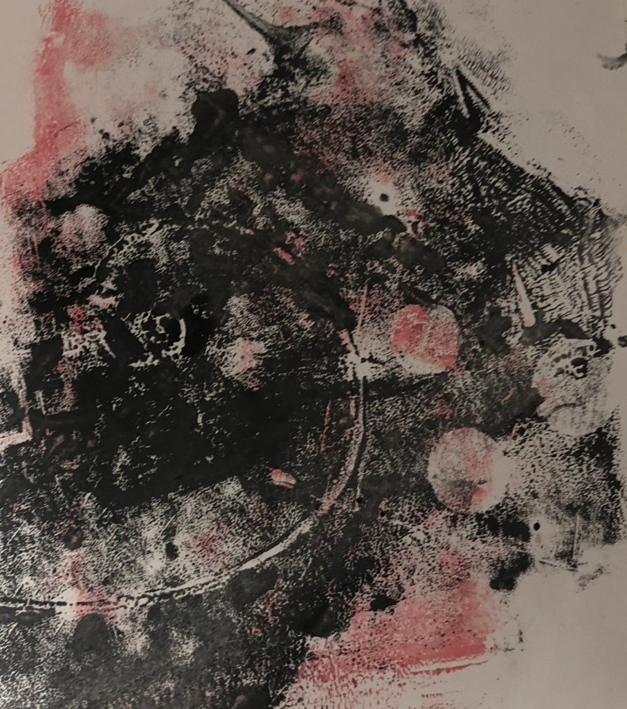
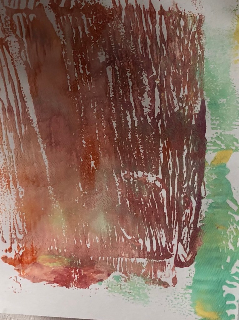
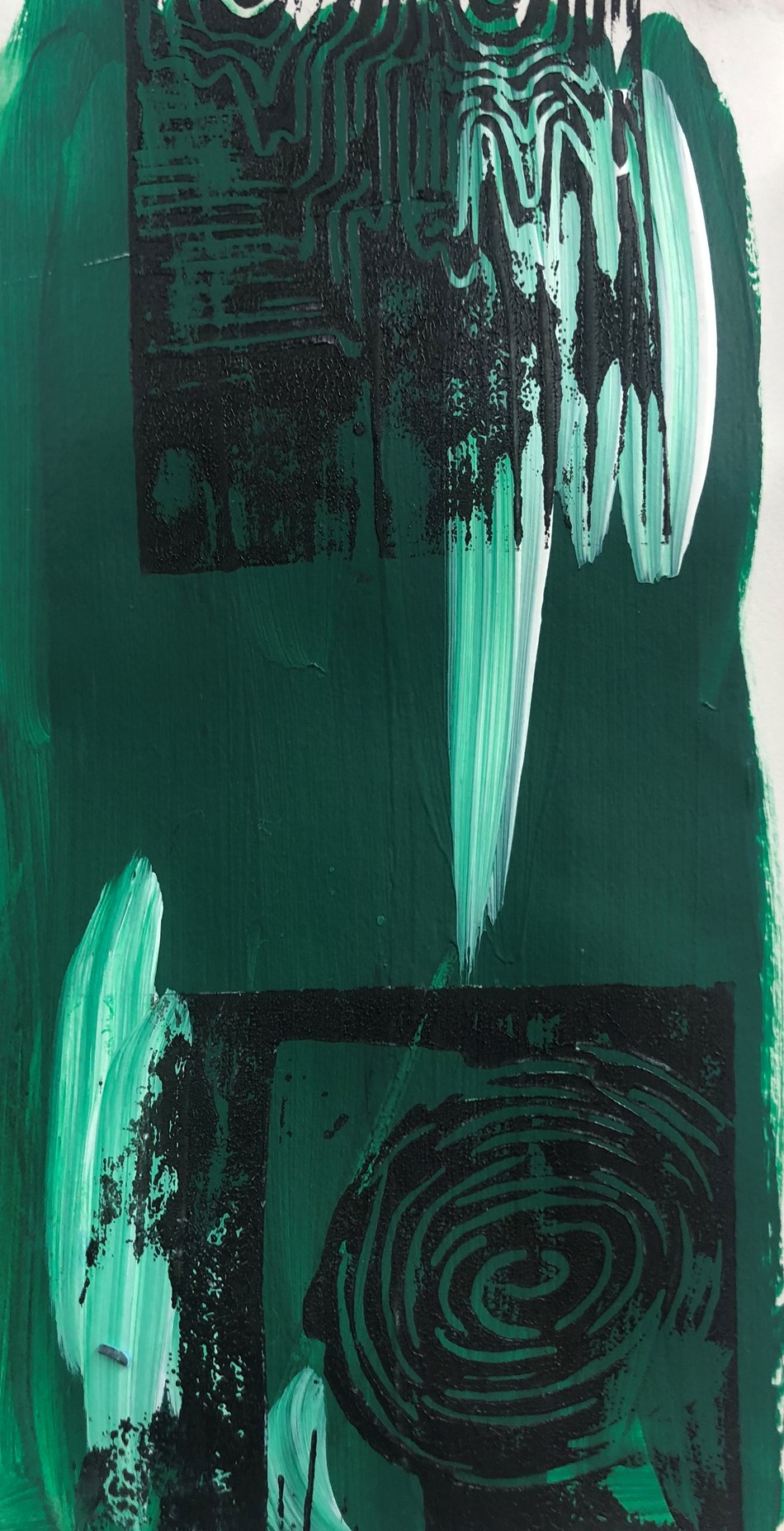
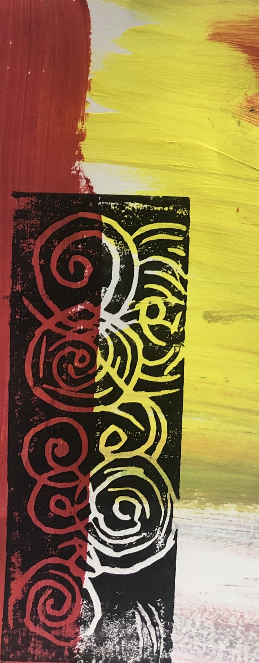
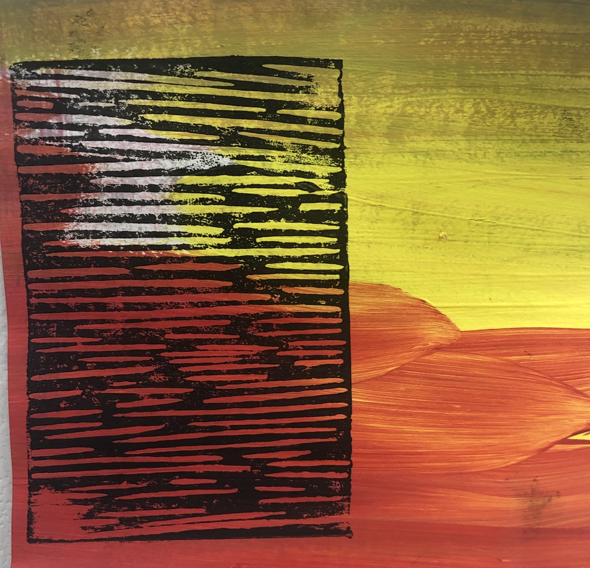
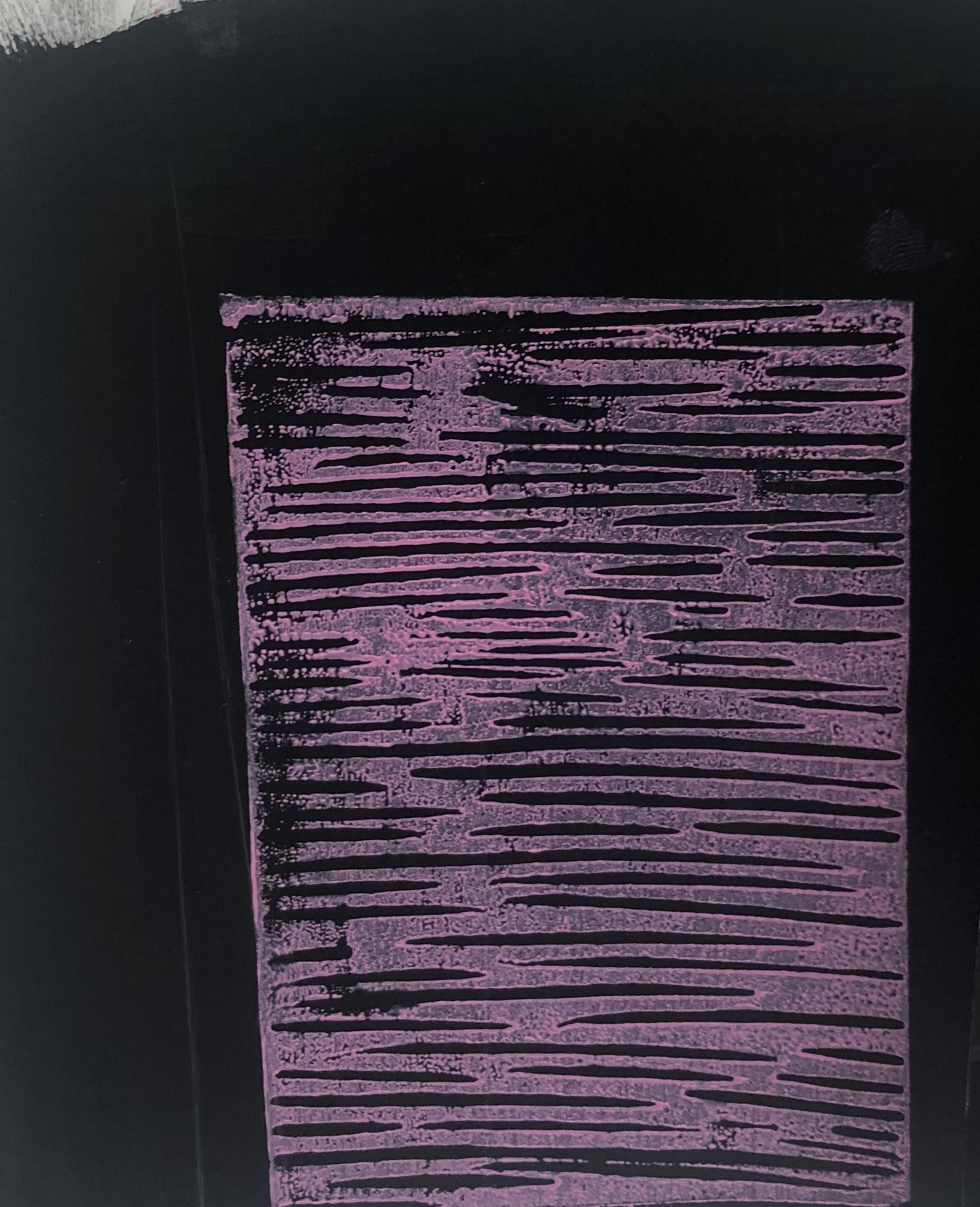
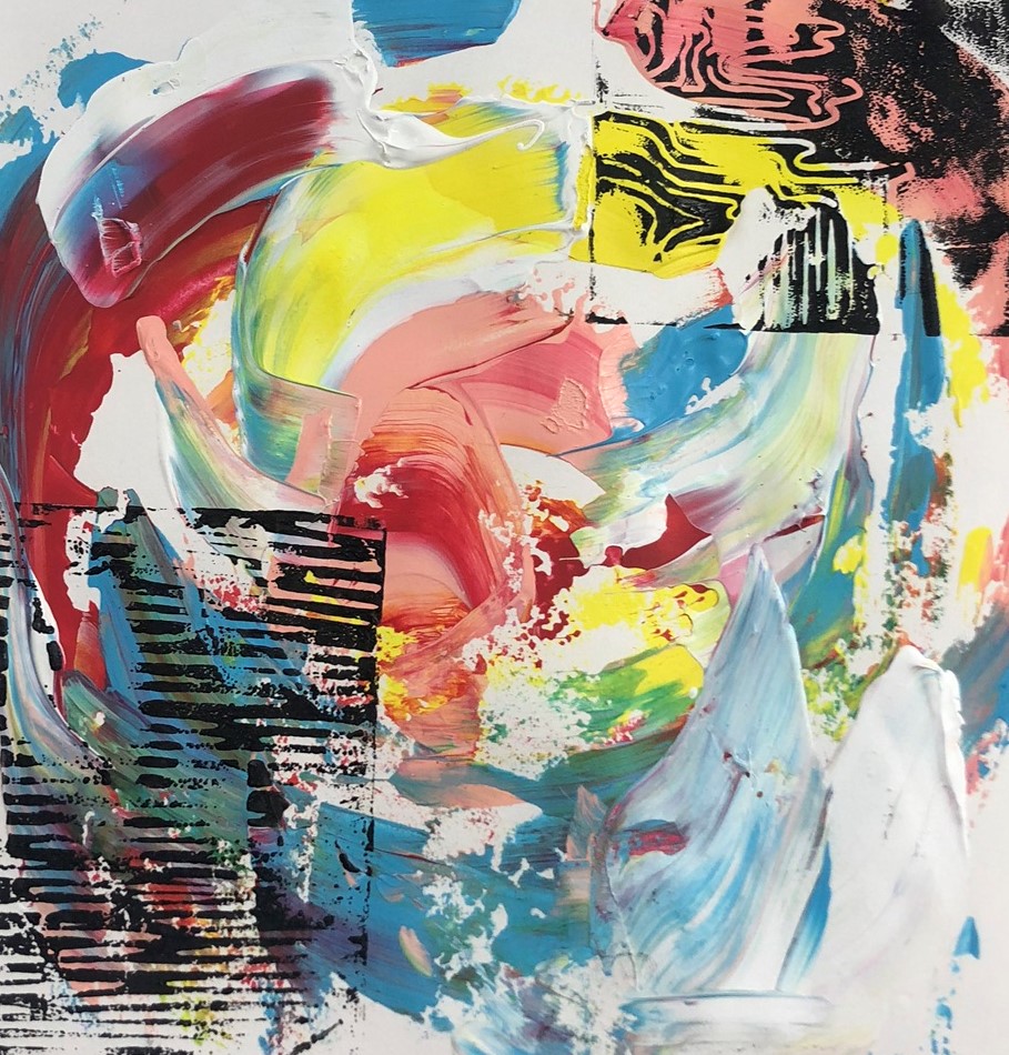
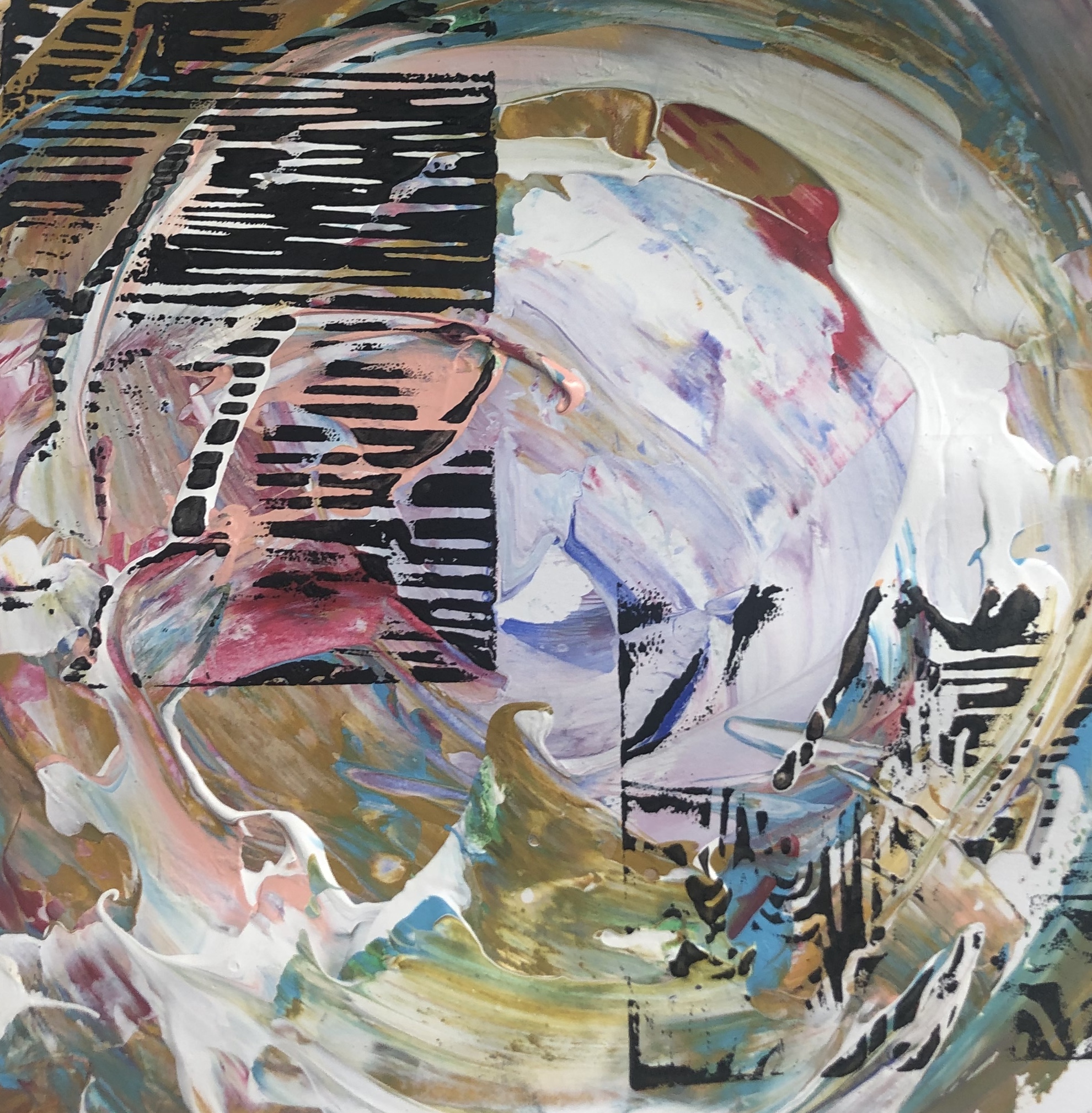
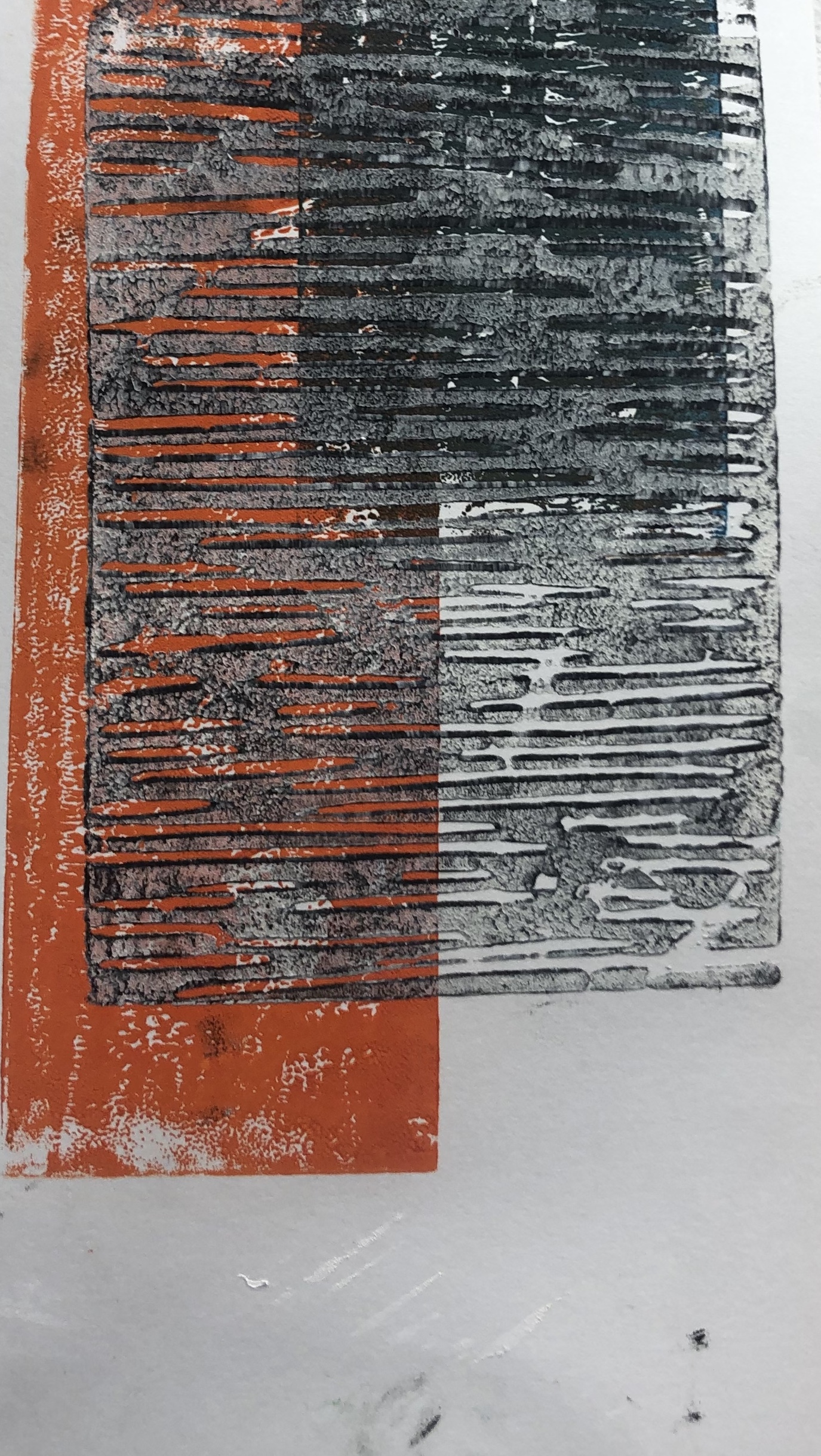
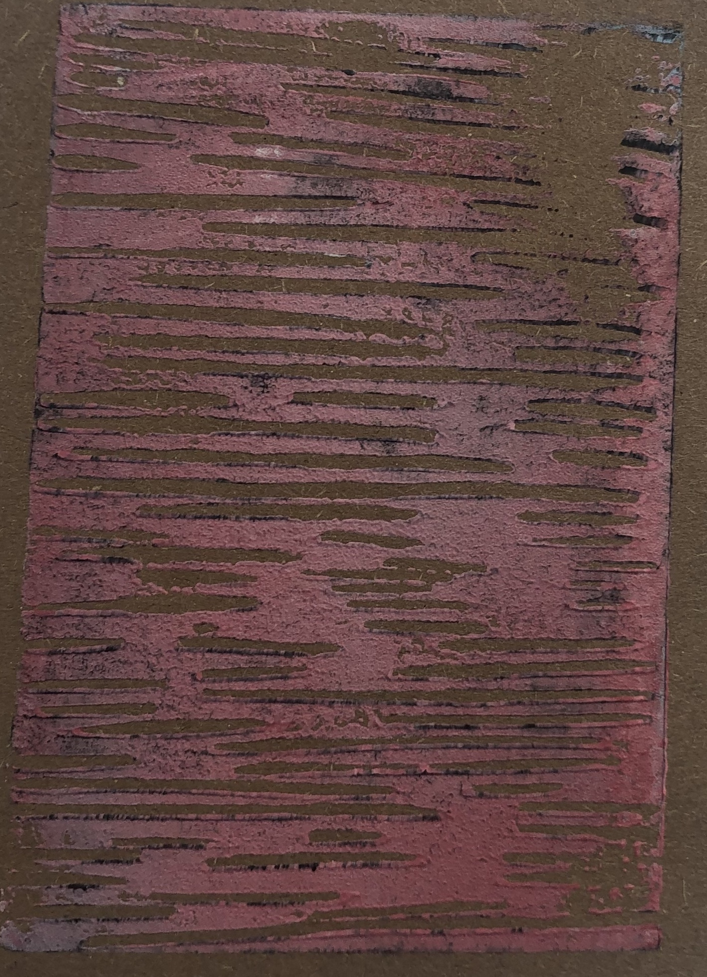
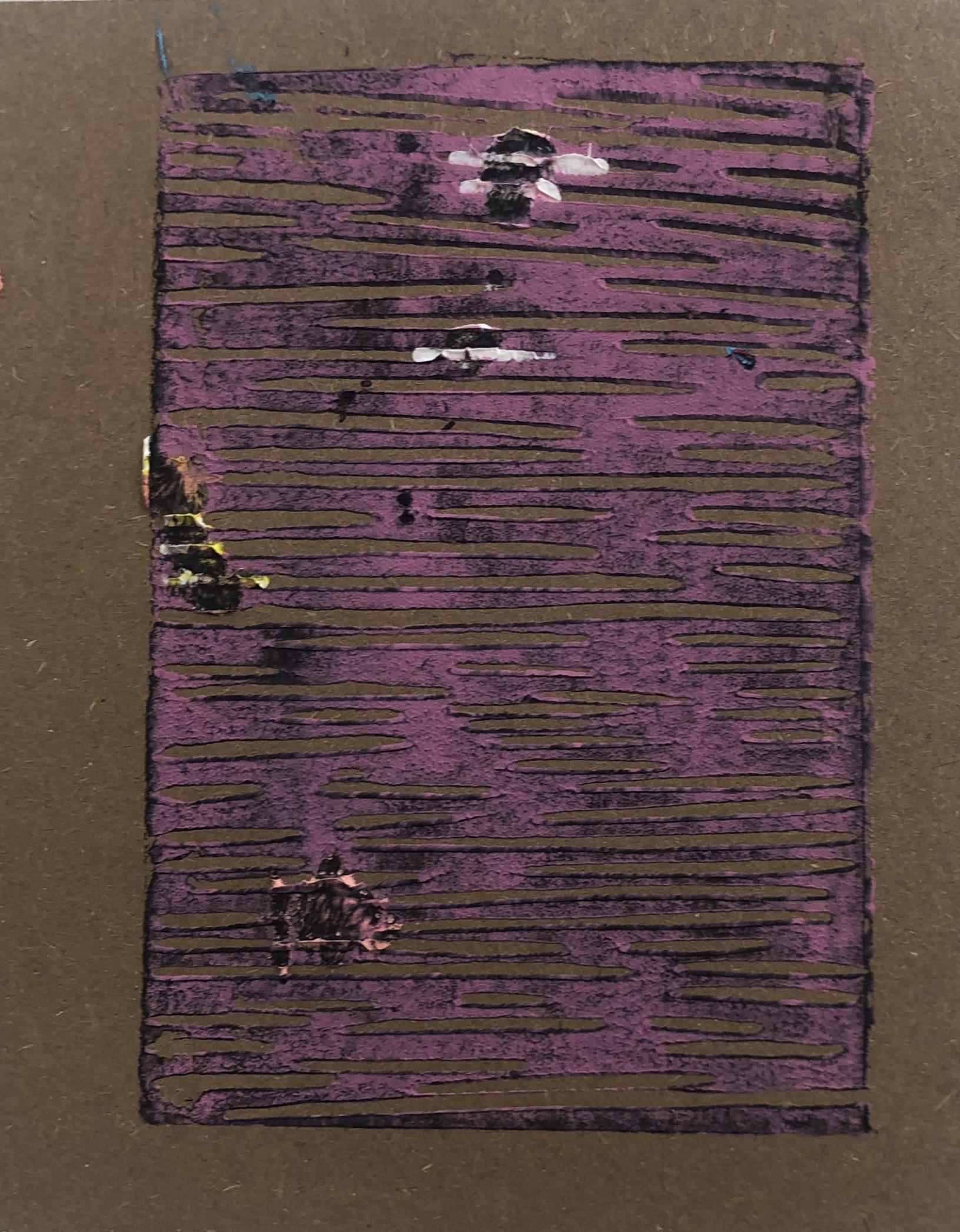
Following from my previous post, I started experimenting with creating a rough texture. I started off with selecting colours that match the colour range of Edinburgh. I layered paint and then used Lino print of lines ontop with yellow. Originally I wanted the yellow lines to stand out, but they ended up patchy and faded-is. However, I really like the outcome as it has added depth and texture to the piece.

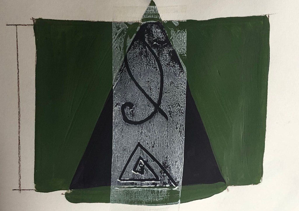
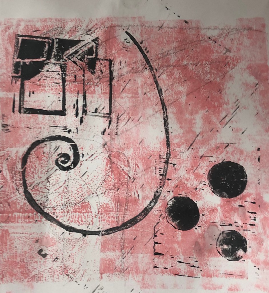
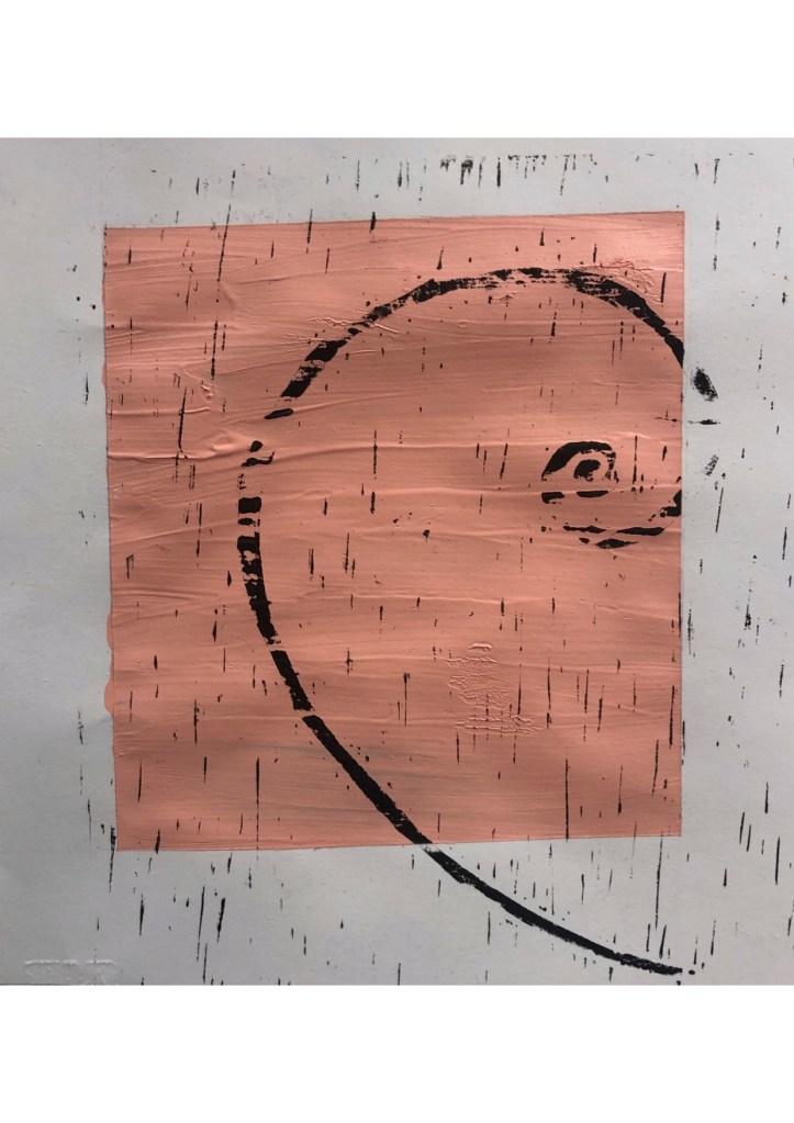
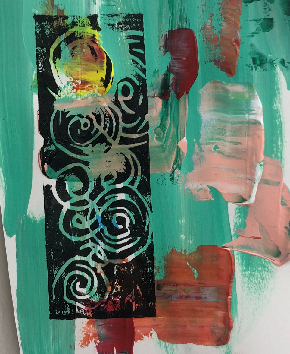
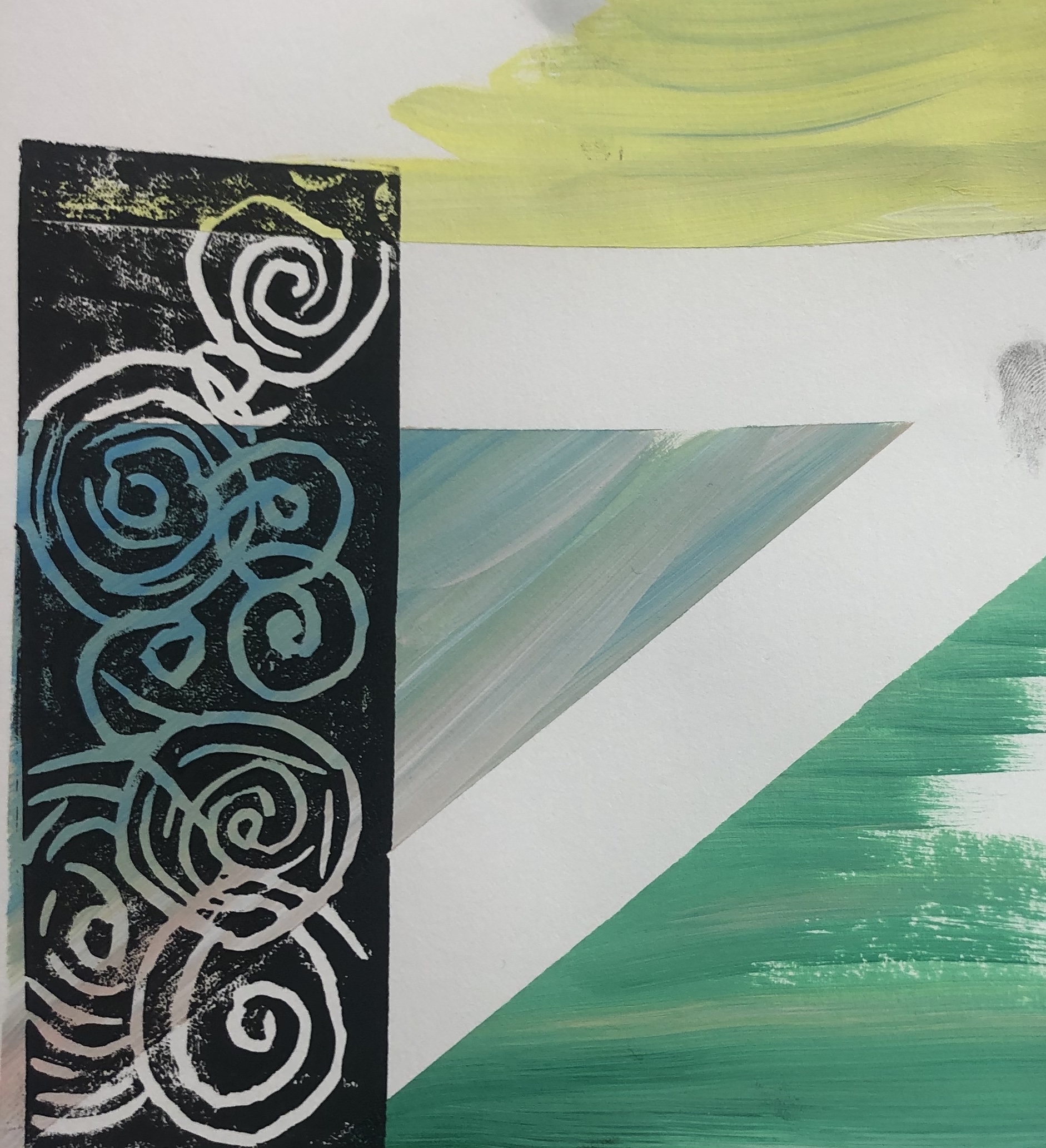
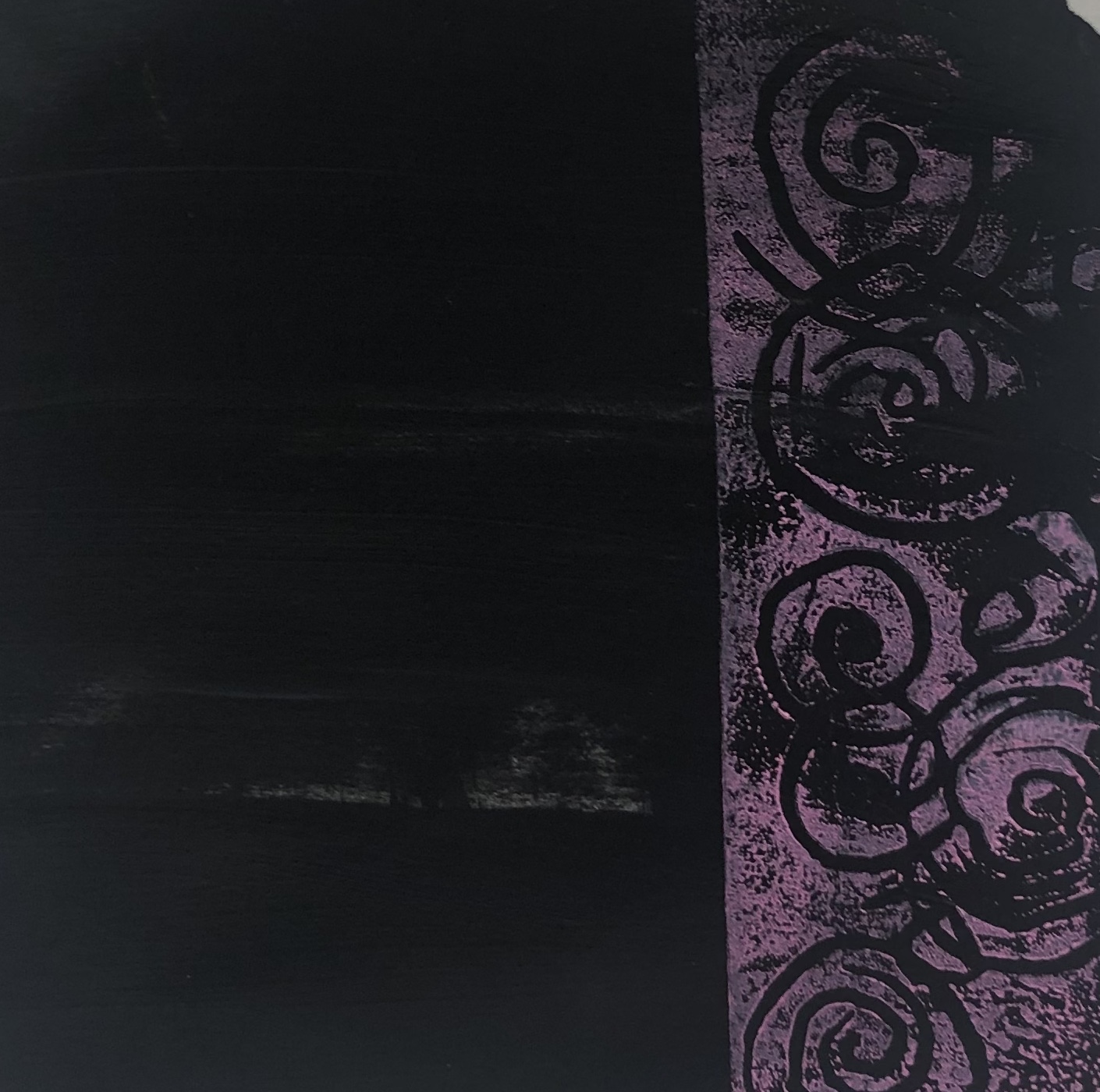
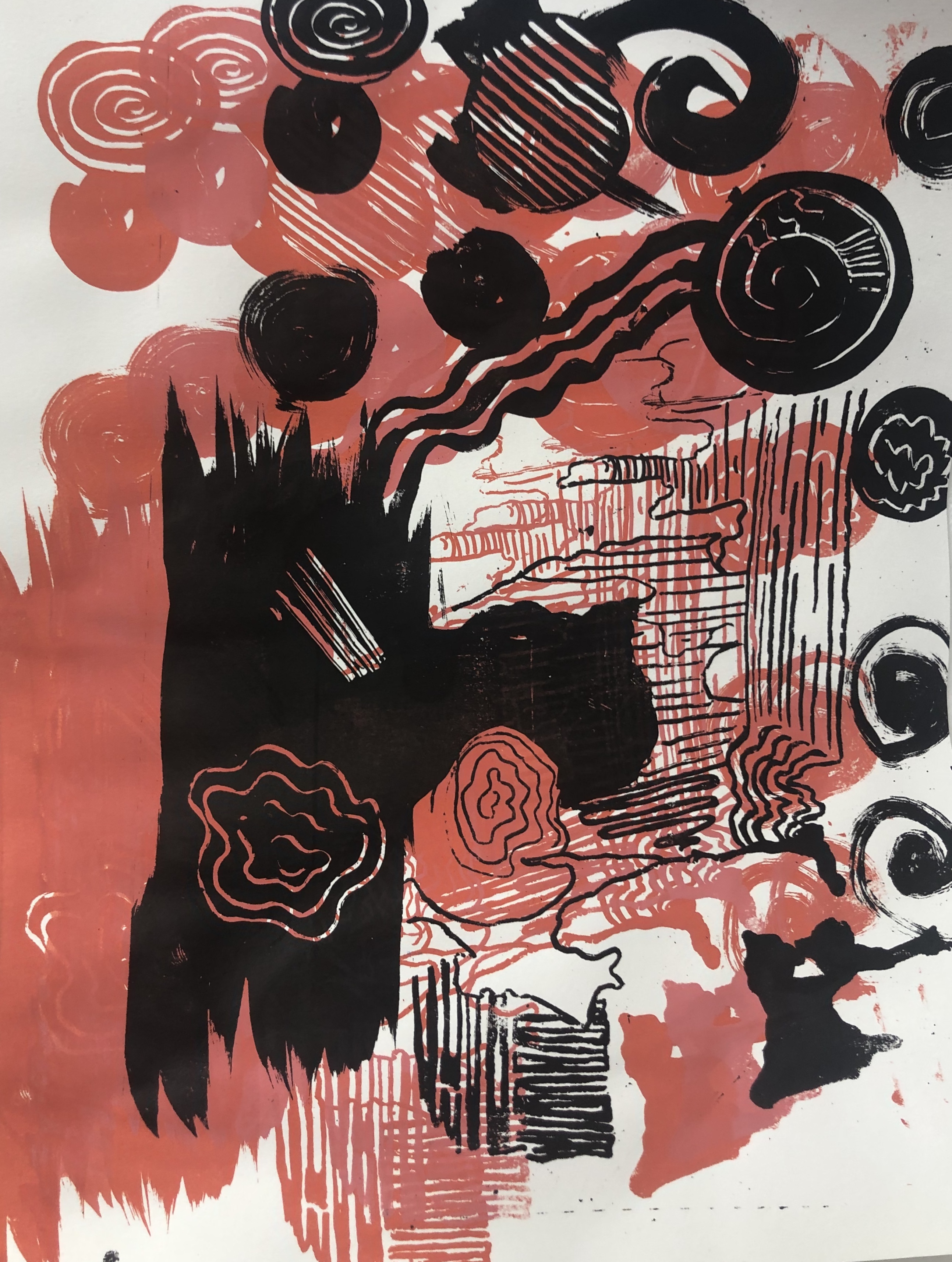
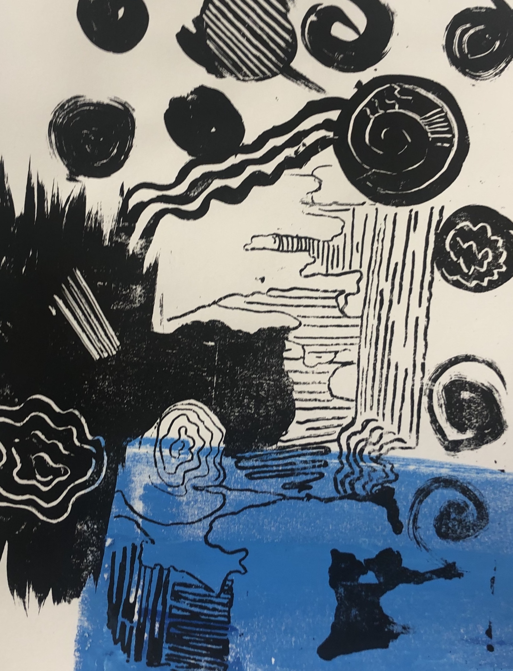
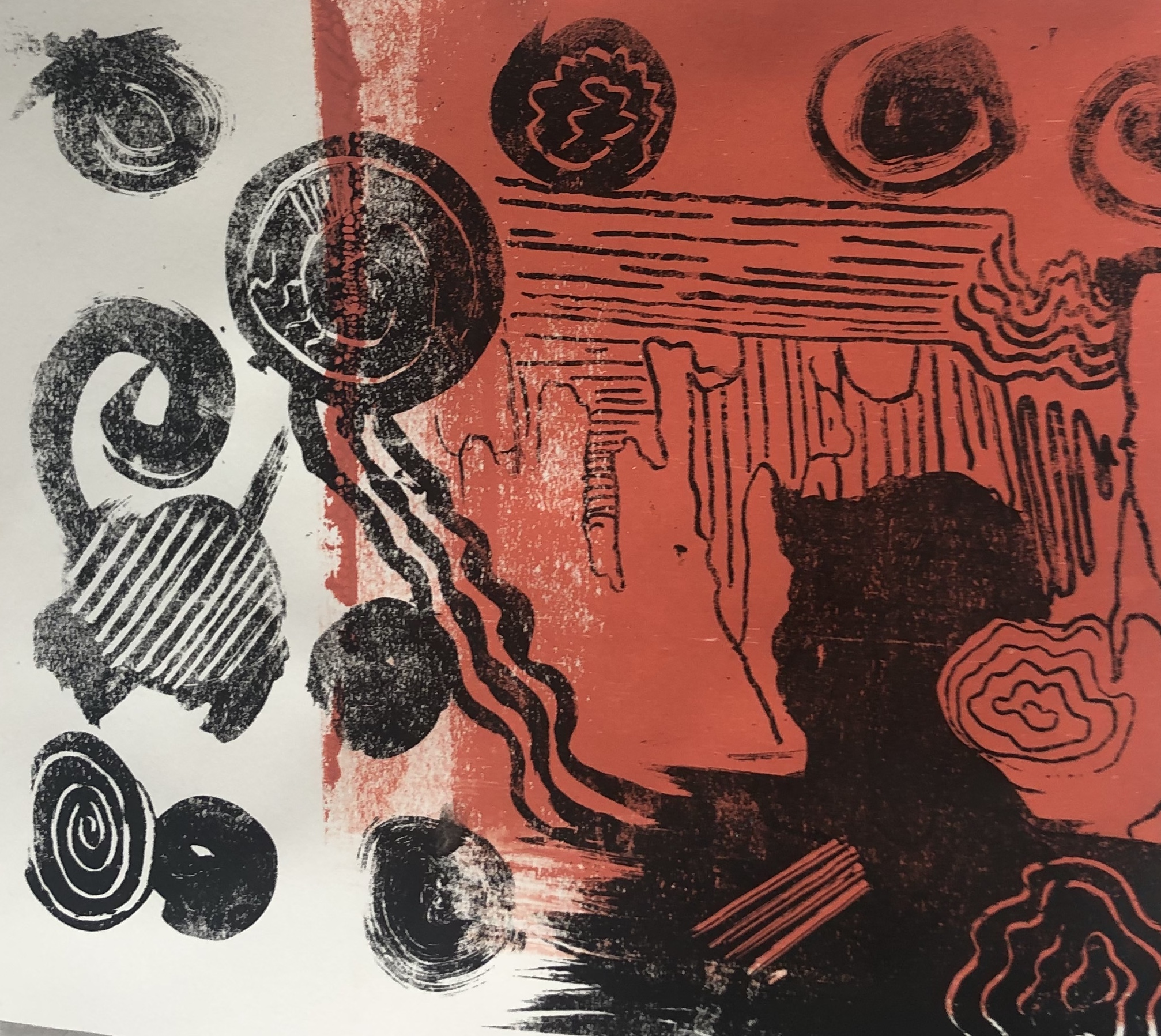
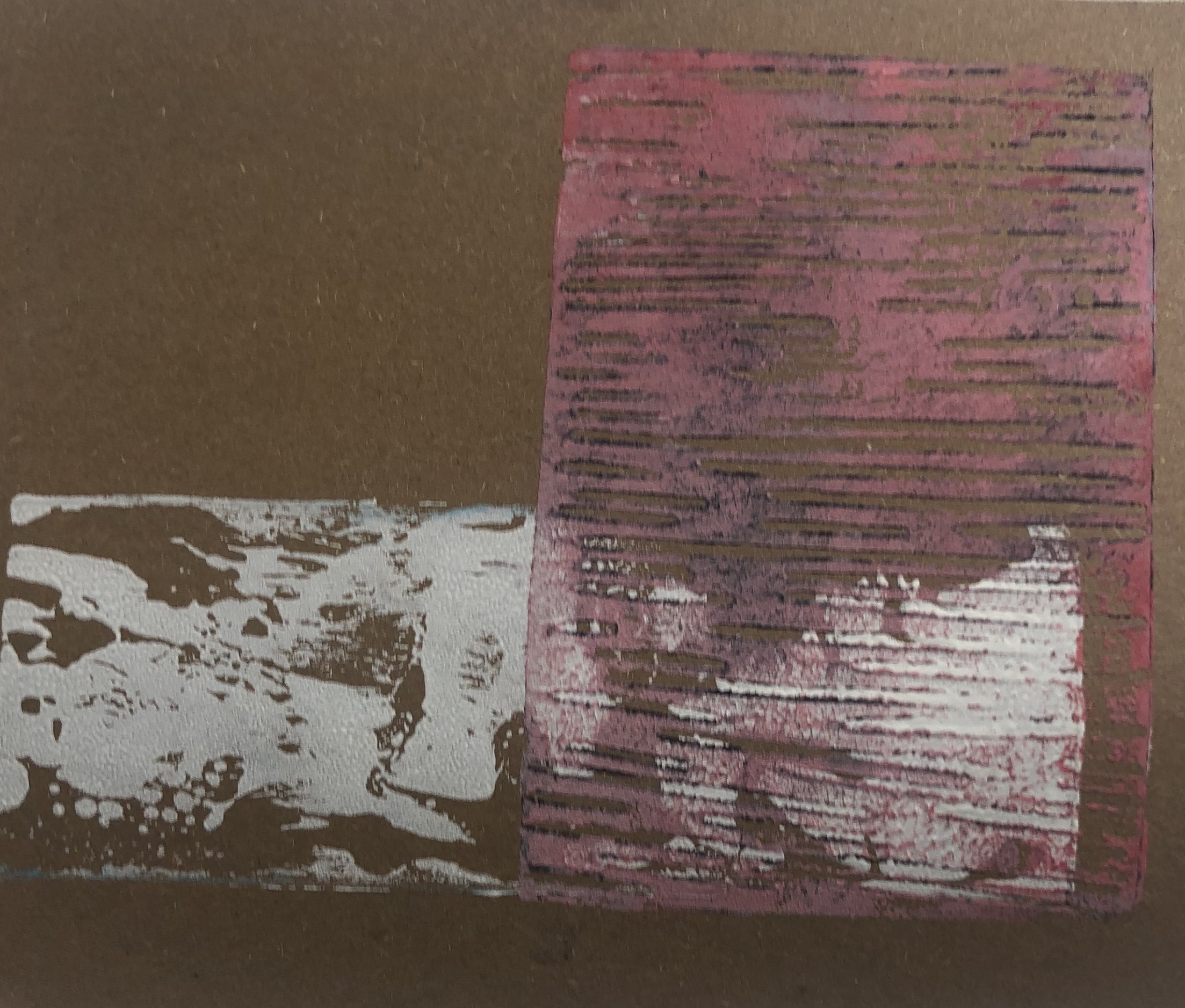
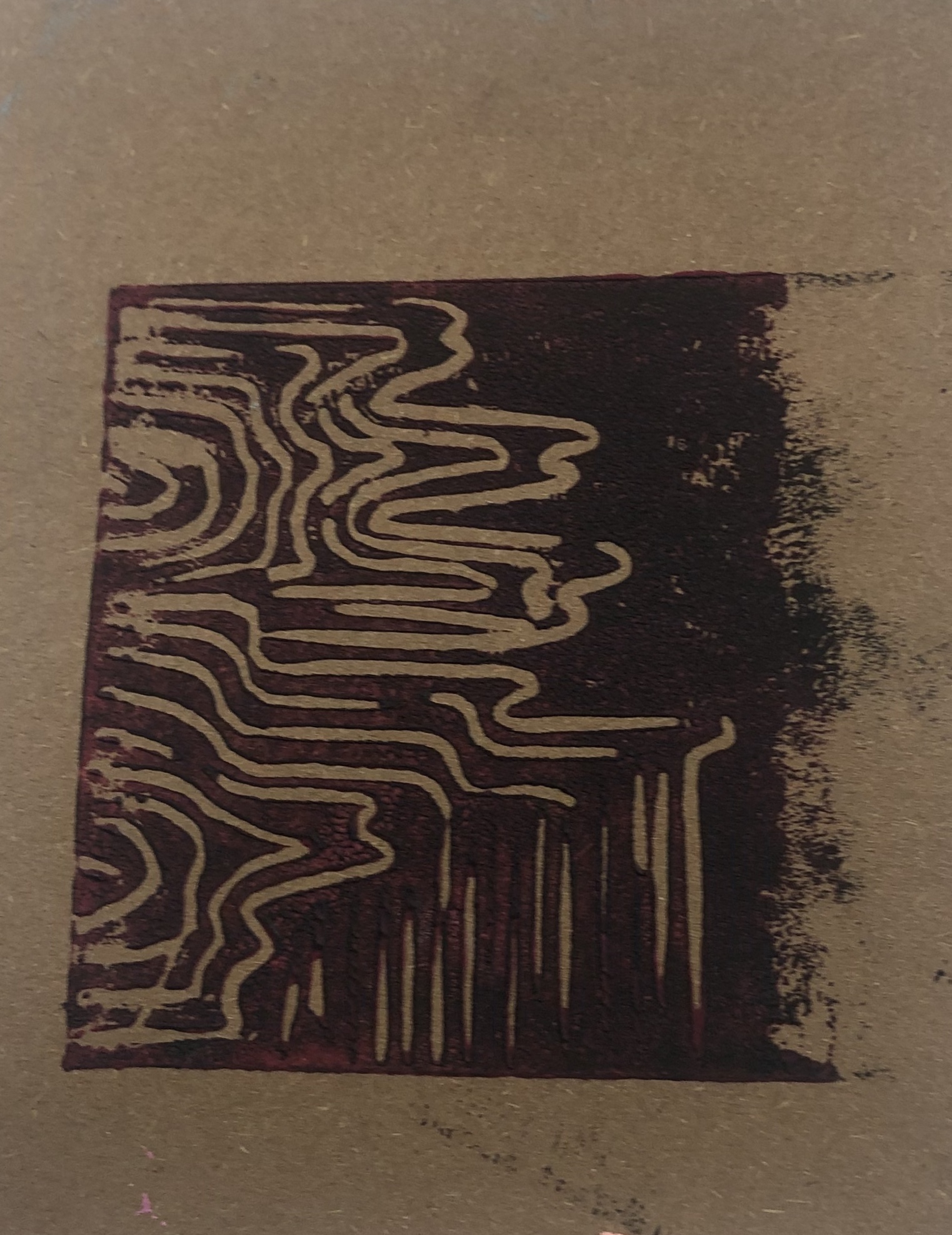
I also created a smaller Lino print of the apartments in Edinburgh, which you can spot near the castle. I really liked the effect and want to created a more larger and more detailed print, but this print was good experimenting.

I really feel the Lino print of the apartments add to the texture. I plan on going out and photographing my city. I would like to do some collage work.

Categories
cap2 studioproject1 wawwa

WAWWA: DEVELOPMENT PRT.7

Today, I carried on making prints with the Lino cut I did previously. I experimented with them by layering over one another with different colours. I then went one to photoshop them and overlaying them once again and enhancing the saturation on them to give them a x-ray type look to them. I did this because I feel it looks like those science like animations you see on the television when they’re talking about cells and anatomy.

I really enjoy making these and found the outcome to be successful. I also decided to crop certain parts of the artwork to focus on the patterns and colour contrasts. However, due to file sizing and the original size of the images, the outcome photos are particularly small. In the future I plan to check my photo sizing and learn how I can fix it for next upcoming pieces.

Categories
cap2 studioproject1 wawwa

WAWWA:DEVELOPMENT PRT.5

I decoded to created some Lino prints, as I wanted to develop and experiment with colour more. I was researching why is the corona cell seen as red? Turns out they make it up for visual purposes, so I started thinking about what colours would I choose the virus to be. I did this to help with experiment and see what direction it take.

The other print I created was a crown, due to the word corona being connected to the latin work ‘crown’. Then went on to experiment layering print with multiple colours. I chose vibrant colours as I enjoy working with them and I was inspired by the recent artist talk I attended by Hannah Nugent.

The influence of Hannah Nugent, I decided to paint a painting of a visual cell piece, of two cells facing each other off. It’s to represent Immune system cells and the virus cell fighting each one off.

Categories
cap2 studioproject1 wawwa

WAWWA: DEVELOPMENT PRT.3

I decided to experiment with Lino print. I started off with creating designs that represent the lung and the air sacs that are located within the lungs. I decided to focus on lungs and breathing as that is where the virus effects the human body first.

At first I used green ink, as that is the only colour that I have, however I then went on to experimenting with acrylic paint as I can get more variety of colours. I really enjoyed printing and working with vibrant colours.

With some of the left over paint, I decided to attempt mono print. I wrote the words ‘covid’ and ‘breathe’. I feel this was successful as I would like to experiment with these prints on photoshop.

Categories
MajorProject1

M.J 1 – PRT 7

I continued experimenting with the reverse printing, but using more greens and blues. I then created background with geometric shapes using acrylic painting. I feel it wasn’t a success as the colours ar eoo dark and the Lino prints weren’t as bright as I hoped for. However, I do like the lines and patterns created in the ink.

Categories
MajorProject1

M.J 1 – PRT 6

I experimented with Mono print. I rolled out ink as a based and the used the Lino prints to add the composition rules. I then used the access ink on the pallet to do a sort of reverse Mono print. I’m happy with outcome and the colours used, however I do feel that I have strayed from my project theme.

Categories
MajorProject1

M.P 1 – PRT 5

I started to experiment with Linocut. I decided to make prints with the rules of composition. I first tried with the golden ratio rule and as a background of the prints, I decided to have a block square of colour, as I want to introduce geometrical shapes.

I then went on to add different shapes in the background of the prints in different colours, which I feel made the prints more effective. I also made the shapes more geometrical in the style of Frank Stella. I like the outcome, however I feel I want more shapes added and them to be the foreground as well, so I plan to make Lino prints of shapes.

I did some experiments with mono and used a tissue to transfer pattern onto toe prints. I drew composition rules and shapes in the mono prints in different colour of ink. I liked the outcome and feel these pieces could be good as a background for painting.

Categories
2DPractice

2D PRACTICE PRT 5- LINO PRINT

I started to experiment more with Lino print and layering it with acrylic paint to create more depth. To create more pattern I used tape to make sharper straight lines, which I feel worked really well and with the print on top made an interesting effect. With adding more thicker spreads of acrylic and printing on top, it created a bumpy and distorted look, reminding me of a glitch in a computer or finger print. However I wanted to exaggerate it more, so I made swirls of thicker paint and then proceeded to print on top. The outcome of this was really successful and I would like to then print negative through the printer to see the outcome and colours of it. In experimenting with the thicker materials I had Pia Fries in mind and would to look more into her work and her use of negative space and colour.

Categories
2DPractice

2D PRACTICE PRT.4 – PRINTMAKING

Throughout the 2D practice project, we’ll be introduced to different techniques each week. This week was printmaking. By taking a frame and burning the pattern into the mesh with emulsion, it allows me to use the pattern repeatedly with different inks. I started off with experimenting and getting use to how the pattern and ink would look when together. I decided to use black ink for the main pattern and for the background colours; blue and orange. I really like the effect and strong contrast of the black, blue and orange. With experimenting with the negative technique of the printer and how it changes the black lines to white, I made lino prints of common patterns that you can see through out my project and started to layer them. By using the lino prints it gives the same effect that the printer did. I prefer using the lino to active this outcome as it also leaves a texture look to which i find to be effective. I really enjoyed printmaking and lino print, as the effect can lead to interesting textures and alows you layer.

Design a site like this with WordPress.com
Get started