Categories
cap2 StudioProjects2

SELF GEN PROJECT PRT10

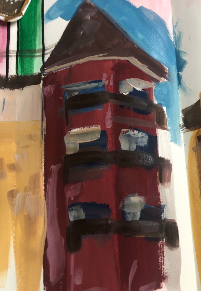
Feeling really inspired by the work of Peter Brown. I decided to walk around my city and do quick sketches of buildings and when I got home, I painted from memory. In the future I want to go out of draw fully to painting on the spot.

I really enjoyed doing this and felt my technique in layering and depth are improving. I do want to do the same again, however instead use bright vibrant colours, usually seen on flowers as I feel that goes well with my theme, but also could produce an interesting outcome.

Categories
cap2 StudioProjects2

JOSE TRUJILLO

Jose Trujillo is a Mexican artist that now resides in America. Trujillo is a Impressionist painter, who likes using colours and looks at the movement and feel of a painting.

I really like the extreme strokes Trujillo creates and the bright, contrast of colours. It reminds me of nature and of flowers and I thought this would be a good idea for creating an artwork around city buildings. I like Trujillo’s city paintings, but I would like to go further and use very contrasting colours, certain colours that represent flowers or nature native to the city. I look forward to experimenting with the ideas created by Trujillo’s influence.

Categories
cap2 StudioProjects2

SLEF GEN PROJECT PRT9

Compared to my last piece I much prefer this piece. I think the colours are more effective together and I also feel the composition is more better placed. I added the brick pattern at the side of the artwork as I didn’t want to create too much of a contrast anywhere else in the painting. I then decided to paint with railings slightly green because I do want to start thinking about incorpaterting nature, so added then green. I do like the green, I feel it adds a surrealistic vibe. I also decided to districtly add architectural lines to add detail.

By adding the lines, it reminded me of blue prints, which you usually see when looking at building plans. I thought this could be interesting to combine with the nature aspect of the theme.

Categories
cap2 StudioProjects2

SELF GEN PROJECT PRT5

Following from my previous post, I started experimenting with creating a rough texture. I started off with selecting colours that match the colour range of Edinburgh. I layered paint and then used Lino print of lines ontop with yellow. Originally I wanted the yellow lines to stand out, but they ended up patchy and faded-is. However, I really like the outcome as it has added depth and texture to the piece.

I also created a smaller Lino print of the apartments in Edinburgh, which you can spot near the castle. I really liked the effect and want to created a more larger and more detailed print, but this print was good experimenting.

I really feel the Lino print of the apartments add to the texture. I plan on going out and photographing my city. I would like to do some collage work.

Categories
cap2 StudioProjects2

Serj Fedulov

Serj Fedulov is a Russian artist that focuses on urban landscapes and people. He mainly uses mixed media like acrylic, collage and watercolour. I especially like his urban landscape artworks because of the thick layers of paint being used and the collage or photography. I find his work really inspiring and effective. I feel I could use this mixed media style well with my new project.

I plan on doing some quick responses with paint and sketches to see if it works.

Categories
cap2 StudioProjects2

SELF GEN PROJECT PRT2

From the previous group of responses I did, I really enjoyed working with line. So, I started experimenting with creating I line pattern, like I did before with the snake responses, but this time not using the whole page but just a small area of the page. I then do a similar pattern on top of the pattern I did, but in a contrasting colour. I really like the outcome of this, so I then outline them with black, I feel this makes the shapes stand out even more and brings for definition to the shape. I then went to experiment more of these. The pieces, in a way, remind me of the work of Keith Harring. I think due to the black outline and the simplistic form. I really enjoying experimenting with this and painting them. I’m not sure what would be the outcome if I were to carry one with developing since there’s no exact theme, but maybe I will be able to incorporate it into another project.

Categories
cap2 StudioProjects2

SELF GEN PROJECT PRT.1

For this projects, its completed self generated. I didn’t have a theme planned for this project, so I started off with making quick responses to anything. I started off with just painting whatever come to mind. I then went on to think about snakes and movement due to me drawing quite curved lines. So, I focused on that movement and started experimenting with colour and placement. I really like the look of these sketches and started making the lines bigger, less negative space on the page and more detailed. I then decided to add a snake into a sketch, which I really liked the outcome of the responses, however I’m not sure what I could develop further in the future. I would focus on the patter and shape and the movement of snakes. I am thinking of going down a more urban environment route for this project, however I’m not entirely sure yet.

Design a site like this with WordPress.com
Get started