Over the past couple of days, I have been going around the city and doing quick sketches of random buildings. I feel very out of my comfort zone, as I have never really painted buildings before. However I do feel I am improving. I am mainly using either Gouache or watercolour as these are the only materials I have. I do want to continually do these quick sketches as I feel it helps with technique and could be useful in the future of my project.
Tag: developmentaldrawings
WAWWA: DEVELOPMENT PRT.2
This week I’ve been mainly focusing on doing experimentation and development on the virus and cells aspects of my project. I have paint about 3 painting and made an artwork on ProCreate, and then combined them on photoshop by layering them on top on each other.
When thinking about cells and fighting of disease, I feel it can potray quite a chaotic feel, everything fighting to survive. So, I wanted to create or experiment with trying to represent messy, chaotic. I feel the layering technique helped as it make the artwork busy and a lot going on. However, I think it was successful.
This week, I feel I have hit a wall for inspiration. So, I am just experimenting with ideas that come to mind and not worrying about if it connects completely to my theme, as I don’t think that helps when mentally blocked.
I would like to further develop this piece in photoshop and add detailing to it.
WAWWA: DEVELOPMENT PRT.1
I’ve been mainly focusing on doing contextual research and then responding to the new information through developing and experimenting.
With research about the virus’s cells and the how the human body fights the virus with antibodies and protein cells, I decided to draw a visualisation of the cells ‘fighting’. I used the colours that the majority of science articles use when describing which cell us which. The red is the virus and the blue is the antibodies. I was struggling when making due to not feeling any ideas are motivation.
I then started trying photoshop, and really enjoyed using it! I don’t have much experience using photoshop, so I experimented with my theme and just getting use to photoshop. I do like what I created, and feel this could be a path of potential development.
The last response I have done was just an idea I got when researching, with the thought of the cells moving in the body. I wanted to try and visualise that movement.
I want to know focus on the actual human body, especially the chest and throat area as that is where the virus first affects.
RESOLVED PIECES
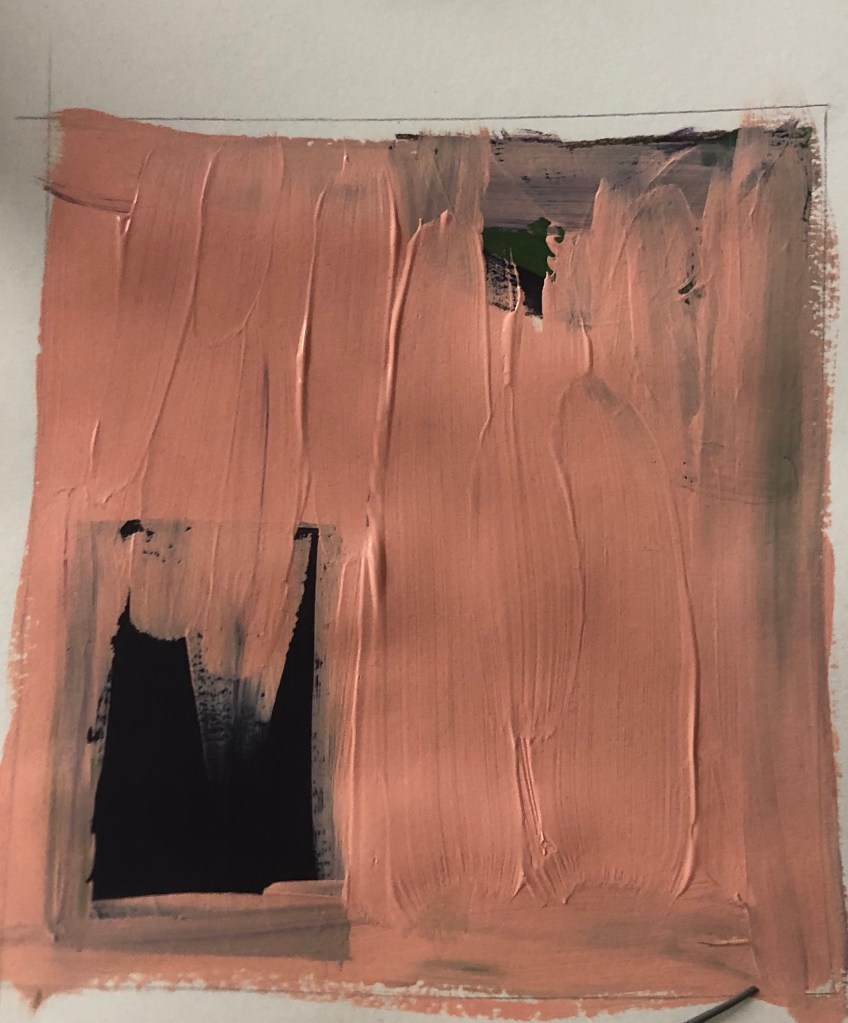
Our next task for this project is to create a minimum of four resolved pieces, inspired from the 2D and 3D pieces done in the previous task. I really enjoyed doing this task, and I feel this has helped in getting use to creating, and painting again!
The main materials I decided to use was black ink, pencil and a black brush pen, as w weren’t allowed to use colours. Only being able to use black was a change for me, as I usually work with colours, however I really enjoyed working with black and find really effective.
One the first resolved piece, I took inspiration from Daniel Zeller, and from one of the first 2D piece I did. I like the curved lines and the use of linear that I did in the 2D piece, and wanted ti see if I could incorporate the shapes of Zeller. I do like the piece, and the movement that is created by the curves and the contrast of the straight line, however I feel it has a more Bridget Riley feel to it, then Daniel Zeller inspired, probably from only using black ink.
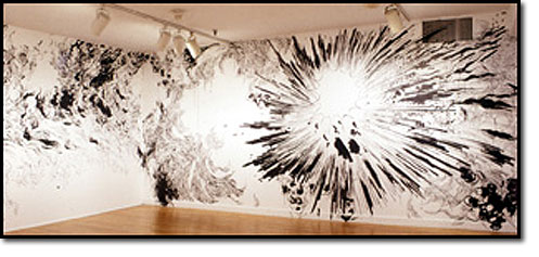
For the second piece, I took my inspiration from the 3D piece I did earlier. I wanted to focus on the contrast of black and white, and by using shapes. This is my favourite piece out of the four. I originally wasn’t going to have a gradient, however I’m glad I choose to do so, as it make the white shapes, really stand out and makes the black more effective.
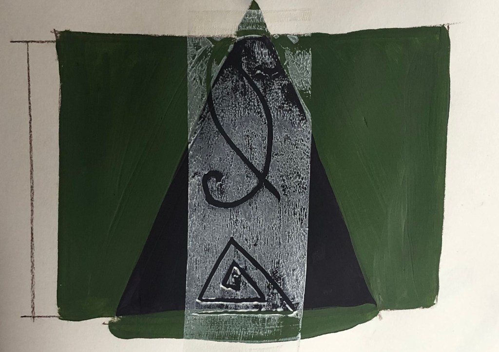
The third piece is my least favourite. I really struggled on this piece. I originally wanted it to be solely rectangles and squares overlapping, like the piece that inspired it. However I felt there was something missing, as the piece seemed bland and boring. Instead of leaving the piece and then coming back to it, I just kept adding, and decided to add the curved patterns that I did in the first resolved piece. I feel the shapes and patterns don’t work, its too busy and the placement is all wrong. Maybe if I placed the survey pattern in the middle, with the more black shapes in the background it could of been more successful. However, I am glad I did it, as it reminded me to take your time and if something isn’t working, leave it and then go back to it.
For the fourth piece, I wanted to focus on the smaller shapes created when overlapping multiple shapes. I really like this piece, and I feel I was successful in showing the shapes. I do question my decision on adding lines in the circles, as I feel it is a bit busy, but I do like the effect it gives. For this piece I let the shapes blend into the background, as I wanted to see the effect it would have on the overall contrast on colours. I do like the effect it has, but I feel though, I would of had more of a sharper contrast, as that was my main focus.
With the continuation of producing a mix of 3D and 2D pieces. I really enjoyed making and experimenting with these pieces and are really happy with the results.
I mainly worked with ink, masking tape, brush pen and pencils. With my environment being my bedroom, and my bedroom consisting of squares and circlers, I decided that to be my main objected, when facing on what to create.
I experimented by overlapping certain shapes, cutting out certain shapes using a crafting knife or scissors. When experimenting I particually liked the contrast of curves and lines and block colours.
Carrying on from the previous task, I created I small installation, using the limited materials in my environment to create the 2D artwork I did in the last task. I enjoyed creating the piece, and experimenting with using different materials then usual, however I feel the actual outcome was unsuccessful.
I tried to create the linear shapes seen in the drawing by using wires, and hanging them on a clothes hook. And for the more sharper straighter lines, I decided to use kitchen utensils,
I do however, really like the drawing and shapes in the drawing taken from the newest installation piece. I more focused on the shapes of the shadows instead of the actual objects.
DEVELOPMENT TASK TWO
For this task we need to create a small three dimensional piece and from the shapes and shadowing it creates, create a two dimensional piece inspired from it.
I really enjoyed this task and loved manipulating the shadows. I decided to recreate the three dimensional in a linear, simplistic style, incorporating the shadows into the drawing. I felt this piece was successful, and I like the two dimensional outcome.
GRADED UNIT – SKETCHBOOK
During this project the variety of colours available is very limited, however I decided to experiment a little with colours. I quickly painted pages in my sketchbook with acrylic paint, with very squared brushstrokes.
I do like these bases, as they are also useful for inspiration for a painting. Whether that be for colour or even compositional reasons. For this project, alot of my paintings are layered, these sketches helped me to see what colours look well with layering.
M.J 1 – PRT 14
I wanted to experiment more the composition and negative space. I decided to position the lighter area at the end and have a slightly more crowded surrounding. At first, I was just going to have sharp lines, but decided to add more curved lines as I feel it added more movement to the piece. As I did with previous piece, I added a mix of light and dark tones to give depth to the piece.
When I saw the work of Julie Mehretu piece… add the name of title. I like the lines used in her piece and I thought it would look interesting added with the lines I created. I feel it added movement and detail into the piece. I also outlined the curves with pen to make them more outstanding, which I feel was a success.


