Categories
MajorProject1

M.J 1 – PRT 17

Since many of my more resolved pieces have been square shaped, I decided to try a piece with a more rectangular shape. I wanted to try creating a depth with the lines and make the piece look like the lines are closer to the viewer.I do like the colours I used as I feel they contrast in a way that shows off the colours. 

However, I don’t like the outcome of the painting. I feel the placing of the lines don’t match with composition and there’s too much highlighting on against the darker tones, which makes the piece seem clustered. I feel I used too many different light tones against the darker tones, creating a lot of contrast, but not in a harmonious way.

Categories
MajorProject1

M.J 1 – PRT 16

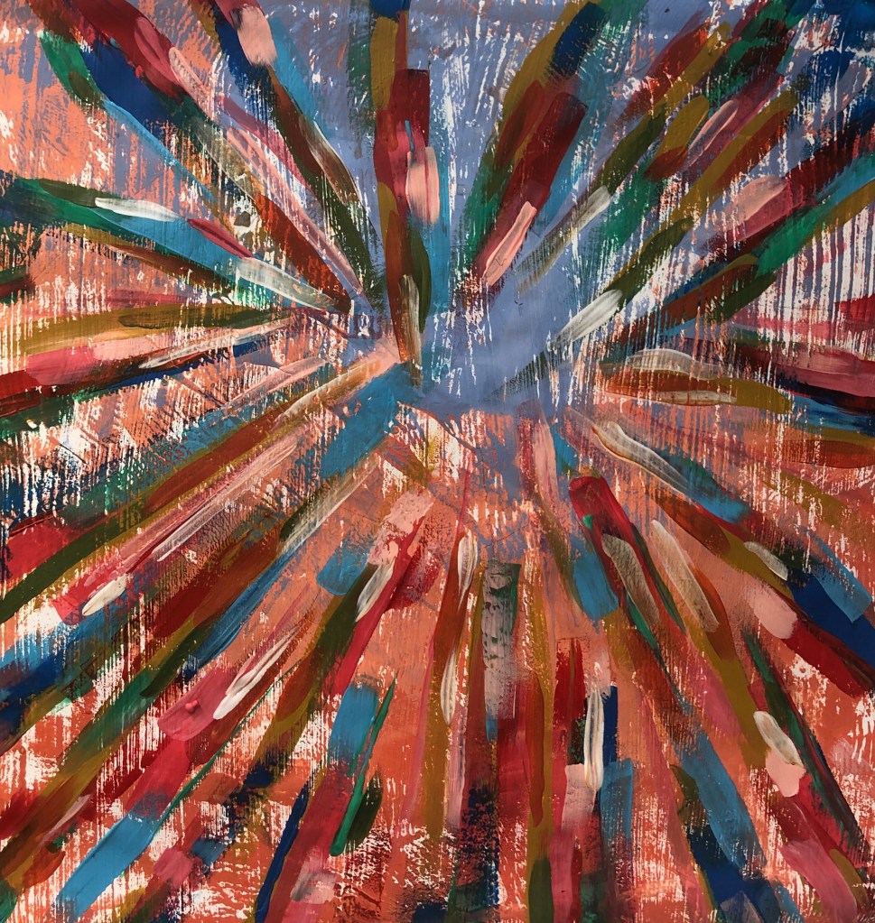
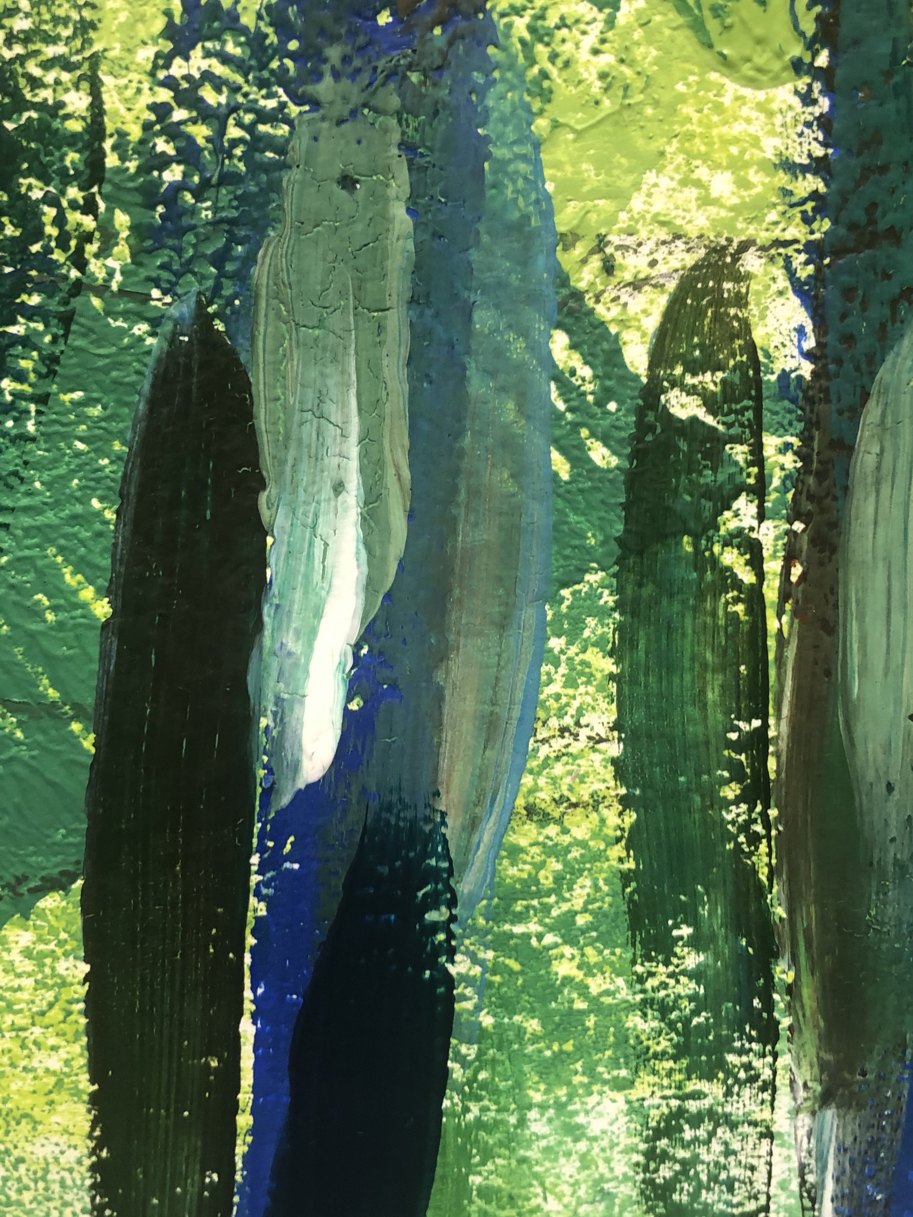
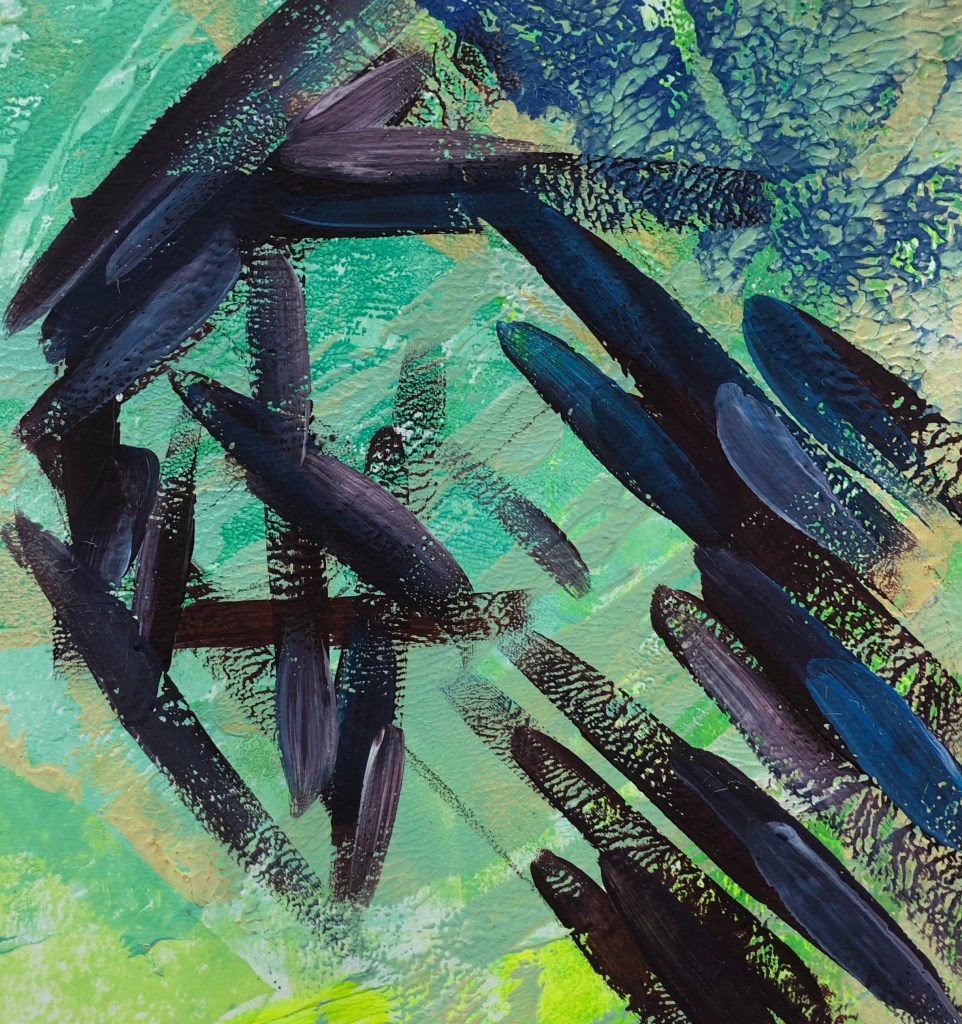
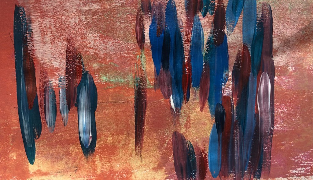
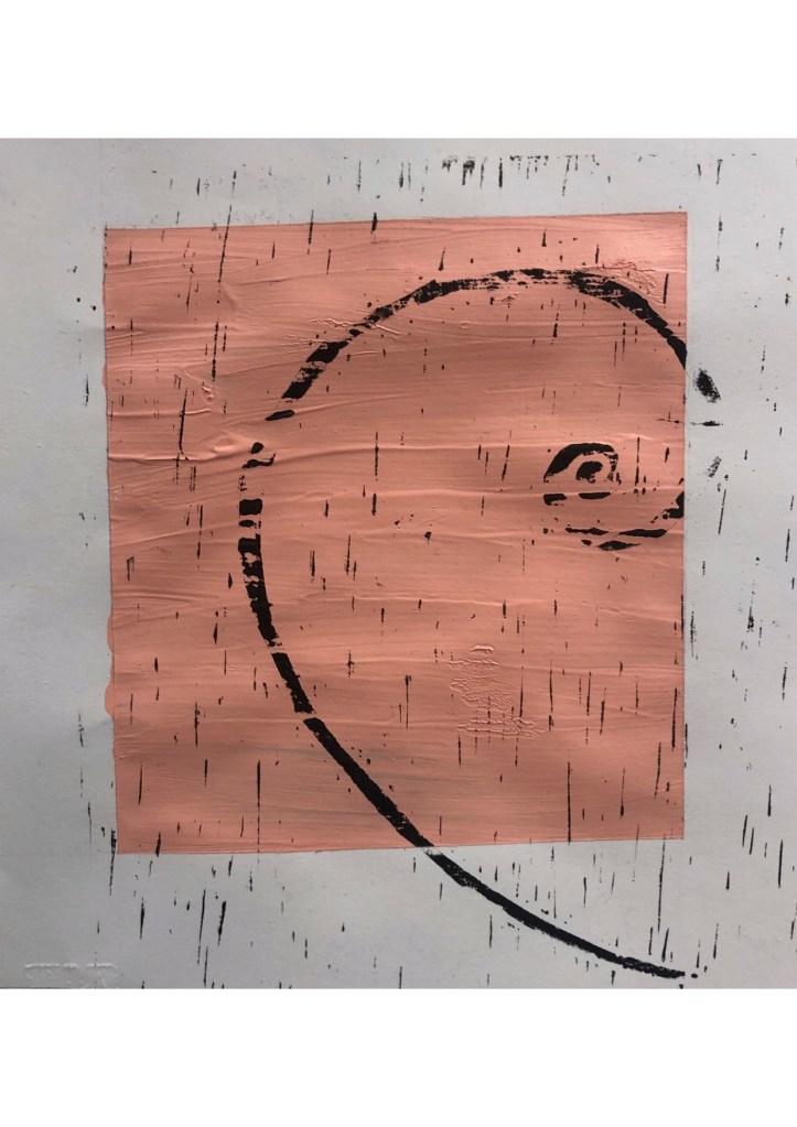
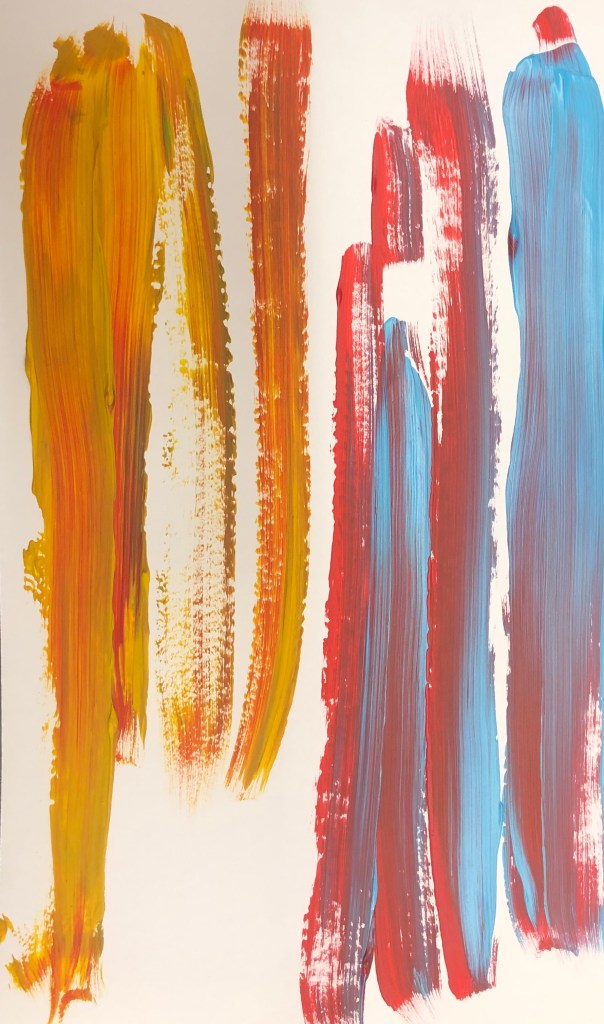
Based on the 1st artwork I’d done when looking at sources, I really liked the outcome of that artwork, so I decided to recreate that piece, but using opposite colours as I wanted to see if it would be successful. Since I’m looking int negative space, I wanted to add a more crowded surrounding to see if negative space has an effect on a piece.

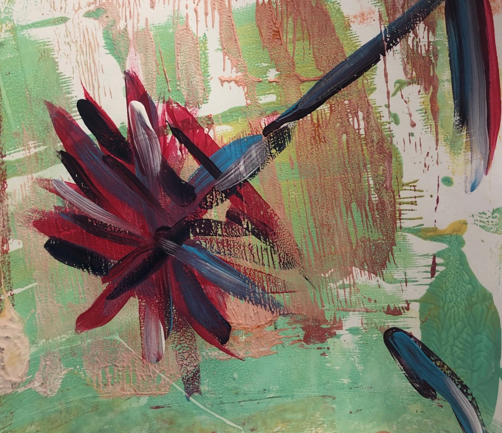
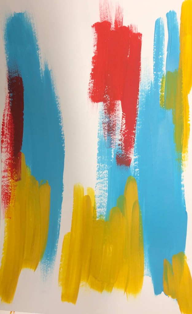
I felt this was a successful piece as I feel the colours used really makes the painting stand out. It’s a very busy piece, and at first, I thought it was too busy and therefore didn’t work, but after looking over it I’ve come to realise it works really well.

I did struggle when painting this artwork, due to figuring each opposite colour compared to the colours I used in the first painting and trying to create depth by using only quite vibrant colours. The light brown and blues were the main colours being used for the depth and to add contrast, but I also lightened colours, especially red, using white paint, which I feel helped the piece to become brighter.

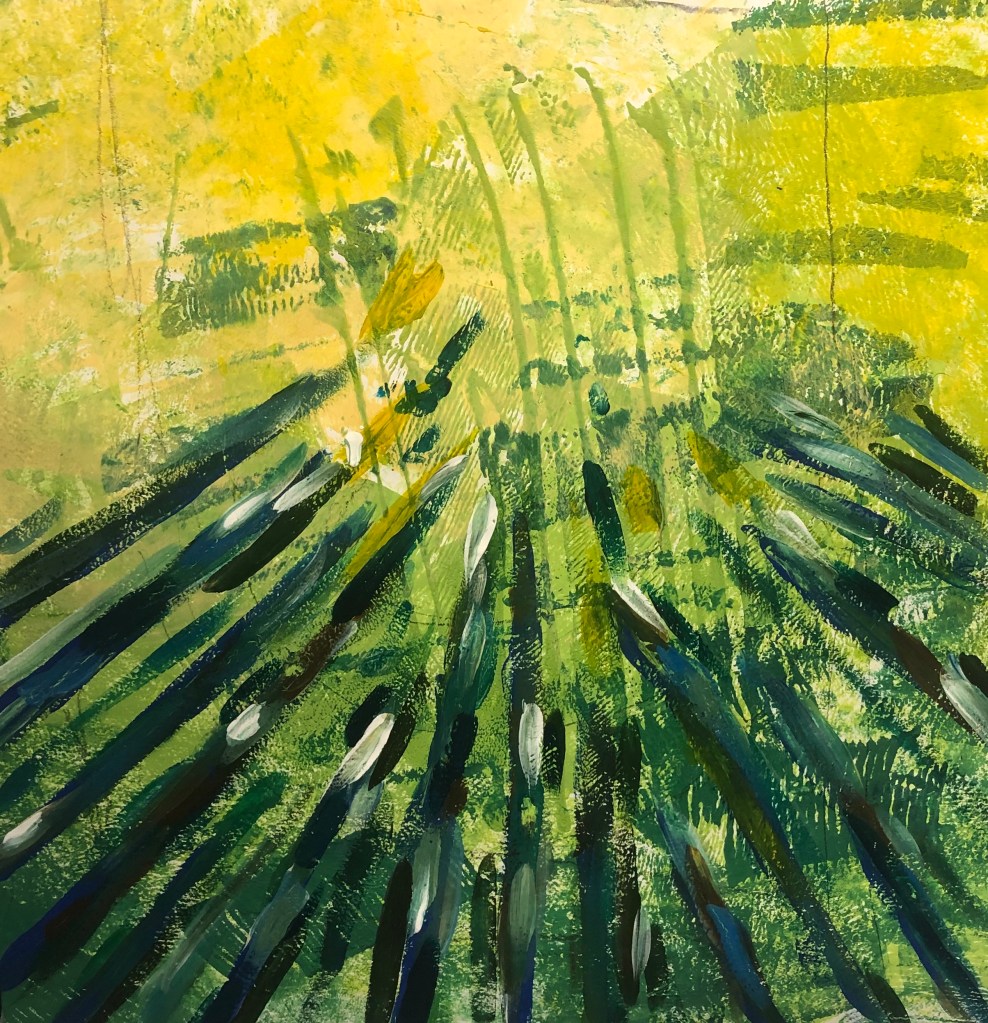
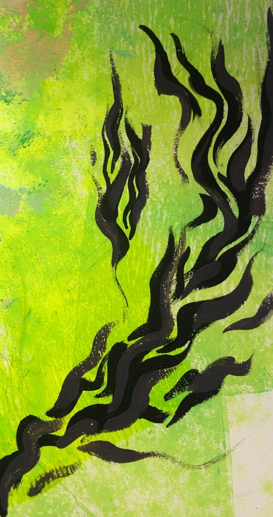
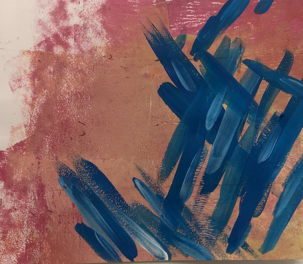
I was originally going to add lines, similar to the ones seen in Julie Mehretu’s work, but decided against it as I feel the piece would become too messy and the contrast of the black lines and bright colour would clash. I think I made the right decision in not adding the lines.

Since the only part of the painting that has negative space is the middle, I thought it would be clustered and messy, but I think with all the colours that have been used, it balances the composition out.

Categories
MajorProject1

M.J 1 – PRT 14

I wanted to experiment more the composition and negative space. I decided to position the lighter area at the end and have a slightly more crowded surrounding. At first, I was just going to have sharp lines, but decided to add more curved lines as I feel it added more movement to the piece. As I did with previous piece, I added a mix of light and dark tones to give depth to the piece.

When I saw the work of Julie Mehretu piece… add the name of title. I like the lines used in her piece and I thought it would look interesting added with the lines I created. I feel it added movement and detail into the piece. I also outlined the curves with pen to make them more outstanding, which I feel was a success.

Categories
MajorProject1

M.J 1 – PRT 13

I gathered pictures of trees with sunlight shining through, as I feel it connects to the previous pieces I’ve done due to the lines created. I decided to use similar colours as the source pictures and wanted to recreate the pictures but in a abstract way as I feel it will help me to understand compositions and I wanted to experiment with negative space and understand it more.

I wanted to recreate the source picture as I feel it will help with understanding contrasting colours due to the extreme light tones and dark tones. I originally wanted to just ave the lines in a dark blue, however I feel I made the piece too flat so I added a more range of colours and light tones against the darker tones to add more depth. With the strong constrast on the light and dark colours it makes the the piece less flat.

I was going to have the lines going all around the outer piece, but I wanted to see if the negative piece at the top works better. I do feel it was the right choice to leave the top open, but I plan on doing a piece with a more crowed surrounding and use opposite colours compared to this current piece.

Categories
MajorProject1

M.J 1 – PRT 11

I’ve been experimenting a lot with more soft and pastel colours. I wanted to try more colours that I wouldn’t personally go for, so I decided to try neon. By mixing printing inks, I created a green/yellow neon colour that I mono printed as a base for compositional pieces. When doing the pieces focusing on good and bad compositions, I did a lot of sharp, thick brushstrokes, which I liked, however I wanted to try more delicate curvier lines. I used the golden ratio rule for the first piece and then used the rabatement of rectangle rule for the second, to practice at using negative space. I started off with just using black, as it would be effective against the bright neon, however I felt the black was too dark and heavy, so I decided to add purple to add depth and balance the black. For the second piece, I decided to add blue to see if the brightness of the blue against the purple and black could work. I feel it didn’t work due to the contrasting colours, but I did like the composition.

Categories
MajorProject1

M.J 1 – PRT 10 Bad Compositions

  1. I tried to have contrasting colours that didn’t match to see if it had an effect on the composition. When looking at trying to create bad compositions, its all-out controlling the viewers’ eyes, and how they lead through the painting.

2. I feel this was a success in being a bad composition. I feel there should be more negative space at the top and maybe some brushstrokes at the top left of the piece.

3. At first, I followed the plan I had sketched out before, however I added the lines without thinking. This shows your subconscious automatically knows about positive compositions.

4. With all these experiments, I wanted to use opposite colours, yet I feel in this piece the colours work. For it to be a successful bad composition there should of been more negative space.

Categories
MajorProject1

M.J 1 – PRT 9 Good Compositions.

  1. GOLDEN RATIO RULE

In the first picture, I used the golden ratio rule to plan out the composition. For the colours, I decided to use darker tones compared to the background or opposite colours that contrast well.

2. GOLDEN RATIO AND SYMMETRY

I experimented with using the golden ratio rule and symmetry. I went with using contrasting colours. However I feel this wasn’t successful since the colours don’t go well together. I feel this would be a better piece if there was more negative space.

3. RABATMENT OF RECTANGLE AND GOLDEN RATIO

I wanted to use these two rules to see if I can balance negative space with a more busier space. I liked the colours that I used and the layout of the piece. I feel the colours go well with the background.

4. RULE OF THIRDS

This is my favourite piece. I feel the colours really make the piece stand out, since there’re contrasting colours. I decided to add more lighter tones of blues to give the piece more depth.

I also looked rabatement of rectangle for the piece and the effects that negative space can have on a piece.

Categories
MajorProject1

M.J 1 – PRT 8

I decided to created larger scale of ink pieces to try and get more pieces with line patterns. I feel this could be good bases for when I look into composition layouts. With the left over ink on the palette I used a brush to created shapes and then mono printed it. I really like the outcome and feel it could be interesting if I were to use this technique when painting.

Categories
MajorProject1

M.P 1 – PRT 5

I started to experiment with Linocut. I decided to make prints with the rules of composition. I first tried with the golden ratio rule and as a background of the prints, I decided to have a block square of colour, as I want to introduce geometrical shapes.

I then went on to add different shapes in the background of the prints in different colours, which I feel made the prints more effective. I also made the shapes more geometrical in the style of Frank Stella. I like the outcome, however I feel I want more shapes added and them to be the foreground as well, so I plan to make Lino prints of shapes.

I did some experiments with mono and used a tissue to transfer pattern onto toe prints. I drew composition rules and shapes in the mono prints in different colour of ink. I liked the outcome and feel these pieces could be good as a background for painting.

Categories
MajorProject1

M.J 1 – PRT 4

Following from the work I did last week, I looked at composition and contrasting colours with background. With the primary colour compositions I did, I then experimented with a darker background. I created the darker colour by mixing red and green. I did like the outcome, however I feel I need the shapes to be more persice. From the brushstrokes, I bypassed them through the printer on to work, and made it negative. I really liked the colours and composition of layering. The prints also have a great texture.

Design a site like this with WordPress.com
Get started