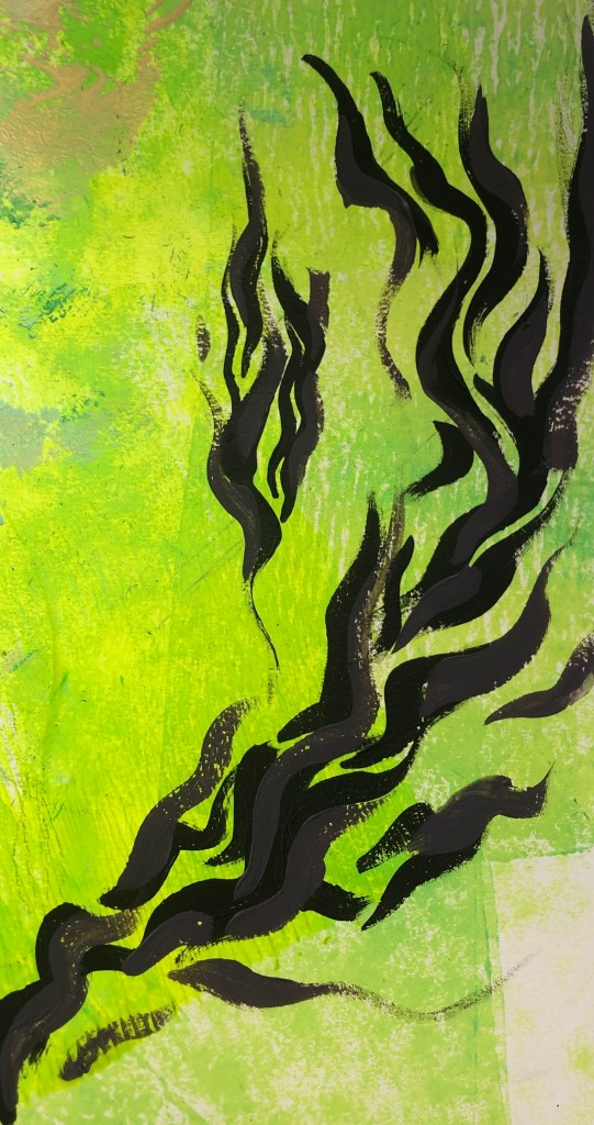
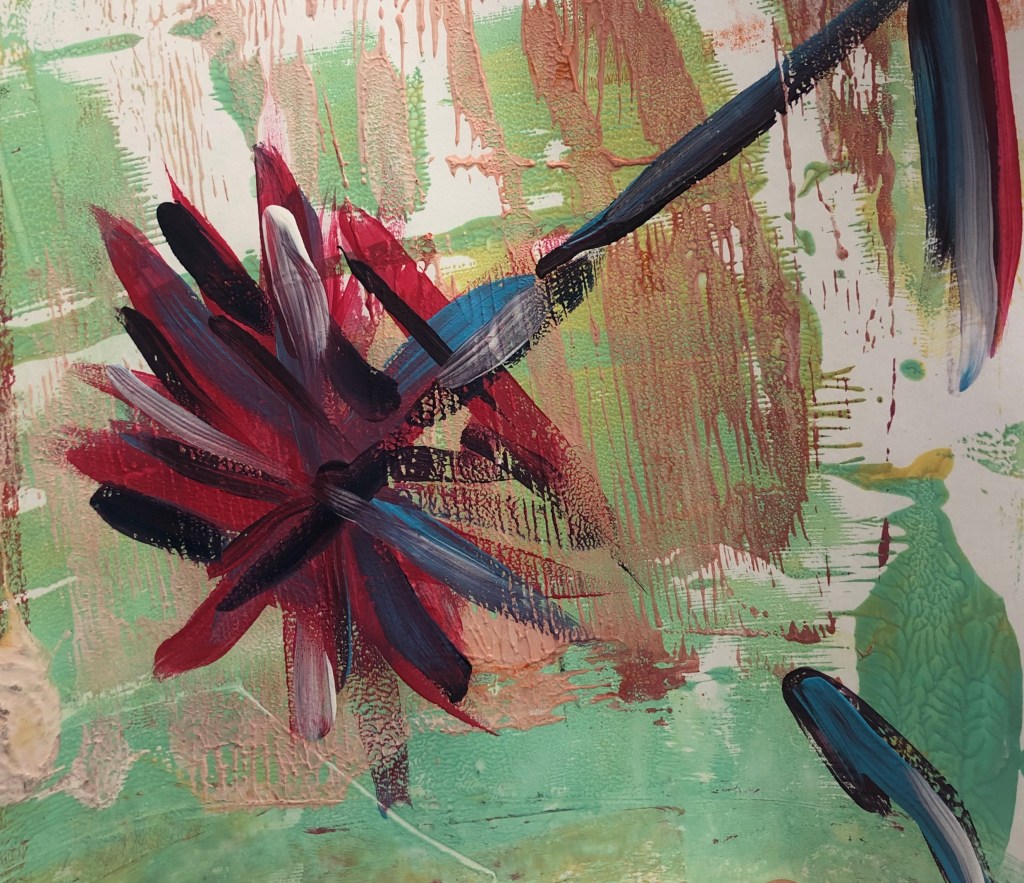
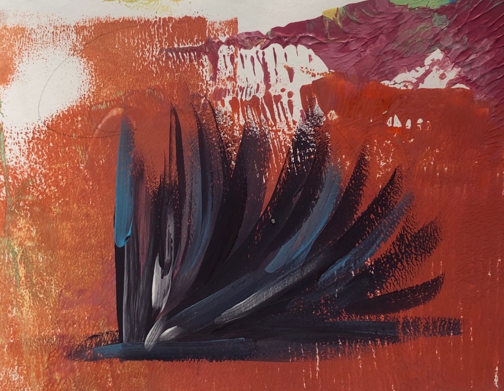
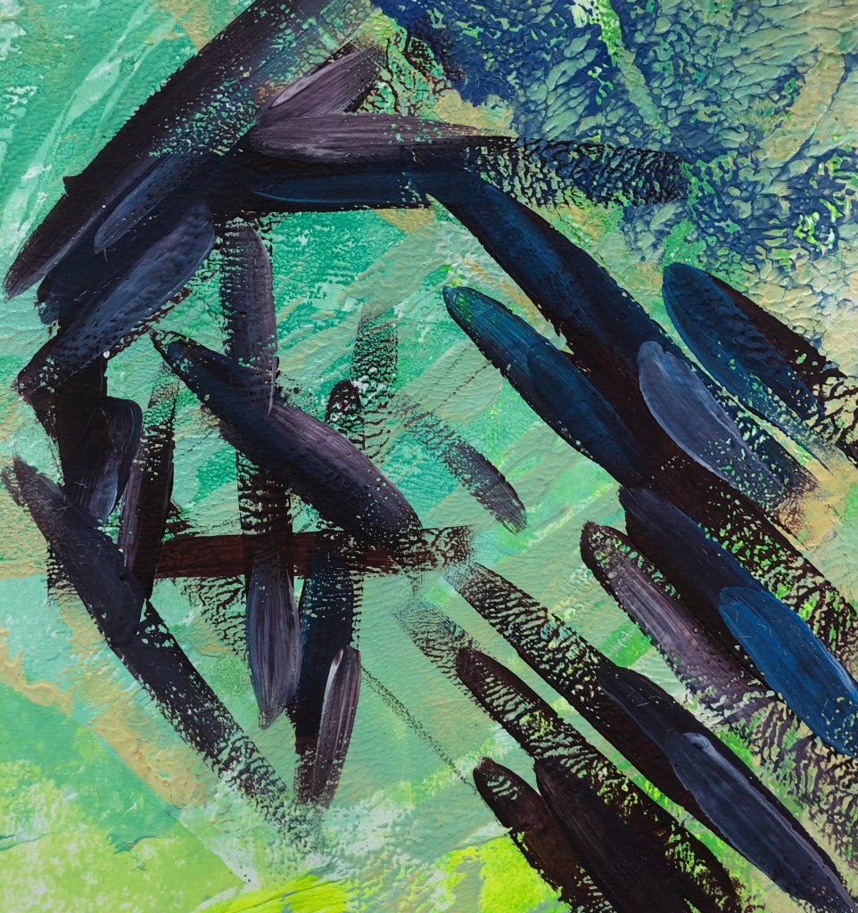
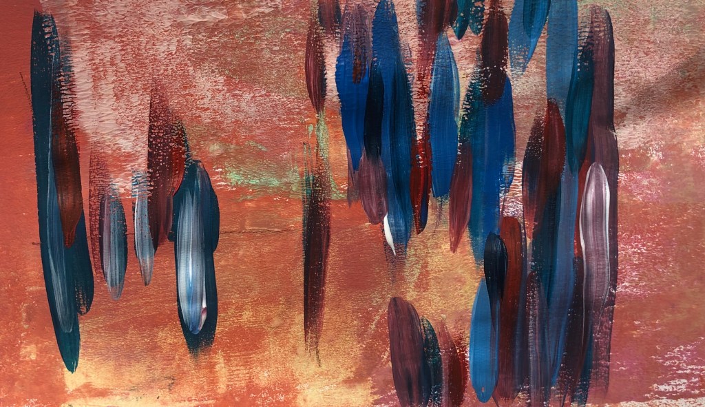
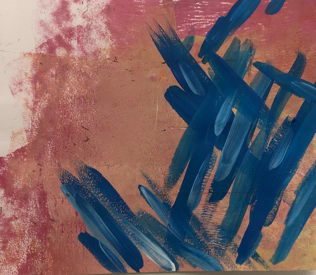
During this project, especially when painting the compositional pieces, I realised how important it is to have a meaning or purpose behind your work. In previous projects I always find it difficult with a theme as I wanted to just focus on the techniques being used and not the meaning. When I was given the opportunity to have my theme for M.J 1, I immediately chose to focus on a group of techniques and not a topic of interest. At the start of the project I enjoyed just exploring the techniques, but when I went to paint the compositional pieces, I found myself struggling to paint, as there was no meaning behind the brushstrokes or reasons why the compositions are the way they are. This made me realise how important it is to have a meaning or topic behind your work, and how context for art is so important when looking at any art.
Author: theamurphycap
M.J 1 – PRT 11
I’ve been experimenting a lot with more soft and pastel colours. I wanted to try more colours that I wouldn’t personally go for, so I decided to try neon. By mixing printing inks, I created a green/yellow neon colour that I mono printed as a base for compositional pieces. When doing the pieces focusing on good and bad compositions, I did a lot of sharp, thick brushstrokes, which I liked, however I wanted to try more delicate curvier lines. I used the golden ratio rule for the first piece and then used the rabatement of rectangle rule for the second, to practice at using negative space. I started off with just using black, as it would be effective against the bright neon, however I felt the black was too dark and heavy, so I decided to add purple to add depth and balance the black. For the second piece, I decided to add blue to see if the brightness of the blue against the purple and black could work. I feel it didn’t work due to the contrasting colours, but I did like the composition.
M.J 1 – PRT 10 Bad Compositions
- I tried to have contrasting colours that didn’t match to see if it had an effect on the composition. When looking at trying to create bad compositions, its all-out controlling the viewers’ eyes, and how they lead through the painting.

2. I feel this was a success in being a bad composition. I feel there should be more negative space at the top and maybe some brushstrokes at the top left of the piece.

3. At first, I followed the plan I had sketched out before, however I added the lines without thinking. This shows your subconscious automatically knows about positive compositions.

4. With all these experiments, I wanted to use opposite colours, yet I feel in this piece the colours work. For it to be a successful bad composition there should of been more negative space.
M.J 1 – PRT 9 Good Compositions.
- GOLDEN RATIO RULE
In the first picture, I used the golden ratio rule to plan out the composition. For the colours, I decided to use darker tones compared to the background or opposite colours that contrast well.

2. GOLDEN RATIO AND SYMMETRY
I experimented with using the golden ratio rule and symmetry. I went with using contrasting colours. However I feel this wasn’t successful since the colours don’t go well together. I feel this would be a better piece if there was more negative space.

3. RABATMENT OF RECTANGLE AND GOLDEN RATIO
I wanted to use these two rules to see if I can balance negative space with a more busier space. I liked the colours that I used and the layout of the piece. I feel the colours go well with the background.

4. RULE OF THIRDS
This is my favourite piece. I feel the colours really make the piece stand out, since there’re contrasting colours. I decided to add more lighter tones of blues to give the piece more depth.
I also looked rabatement of rectangle for the piece and the effects that negative space can have on a piece.

M.J1-ARTISTS, COLOUR/COMPOSITION
I’ve been researching a lot on artists that use colour and compositions as a main in their work. The artist that has mainly influence me is Jules Olitski, and his skill in using colour, also Morris Louis, and his ability to manipulate paint and composition.
JULES OLITSKI – Born in 1922, Olitski was an American painter, printmaker and sculptor. Olitski focuses colour and how the surface can change the process of the colour. I really like the vibrant colours being used and the shapes also.
MORRIS LOUIS – Born in 1912. In the 1950s Louis became one of the earliest exponents of Colour Field. Louis spent a lot of I’m time in Baltimore and Washington D.C. I like how be moves the canvas to manipulate the paint, and the lines that are created in the process.
FRANK STELLA – Born 1936, Stella focuses on geometric lines and vibrant colours. I like the compositions that Stella uses and how he can make it look illusion like. Also the use of lines and how some lines can create a new direction.
M.J 1 – PRT 4
Following from the work I did last week, I looked at composition and contrasting colours with background. With the primary colour compositions I did, I then experimented with a darker background. I created the darker colour by mixing red and green. I did like the outcome, however I feel I need the shapes to be more persice. From the brushstrokes, I bypassed them through the printer on to work, and made it negative. I really liked the colours and composition of layering. The prints also have a great texture.


