Categories
cap2 StudioProjects2

SELF GEN PROJECT PRT 22

With the last week coming up, our final piece is due. I have decided that I do want a final piece, a more resolved artwork.

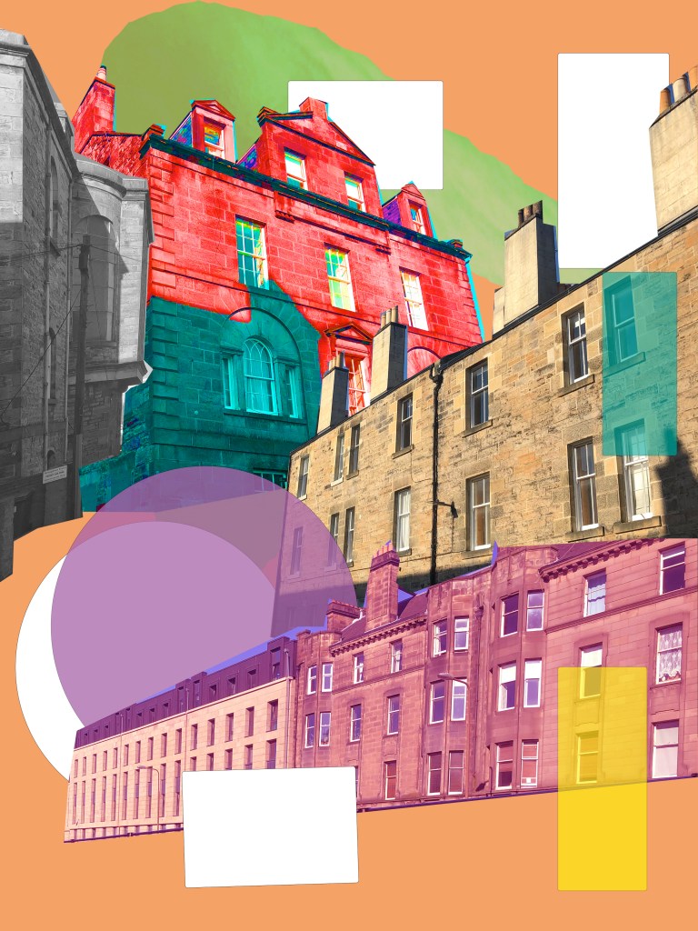
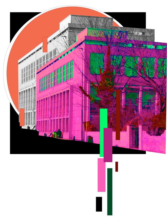
I’ve decided to continue with theme of memory and what I remember when looking at a certain street.

I walked around Edinburgh and I was thinking of things that have had changed, small one on objects that are in the street. I walked pass a certain telephone box, one I use to walk past everyday from school. I noticed that since I last properly saw it, the graffiti had change since last I remember. I decided not to incorporate colours, as I felt the image itself was effective. I wouldn’t say this is my final piece on any level, but I would like to incorporate it.

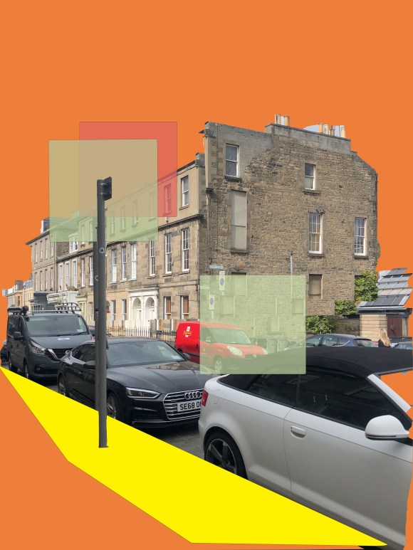
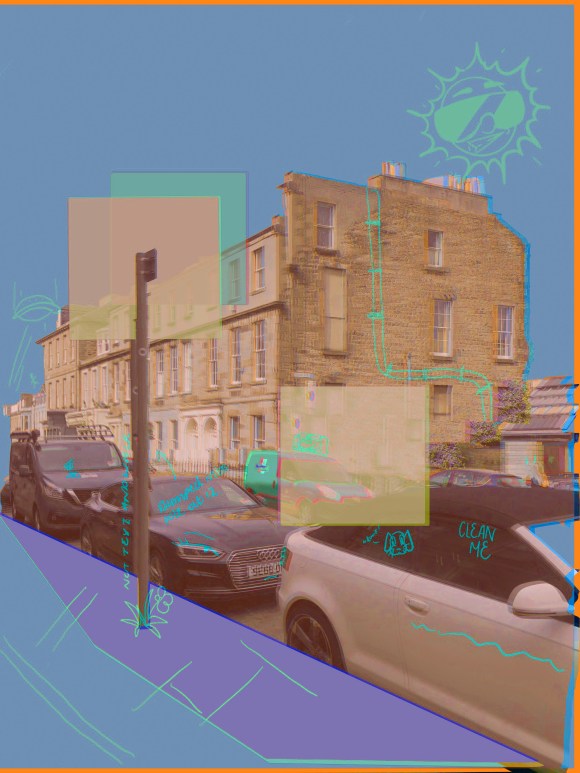
A similar thing happened to again when walking pass a parking lot meter. However I have never notice much about the meter, only that when I walked past I remember how my friend in high school decided to push me into the meter as a joke. I ended up completely smashing into it and falling over. I decided to do the same with meter as I did with the phone box.

I really like theses piece as a couple in a way.

Categories
cap2 studioproject1 StudioProjects2

SELF GEN PROJECT PRT 21

I continued with experimenting with moving image. I wanted to try a more busy composition. Each building reminds me of a small memory I have (Like losing a phone or falling over) that took place around that building.

I did change the colour because I wanted to see the outcome of doing that and would it become messy?

I really like the outcome of this and in the future I want to try video and moving image.

Categories
cap2 studioproject1 StudioProjects2

SELF GEN PROJECT PRT 20

For this piece, I wanted to attempt to animate it and create a moving image. I used Adobe Photoshop to create and really enjoyed the process of making this. I want to incorporate this into my work as I feel it could create a similar feeling to walking in the city. (Unfortunately due to a technical difficulty, it wont upload to YouTube, so here are screenshots.)

When using this again, I would like maybe have a video playing in the moving image. I’m not too sure if this will work, but I want to experiment with multiple moving layers.

Categories
cap2 studioproject1 StudioProjects2

SELF GEN PROJECT PRT 19

I still felt that my project wasn’t really representing anything. I decided to look more into my relationship with the city and how I see it after living here for over just 10 years. I took some picture from Princess street and edited it, similar to my previous work as I still like the look. I then draw onto to illustrate personal memories I remember of the place or an incident that happened there. I really like this new point of view. I’m still facing on the building as I want it to be my memories on what happened around those buildings. I’m also liking the layering and want to push that.

My first piece would be my favourite as I prefer the composition.However, I experimented more on the other piece with different colour schemes and layering the same piece over itself and then lowered the occupancy. For the last piece. I then edited it on pro-create, draw on top and then put back through photoshop where I copied it, changed the colouring and then layered them together changing the occupancy.

I found the outcomes I successful and plan on doing more of these. My next step however will be looking at animation and video work.

Categories
cap2 StudioProjects2

SELF GEN PROJECT PRT 14

I’ve been really enjoying playing around with the colours on adobe photoshop. I did one pieces, where I focus on changing the colours. I really like the final outcome as I enjoy the contrast and with the black background, it allows the foreground colours to really pop. However, I decided to make another piece, similar as I liked the original tones in the actually picture of said building, but this time only is the tone range of the building. One I created the second piece. I found it amazing the complete different atmosphere to get for each one. With the first, more colourful piece, I feel energised and intense, but looking at the second, more beige colours, I felt more calm. I was really happy with the outcome and was proud with feeling I felt when admiring the artworks as I feel you can get that some atmosphere when looking around a city or a building.

Categories
cap2 StudioProjects2

SELF GEN PROJECT PRT12

Started playing around with photoshop, after I went around the city and did a small shoot of buildings. I really enjoyed making these and loved the outcome. These pieces are base experiments and plan on working on doing more detailed pieces. I really like the layering look and strong contrast of detail when it comes to the shapes.

Categories
cap2 studioproject1 wawwa

WAWWA: DEVELOPMENT PRT.14

I was really happy with the previous artworks I had done, and wanted to see if I could create I piece, made from my favourite aspects of each piece.

I started off with adding the glitch slogan to the artwork where I was focusing on worshiping. I did like the look, but I do feel it looks like two different artworks on top of one another and not in a good way! So I decided to take all the aspects I like and them combined them together. I did like the outcome and I do feel I did what I had intended, but I do feel the piece is too busy, too much going on.

I then did a quick photoshop piece, just out of pure curiosity and experimentation. I took a picture I took of myself when in a Zoom call, and then copied it three time in different sections. I really like this piece and feel it was my favourite of the three I did today, but it doesn’t really have anything to do with my project. But it has definitely inspired my next development process.

Categories
cap2 studioproject1 wawwa

WAWWA: DEVELOPMENT PRT.13

I went back to my original artwork of me in my comfort clothes, and decided to see if I could develop this piece further, as I think it looked boring and unfinished.

I decided to zoom into the whole piece, this cause the pixels to really show. I like the pixels showing and I feel it looks more digital, which I feel is appropriate as the majority of anything in general is online. I also decided to add the Queen’s slogan: ‘Sapienta et doctrina stabilitas’, meaning ‘wisdom and knowledge shall be the stability of thy times’. I thought this slogan was quite funny, as the British government hasn’t handled the coronavirus well at all, and hasn’t dealt with it with ‘wisdom and knowledge’, quite far from it. I then added on ‘right?’, in response to how the UK has dealt with the virus. I then made the slogan have a x-ray like look to add to the glitch look.

I much prefer this piece to the original piece. There’s more going on and the composition is better.

Categories
cap2 studioproject1 wawwa

WAWWA: DEVELOPMENT PRT.12

I wanted to develop my previous piece further, especially around the aspect of royalty and worship. I did a photoshoot where I was seated in worship poses. I then went on to place between the two portraits of me that were originally there. I feel adding these poses really enhance the idea od the virus being a higher being or a modern royalty.

I also added more graphs, and layering them ontop of one another as a background, which I prefer when compared to the artwork previously as it adds colours, and more interesting in general.

I also edited the hue and saturation of the ‘cell’. I decided to enhance the colours, so they become more vibrant and neon like, which I feel give the artwork I more sense of science and virus like atmosphere.

I really like this piece, and I feel its a really strong piece. I do like how the project is developing and looking forward to experimenting more

Categories
cap2 studioproject1 wawwa

WAWWA:DEVELOPMENT PRT.11

I continued with the red theme, but I wanted to play about with the theme of royalty, and comparing that to the virus and the restrictions put in place.

I photoshopped a painting of a cell I did in a previous painting and played it on top of the Royal Crest. I wanted portray that the virus is above and is becoming a ‘higher being’. And with the restrictions, we have to do what it says. In a way we’re worshipping it, obeying it in a way.

I added stressed faces of myself, to representing the angry and manic feeling I had during quarantine. I still wanted to represent the graphs in this piece as well, so I added the counting in numbers between march 2020 and December 2020.

When thinking about royalty and covid and its restrictions, I realised they all have something in common. They all have slogans. I then went on to replace the royal slogan: “Dieu et mon droit” with the covid safety slogan: “Hands.Face.Space”. I wanted to show that the virus is becoming powerful in controlling how we live, and is becoming a modern god.

I continued to have the red circle as, with its placement it looks like in over taking. I really like this piece, and I’m looking forward to developing it further.

Design a site like this with WordPress.com
Get started