Categories
Graded Unit

GRADED UNIT – PRT. 6

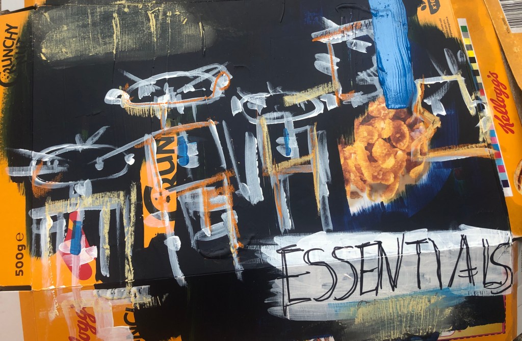
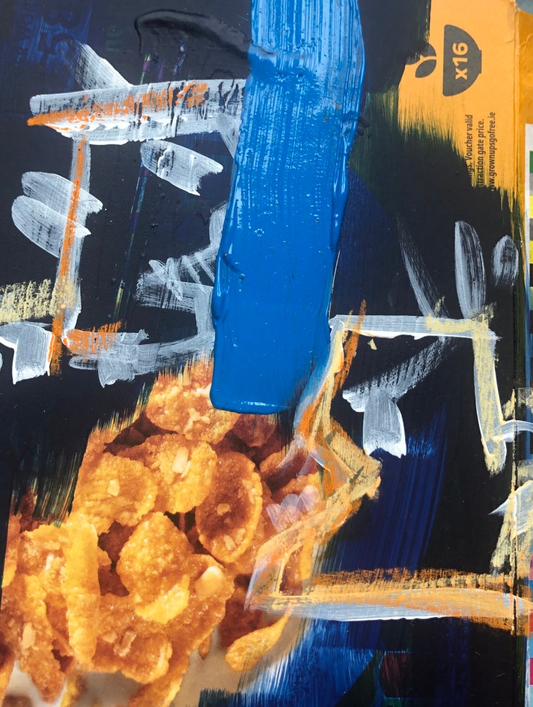
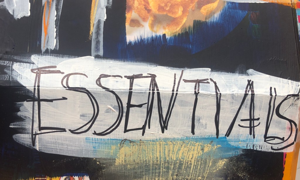
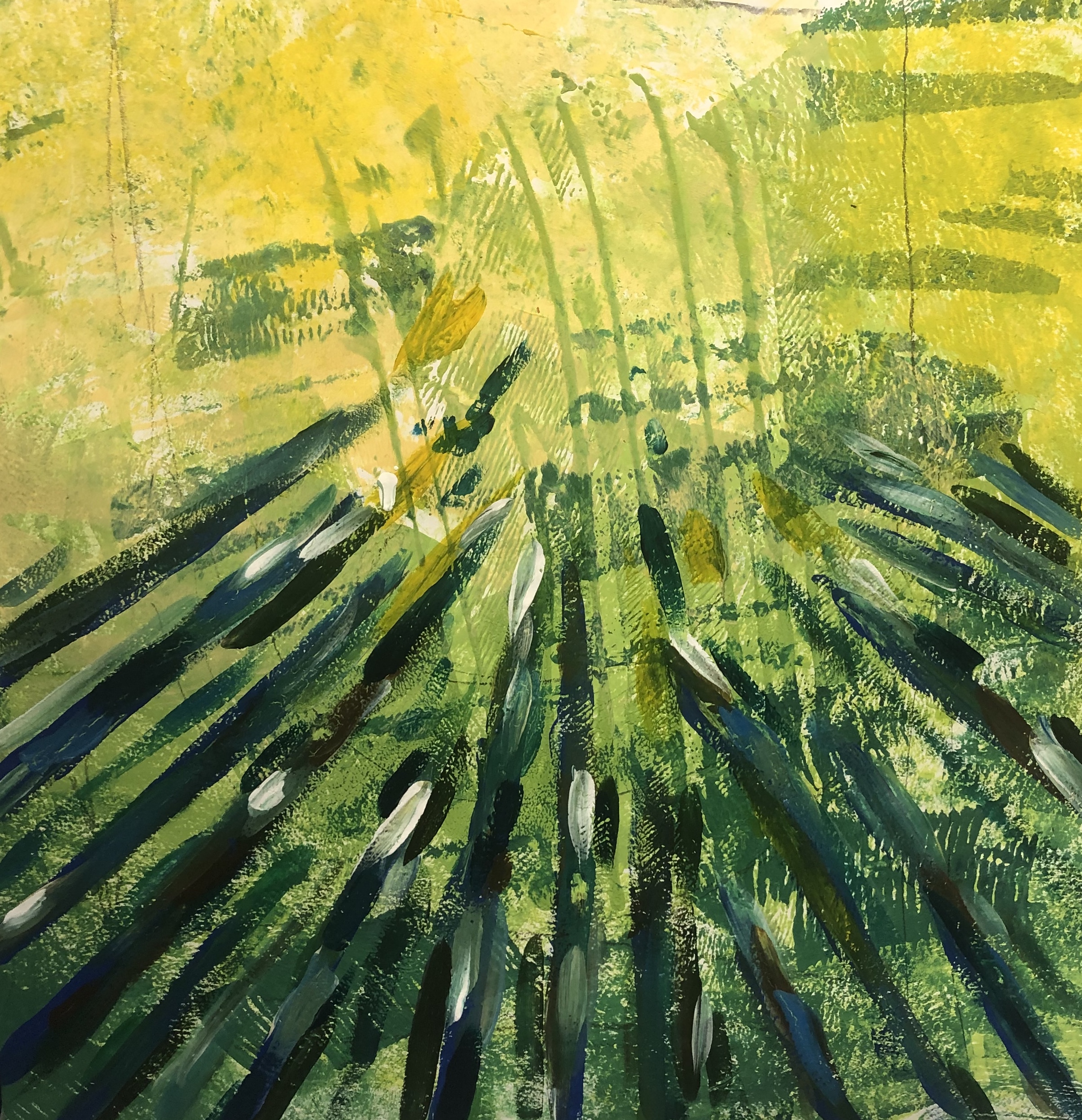
For this piece, I decided to paint it onto a cereal box. I got inspiration for this piece when I went out for a food shop. When waiting in the queue to go into the supermarket, I noticed several signs with “Essential” written. At first, I thought this was silly as its obvious that in this current state, we must only buy what is necessary. However, when I got into the shop and started collecting the food, the first item I went for was the Kellog’s Crunchy Nut Cornflakes. I thought nothing of it, until I went home. This experience for me opened my eyes at what we think is essential in our lives and how blinded we are at what we need to just get by.

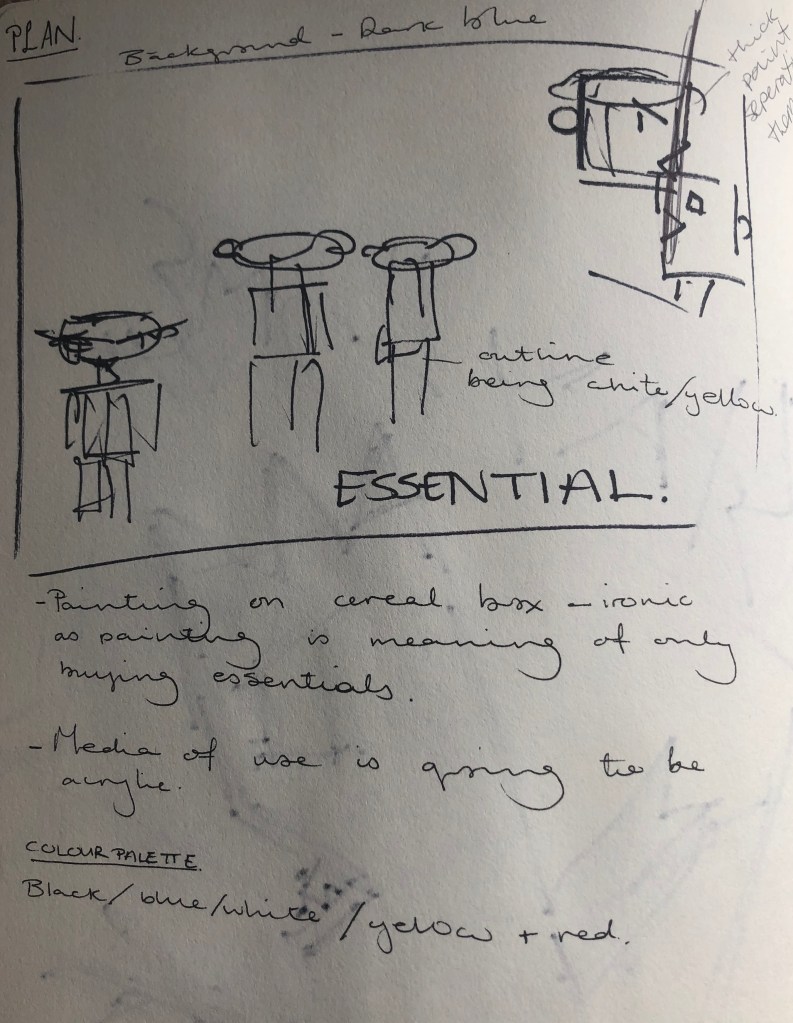
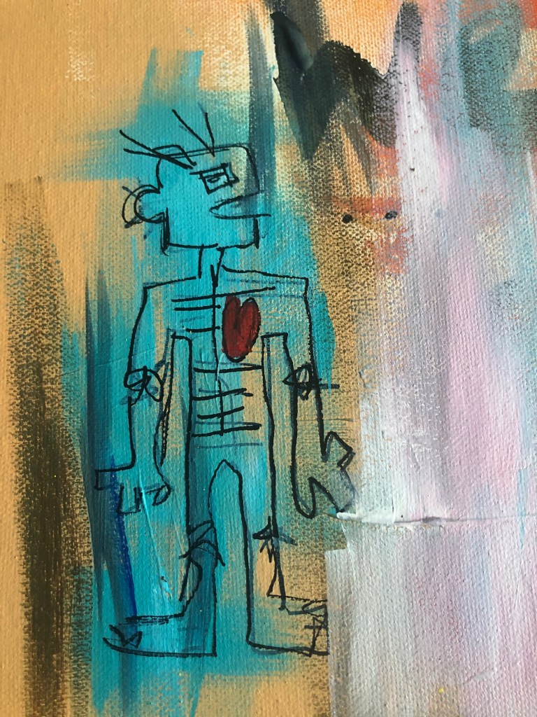
The two people in the top right corner of the piece, is to show the glass barriers in the supermarkets and to represent a scene I witnessed. That scene being, I man coming too close to a member of staff, and when asked to step back got aggressive towards the member of staff. As this scene was unfolding, you could sense the panic and anger in the store, with people getting frustrated and wanting to keep a distance.

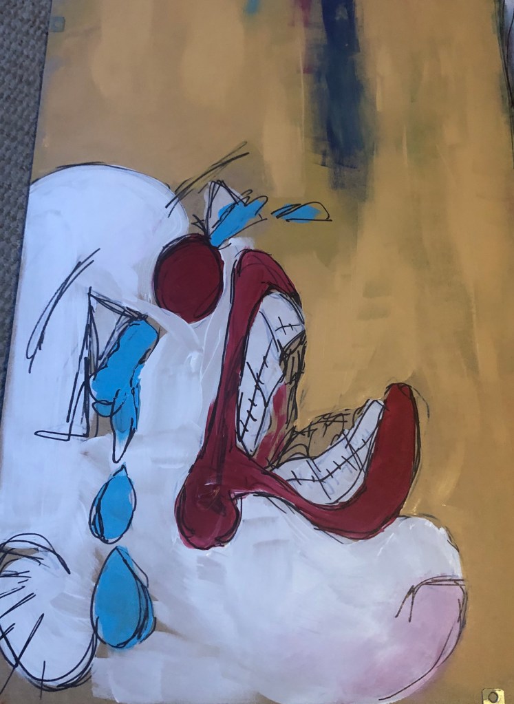
I do like this piece and feel it was successful, however I feel I made the piece too literate at what I wanted to show. Also I feel the colours used are too dark and in the future try more lighter colours, as I feel the background colour drags everything down. With all the artwork I’ve created before this piece, I haven’t planed out, however I decided to plan this one out before hand. With planning this piece, it helped me to think on what I wanted to show and represent, but I feel it wasn’t as personal due to the fact I planned in. Where as with the other pieces I created out of emotion.

Categories
Graded Unit

GRADED UNIT – PRT. 4

This piece, I feel did not turn out as planned and it was unsuccessful. I do like the centre of this painting with the flower and the box surrounding it, however I feel the bottom right of the painting ruins it, due to black I that used.

I originally painted the flower on its own as a decoration piece for my house when the lockdown started. Couple of weeks into the lockdown, I decided to paint a square around the flower to show how I personally, feel trapped in the house. I decided to paint the creature to show frustration, but regretted it immediately. However, I have learned that if I want to add dark colours into a painting, maybe start off with lighter colours that can be coverable and maybe use darker blues, instead of black.

Categories
Graded Unit

GRADED UNIT – PRT. 3

When I finished the book “widow Basquiat”, a particular quote stood out to me: “Walls were paper and trains were book.” I really liked this quotation and quickly wrote in down on the canvas. I then slowly started to add more onto the canvas. The painting isn’t finished yet, as I want to keep on adding to the paintings throughout this lockdown. This isn’t my favourite piece, as I’m not really sure what the piece means, however I don’t see that as a bad thing.

For this project, I originally wanted to only use spray paint, however due to limited resources I will be mainly using acrylic, pastel and some oil paint.

Categories
Graded Unit

GRADED UNIT – PRT. 2

I created my second artwork on the backing of an old picture frame. In this painting, you can see a self portrait of myself in the top right corner and in the bottom left, a clown crying. Just off the centre to the left, you can see a drawing a toilet roll. I decided to give myself a cartoon/animalistic angry mouth due to the fact I felt like a savage animal in a cage, unable to leave. I wanted to try recreate that frustration and desperation.

The clown was added to show the sadness and I wanted the clown to also represent a baby crying as when I’m complaining about being stuck inside, I feel similar to a baby having a tantrum.

Since the lockdown in the UK, toilet roll has been one of the most popular items in panic buying. I wanted to show that as I find it quite chaotic at the thought of people being so desperate that they have to buy as many toilet rolls as possible.

I plan on adding to each painting I create throughout the lockdown. I want my paintings to represent my time in lockdown from the start to the end.

Categories
Graded Unit

GRADED UNIT – PRT. 1

At the start of the week, we were given our new briefing for our graded unit. We must choose from a list of topics on what we want our project based on. The topics are : Home and Displacement, War and Conflict, Natural World, Ritual and Commemoration, and Technology and Systems. I do plan to experiment with each topic, however I have decided that the main topic I’ll be focusing on is Home and Displacement.

Currently, the world is going through a pandemic, with a virus. For safety, everyone has been confined to their homes. When given this project I had been in the house for nine days straight. When the I saw the topic Home and Displacement I immediately started doing visual responses.

I personally I’m not a angry person, but of lately have felt frustration build up. At the time of these drawings I felt very angered and frustrated at the thought of not freely being able to leave my house and go anywhere. This was a new feeling for me because I wasn’t angry at anyone or action, just anger and it was the first that I really drew how I felt, so it helped me in over coming that.

I instantly drew a clown. I feel clowns have always been a fascinating being, due to them being always happy and when you see them sad it is uncomfortable, since you expect I more positive vibe from them. I feel connected to a clown at the time as I didn’t know how to respond to the angry I felt at the time.

Categories
MajorProject1

M.J 1 – PRT 15

I was originally going to try painting on smaller scale compared to the two previous works, but instead I decided to collage it onto a bigger piece. On the top left corner of the collaged smaller piece, I like how the white paper contrasts against the dark colours. I added darker colours to combine the collaged pieces together and added pink to contrast the colours. I decided to splatter white paint to add lightness and I feel it makes the piece stand out more.

Categories
MajorProject1

M.J 1 – PRT 14

I wanted to experiment more the composition and negative space. I decided to position the lighter area at the end and have a slightly more crowded surrounding. At first, I was just going to have sharp lines, but decided to add more curved lines as I feel it added more movement to the piece. As I did with previous piece, I added a mix of light and dark tones to give depth to the piece.

When I saw the work of Julie Mehretu piece… add the name of title. I like the lines used in her piece and I thought it would look interesting added with the lines I created. I feel it added movement and detail into the piece. I also outlined the curves with pen to make them more outstanding, which I feel was a success.

Categories
MajorProject1

M.J 1 – PRT 13

I gathered pictures of trees with sunlight shining through, as I feel it connects to the previous pieces I’ve done due to the lines created. I decided to use similar colours as the source pictures and wanted to recreate the pictures but in a abstract way as I feel it will help me to understand compositions and I wanted to experiment with negative space and understand it more.

I wanted to recreate the source picture as I feel it will help with understanding contrasting colours due to the extreme light tones and dark tones. I originally wanted to just ave the lines in a dark blue, however I feel I made the piece too flat so I added a more range of colours and light tones against the darker tones to add more depth. With the strong constrast on the light and dark colours it makes the the piece less flat.

I was going to have the lines going all around the outer piece, but I wanted to see if the negative piece at the top works better. I do feel it was the right choice to leave the top open, but I plan on doing a piece with a more crowed surrounding and use opposite colours compared to this current piece.

Categories
MajorProject1

M.J 1 – PRT 9 Good Compositions.

  1. GOLDEN RATIO RULE

In the first picture, I used the golden ratio rule to plan out the composition. For the colours, I decided to use darker tones compared to the background or opposite colours that contrast well.

2. GOLDEN RATIO AND SYMMETRY

I experimented with using the golden ratio rule and symmetry. I went with using contrasting colours. However I feel this wasn’t successful since the colours don’t go well together. I feel this would be a better piece if there was more negative space.

3. RABATMENT OF RECTANGLE AND GOLDEN RATIO

I wanted to use these two rules to see if I can balance negative space with a more busier space. I liked the colours that I used and the layout of the piece. I feel the colours go well with the background.

4. RULE OF THIRDS

This is my favourite piece. I feel the colours really make the piece stand out, since there’re contrasting colours. I decided to add more lighter tones of blues to give the piece more depth.

I also looked rabatement of rectangle for the piece and the effects that negative space can have on a piece.

Categories
2DPractice

2D PRACTICE – PRT 8

I feel really happy with the compositions of my work, but I want to look more into the other medias hat I’m incorporating with my work. Today I focus on the cut outs of acrylic paint hat I’ve been using. I did varies brushstrokes of acrylic paint, in different colours, using a palette knife and a paint brush. The more basic colours I plan on spray painting then different colours and maybe trying to add charcoal. I do however need to wait for the paint to dry. I plan on using charcoal on the more circular shapes to see if the charcoal makes the swirls stand out more. I also feel it would be interesting to see what effect ink would have.

Design a site like this with WordPress.com
Get started