Categories
cap2 studioproject1 wawwa

WAWWA: DEVELOPMENT PRT.3

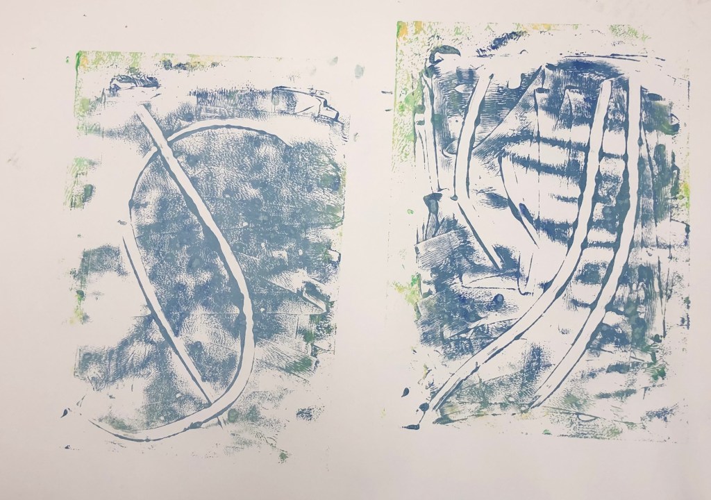
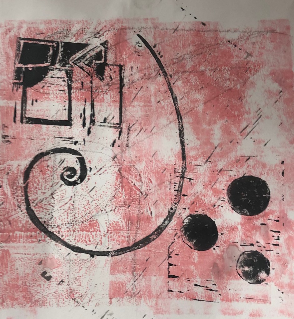
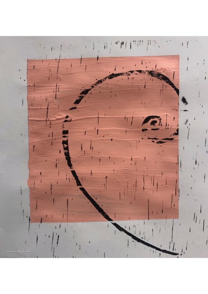
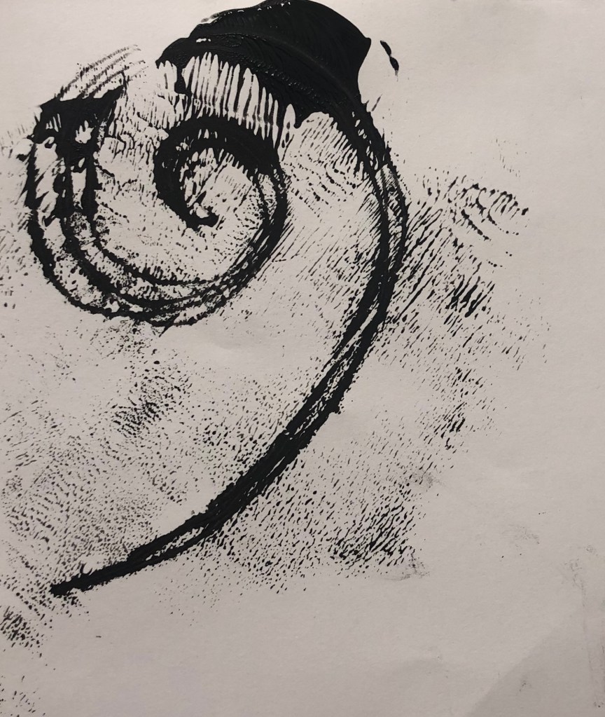
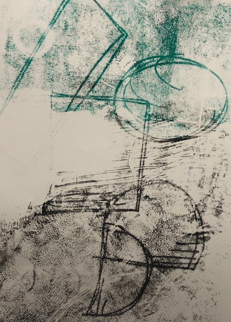
I decided to experiment with Lino print. I started off with creating designs that represent the lung and the air sacs that are located within the lungs. I decided to focus on lungs and breathing as that is where the virus effects the human body first.

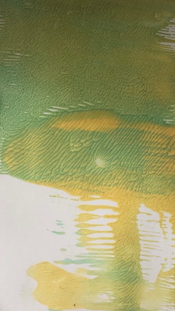
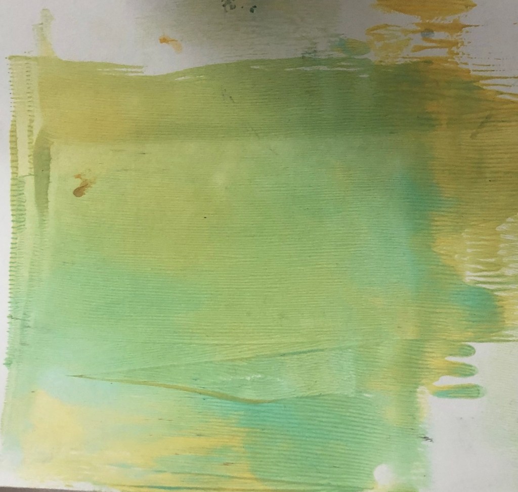
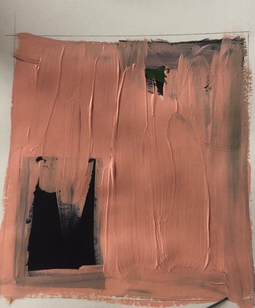
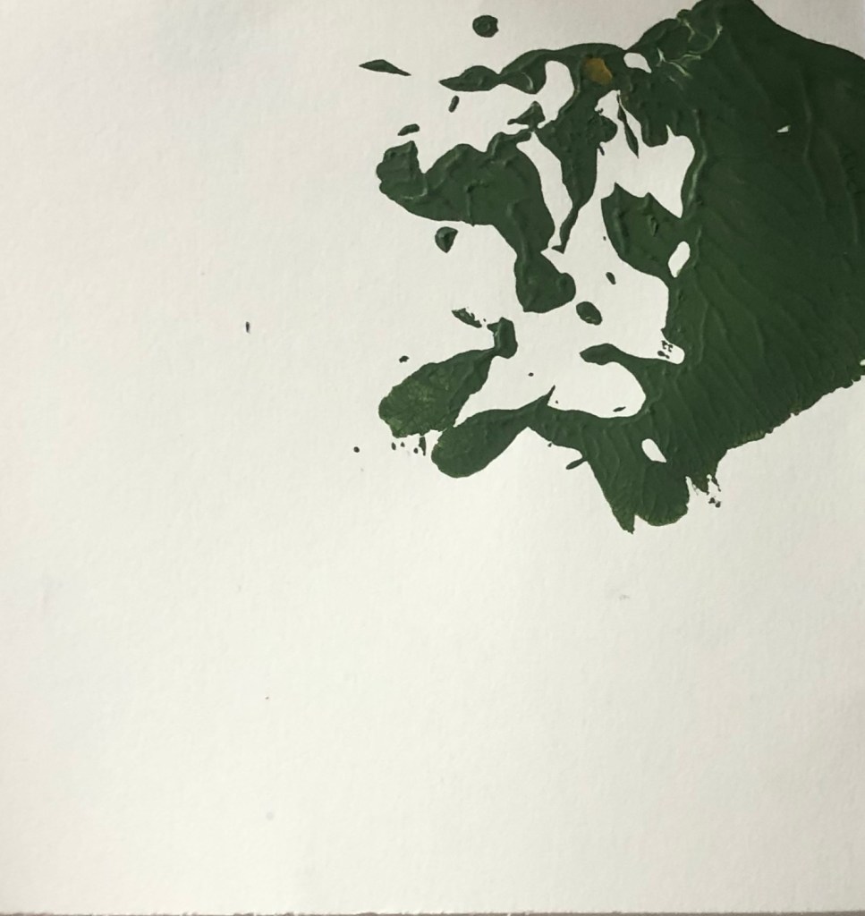
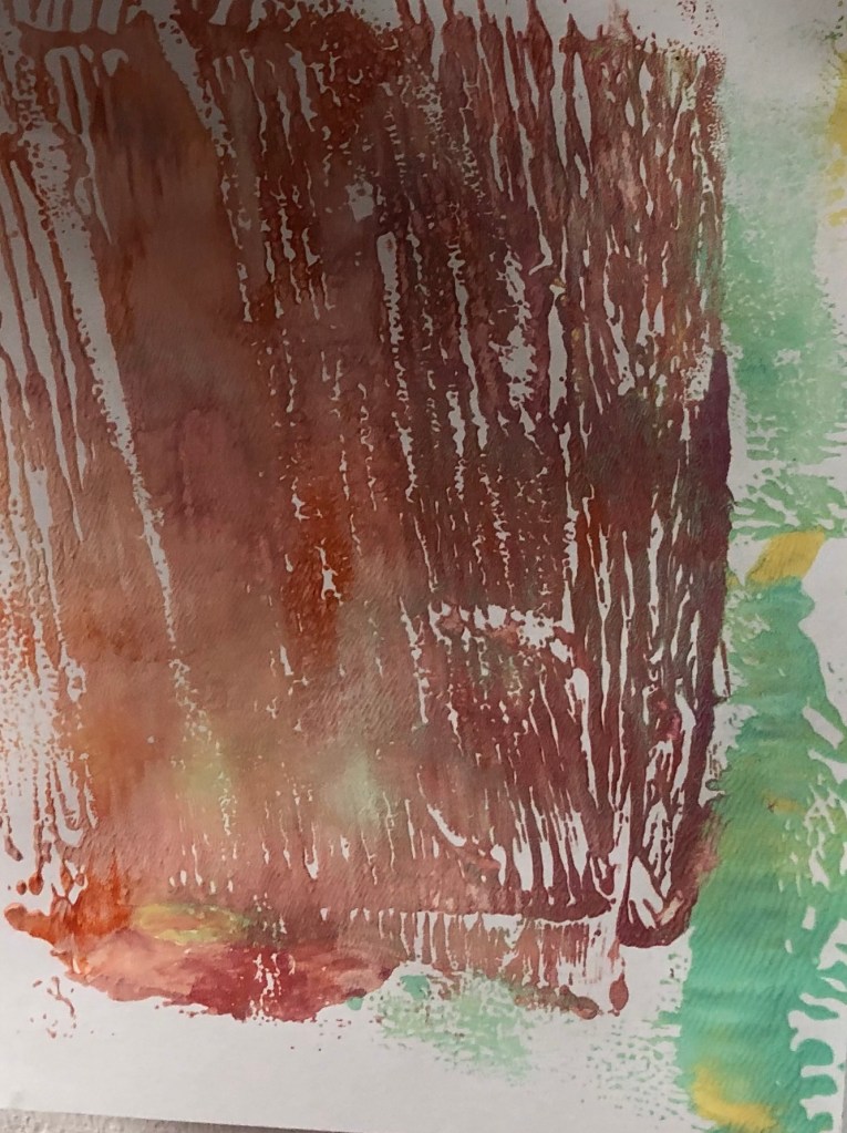
At first I used green ink, as that is the only colour that I have, however I then went on to experimenting with acrylic paint as I can get more variety of colours. I really enjoyed printing and working with vibrant colours.

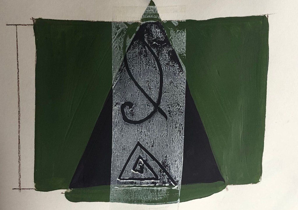
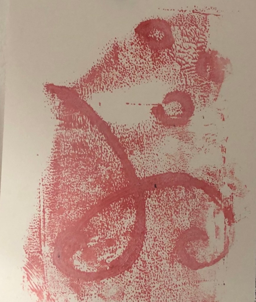
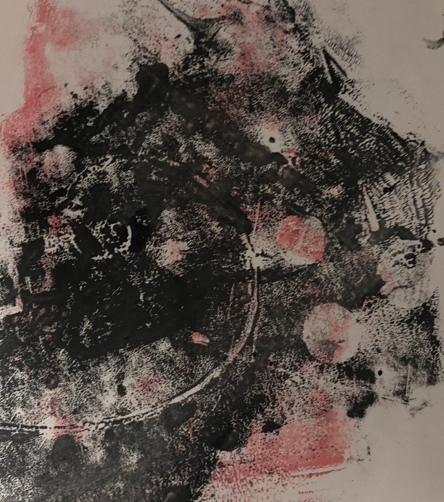
With some of the left over paint, I decided to attempt mono print. I wrote the words ‘covid’ and ‘breathe’. I feel this was successful as I would like to experiment with these prints on photoshop.

Categories
MajorProject1

M.J 1 – PRT 8

I decided to created larger scale of ink pieces to try and get more pieces with line patterns. I feel this could be good bases for when I look into composition layouts. With the left over ink on the palette I used a brush to created shapes and then mono printed it. I really like the outcome and feel it could be interesting if I were to use this technique when painting.

Categories
MajorProject1

M.J 1 – PRT 7

I continued experimenting with the reverse printing, but using more greens and blues. I then created background with geometric shapes using acrylic painting. I feel it wasn’t a success as the colours ar eoo dark and the Lino prints weren’t as bright as I hoped for. However, I do like the lines and patterns created in the ink.

Categories
MajorProject1

M.J 1 – PRT 6

I experimented with Mono print. I rolled out ink as a based and the used the Lino prints to add the composition rules. I then used the access ink on the pallet to do a sort of reverse Mono print. I’m happy with outcome and the colours used, however I do feel that I have strayed from my project theme.

Categories
MajorProject1

M.P 1 – PRT 5

I started to experiment with Linocut. I decided to make prints with the rules of composition. I first tried with the golden ratio rule and as a background of the prints, I decided to have a block square of colour, as I want to introduce geometrical shapes.

I then went on to add different shapes in the background of the prints in different colours, which I feel made the prints more effective. I also made the shapes more geometrical in the style of Frank Stella. I like the outcome, however I feel I want more shapes added and them to be the foreground as well, so I plan to make Lino prints of shapes.

I did some experiments with mono and used a tissue to transfer pattern onto toe prints. I drew composition rules and shapes in the mono prints in different colour of ink. I liked the outcome and feel these pieces could be good as a background for painting.

Design a site like this with WordPress.com
Get started