Categories
MajorProject1

M.P 1 – PRT 5

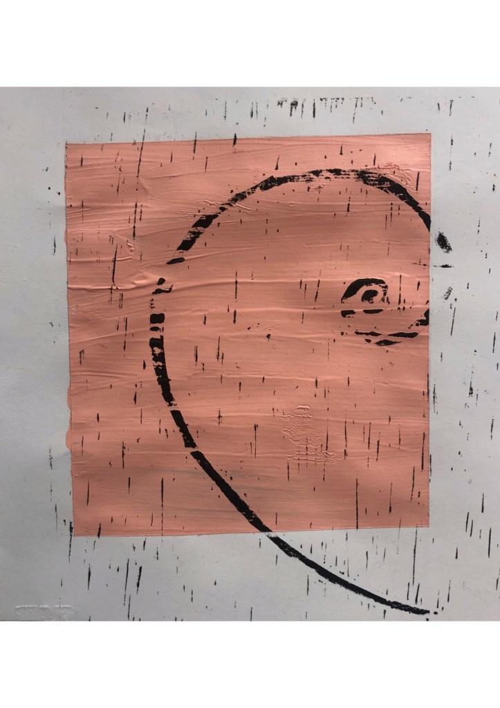
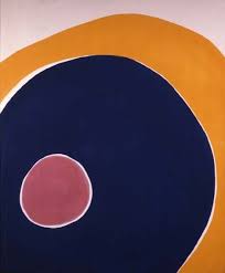
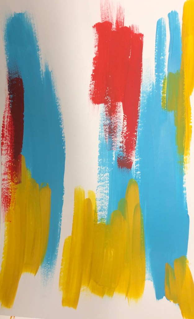
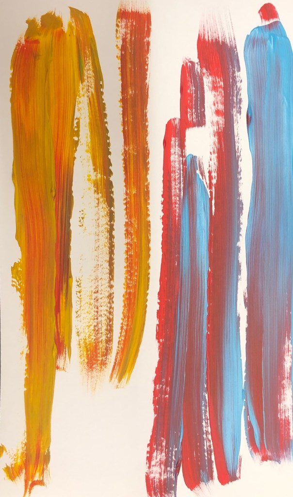
I started to experiment with Linocut. I decided to make prints with the rules of composition. I first tried with the golden ratio rule and as a background of the prints, I decided to have a block square of colour, as I want to introduce geometrical shapes.

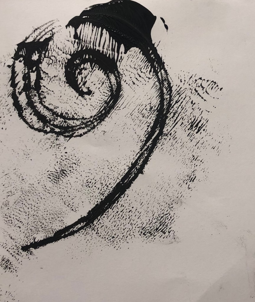
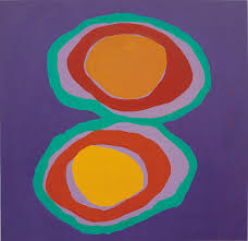
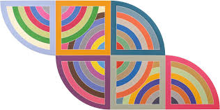
I then went on to add different shapes in the background of the prints in different colours, which I feel made the prints more effective. I also made the shapes more geometrical in the style of Frank Stella. I like the outcome, however I feel I want more shapes added and them to be the foreground as well, so I plan to make Lino prints of shapes.

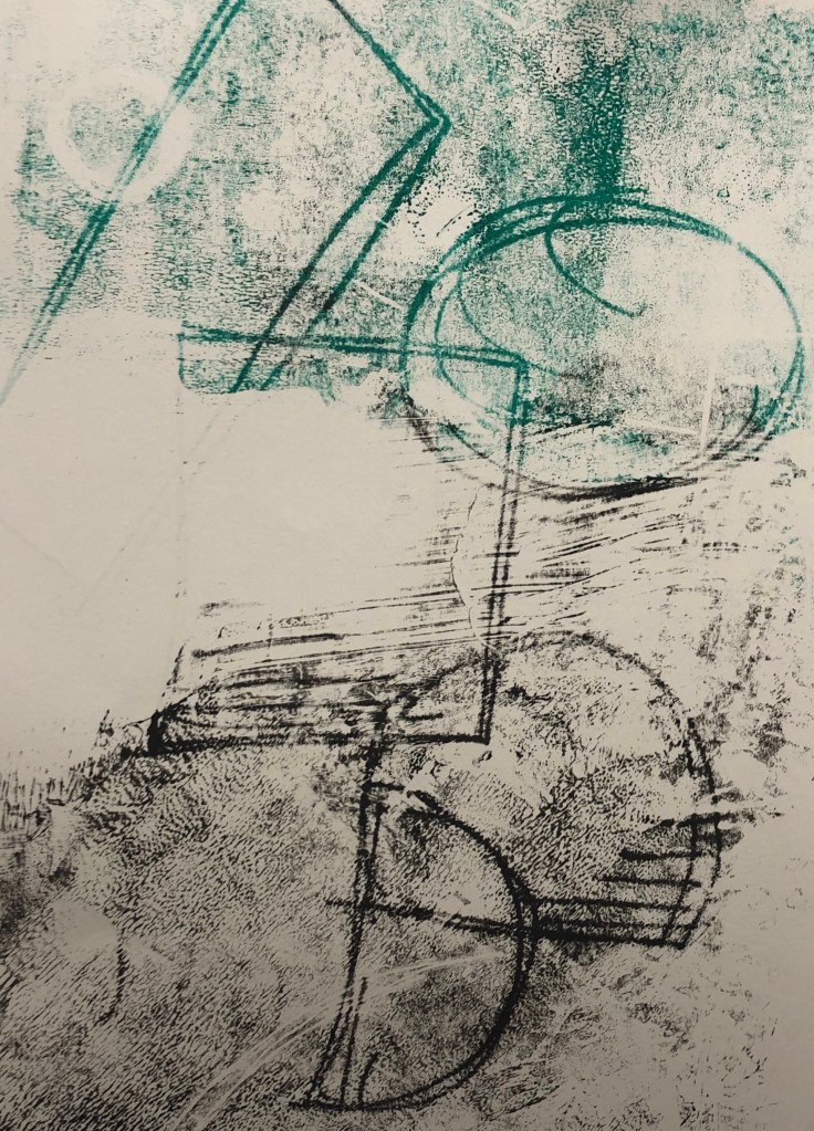
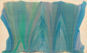
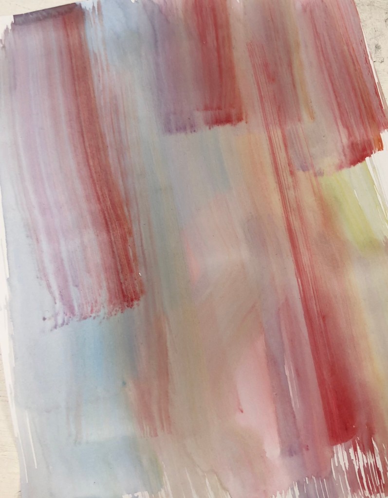
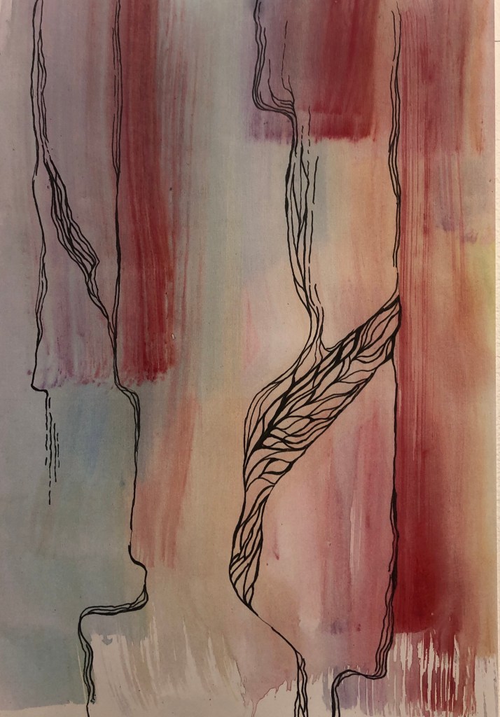
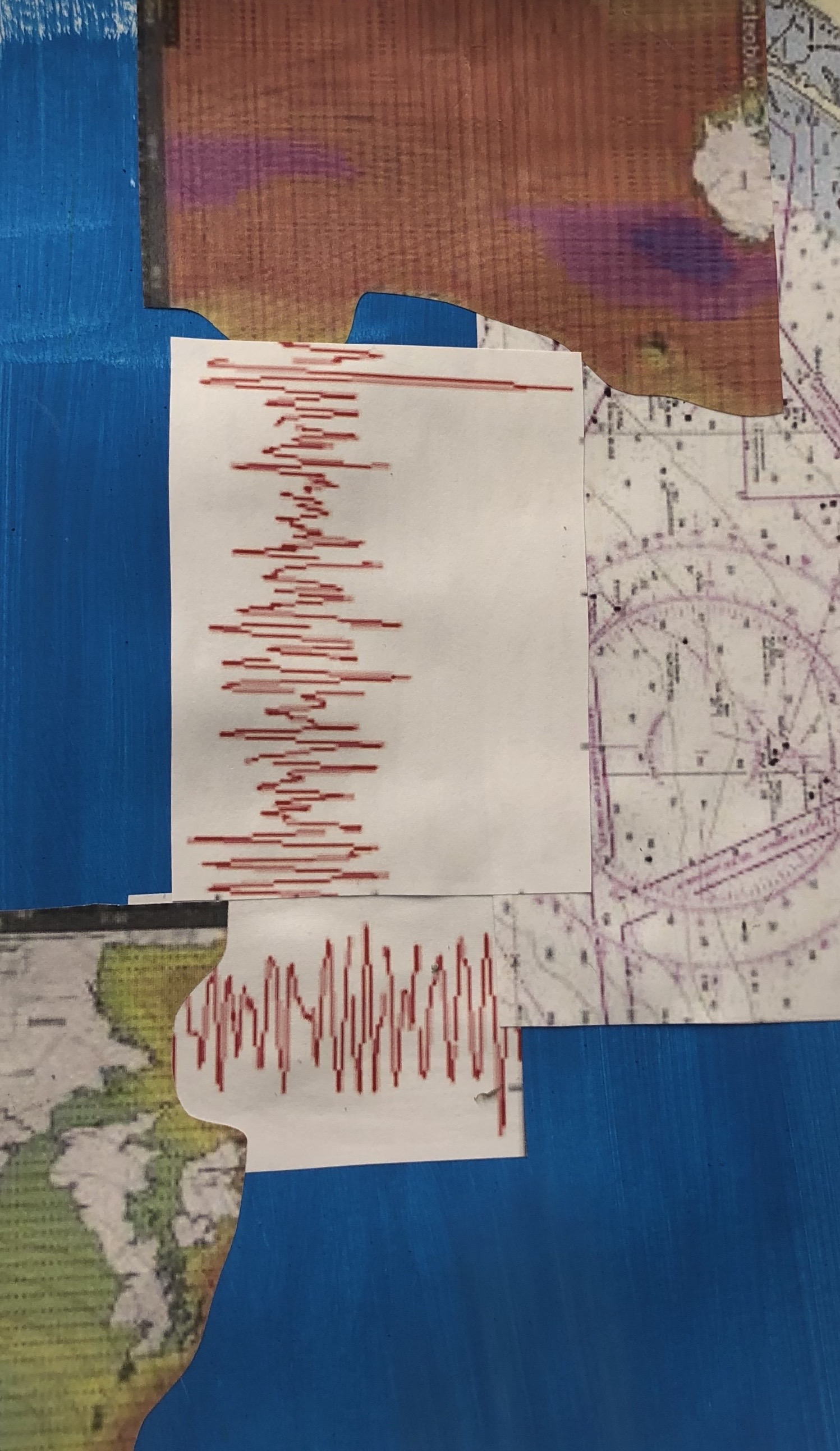
I did some experiments with mono and used a tissue to transfer pattern onto toe prints. I drew composition rules and shapes in the mono prints in different colour of ink. I liked the outcome and feel these pieces could be good as a background for painting.

Categories
MajorProject1

M.J1-ARTISTS, COLOUR/COMPOSITION

I’ve been researching a lot on artists that use colour and compositions as a main in their work. The artist that has mainly influence me is Jules Olitski, and his skill in using colour, also Morris Louis, and his ability to manipulate paint and composition.

JULES OLITSKI – Born in 1922, Olitski was an American painter, printmaker and sculptor. Olitski focuses colour and how the surface can change the process of the colour. I really like the vibrant colours being used and the shapes also.

MORRIS LOUIS – Born in 1912. In the 1950s Louis became one of the earliest exponents of Colour Field. Louis spent a lot of I’m time in Baltimore and Washington D.C. I like how be moves the canvas to manipulate the paint, and the lines that are created in the process.

FRANK STELLA – Born 1936, Stella focuses on geometric lines and vibrant colours. I like the compositions that Stella uses and how he can make it look illusion like. Also the use of lines and how some lines can create a new direction.

Categories
MajorProject1

M.J 1 – PRT 4

Following from the work I did last week, I looked at composition and contrasting colours with background. With the primary colour compositions I did, I then experimented with a darker background. I created the darker colour by mixing red and green. I did like the outcome, however I feel I need the shapes to be more persice. From the brushstrokes, I bypassed them through the printer on to work, and made it negative. I really liked the colours and composition of layering. The prints also have a great texture.

Categories
MajorProject1

M.J 1 – PRT 3

From the feedback and discussion I had with my lecturer and fellow students, I’ve decided to change my theme. I’ll now be looking at colour, line and composition, focusing more at 2D media, like printmaking, Lino Cut and Mono Print. I decided to change themes because I really enjoy working with colour and line and would like to explore it more.

I began to look into colour theory and the physics behind colour. However, what caught my eye was a teacher gave a pallet of colours, stating that the colour combinations were harmonious. By when getting feedback from the class, the students thought the the teachers’ combination were not harmonious. The teacher then told the students to come up with their own harmonious combination.

I decided to go with primary based colours, yellow, red, and blue. From the paintings by Frank Stella, I really liked the compositions, and layers on squares, I decided to experiment with colour and compositions by changing the colours, but keeping the same composition. Even though I liked the composition, I felt the white background made the colour dull in a way, I felt there wasn’t enough contrast.

Categories
MajorProject1

M.J 1 – PRT 2

Since the start of the major project, I’ve been researching dreams and daydreaming. The stages that you dream, and the biology behind daydreaming.However, I haven’t produced any art work, so I decided to make several pieces that I feel represent dreaming. I experimented with watercolour, ink and pens. I really liked the outcome of my art work, and I think it will turn out well, when I combine it with science research to do with dreams. I do feel, however that my piece were looking flat, so I decided to add acrylic paint with a palette knife, which added to the outcome.

Categories
MajorProject1

M.P1 – PRT 1

For our new project we have eight weeks to develop and produce work that goes along with a theme of our choice or we can choose a theme from a list of themes that the lecturers have provided.

To start, I did around four mind maps with ideas and then quickly made a responses to the ideas that I felt I could develop more. As my main focus was to produce work, I took the easiest media to produce said art. I painted a surface with acrylic paint, and collage pictures from the internment and arranged them in a composition I felt was effective. I do like the pieces I made, however I feel that the themes may turn out to be a dead end or that I might go in a similar direction of my 2D project.

The three main ideas I would like to look further into is the idea of Dreams and psychology and if you can manipulate them?, the idea of maps, and the places I have lived in, and tying that in with my childhood, and the last idea I would like the research is the different opinions on religion and the Queen between my generations and the older generation ( people born in 1930). I plan on researching the ideas thoroughly and making responses to them.

Design a site like this with WordPress.com
Get started