C.V, Bio and Statement
Categories
At the beginning of this project we were given several topics to base our theme from, the topics were Home and Displacement, War and Conflict, Natural World, Ritual and Commemoration and Technology and Systems. I decided to go with the topic Home and Displacement. I felt this theme suited me best, since at the time the UK was under lockdown, making it law that everyone must stay home. The developed theme is still relevant as it is focusing on me and my experience in staying inside for a long period of time. The theme also allows me to show the change in society and what effect this has had on me and the community surrounding me.
The artwork that I have created throughout this project is still relevant as each artwork created presents me and my view on the chosen topic.
Since all Educational buildings have been closed, students have to study and work at home. This means limited resources, meaning the materials that I have mainly used in this project is acrylic, pastel and oil colours. In a way, I find this quite fortunate, as I feel only being able to use what is in the house, gives the artwork more of a connection to the topic. For surfaces, I used canvases at the begging of the project, but soon had to find an alternative due to running out. I used the backing of old picture frames and cereal boxes as a base and felt that they helped present the message I wanted to portray.
In passed projects, many of my topics are experimental and technique based, but for this project my method of working is very emotional. I decided not to plan any of my paintings, only painting when I feel strongly about the current situation. I really enjoyed this method, it was completely out of my comfort zone, but I feel I learned a lot in how I personally work.
If given the opportunity to extend my work more, I think I would still focus on my emotions, but maybe start looking at hope. Looking more into what people think of to get them through the lockdown. During this time many holidays and events have been cancelled, or rescheduled. For me, when I felt low about being inside, I thought of holidays I’m going on later in the future, however knowing it’s likely going to be cancelled. I feel looking into false hope would connect well with my theme and it would be interesting to see what artwork I would produce.
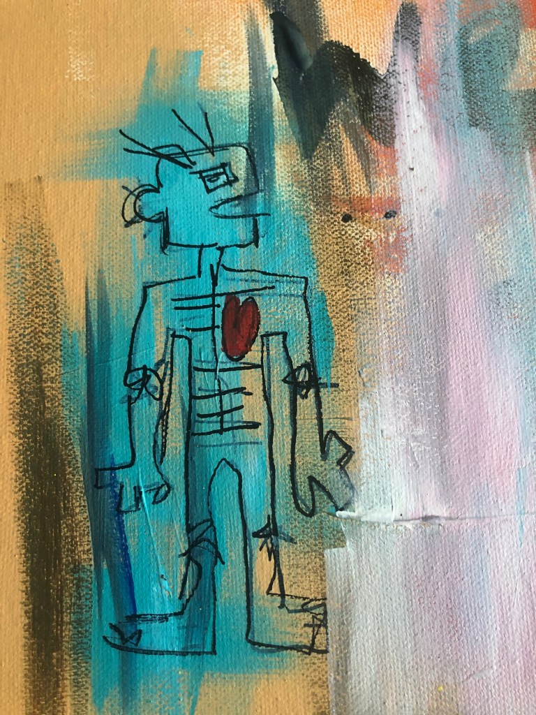
The artists that I have been studying have had a great influence on the work I am currently producing. One of the main inspirations would be Jean-Michel Basquiat and Futura 2000. In many of Basquiat’s paintings he copies quotes and paints passed events or conversations, I felt this was great inspiration and a perfect time to experiment with. The artists I have chosen to take influence on are graffiti artists, as I have always had an interest in graffiti and the reputation it has, also the history that surrounds itself. The style I decided to paint in is very different to my usual style, much looser and carefree. I especially took inspiration on my style from Basquiat as he tells a story of some sort, and I wanted to try and do the same.
When it came to time management, I tried to give an equal amount of time to all aspects of the project. I made sure that I kept my blog up to date and balancing time with written work and practical. If I could improve my time management, I wish I spent lesser time on paintings, and painted quicker and going back to the painting several times over the project, then focusing on finishing a painting in one or two days.
I really enjoyed this project, and I feel the outcome was a great success, however if I could improve on one thing it would be to use my sketchbook more for developing ideas, however I will take this into consideration for future projects.
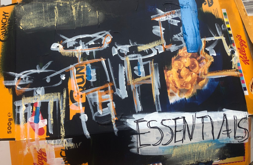
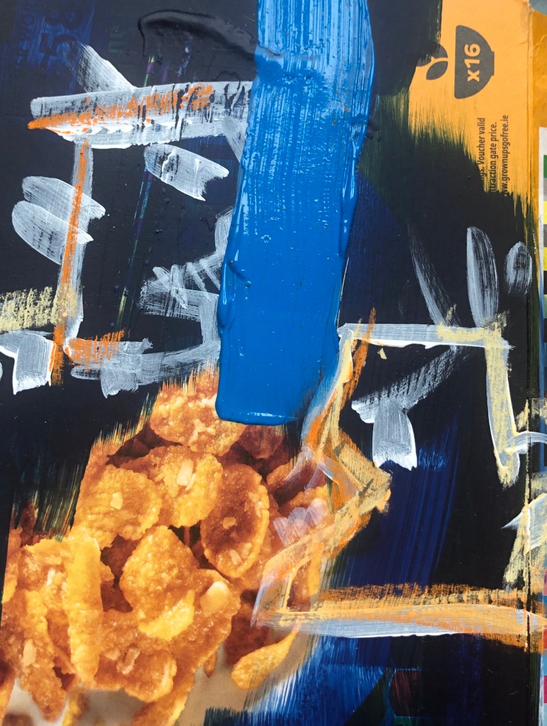
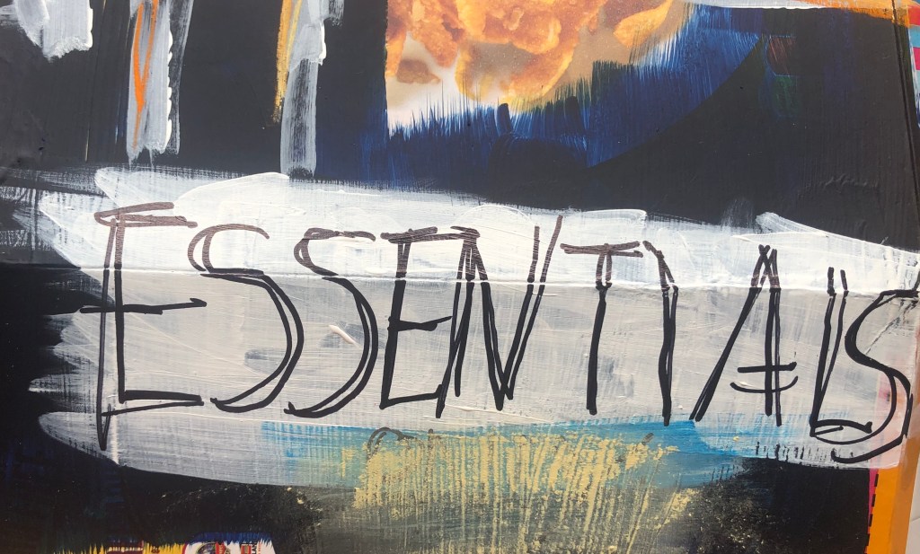
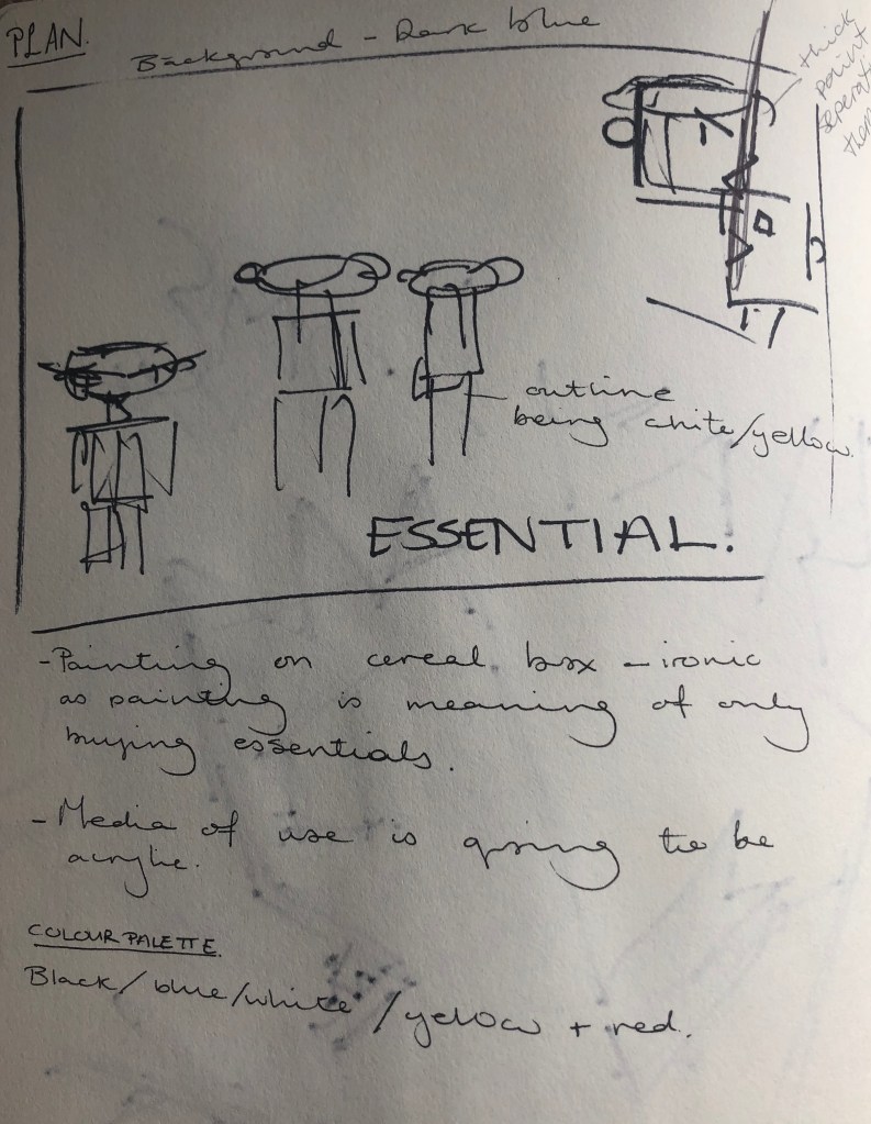
For this piece, I decided to paint it onto a cereal box. I got inspiration for this piece when I went out for a food shop. When waiting in the queue to go into the supermarket, I noticed several signs with “Essential” written. At first, I thought this was silly as its obvious that in this current state, we must only buy what is necessary. However, when I got into the shop and started collecting the food, the first item I went for was the Kellog’s Crunchy Nut Cornflakes. I thought nothing of it, until I went home. This experience for me opened my eyes at what we think is essential in our lives and how blinded we are at what we need to just get by.
The two people in the top right corner of the piece, is to show the glass barriers in the supermarkets and to represent a scene I witnessed. That scene being, I man coming too close to a member of staff, and when asked to step back got aggressive towards the member of staff. As this scene was unfolding, you could sense the panic and anger in the store, with people getting frustrated and wanting to keep a distance.
I do like this piece and feel it was successful, however I feel I made the piece too literate at what I wanted to show. Also I feel the colours used are too dark and in the future try more lighter colours, as I feel the background colour drags everything down. With all the artwork I’ve created before this piece, I haven’t planed out, however I decided to plan this one out before hand. With planning this piece, it helped me to think on what I wanted to show and represent, but I feel it wasn’t as personal due to the fact I planned in. Where as with the other pieces I created out of emotion.
Angel Ortiz, born 1967, is an American Pop and graffiti artist, based in New York City. Ortiz began using LA II as a tag at the age of thirteen when doing graffiti in the Lower East Side in New York. Mostly known for his unique group of influences ranging from Chinese calligraphy to pictograph-like cave paintings. Ortiz’s work is mostly known for the use of bright colours and energetic doodle-like style. Keith Haring and Angel Ortiz met when they were around 13, due to Haring liking his graffiti style. Since then, LA2 and Keith Haring had many collaborations together and helped one another in showing their techniques.
In LA2’s work I really like the use of black outlining and vibrant colours, always making his art eye-catching. I feel there’s a simplicity with LA2’s work, maybe with having not a lot of detail, it causes the pieces to look simple, but not a bad way.
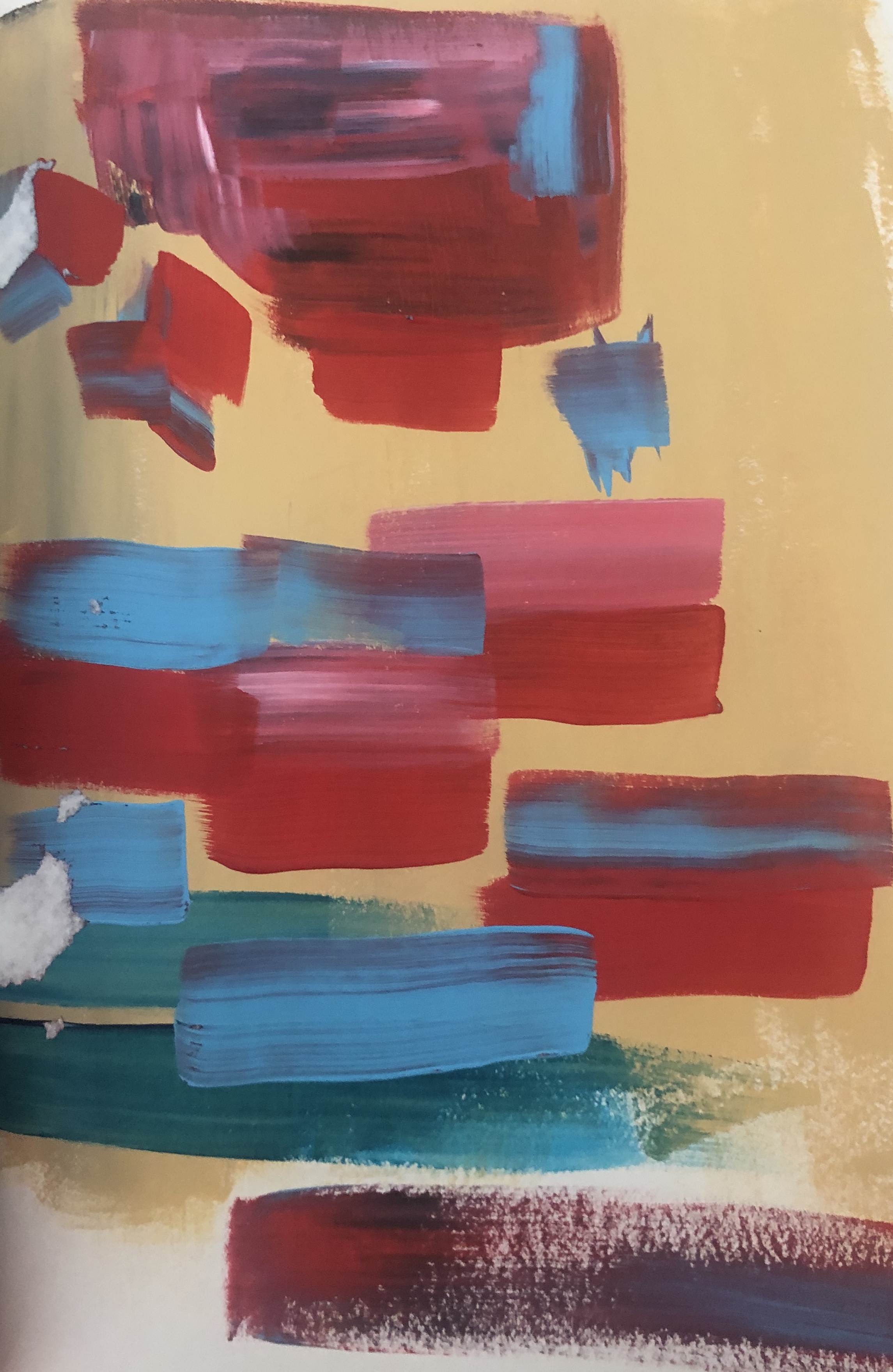
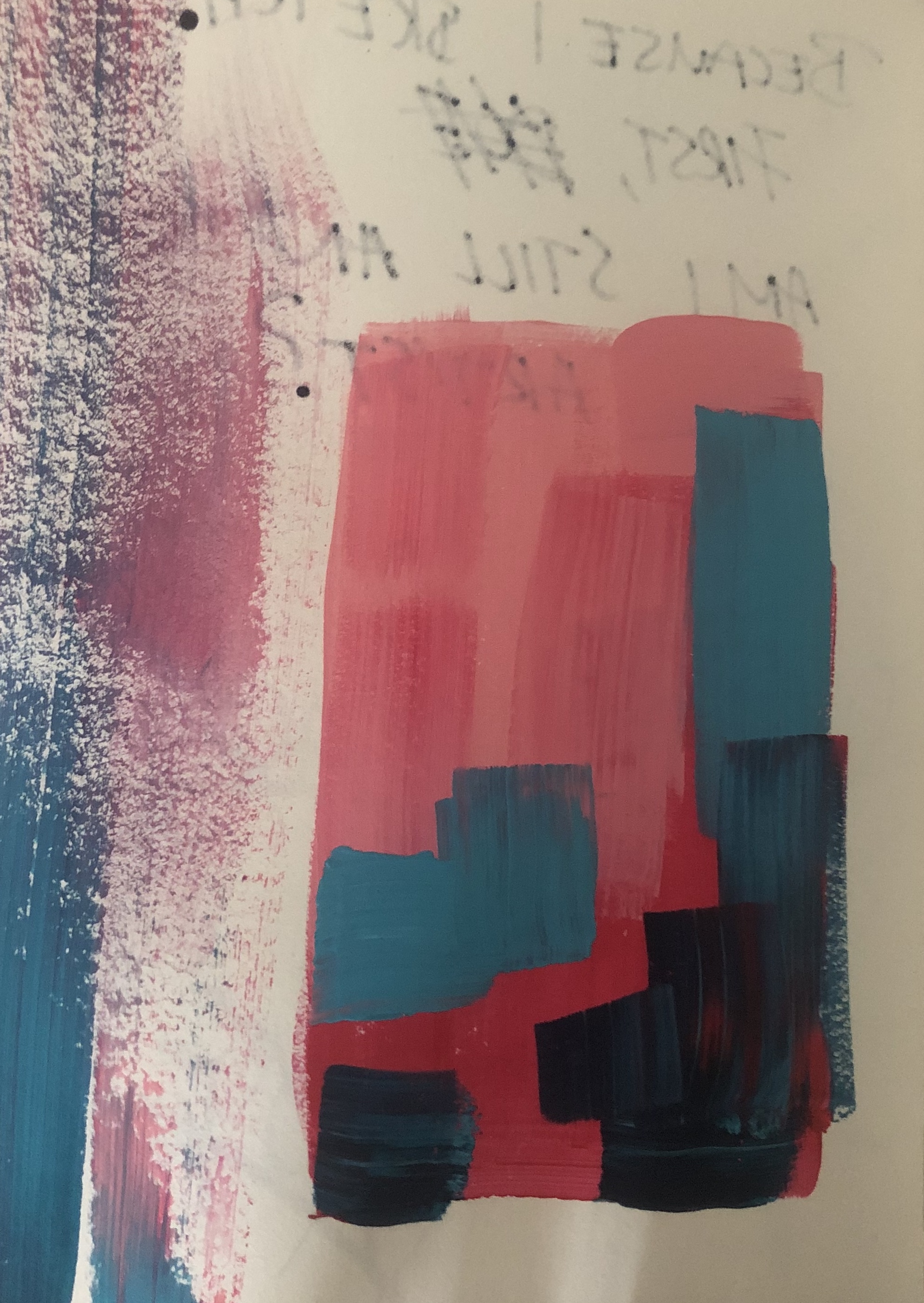
During this project the variety of colours available is very limited, however I decided to experiment a little with colours. I quickly painted pages in my sketchbook with acrylic paint, with very squared brushstrokes.
I do like these bases, as they are also useful for inspiration for a painting. Whether that be for colour or even compositional reasons. For this project, alot of my paintings are layered, these sketches helped me to see what colours look well with layering.
Anthony Clarke, known as A-One was an American graffiti artist, born in 1964 and based in New York. A-One began tagging subway cars during the 1970s. He took a lot of his inspiration from Black culture and his friend Jean-Michel Basquiat. A-One became well known and popular in the street art and contemporary art scenes. He developed an aesthetic that was looser than his fellow Manhattan artists, such as DAZE. Anthony Clarke then joined a group of artists known as the “Tag Master Killers,” which included Ramellzee, Toxic and Delta 2.
In 1982, he participated in a landmark graffiti exhibition in the South Bronx and was included the 1984 Venice Biennale, of which he was the youngest participant. Later on, in his life, he moved to Paris, where he continued to work until his death from an unexpected brain hemorrhage on November 11, 2001 at the age of 37.
In his work, I really like the colours used and the layering of some of his work. I find the way he works with line and colour really fascinating and how both aspects help one another to stand out.
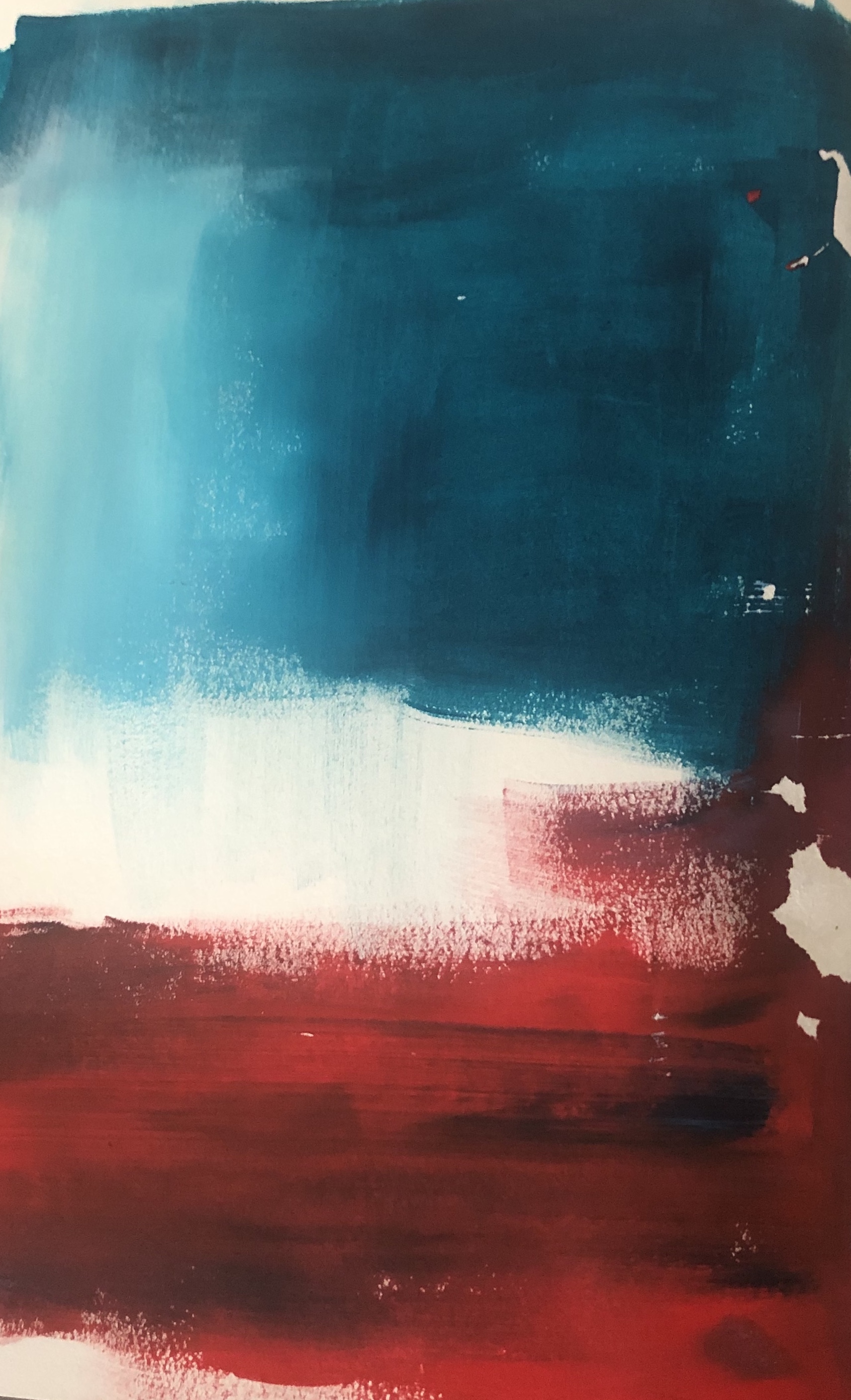
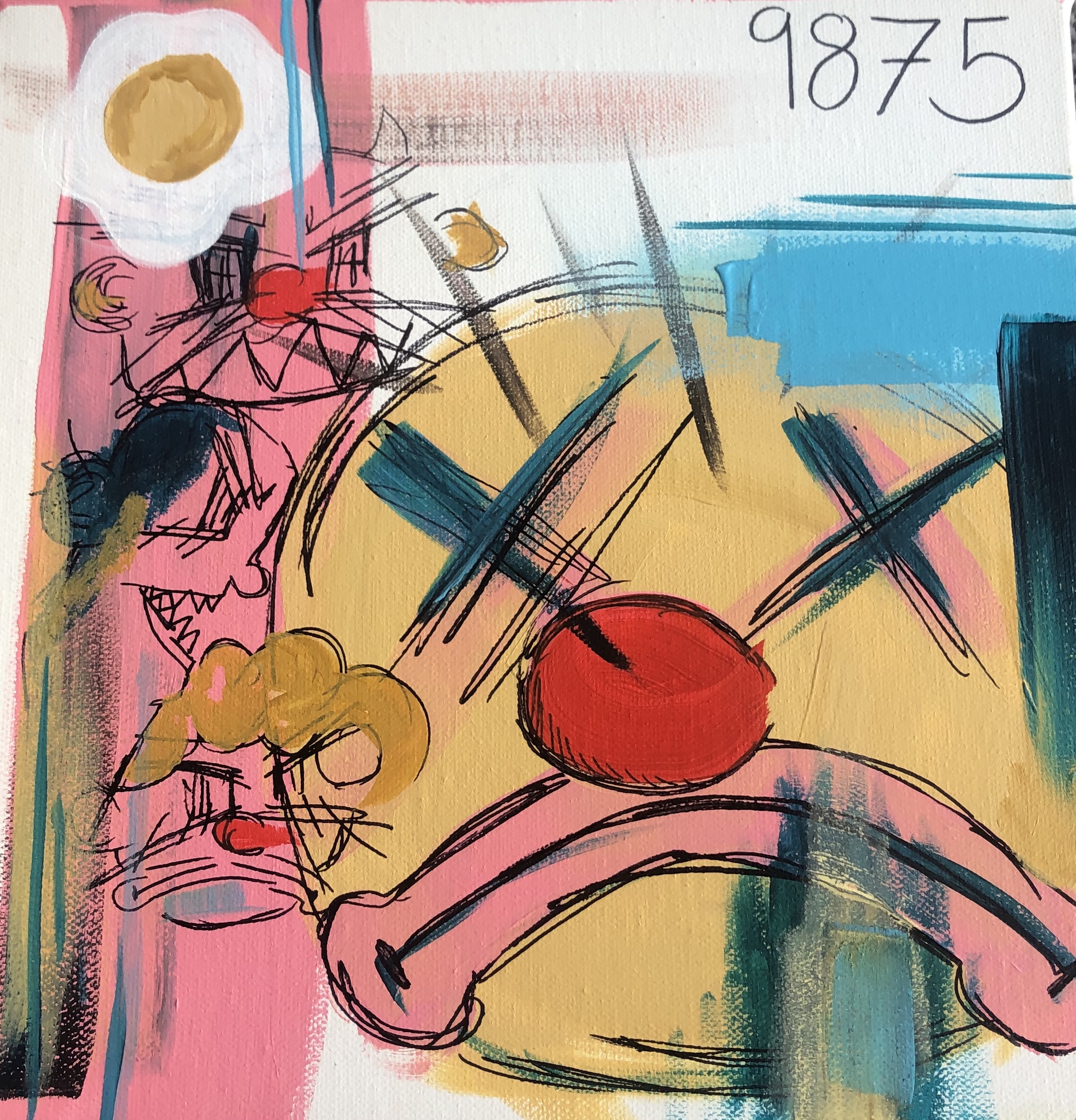
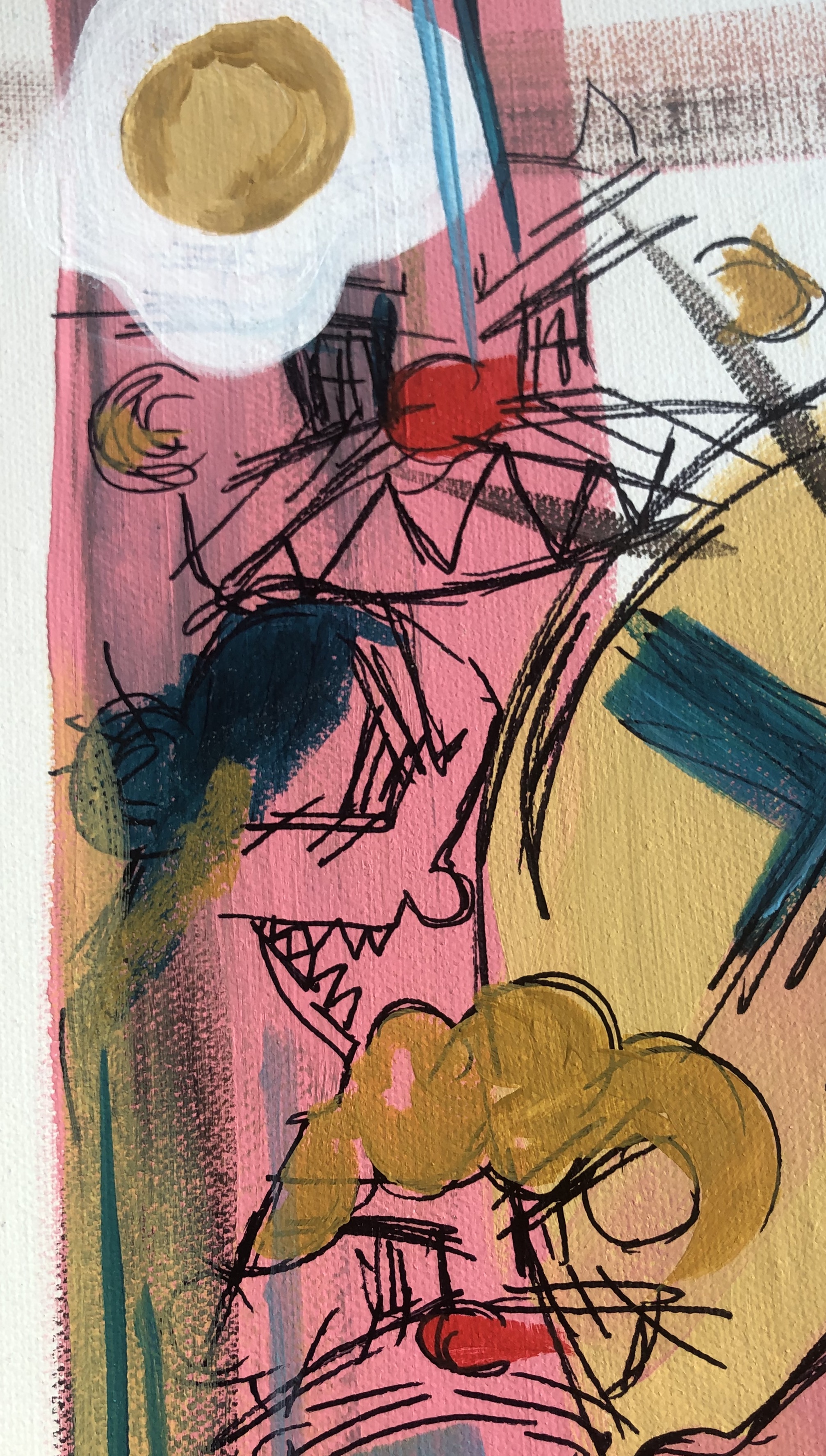
This would have to be one of my favourite pieces to far. I did this piece on the day that the deaths in the UK raised a considerably amount over night.
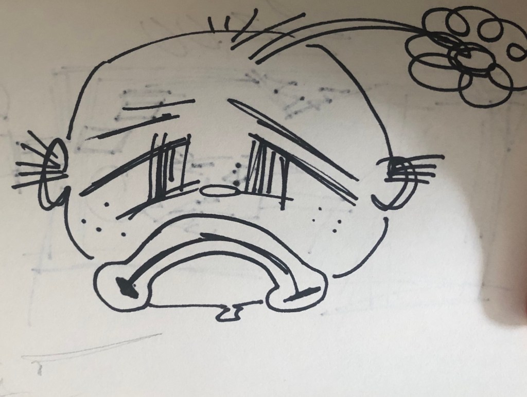
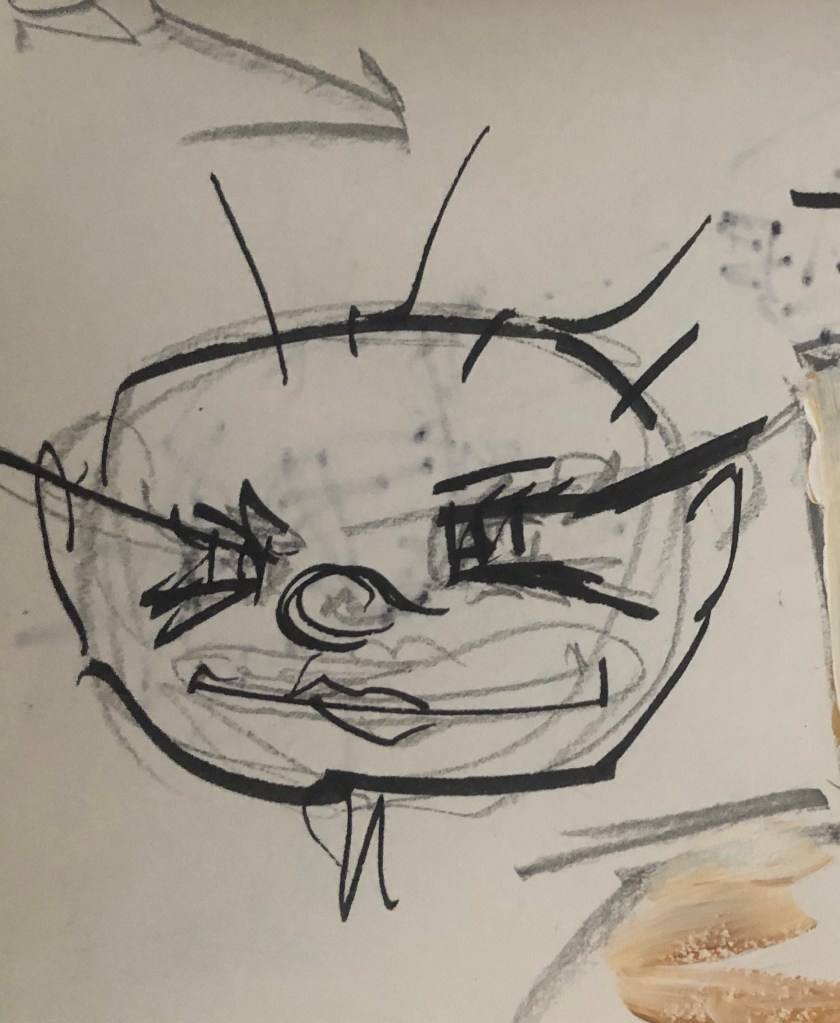
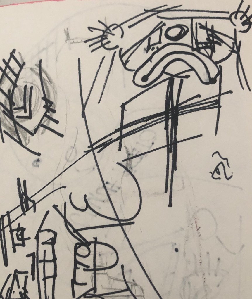
I have a holiday planned in June that I have been using to help me get through the current lockdown. On that day I had three conversations with people telling me that my holiday will probably get cancelled and flights won’t start till September. When receiving this news, I felt so angry and frustrated at the thought of forever staying in the house and not having something to think about, like a light at the end of the tunnel. I decided to paint a large face at the front and along the side, with resemblance to a clown and along the left of the painting having several small character faces. The smaller faces are to represent being overwhelmed and frustration. I feel having the different faces over-lapping one another helps to portray that.
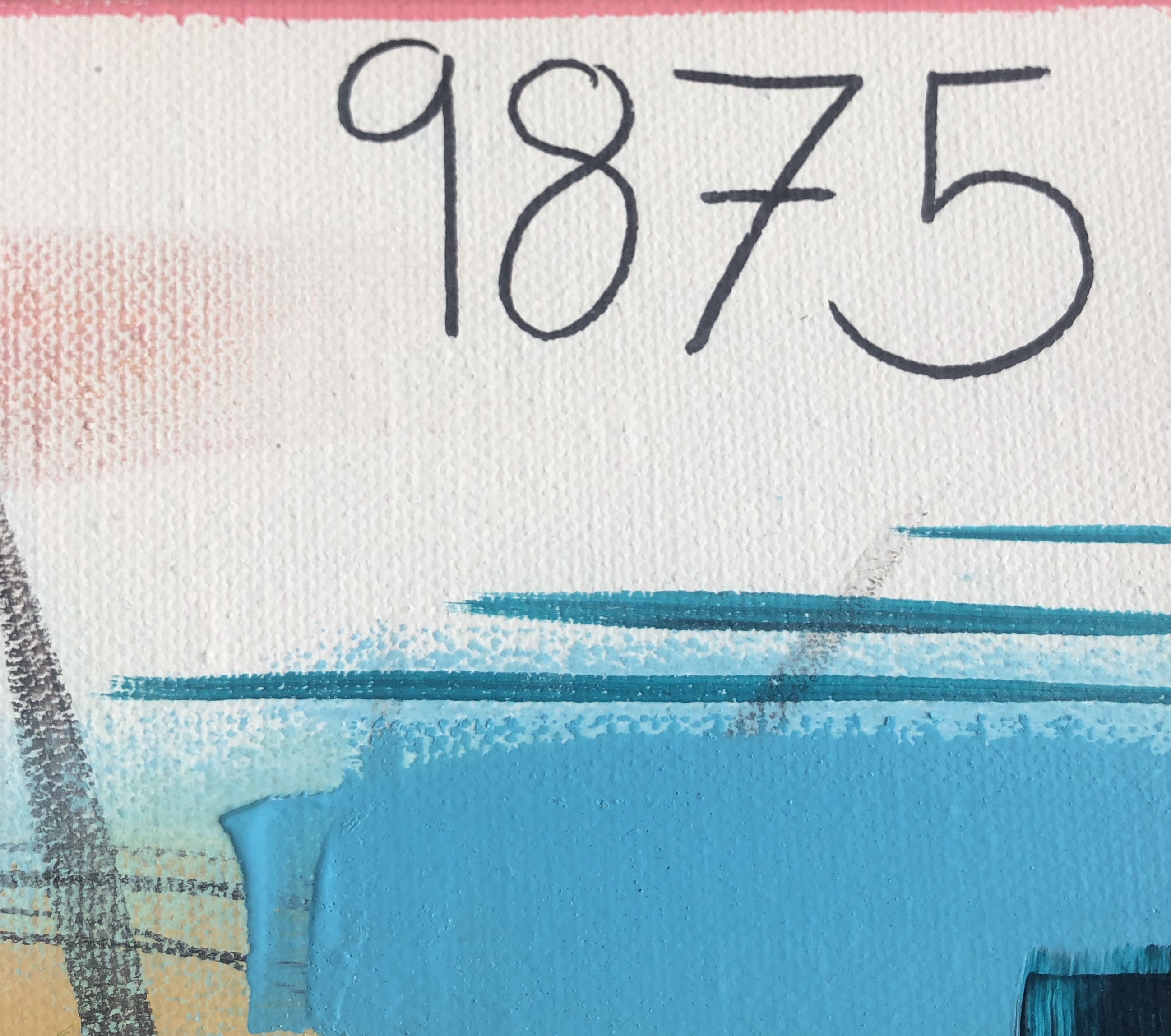
The number in the corner is of the numbers of deaths in the uk of that time and I feel it represents a date. As the lockdown goes on, I loose track of the days, but when I go on social media, all I see is number of deaths. I found it interesting how frustrated I got when being told my holiday would be cancelled, showing how much I depend on that idea to help me through.
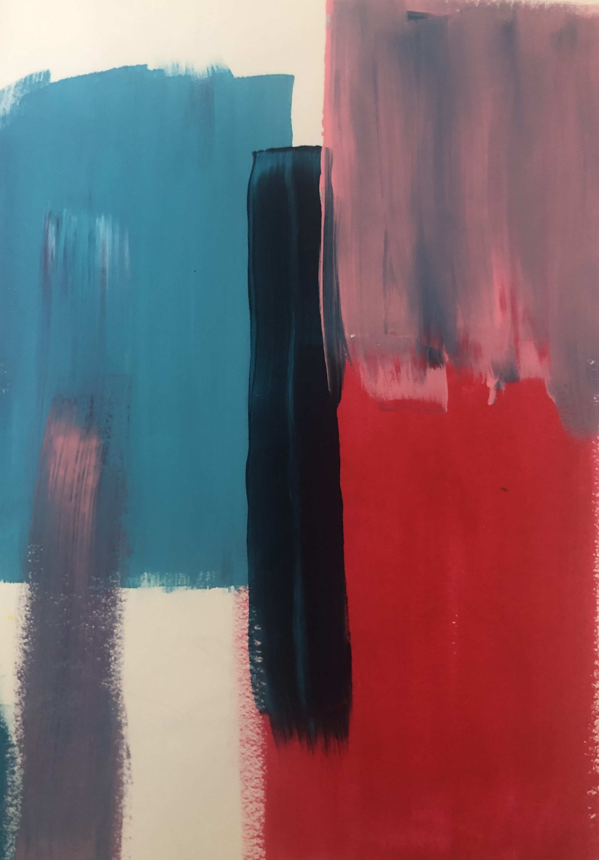
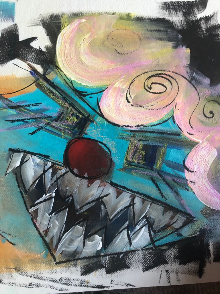
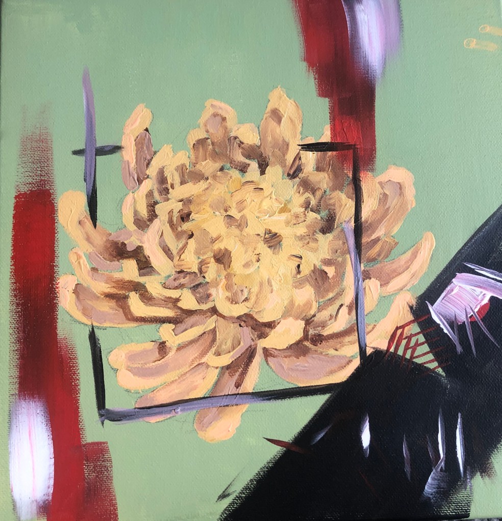
This piece, I feel did not turn out as planned and it was unsuccessful. I do like the centre of this painting with the flower and the box surrounding it, however I feel the bottom right of the painting ruins it, due to black I that used.
I originally painted the flower on its own as a decoration piece for my house when the lockdown started. Couple of weeks into the lockdown, I decided to paint a square around the flower to show how I personally, feel trapped in the house. I decided to paint the creature to show frustration, but regretted it immediately. However, I have learned that if I want to add dark colours into a painting, maybe start off with lighter colours that can be coverable and maybe use darker blues, instead of black.
When I finished the book “widow Basquiat”, a particular quote stood out to me: “Walls were paper and trains were book.” I really liked this quotation and quickly wrote in down on the canvas. I then slowly started to add more onto the canvas. The painting isn’t finished yet, as I want to keep on adding to the paintings throughout this lockdown. This isn’t my favourite piece, as I’m not really sure what the piece means, however I don’t see that as a bad thing.
For this project, I originally wanted to only use spray paint, however due to limited resources I will be mainly using acrylic, pastel and some oil paint.