Categories
cap2 StudioProjects2

SELF GEN PROJECT PRT 14

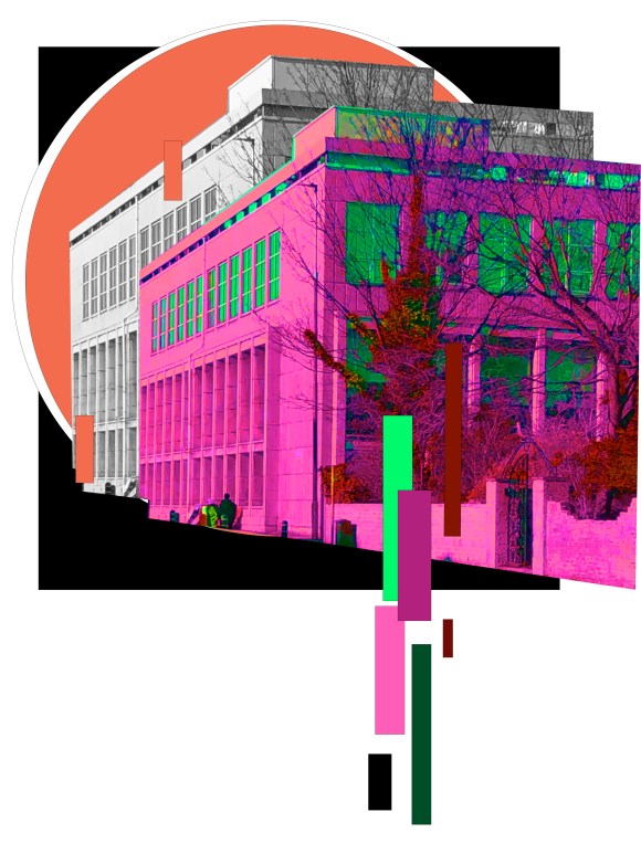
I’ve been really enjoying playing around with the colours on adobe photoshop. I did one pieces, where I focus on changing the colours. I really like the final outcome as I enjoy the contrast and with the black background, it allows the foreground colours to really pop. However, I decided to make another piece, similar as I liked the original tones in the actually picture of said building, but this time only is the tone range of the building. One I created the second piece. I found it amazing the complete different atmosphere to get for each one. With the first, more colourful piece, I feel energised and intense, but looking at the second, more beige colours, I felt more calm. I was really happy with the outcome and was proud with feeling I felt when admiring the artworks as I feel you can get that some atmosphere when looking around a city or a building.

Categories
cap2 StudioProjects2

SELF GEN PROJECT PRT 7

I walked around the around of Leith Walk and photographed any buildings that took my ineterest. I really notices the amount of buildings in the city and would like to look more into incorporating layers in my project. I then collaged certain buildings and layered and paint around them. I took inspiration from Serj Fedulov and his work. I do feel this piece is quite busy, but I do plan in continuing with this as I feel it could develop into something further. I am just painting on paper, but I would like to try canvas as I feel it could look better.

I wanted to experimenting creating that layering of brick look. I do like the effect and the look, however I feel the placement and compassion is all wrong.

Categories
cap2 studioproject1 wawwa

WAWWA:DEVELOPMENT PRT.9

From the feedback given to me at Group Crits, I decided to look more into information graphs the† have been used to show the covid-19 progression with infected, deaths and cases. I also wanted to look into the connection of the virus and royalty. As coronavirus connects with the word “crown” in latin.

I started off with painting a piece with a background and similar virus imagery like my previous painting. However I used the colours red and warm colours, as the news uses red for the virus.

When thinking about the restrictions, we listen to them and follow them and in a way we obey them, which is all surrounding the virus. Whatever the virus does we relate and in a way the virus controls us, like royalty would.

I then went on to do a photoshoot of me in a worshipping position and photoshopped the painting, so the painting is outline with me. I also looked at graphs showing the deaths in five days since getting the virus and the number in each countries.

I don’t really like the piece created, however I do feel I’m going down a good path in my project and looking forward to carrying it on.

Categories
cap2 studioproject1 wawwa

WAWWA:DEVELOPMENT PRT.6

I started to paint a piece where there’s a detailed cell in the centre, however it wasn’t going well, it just wasn’t turning out the way a expected, and I was struggling with the colours. So, I decided to put them into photoshop and change the colours into that.

I then went on to use photoshop as a way to collage my previous work together. For the first collage piece, I wanted to show a representation of how the virus can seem to be everywhere, and I put the Lino print of the ‘air sac’ over the body as I way to make it clearer. I really like the contrast in this piece and the dreamy feel it has.

I then used the painting I did, and photoshopped it into the background of a photo I took of myself. This was to show that the virus felt it was always looming about us, even when you’re in you own bed, its hard now a days to not be thinking about it, even when you close your eyes.

The last photoshop I didn’t like as much. This piece was more a experimentation, where I just wanted to if the composition would be effective, I feel it is effective to an extent, but next time I would either more colour or change the position.

Categories
MajorProject1

M.J 1 – PRT 15

I was originally going to try painting on smaller scale compared to the two previous works, but instead I decided to collage it onto a bigger piece. On the top left corner of the collaged smaller piece, I like how the white paper contrasts against the dark colours. I added darker colours to combine the collaged pieces together and added pink to contrast the colours. I decided to splatter white paint to add lightness and I feel it makes the piece stand out more.

Categories
2DPractice

2D PRACTICE – PRT 8

I feel really happy with the compositions of my work, but I want to look more into the other medias hat I’m incorporating with my work. Today I focus on the cut outs of acrylic paint hat I’ve been using. I did varies brushstrokes of acrylic paint, in different colours, using a palette knife and a paint brush. The more basic colours I plan on spray painting then different colours and maybe trying to add charcoal. I do however need to wait for the paint to dry. I plan on using charcoal on the more circular shapes to see if the charcoal makes the swirls stand out more. I also feel it would be interesting to see what effect ink would have.

Categories
2DPractice

2D PRACTICE – PRT 7

With my previous work in mind, I feel it was a step back in development. I really liked the collage work id done, so I decided to combine the two. I added magazine cut outs onto a painted base, but I added the layered patterned pieces id don’t the other day. I really like the look and I also added thick acrylic strokes, which gave the pieces a space look. I plan on doing more of collage in different scales and experiment with layering through printer as that can lead to new ideas.i feel this was successful and I don’t feel like I’m at a block. I would like to experiment more with Lino print as that was really interesting to work with.

Categories
2DPractice

2D COLLAGE – PRT 5

for our final day of collage I continued with incorporating lines and patterns into collage. I tried to add more lines and pattern into my collages and it looks successful. I really enjoyed working with collage and I feel I developed my work really well.

Categories
2DPractice

2D COLLAGE – PRT 4

I started to just experiment with line and pattern placement. I also took a lot of pictures from a renaissance magazine and I feel that the faces add a comical feel to the pieces. I still stayed to smaller scale collages, which I preferred to when working with larger scale. I really like how the pieces turned out and the contrasting colours. I would like to still work in small scale, but have more layers and also I’m curious as how the current pieces would look if turned negative. I’ve been looking at artist Minna Gilligan and would like to look more into her work.

Categories
2DPractice

2D COLLAGE – PRT 3

From the collages I did the previous day, I made them negative through the printer to see what colour would made. I then took the negative prints and collage them into one piece. Since a lot of the collages looked like x-rays, I decided to give it a black background as white or any other colour would of been too light and they would wouldn’t stay out as much. As the negative collage was on a slightly larger scale, I wanted to experiment with smaller scale collages. I took some negative prints from previous collages and also cuttings from backgrounds. I still wanted to have patterns and lines shown, so I added them in the background. I feel my pieces have been really successful and I would like to experiment with lines and collages.

Design a site like this with WordPress.com
Get started