Categories
2DPractice

2D PRACTICE – PRT 8

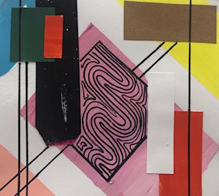
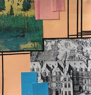
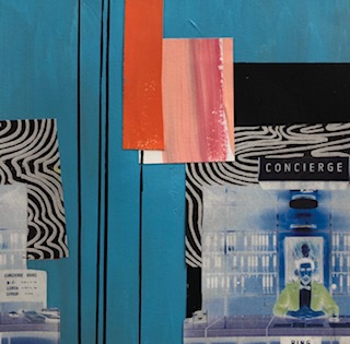
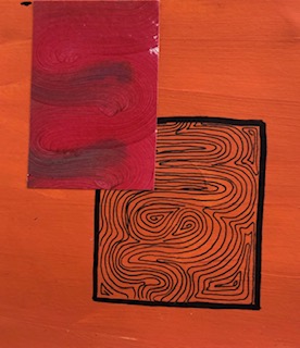
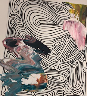
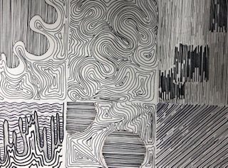
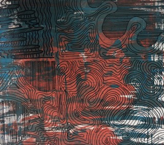
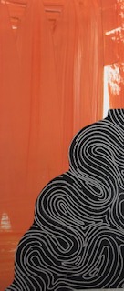
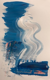
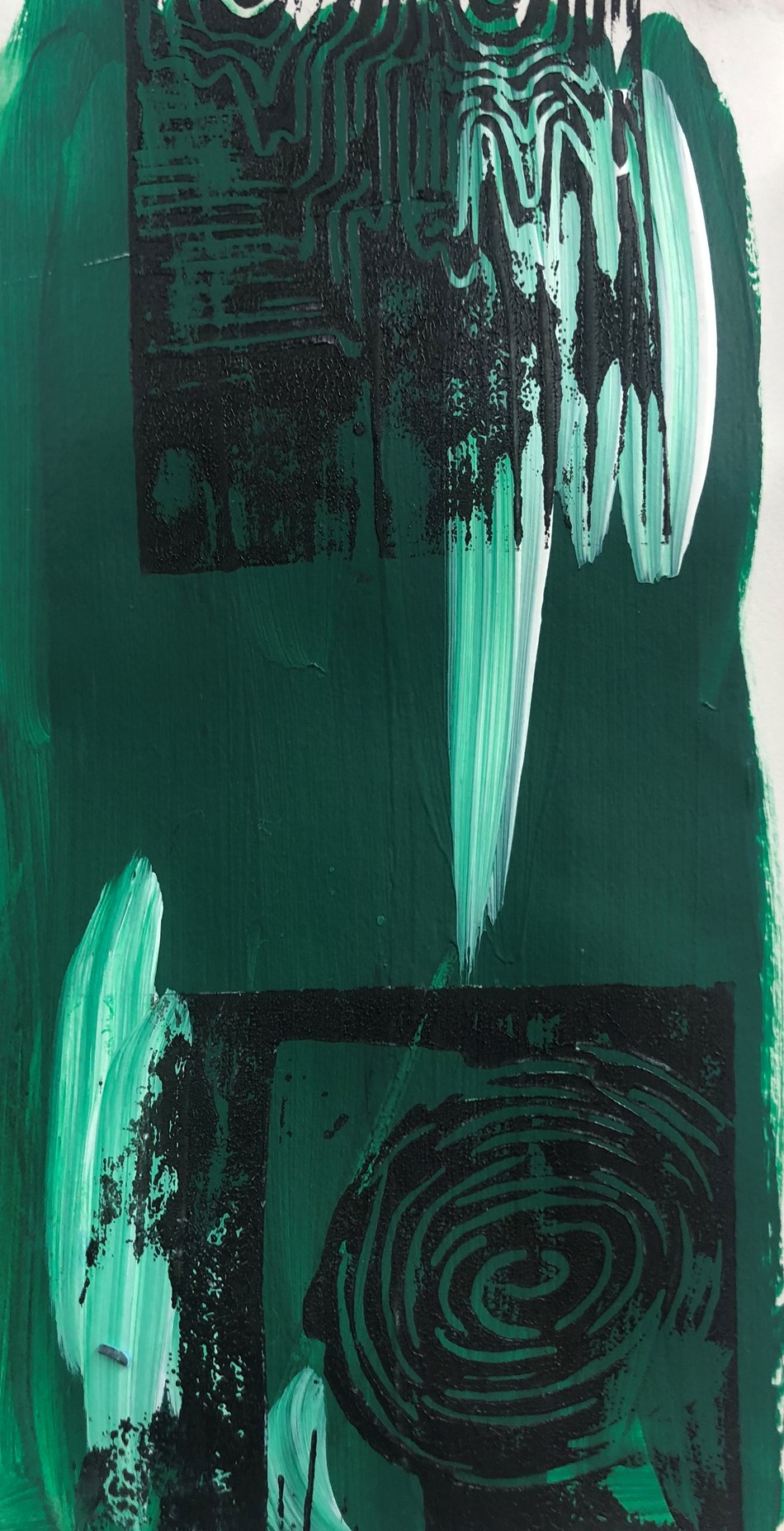
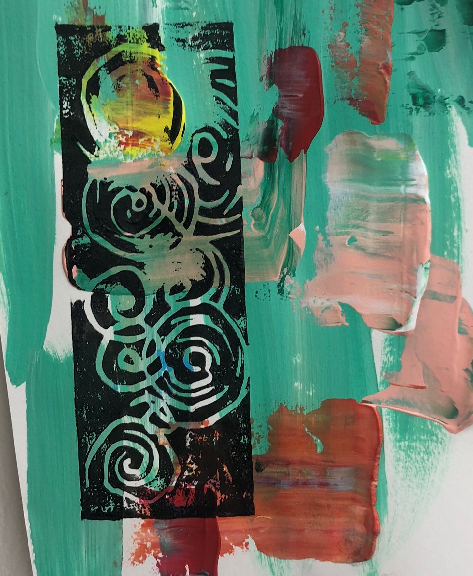
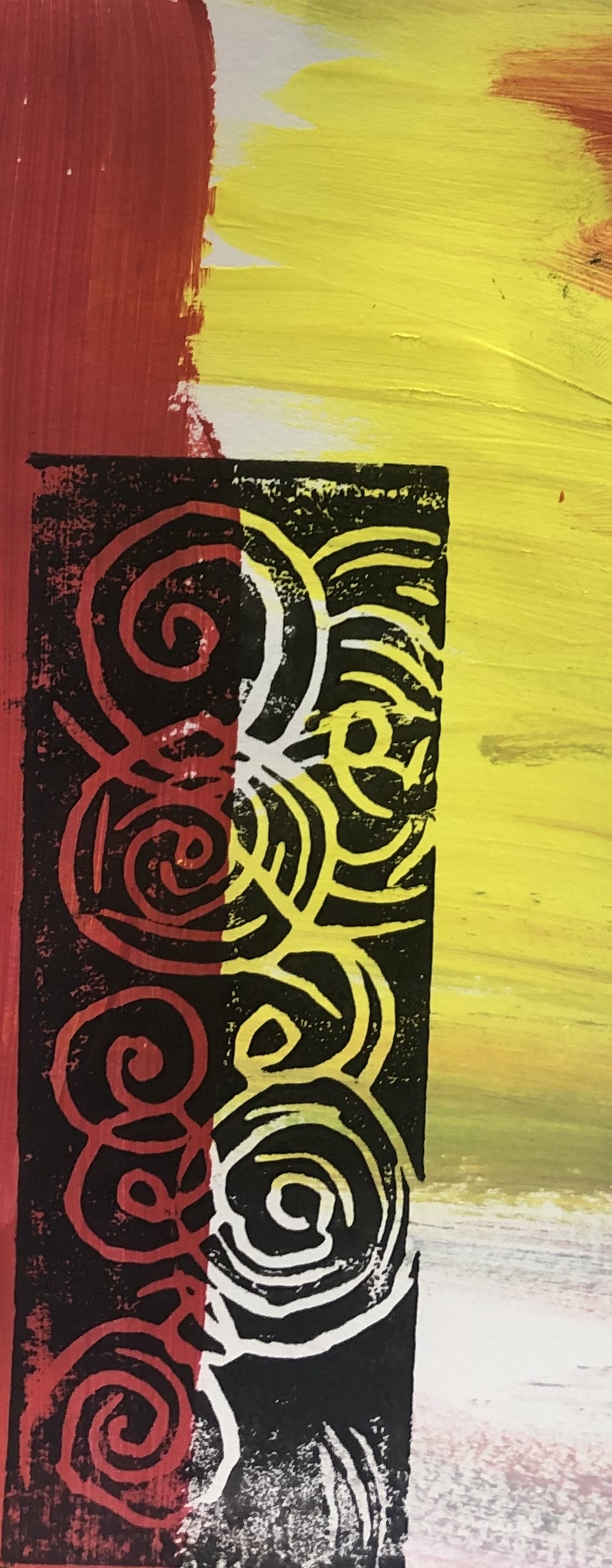
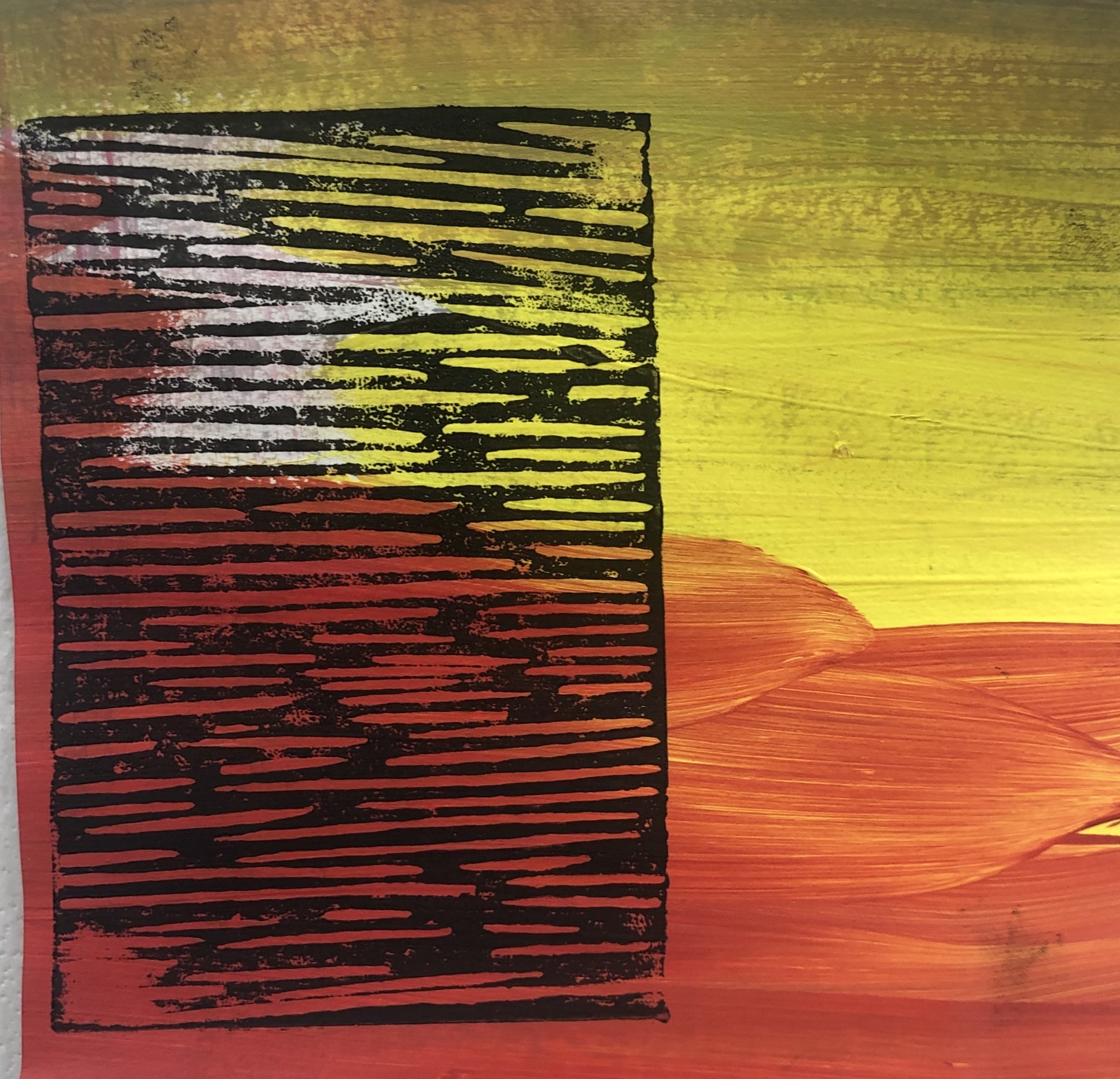
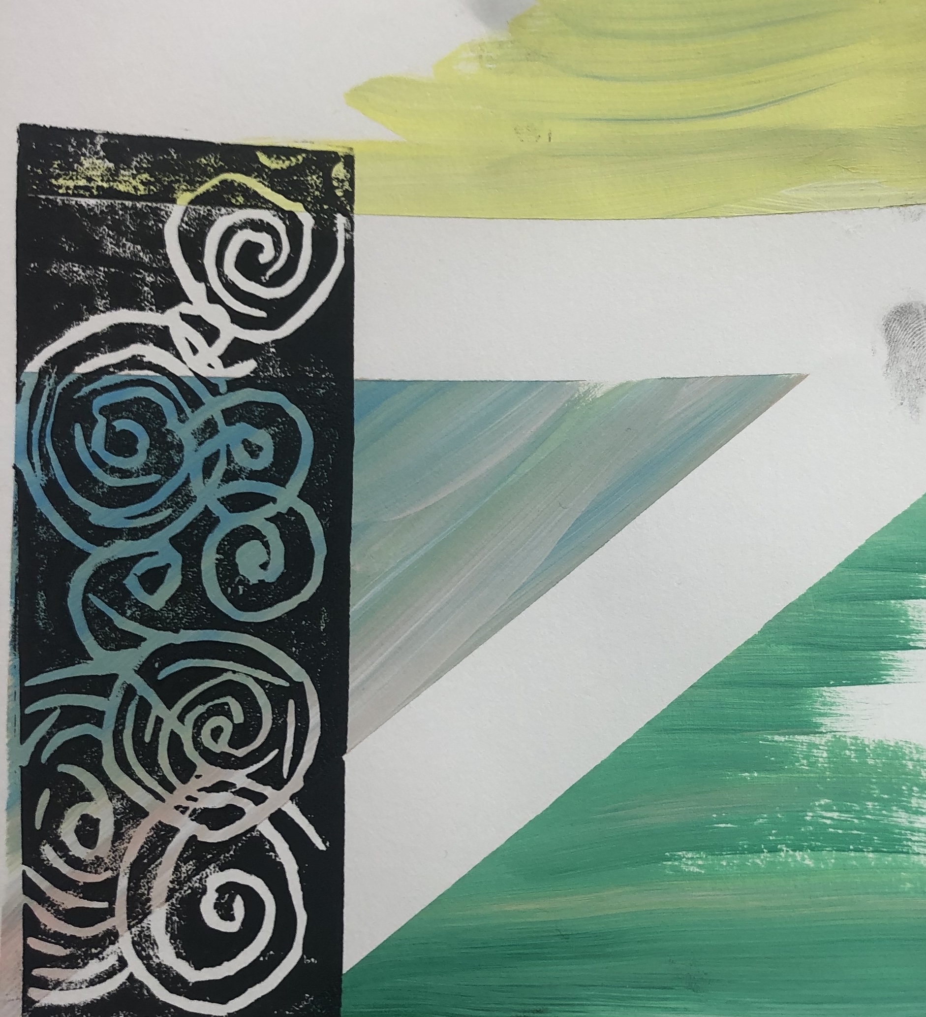
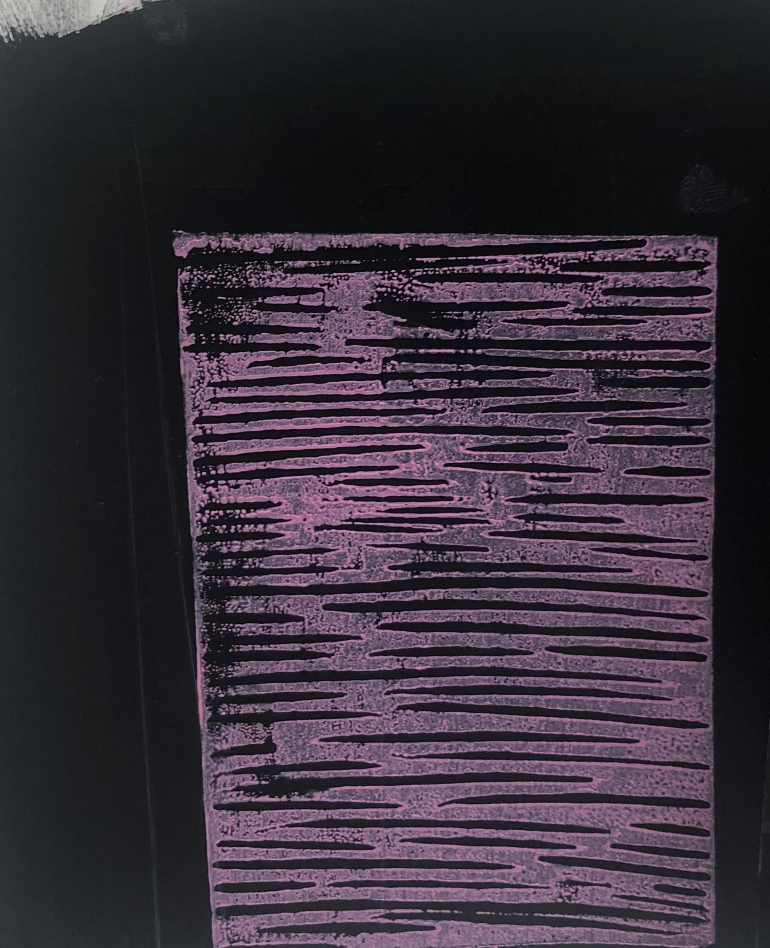
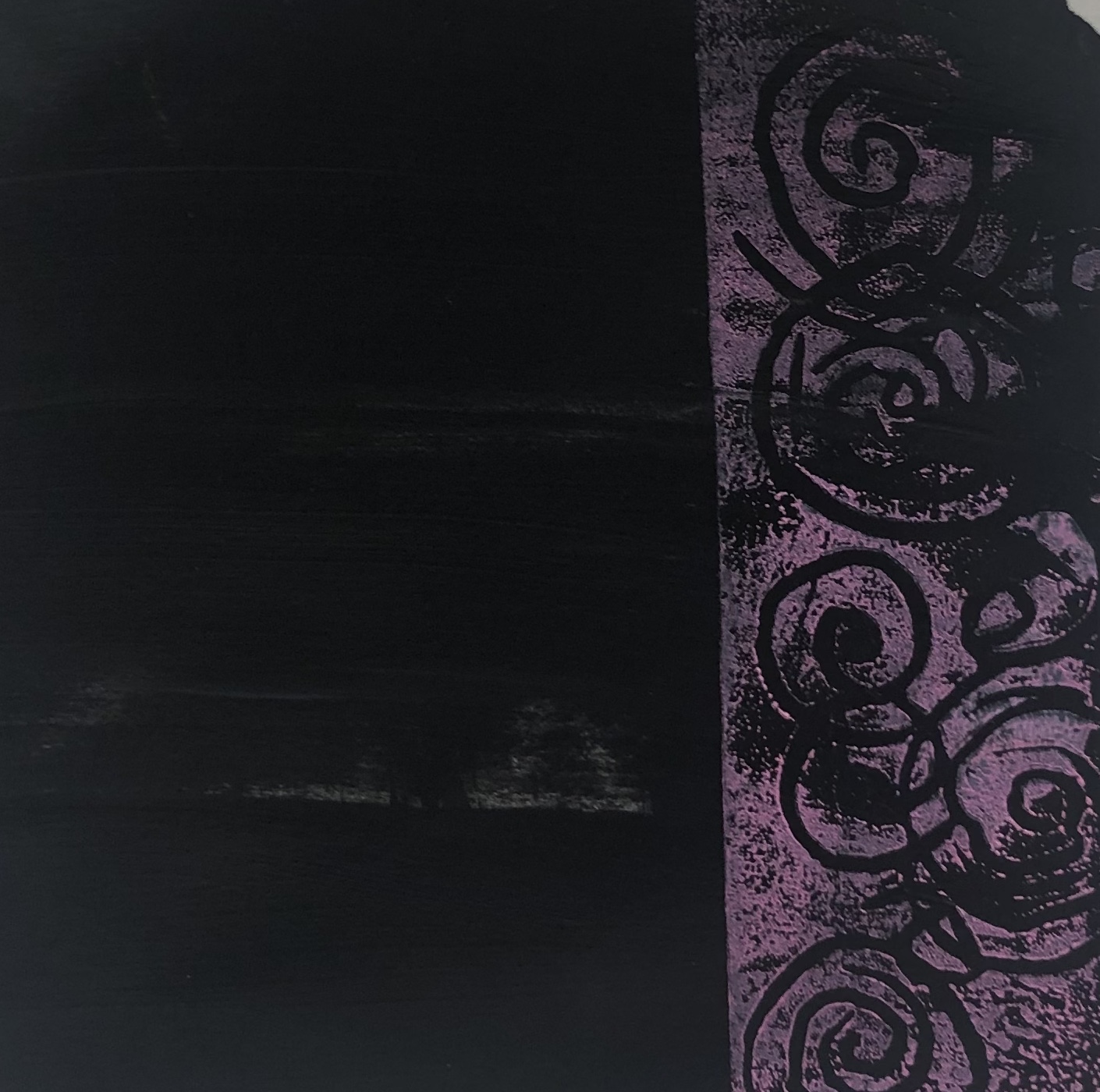
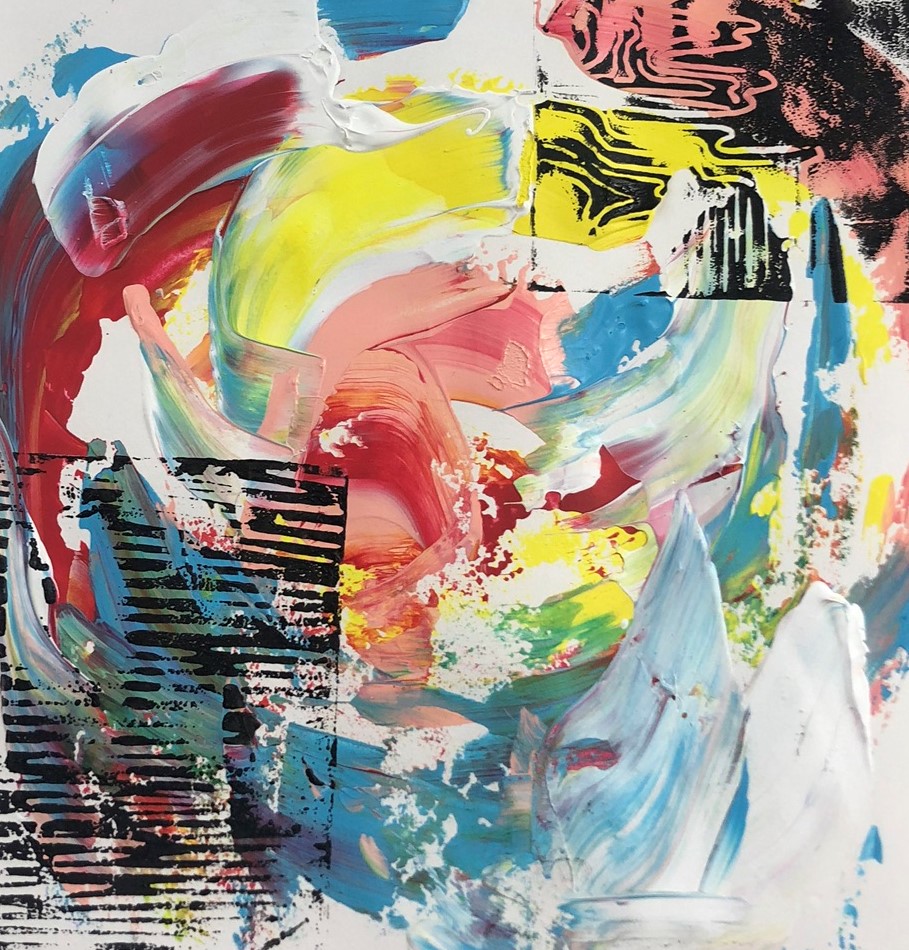
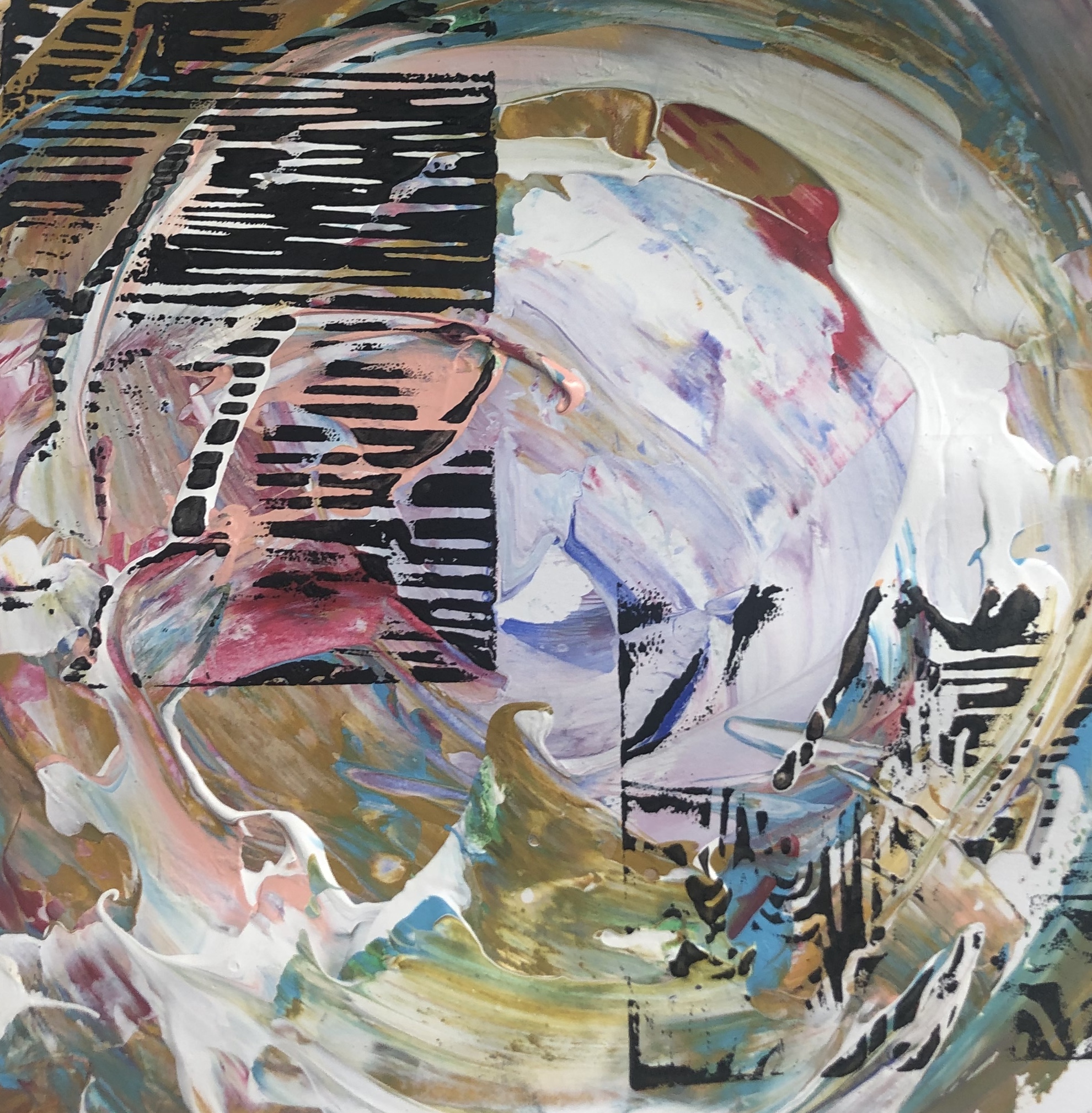
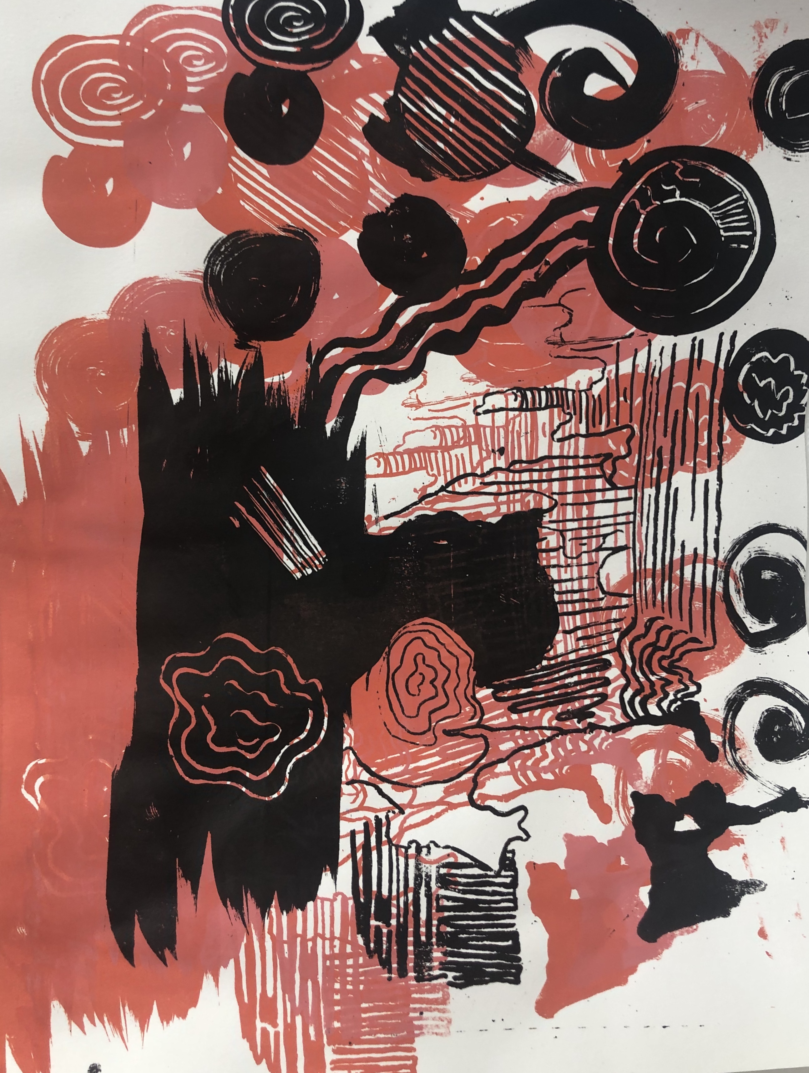
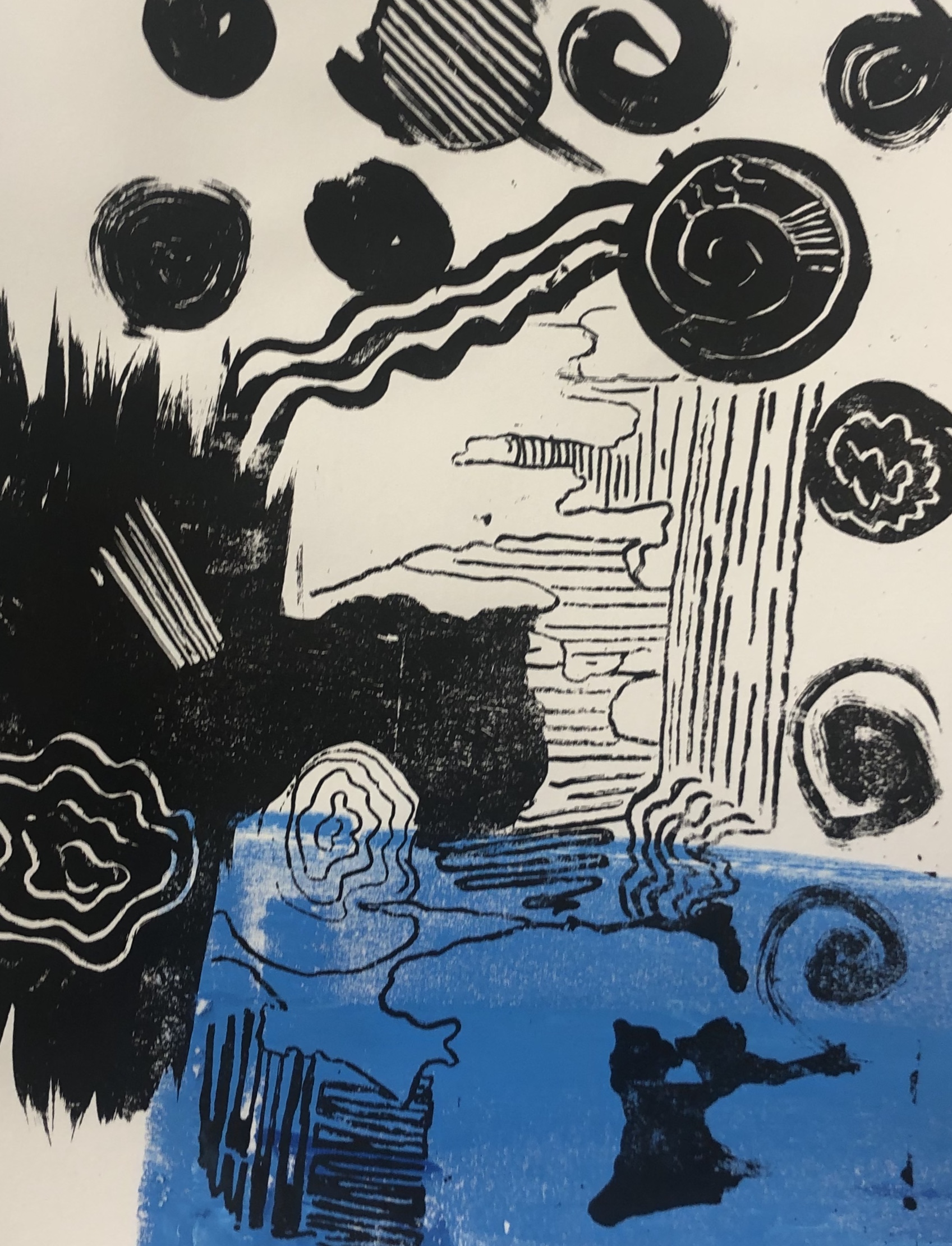
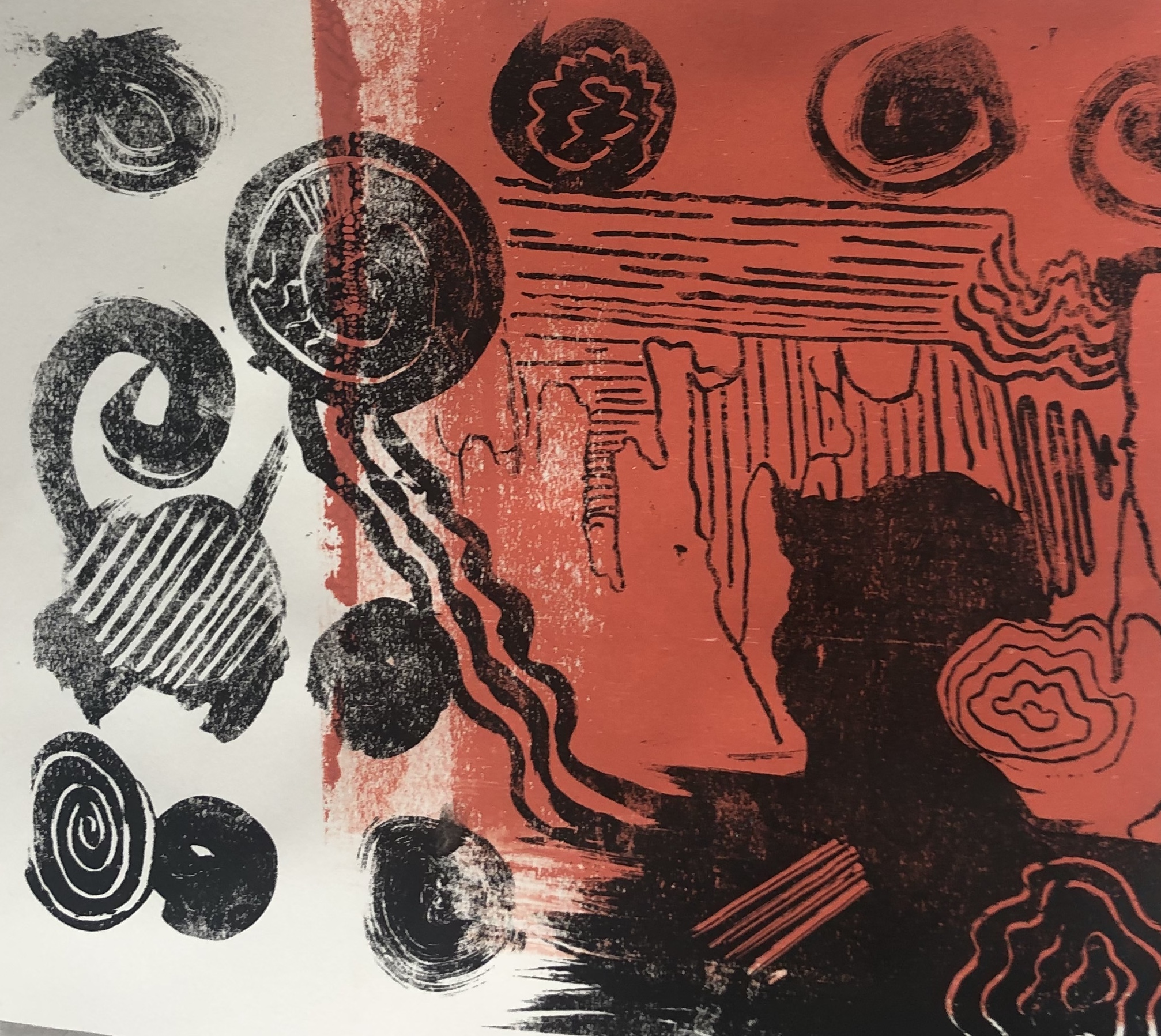
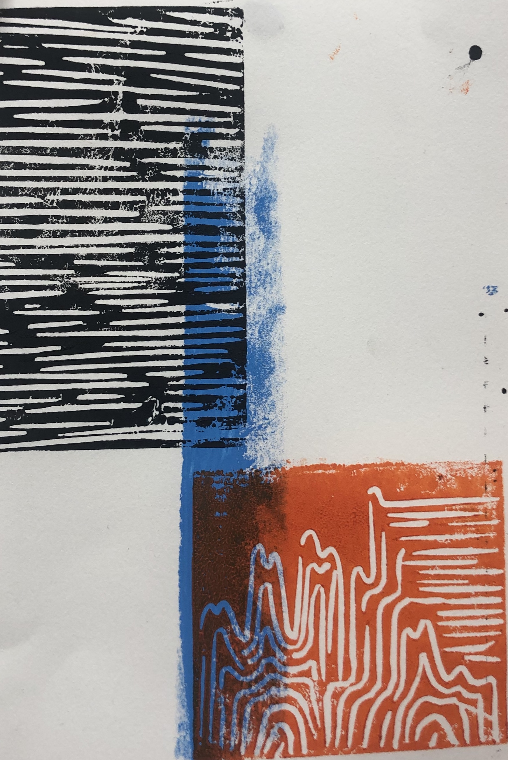
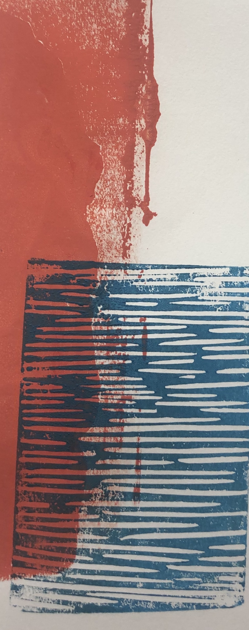
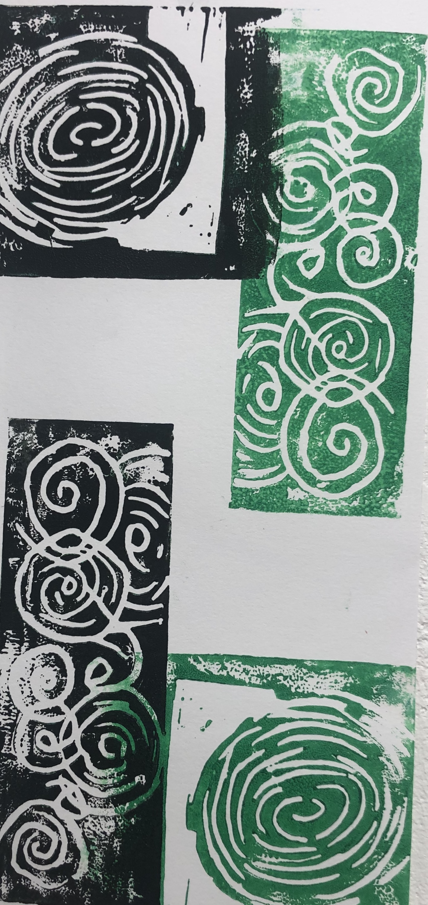
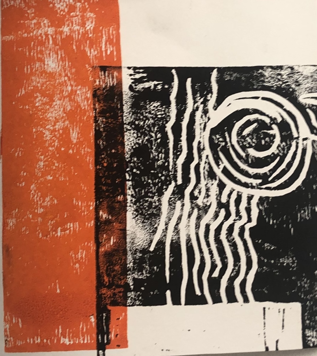
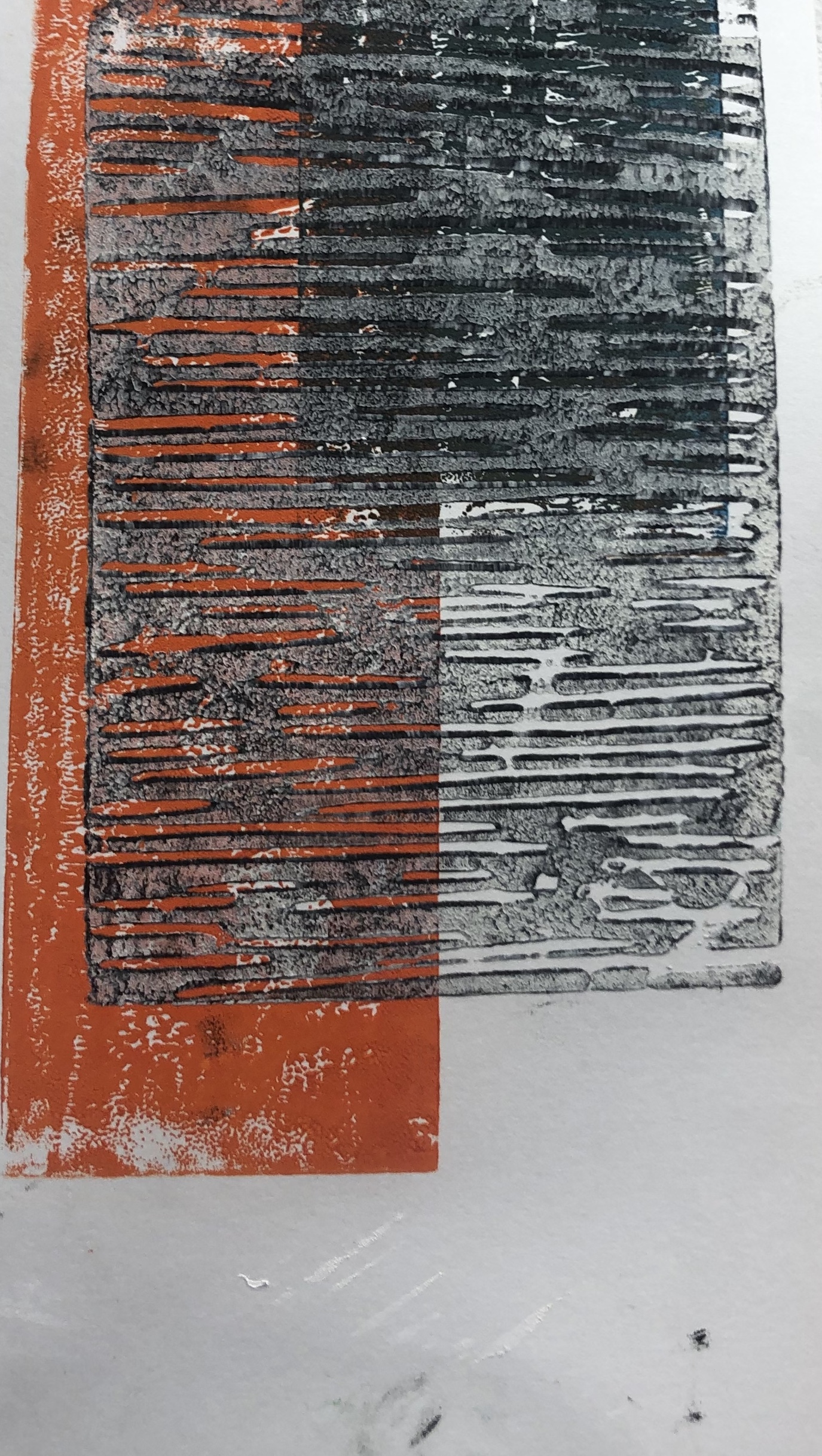
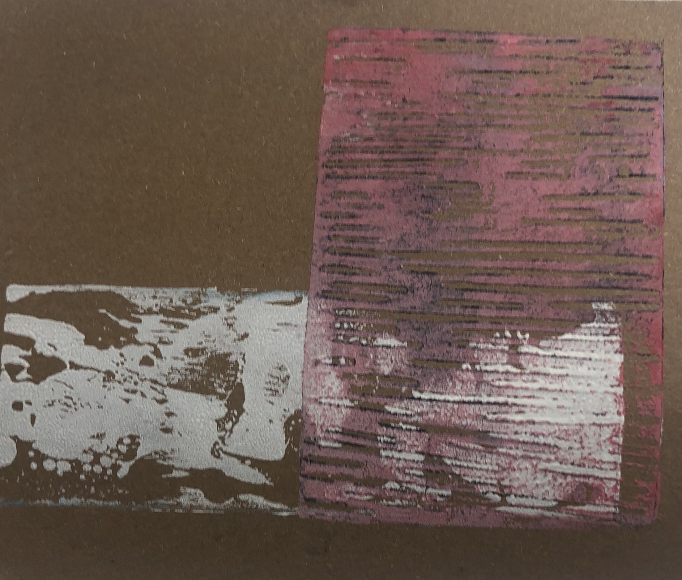
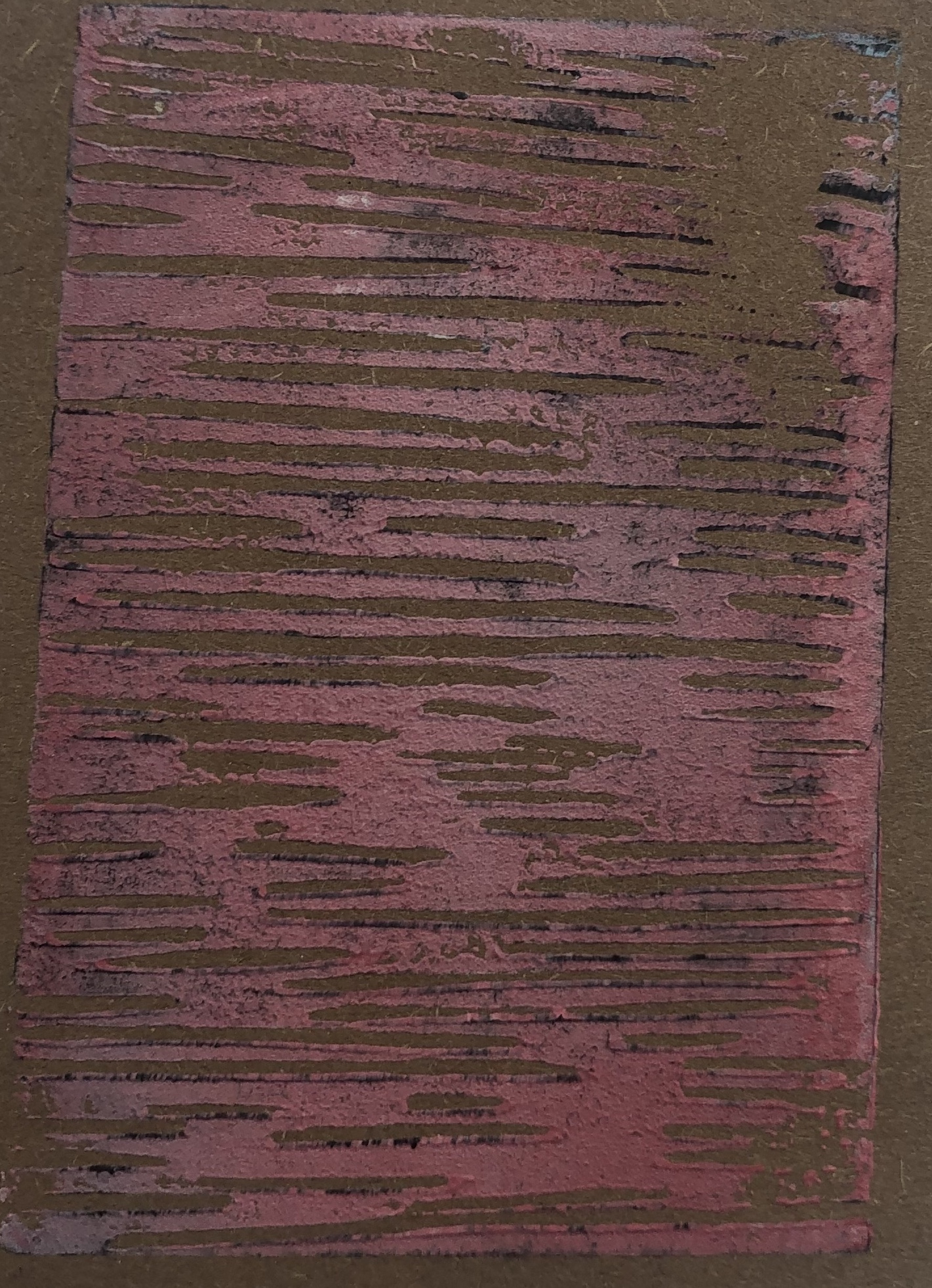
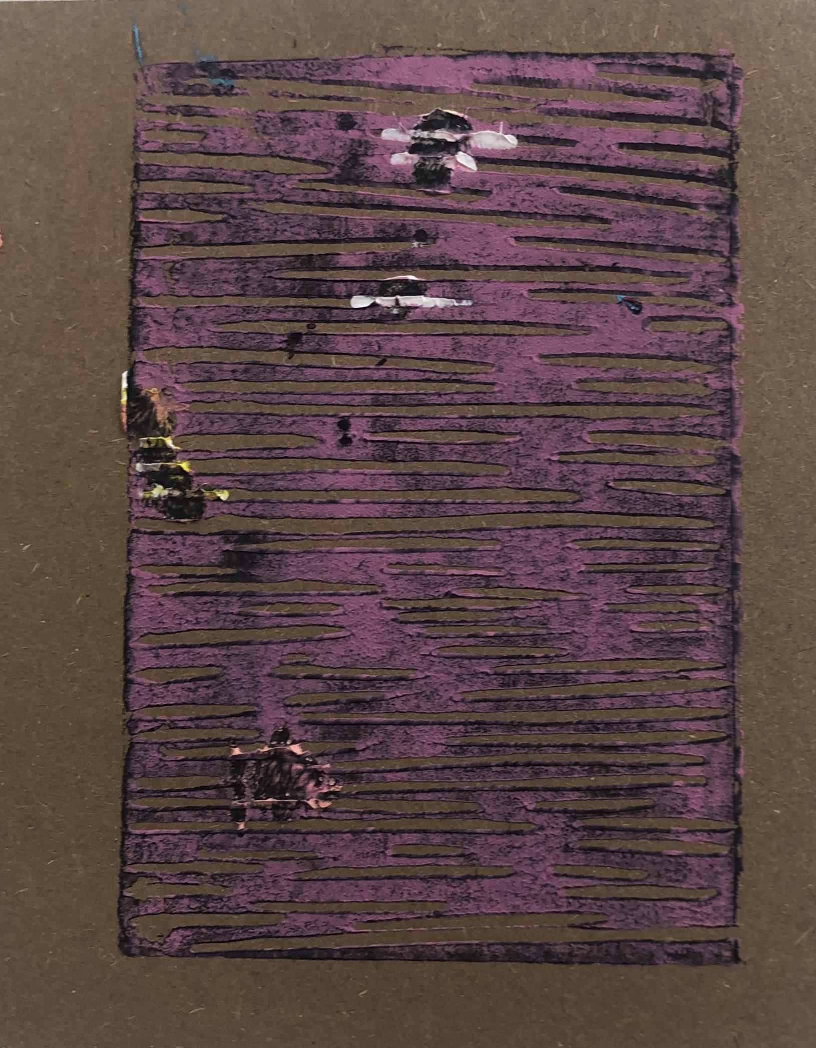
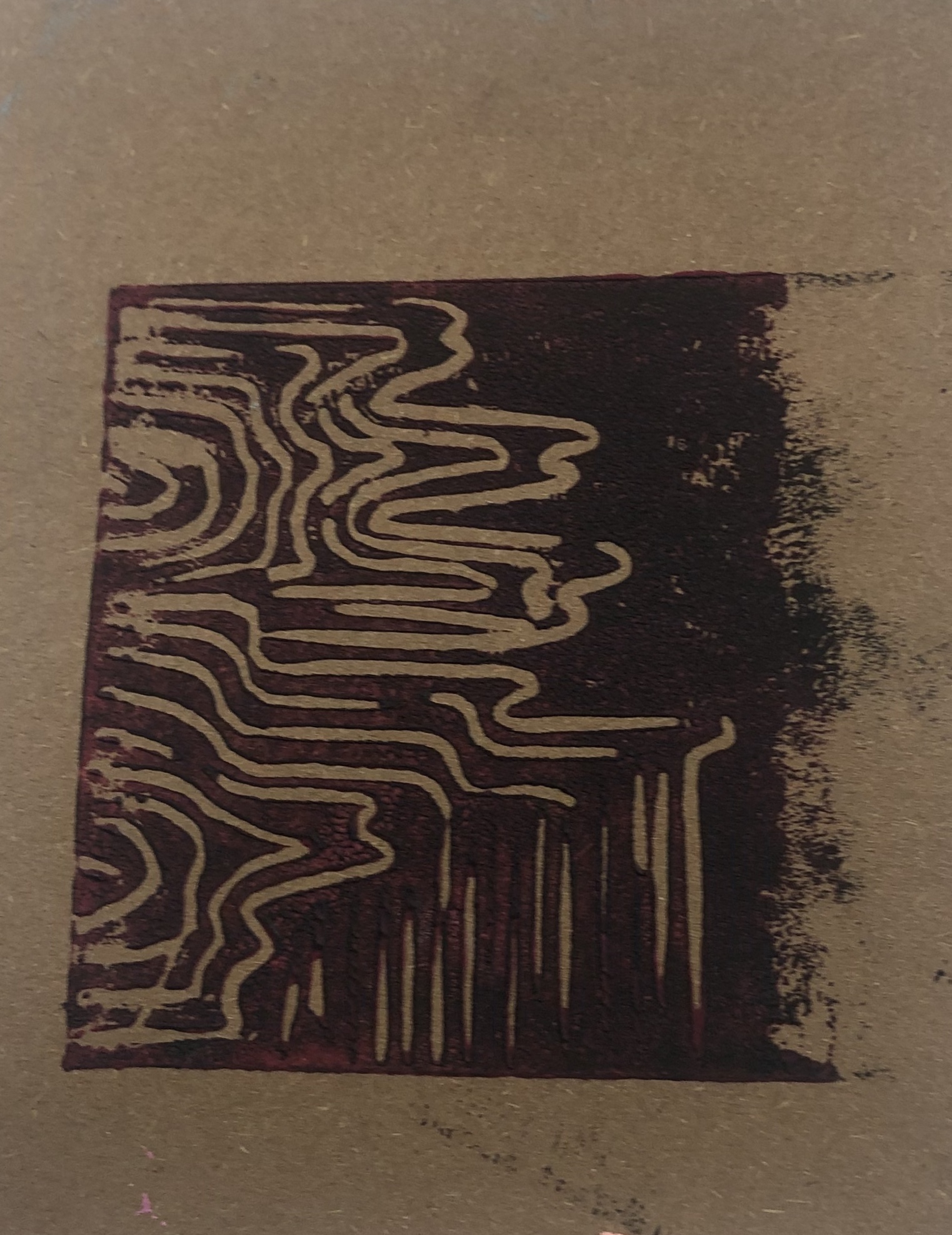
I feel really happy with the compositions of my work, but I want to look more into the other medias hat I’m incorporating with my work. Today I focus on the cut outs of acrylic paint hat I’ve been using. I did varies brushstrokes of acrylic paint, in different colours, using a palette knife and a paint brush. The more basic colours I plan on spray painting then different colours and maybe trying to add charcoal. I do however need to wait for the paint to dry. I plan on using charcoal on the more circular shapes to see if the charcoal makes the swirls stand out more. I also feel it would be interesting to see what effect ink would have.

Categories
2DPractice

HANNELINE VISNES

Hanneline Visnes is a Norwegian artist, that now lives in Glasgow. Hanneline’s work is very influenced by cultural and historical sources, including patterns and textiles from Europe, Persia and china. In most of her work you can usually see birds, jewellery and flowers. I like to the colours used in her and how she works on wood most of the time, using oil paints. The complicated patterns against the plain background really makes, not only the patterns but the colour as well eye-catching.

Categories
2DPractice

2D PRACTICE PRT 6

During the October break, I was doodling with squares and layering them and in between the lines I filled with the line pattern. I really liked this effect and how all the lines in each section are different and going in different direction. Since doing collage, I thought it would be interesting to see if I could recreate the doodle but with collage. I painted surfaces and and then drew the pattern onto the base and then collaged them. I like the contrasting colours and it reminds me of Minna Gilligan’s work. I plan to make copies and experiment more with the colour changer on the printer and repeatedly layer. Maybe even try acetate and layer that?

Categories
2DPractice

2D COLLAGE – PRT 5

for our final day of collage I continued with incorporating lines and patterns into collage. I tried to add more lines and pattern into my collages and it looks successful. I really enjoyed working with collage and I feel I developed my work really well.

Categories
2DPractice

2D COLLAGE – PRT 4

I started to just experiment with line and pattern placement. I also took a lot of pictures from a renaissance magazine and I feel that the faces add a comical feel to the pieces. I still stayed to smaller scale collages, which I preferred to when working with larger scale. I really like how the pieces turned out and the contrasting colours. I would like to still work in small scale, but have more layers and also I’m curious as how the current pieces would look if turned negative. I’ve been looking at artist Minna Gilligan and would like to look more into her work.

Categories
2DPractice

2D COLLAGE – PRT 3

From the collages I did the previous day, I made them negative through the printer to see what colour would made. I then took the negative prints and collage them into one piece. Since a lot of the collages looked like x-rays, I decided to give it a black background as white or any other colour would of been too light and they would wouldn’t stay out as much. As the negative collage was on a slightly larger scale, I wanted to experiment with smaller scale collages. I took some negative prints from previous collages and also cuttings from backgrounds. I still wanted to have patterns and lines shown, so I added them in the background. I feel my pieces have been really successful and I would like to experiment with lines and collages.

Categories
2DPractice

2D COLLAGE – PRT 2

I started off with just doing simple collage compositions with magazine cut outs onto paper. I wanted to incorporate my current theme with collage, so I cut out acrylic brushstrokes that I prepared the other day and used them. The cut out brushstrokes gave the collage pieces a photoshop look and gave the pieces depth. I then went on to use the line drawings as background and then brushstrokes as a foreground, but I feel it didn’t look great, just messy. Maybe if I do a less detailed line drawing it might be more effective. I did however like the thick layered acrylic as a background and it looked very effective and I will definitely be using this in the future.

Categories
2DPractice

2D COLLAGE – PRT 1

This week we are looking at collage. I started off with creating small line drawings for the foreground of the pieces. I then decided to layer that print on top of a piece I did when we were experimenting with printmaking. I really like the effect of the line patterns and the colour of the print in the background, it would be interesting if it was turned negative. I then went on to create bases with acrylic paint and layered them with the patterns created. I noticed however that my collage pieces had a acrylic background and a pattern in the foreground, I wandered what would happen if I switched it around. For this I created line drawings as bases and tomorrow I plan to experiment with the negative printer techniques and switching the patterns and acrylic. I feel I was very successful today and started off well.

Categories
2DPractice

2D PRACTICE PRT 5- LINO PRINT

I started to experiment more with Lino print and layering it with acrylic paint to create more depth. To create more pattern I used tape to make sharper straight lines, which I feel worked really well and with the print on top made an interesting effect. With adding more thicker spreads of acrylic and printing on top, it created a bumpy and distorted look, reminding me of a glitch in a computer or finger print. However I wanted to exaggerate it more, so I made swirls of thicker paint and then proceeded to print on top. The outcome of this was really successful and I would like to then print negative through the printer to see the outcome and colours of it. In experimenting with the thicker materials I had Pia Fries in mind and would to look more into her work and her use of negative space and colour.

Categories
2DPractice

2D PRACTICE PRT.4 – PRINTMAKING

Throughout the 2D practice project, we’ll be introduced to different techniques each week. This week was printmaking. By taking a frame and burning the pattern into the mesh with emulsion, it allows me to use the pattern repeatedly with different inks. I started off with experimenting and getting use to how the pattern and ink would look when together. I decided to use black ink for the main pattern and for the background colours; blue and orange. I really like the effect and strong contrast of the black, blue and orange. With experimenting with the negative technique of the printer and how it changes the black lines to white, I made lino prints of common patterns that you can see through out my project and started to layer them. By using the lino prints it gives the same effect that the printer did. I prefer using the lino to active this outcome as it also leaves a texture look to which i find to be effective. I really enjoyed printmaking and lino print, as the effect can lead to interesting textures and alows you layer.

Design a site like this with WordPress.com
Get started