Categories
cap2 studioproject1 StudioProjects2

SELF GEN PROJECT PRT 21

I continued with experimenting with moving image. I wanted to try a more busy composition. Each building reminds me of a small memory I have (Like losing a phone or falling over) that took place around that building.

I did change the colour because I wanted to see the outcome of doing that and would it become messy?

I really like the outcome of this and in the future I want to try video and moving image.

Categories
cap2 studioproject1 StudioProjects2

SELF GEN PROJECT PRT 20

For this piece, I wanted to attempt to animate it and create a moving image. I used Adobe Photoshop to create and really enjoyed the process of making this. I want to incorporate this into my work as I feel it could create a similar feeling to walking in the city. (Unfortunately due to a technical difficulty, it wont upload to YouTube, so here are screenshots.)

When using this again, I would like maybe have a video playing in the moving image. I’m not too sure if this will work, but I want to experiment with multiple moving layers.

Categories
cap2 studioproject1 StudioProjects2

SELF GEN PROJECT PRT 19

I still felt that my project wasn’t really representing anything. I decided to look more into my relationship with the city and how I see it after living here for over just 10 years. I took some picture from Princess street and edited it, similar to my previous work as I still like the look. I then draw onto to illustrate personal memories I remember of the place or an incident that happened there. I really like this new point of view. I’m still facing on the building as I want it to be my memories on what happened around those buildings. I’m also liking the layering and want to push that.

My first piece would be my favourite as I prefer the composition.However, I experimented more on the other piece with different colour schemes and layering the same piece over itself and then lowered the occupancy. For the last piece. I then edited it on pro-create, draw on top and then put back through photoshop where I copied it, changed the colouring and then layered them together changing the occupancy.

I found the outcomes I successful and plan on doing more of these. My next step however will be looking at animation and video work.

Categories
cap2 studioproject1 StudioProjects2

SELF GEN PROJECT PRT 18

I feel pretty stuck on what to focus on when it comes to my project. I don’t really know what I truly want to show. I decided to look into the actually history of the buildings.

I found a old sketch of the Royal Bank of Scotland building located on St. Andrews Square. That building was the first building to be built there, due to overcrowding in the Old Town. I then included the Bus Station that is also located in St. Andrews Square and then the row of shut down businesses in Leith Walk. I wanted to show new development in away and how Edinburgh has been a city that has constantly developed. This can be a positive thing, like for the Bus Station which is always busy and the bank, but also a negative, like for the independent businesses that where shut down due to that.

I’m not entirely sure if the message came across, but I definitely want to delve deeper.

The next two pieces are all mainly experimental, with little meaning. I mainly focus on practising with layering and changes the colours of the pictures. I really like working with layering.

The fourth is also a sketch from the building of St.Andrews Square when new development first happened. The main focus of that piece of the layering of multiple shapes and then I decrease the occupancy. I really like effect and the effective it can give.

Categories
cap2 studioproject1 StudioProjects2

SELF GEN PROJECT PRT 17

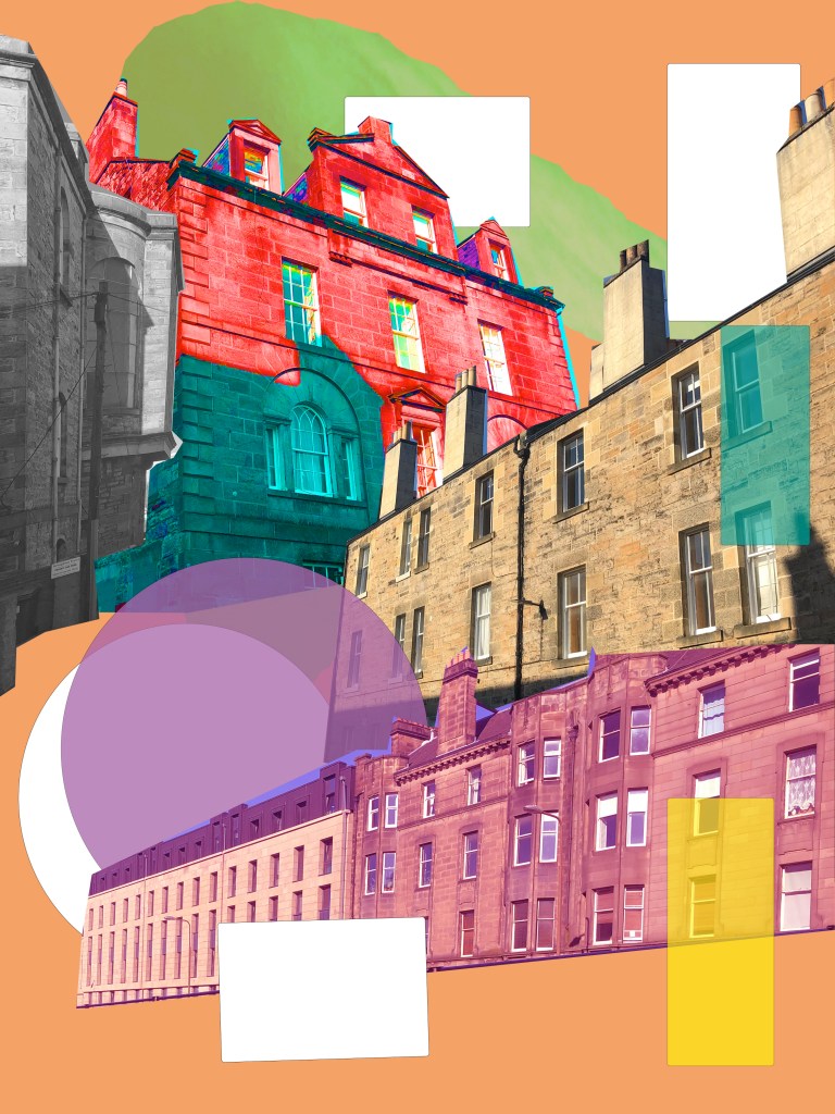
I wasn’t quite sure how to develop my project further with the ‘blue-print’. So, I decided to look back and play around more with photoshop. I added more detail into these pieces compared to my previous photoshop artworks. I wanted to experiment with perspective, especially with the shapes surrounding the building to see if they then change the perspective of the whole piece.

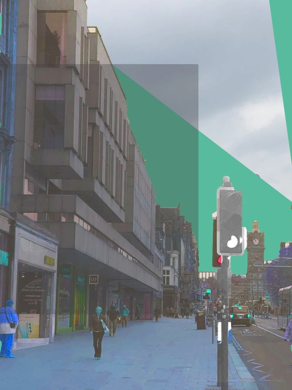
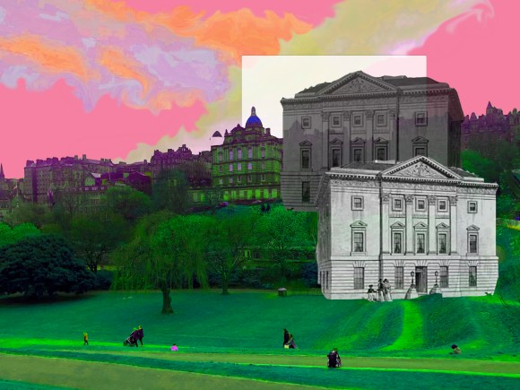
For the first artwork, I was inspired with the colour theme I saw on a random old poster in Leith. I decided to also add a rectangle to which I them edited to made the shape have perspective. I thought the shapes and the colours themselves contrast against the glass building. Without the stripes, I felt the piece was dull and empty. By adding the shapes, it gives the artwork more depth and detail.

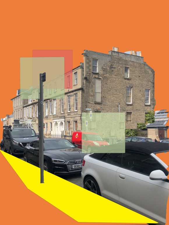
I enjoyed using the stripes and choose to continuing with experimenting with that aspect. I originally was just going have the shape and the building itself, but not only was it a boring composition, but also the colours in the piece contrasted, but in a bad way that made the piece look flat. By adding the white stripes it balancing the two apposite colours and bring depth. Also allowing the building to stand out.

Out of all three, this piece would have to be the most similar to my previous pieces. I wanted to look more to cutting the building in small pieces and they overlapping them. I thought it represent the feeling of buildings upon buildings feel that most people experience when living in a city.

Categories
cap2 studioproject1 StudioProjects2

SELF GEN PROJECT PRT 16

I felt the previous artwork I made was a successful and with the shapes create from the “buildings”, I decided to trace around the shapes with a white brush and change the background to a dark blue. I wanted to recreate a simpler aesthetic to blue-prints. I felt this connected well with my current theme as it’s how building plan are drawn.

I don’t believe that the “blue-print” are a piece in its self, but maybe more as a base that I can layer on a future piece.

Categories
cap2 studioproject1

SELF GEN PROJECT PRT4

With this project, a part of me is slightly out of my comfort zone. I’ve never really painted and drawn buildings before, I’ve always been interested but never something I have been able to try until now. I love the way Serj Fedulov paints and reminds me of Impressionism. I do plan on looking further into Impressionism as I would like to try painting in that technique.

I started off with focusing on the which strokes of paint that you see in his work. I did a small sketch of Edinburgh castle, using a handwriting pen and then used Gouache to create texture. I don’t like them, as I feel they are messy and a bit all over the place. However it did help in what I want to develop more. I really creating the texture and using the paint. I would like to look more into creating a rough, stone texture with paint and layering.

Categories
cap2 studioproject1 wawwa

WAWWA: DEVELOPMENT PRT.14

I was really happy with the previous artworks I had done, and wanted to see if I could create I piece, made from my favourite aspects of each piece.

I started off with adding the glitch slogan to the artwork where I was focusing on worshiping. I did like the look, but I do feel it looks like two different artworks on top of one another and not in a good way! So I decided to take all the aspects I like and them combined them together. I did like the outcome and I do feel I did what I had intended, but I do feel the piece is too busy, too much going on.

I then did a quick photoshop piece, just out of pure curiosity and experimentation. I took a picture I took of myself when in a Zoom call, and then copied it three time in different sections. I really like this piece and feel it was my favourite of the three I did today, but it doesn’t really have anything to do with my project. But it has definitely inspired my next development process.

Categories
cap2 studioproject1 wawwa

WAWWA: DEVELOPMENT PRT.13

I went back to my original artwork of me in my comfort clothes, and decided to see if I could develop this piece further, as I think it looked boring and unfinished.

I decided to zoom into the whole piece, this cause the pixels to really show. I like the pixels showing and I feel it looks more digital, which I feel is appropriate as the majority of anything in general is online. I also decided to add the Queen’s slogan: ‘Sapienta et doctrina stabilitas’, meaning ‘wisdom and knowledge shall be the stability of thy times’. I thought this slogan was quite funny, as the British government hasn’t handled the coronavirus well at all, and hasn’t dealt with it with ‘wisdom and knowledge’, quite far from it. I then added on ‘right?’, in response to how the UK has dealt with the virus. I then made the slogan have a x-ray like look to add to the glitch look.

I much prefer this piece to the original piece. There’s more going on and the composition is better.

Categories
cap2 studioproject1 wawwa

WAWWA: DEVELOPMENT PRT.12

I wanted to develop my previous piece further, especially around the aspect of royalty and worship. I did a photoshoot where I was seated in worship poses. I then went on to place between the two portraits of me that were originally there. I feel adding these poses really enhance the idea od the virus being a higher being or a modern royalty.

I also added more graphs, and layering them ontop of one another as a background, which I prefer when compared to the artwork previously as it adds colours, and more interesting in general.

I also edited the hue and saturation of the ‘cell’. I decided to enhance the colours, so they become more vibrant and neon like, which I feel give the artwork I more sense of science and virus like atmosphere.

I really like this piece, and I feel its a really strong piece. I do like how the project is developing and looking forward to experimenting more

Design a site like this with WordPress.com
Get started