Categories
Graded Unit

JEAN-MICHEL BASQUIAT (1960-1988)

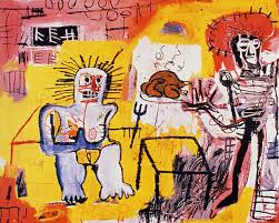
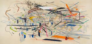
Born and based in New York, Jean-Michel Basquiat was from Haiti and Puerto Rican decent. Basquiat started off doing graffiti on the streets of New York under the name SAMO, and then decided to go with his real name Jean-Michel Basquiat and quickly grew to fame in to 1980s.

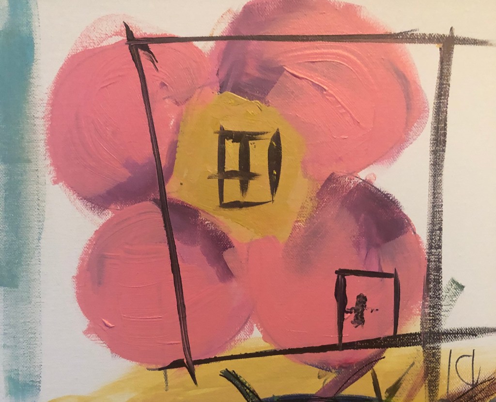
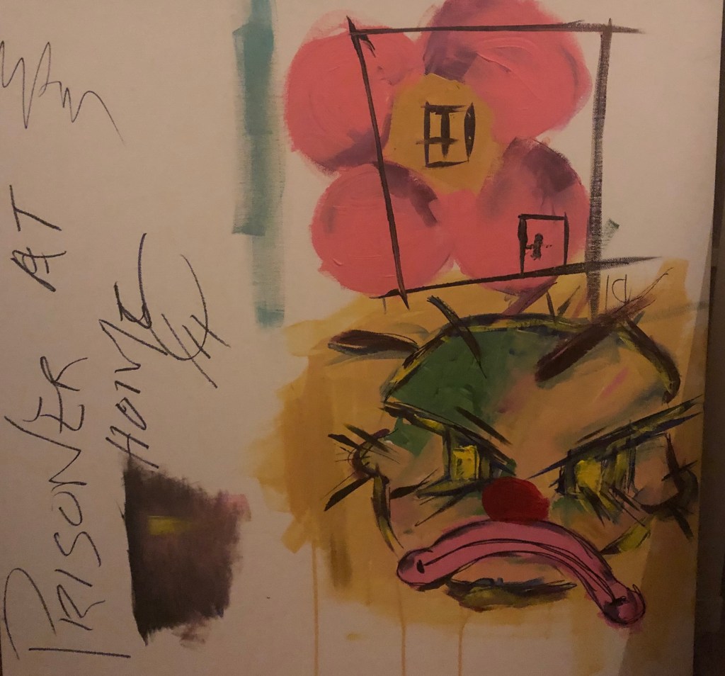
Since reading the book ‘Widow Basquiat” by Jennifer Clement, I’ve been very inspired by the work at Jean Michael Basquiat. In his work, I like the use of layering in colours and the variety of colours being used. I find his artwork to be some sort of collage piece. In the book ‘Widow Basquiat”, it said that a lot of time Jean-Michel would copy quotes from cartoons to cereal boxes and paint the quotations into his artwork. I would like to try this with my own work as I feel it connects well with my project as I’m surrounded by those quotations every day at the moment. As my work id very childlike, I feel Basquiat is a good influence to look at.

Categories
Graded Unit

GRADED UNIT – PRT. 2

I created my second artwork on the backing of an old picture frame. In this painting, you can see a self portrait of myself in the top right corner and in the bottom left, a clown crying. Just off the centre to the left, you can see a drawing a toilet roll. I decided to give myself a cartoon/animalistic angry mouth due to the fact I felt like a savage animal in a cage, unable to leave. I wanted to try recreate that frustration and desperation.

The clown was added to show the sadness and I wanted the clown to also represent a baby crying as when I’m complaining about being stuck inside, I feel similar to a baby having a tantrum.

Since the lockdown in the UK, toilet roll has been one of the most popular items in panic buying. I wanted to show that as I find it quite chaotic at the thought of people being so desperate that they have to buy as many toilet rolls as possible.

I plan on adding to each painting I create throughout the lockdown. I want my paintings to represent my time in lockdown from the start to the end.

Categories
Graded Unit

GRADED UNIT – PRT. 1

At the start of the week, we were given our new briefing for our graded unit. We must choose from a list of topics on what we want our project based on. The topics are : Home and Displacement, War and Conflict, Natural World, Ritual and Commemoration, and Technology and Systems. I do plan to experiment with each topic, however I have decided that the main topic I’ll be focusing on is Home and Displacement.

Currently, the world is going through a pandemic, with a virus. For safety, everyone has been confined to their homes. When given this project I had been in the house for nine days straight. When the I saw the topic Home and Displacement I immediately started doing visual responses.

I personally I’m not a angry person, but of lately have felt frustration build up. At the time of these drawings I felt very angered and frustrated at the thought of not freely being able to leave my house and go anywhere. This was a new feeling for me because I wasn’t angry at anyone or action, just anger and it was the first that I really drew how I felt, so it helped me in over coming that.

I instantly drew a clown. I feel clowns have always been a fascinating being, due to them being always happy and when you see them sad it is uncomfortable, since you expect I more positive vibe from them. I feel connected to a clown at the time as I didn’t know how to respond to the angry I felt at the time.

Categories
Life Drawing

LIFE DRAWING .CLASS 2

For our second session in life drawing we focused on drawing the human body with drapes. I have never drawn the body with clothes before and felt that’s I learned a lot in this session with shading, lighting and poprtion. The majority og life drawing clsses ive been to has had female model. It was nice to get use to drawing male body as it will help with improving my drawing technique.

Categories
MajorProject1

M.J 1 – PRT 17

Since many of my more resolved pieces have been square shaped, I decided to try a piece with a more rectangular shape. I wanted to try creating a depth with the lines and make the piece look like the lines are closer to the viewer.I do like the colours I used as I feel they contrast in a way that shows off the colours. 

However, I don’t like the outcome of the painting. I feel the placing of the lines don’t match with composition and there’s too much highlighting on against the darker tones, which makes the piece seem clustered. I feel I used too many different light tones against the darker tones, creating a lot of contrast, but not in a harmonious way.

Categories
MajorProject1

M.J 1 – PRT 16

Based on the 1st artwork I’d done when looking at sources, I really liked the outcome of that artwork, so I decided to recreate that piece, but using opposite colours as I wanted to see if it would be successful. Since I’m looking int negative space, I wanted to add a more crowded surrounding to see if negative space has an effect on a piece.

I felt this was a successful piece as I feel the colours used really makes the painting stand out. It’s a very busy piece, and at first, I thought it was too busy and therefore didn’t work, but after looking over it I’ve come to realise it works really well.

I did struggle when painting this artwork, due to figuring each opposite colour compared to the colours I used in the first painting and trying to create depth by using only quite vibrant colours. The light brown and blues were the main colours being used for the depth and to add contrast, but I also lightened colours, especially red, using white paint, which I feel helped the piece to become brighter.

I was originally going to add lines, similar to the ones seen in Julie Mehretu’s work, but decided against it as I feel the piece would become too messy and the contrast of the black lines and bright colour would clash. I think I made the right decision in not adding the lines.

Since the only part of the painting that has negative space is the middle, I thought it would be clustered and messy, but I think with all the colours that have been used, it balances the composition out.

Categories
MajorProject1

JULIE MEHRETU

Her word is inspired by the layers of New York City, the underground and the towers throughout the city.

I really like the colours that Mehretu uses in her work and the lines she creates. Also how her work layered and only after looking at her work do you notice the details in each layer.

Categories
MajorProject1

M.J 1 – PRT 15

I was originally going to try painting on smaller scale compared to the two previous works, but instead I decided to collage it onto a bigger piece. On the top left corner of the collaged smaller piece, I like how the white paper contrasts against the dark colours. I added darker colours to combine the collaged pieces together and added pink to contrast the colours. I decided to splatter white paint to add lightness and I feel it makes the piece stand out more.

Categories
MajorProject1

M.J 1 – PRT 14

I wanted to experiment more the composition and negative space. I decided to position the lighter area at the end and have a slightly more crowded surrounding. At first, I was just going to have sharp lines, but decided to add more curved lines as I feel it added more movement to the piece. As I did with previous piece, I added a mix of light and dark tones to give depth to the piece.

When I saw the work of Julie Mehretu piece… add the name of title. I like the lines used in her piece and I thought it would look interesting added with the lines I created. I feel it added movement and detail into the piece. I also outlined the curves with pen to make them more outstanding, which I feel was a success.

Categories
MajorProject1

M.J 1 – PRT 13

I gathered pictures of trees with sunlight shining through, as I feel it connects to the previous pieces I’ve done due to the lines created. I decided to use similar colours as the source pictures and wanted to recreate the pictures but in a abstract way as I feel it will help me to understand compositions and I wanted to experiment with negative space and understand it more.

I wanted to recreate the source picture as I feel it will help with understanding contrasting colours due to the extreme light tones and dark tones. I originally wanted to just ave the lines in a dark blue, however I feel I made the piece too flat so I added a more range of colours and light tones against the darker tones to add more depth. With the strong constrast on the light and dark colours it makes the the piece less flat.

I was going to have the lines going all around the outer piece, but I wanted to see if the negative piece at the top works better. I do feel it was the right choice to leave the top open, but I plan on doing a piece with a more crowed surrounding and use opposite colours compared to this current piece.

Design a site like this with WordPress.com
Get started