From the collages I did the previous day, I made them negative through the printer to see what colour would made. I then took the negative prints and collage them into one piece. Since a lot of the collages looked like x-rays, I decided to give it a black background as white or any other colour would of been too light and they would wouldn’t stay out as much. As the negative collage was on a slightly larger scale, I wanted to experiment with smaller scale collages. I took some negative prints from previous collages and also cuttings from backgrounds. I still wanted to have patterns and lines shown, so I added them in the background. I feel my pieces have been really successful and I would like to experiment with lines and collages.
Author: theamurphycap
2D COLLAGE – PRT 2
I started off with just doing simple collage compositions with magazine cut outs onto paper. I wanted to incorporate my current theme with collage, so I cut out acrylic brushstrokes that I prepared the other day and used them. The cut out brushstrokes gave the collage pieces a photoshop look and gave the pieces depth. I then went on to use the line drawings as background and then brushstrokes as a foreground, but I feel it didn’t look great, just messy. Maybe if I do a less detailed line drawing it might be more effective. I did however like the thick layered acrylic as a background and it looked very effective and I will definitely be using this in the future.
2D COLLAGE – PRT 1
This week we are looking at collage. I started off with creating small line drawings for the foreground of the pieces. I then decided to layer that print on top of a piece I did when we were experimenting with printmaking. I really like the effect of the line patterns and the colour of the print in the background, it would be interesting if it was turned negative. I then went on to create bases with acrylic paint and layered them with the patterns created. I noticed however that my collage pieces had a acrylic background and a pattern in the foreground, I wandered what would happen if I switched it around. For this I created line drawings as bases and tomorrow I plan to experiment with the negative printer techniques and switching the patterns and acrylic. I feel I was very successful today and started off well.
Pia Fries
One artist that I’ve been looking into is Pia Fries. A lot of her work consists of thick layers of paint and negative space. She also uses watercolour and sharp quick brushstrokes. When it comes to colour Pia uses vibrant, contrasting colours. With the backgrounds of her work being white her work is very eye-catching. She has also used collage and it can sometimes seem like a painting, I would like to try and create collages that seem like paintings. I like how she uses negative space and the loose patterns in her work. The sharp brush strokes with thick layers of paint create depth and texture. When experimenting with my work, especially with acrylic I try to thick of Pia Fries, especially with her use of negative space.
2D PRACTICE PRT. 3
I took copies of works that I thought would look good with added layers and experimenting using the bypass techniques in the printer and copying repeatedly on top of one another. I started off with just doing a two layer copy with simple pieces, like the line drawing and a bleach and ink piece, but I started doing more multiple layers onto of textured pieces. I found the more layered copies more successful and interesting when com[aired to the two layered copies. Instead of just copying, I started changing the colours on the printer to negatives, creating a really effective outcome since the lines had turned white. I found this experiment to be very successful.
2D PRACTICE PRT. 2
From what I had made from my previous work, I started looking into collage and the contrast between block colours and patterns. Looking at some of the work by Robert Rauschenberg, I wanted to experiment with collage and printing. I started off with creating a base background with acrylic paint and then layered print copies of the line drawings I had done. Like a lot of John Cages work, I tried to think about negative space and how it can effect the outcome if a piece, I feel I did well with the negative space in the pieces. However I would have wished they were in bigger scale. I do feel they were successful and I really find the straight line pattern really effective with the textured background.
2D PRACTICE PT.1
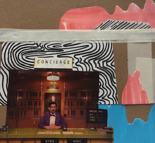
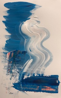
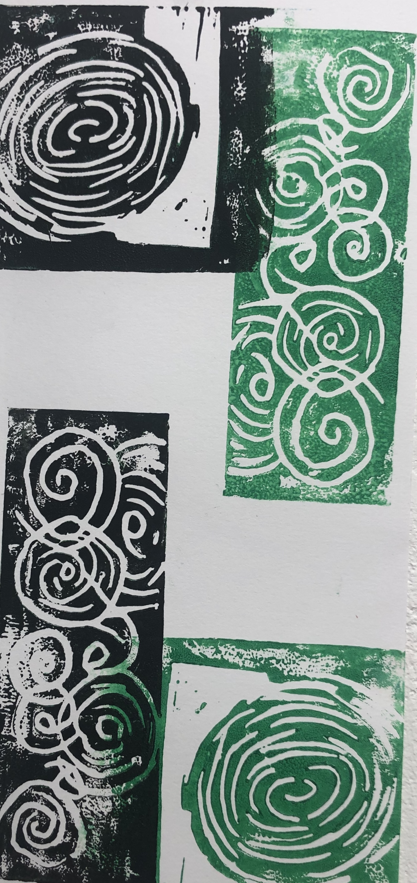
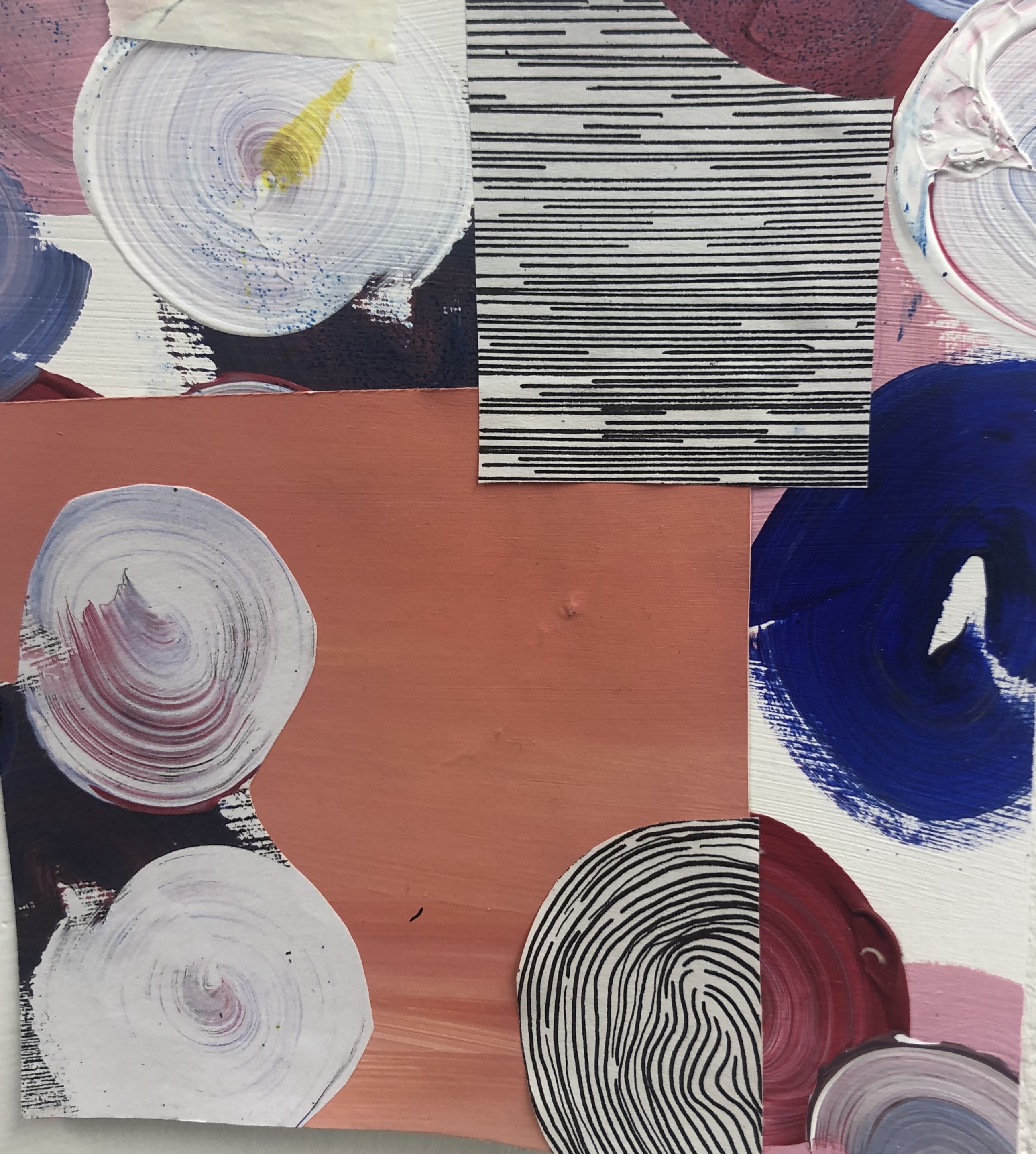
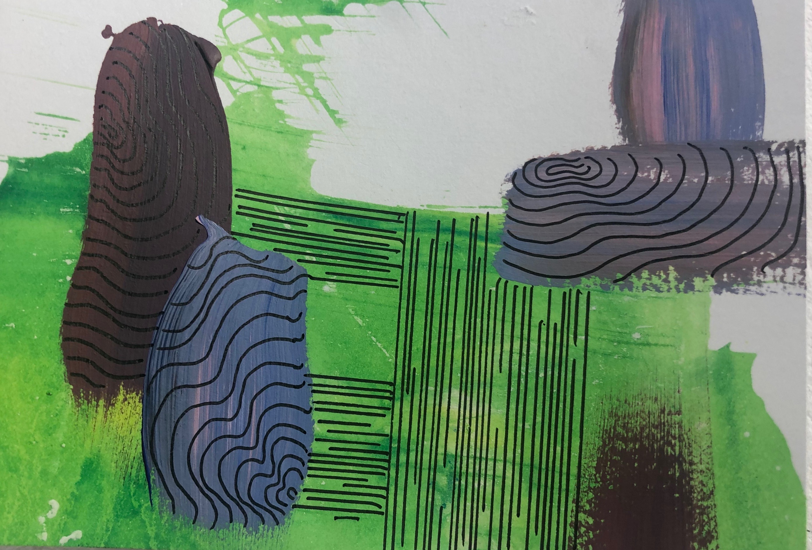
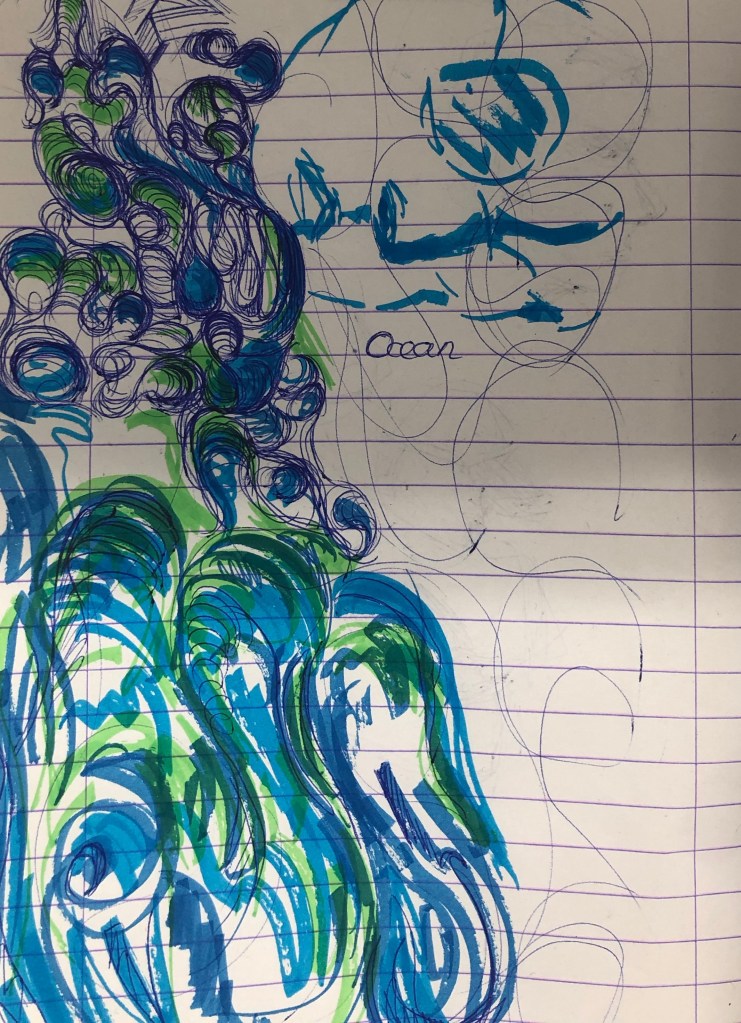
From our last project “The Day To Day” we had to take an image from the pieces we create and develop that piece into 2D practice. My precious piece was focus on waves, so I decided with repeating of patterns, mainly focusing on line work and trying to make to the viewer feel calm, looking at colour and image placement.
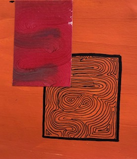
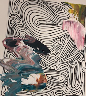
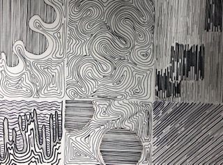
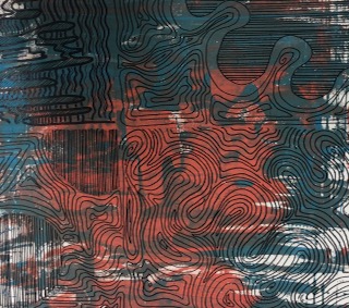
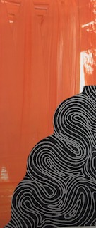
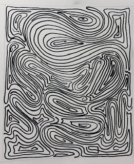
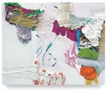
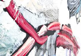
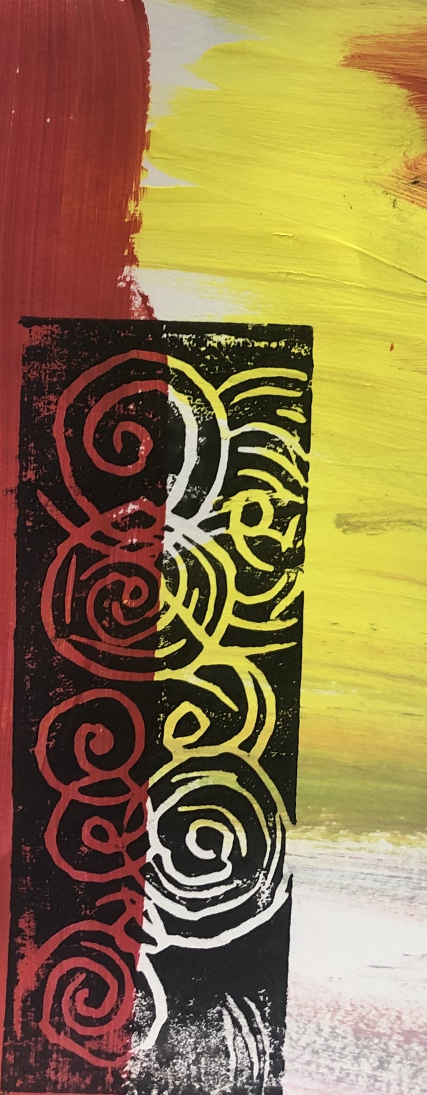
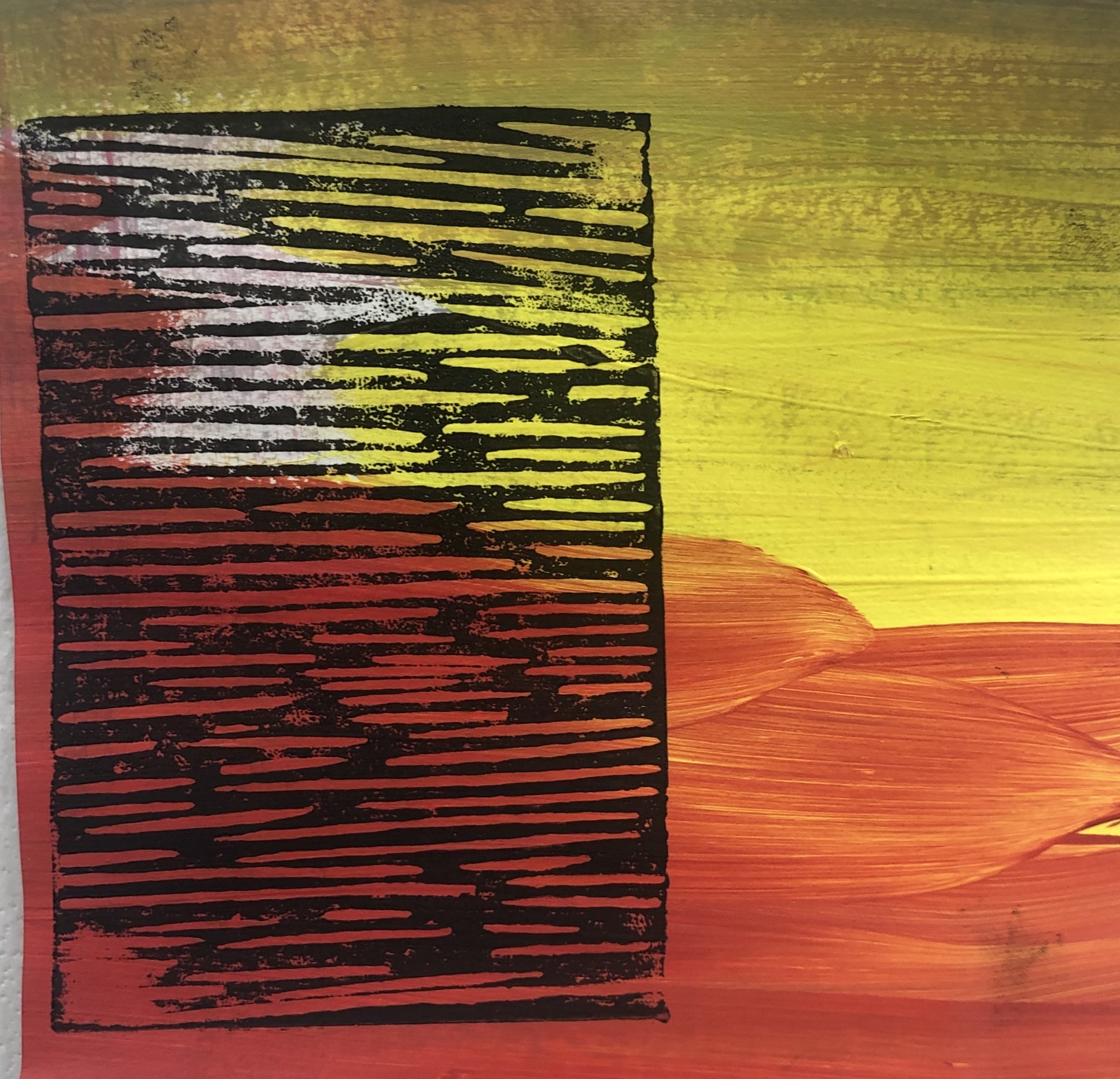
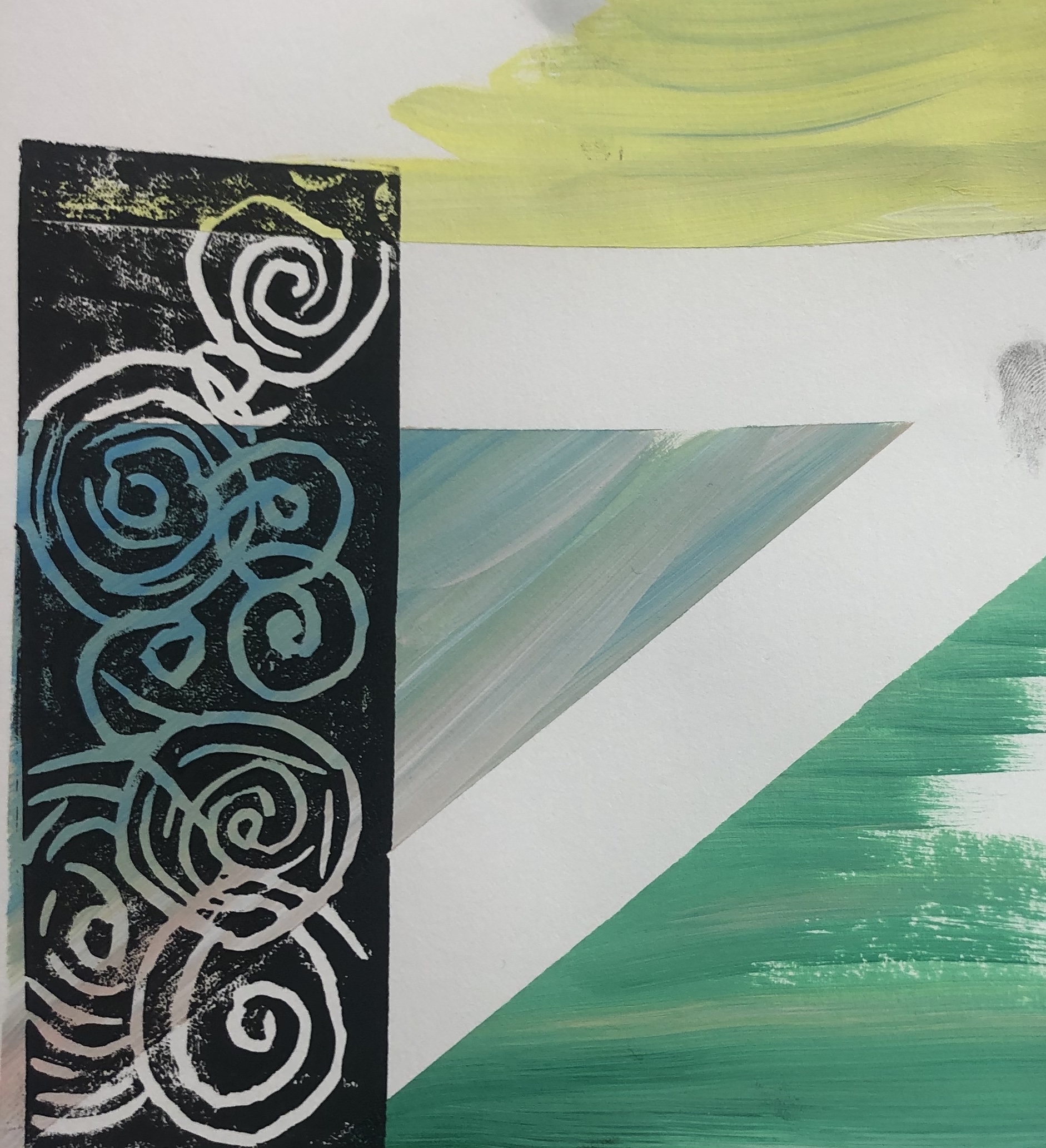
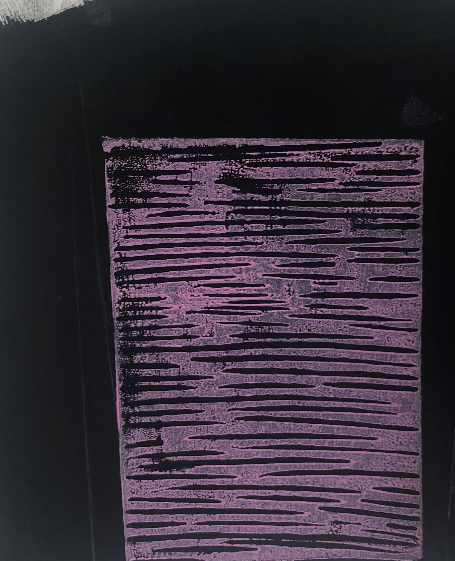
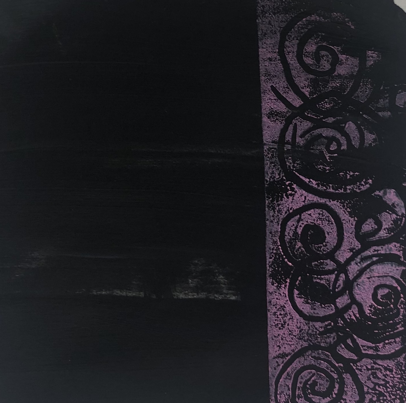
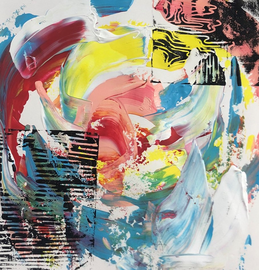
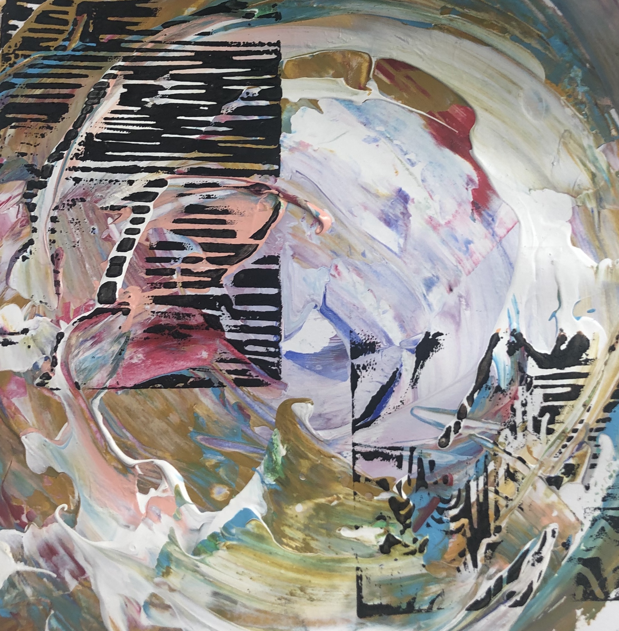
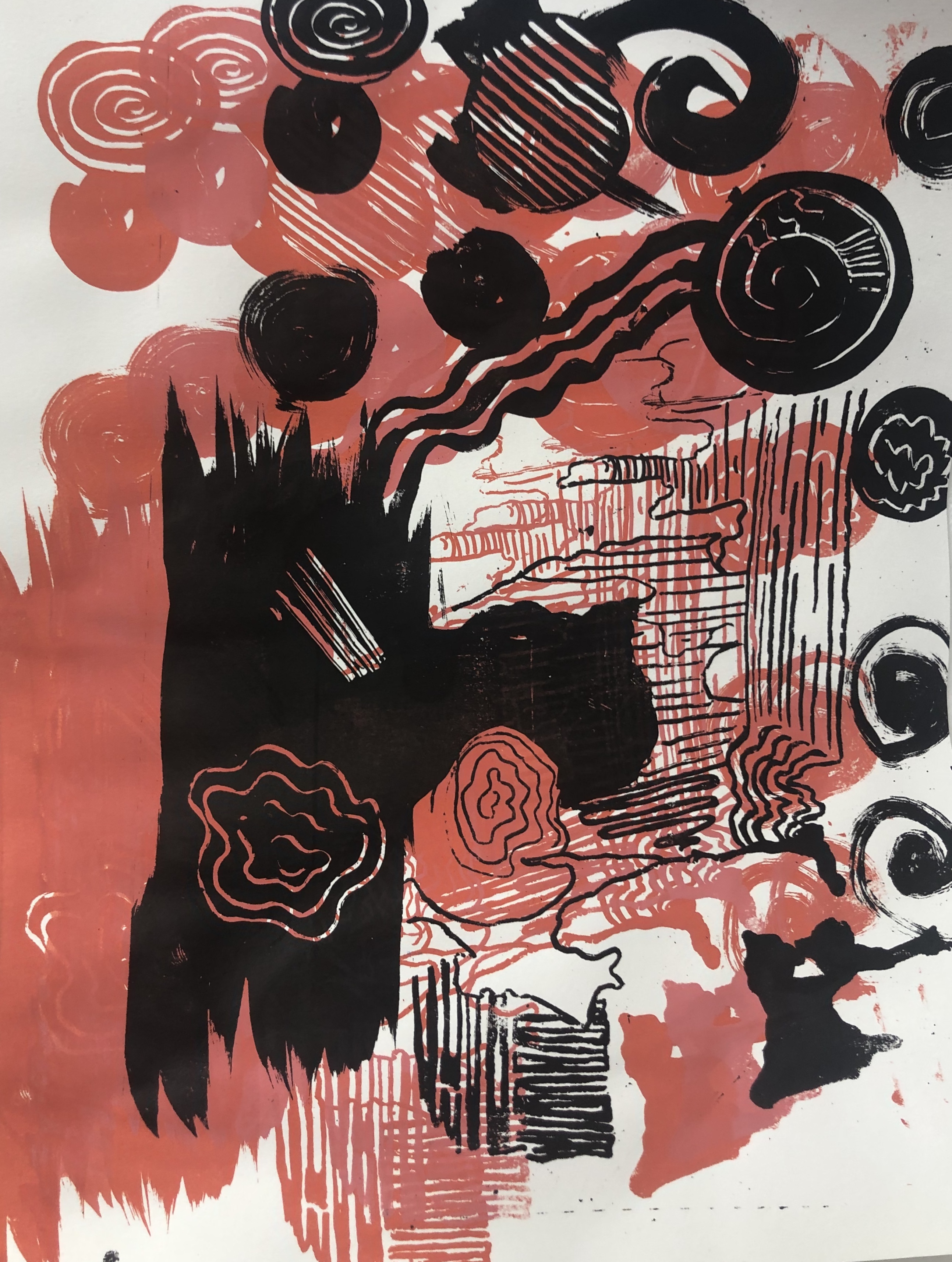
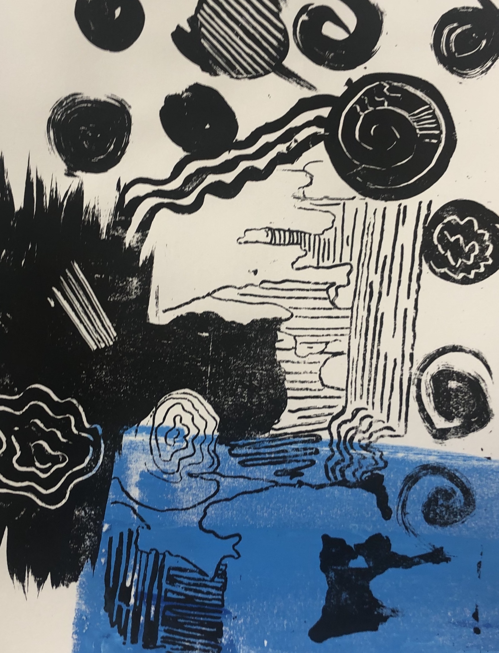
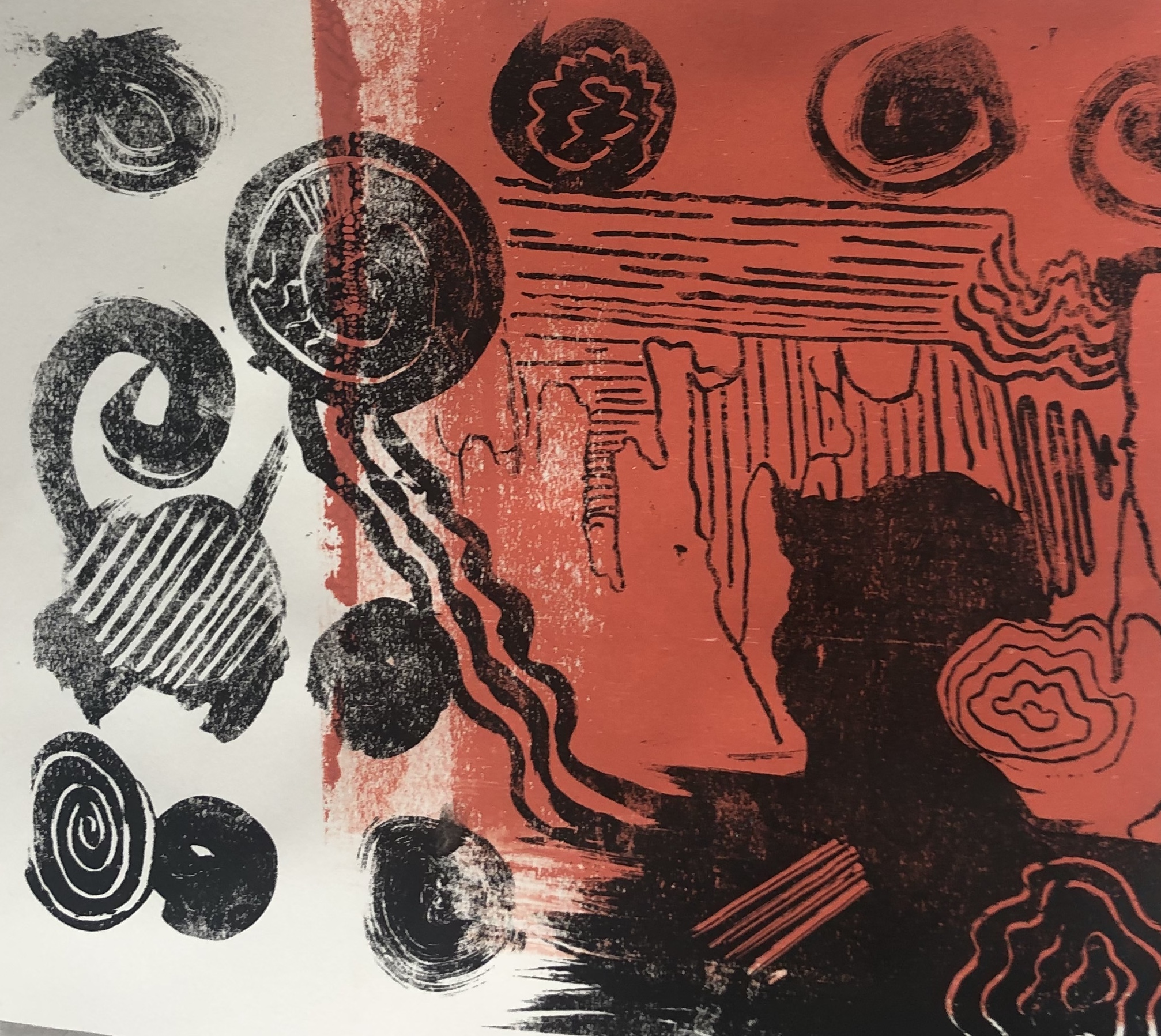
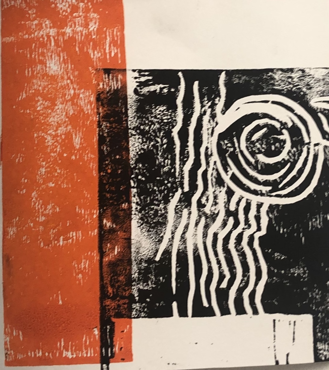
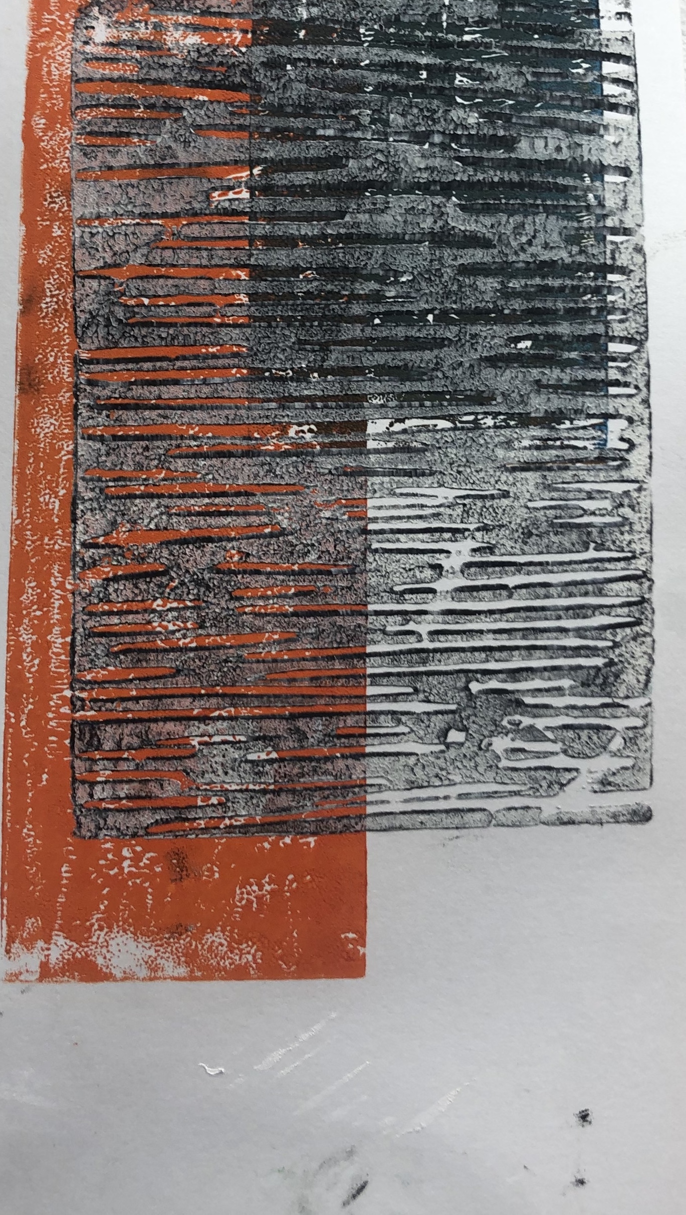
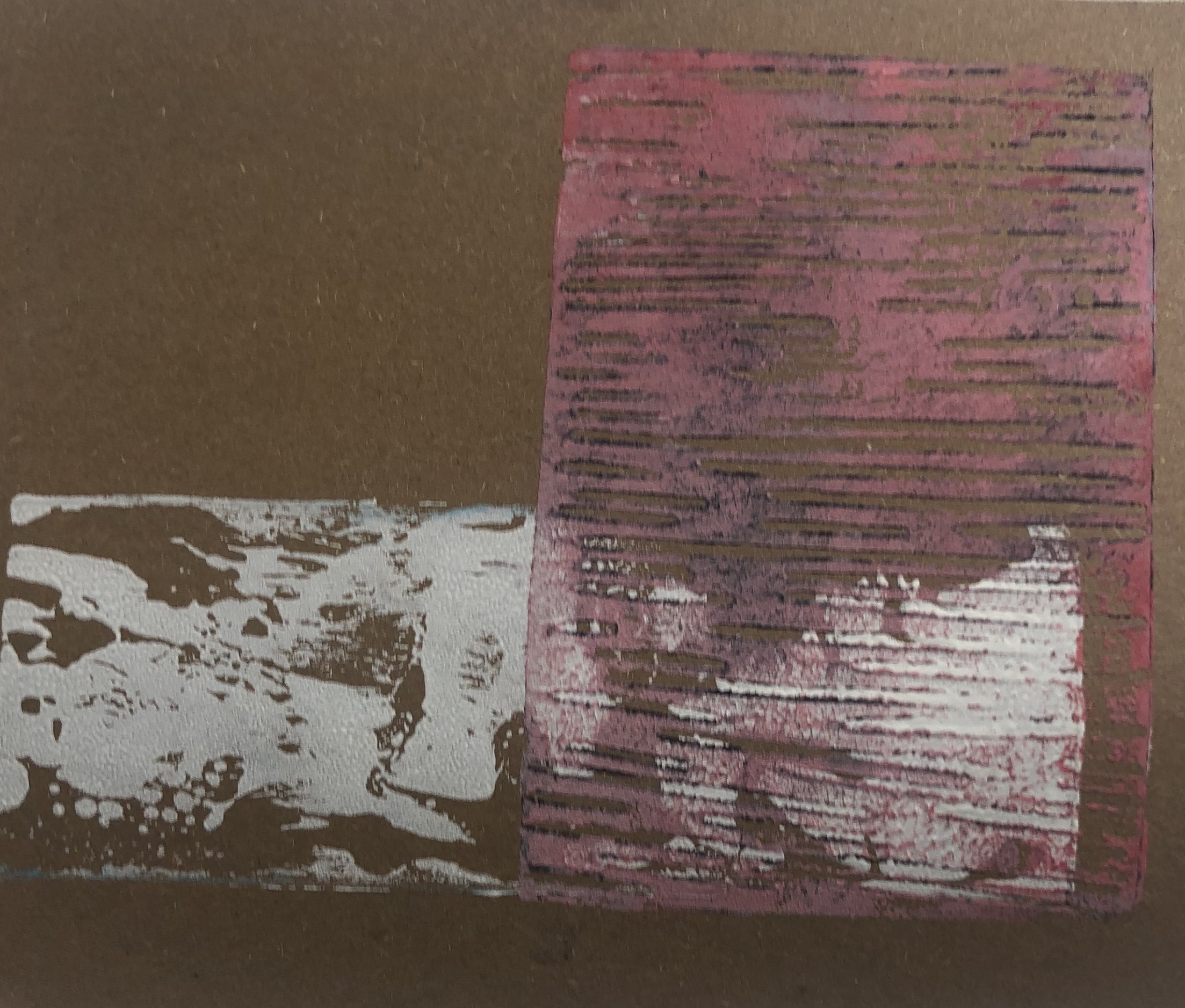
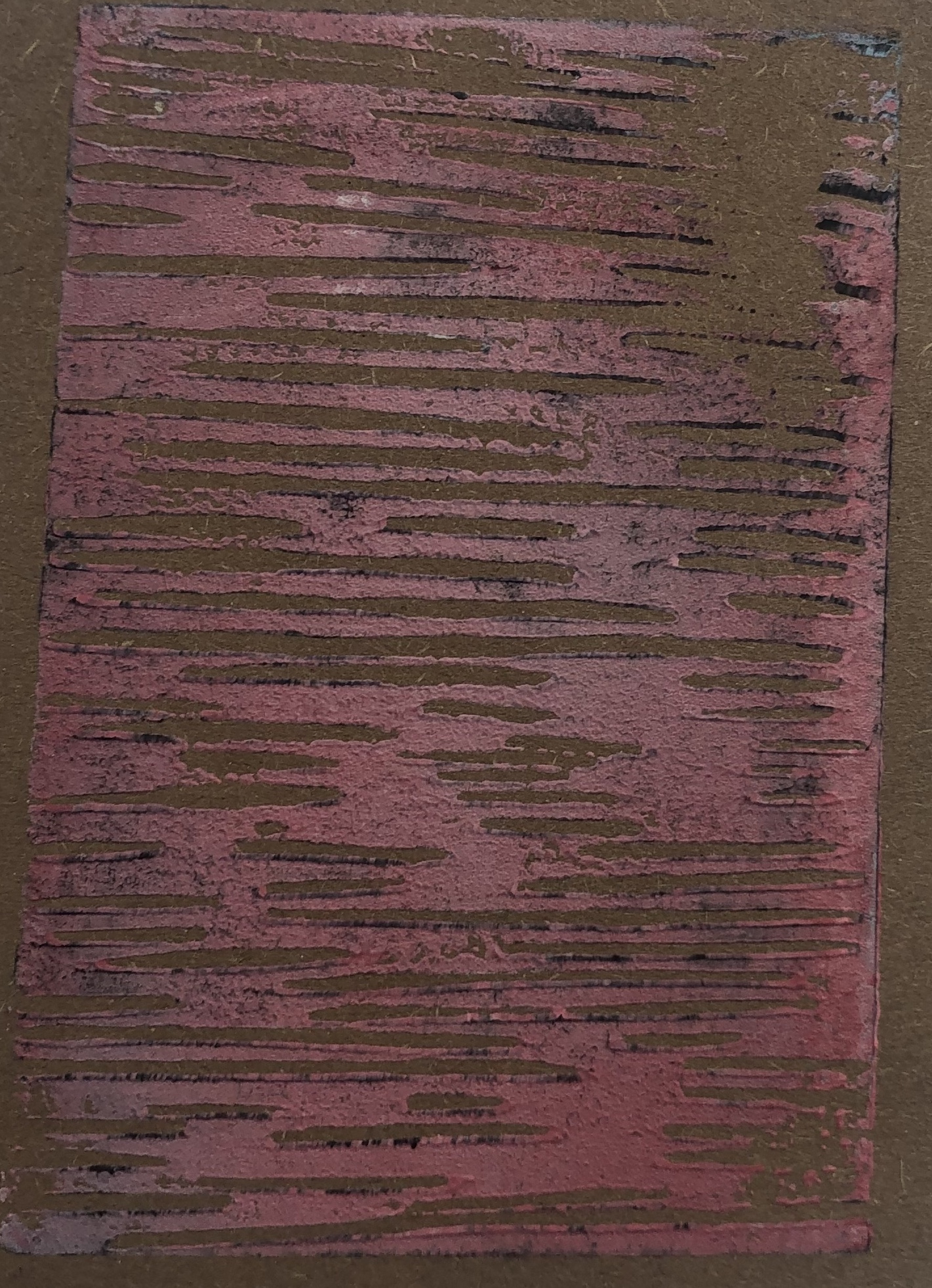
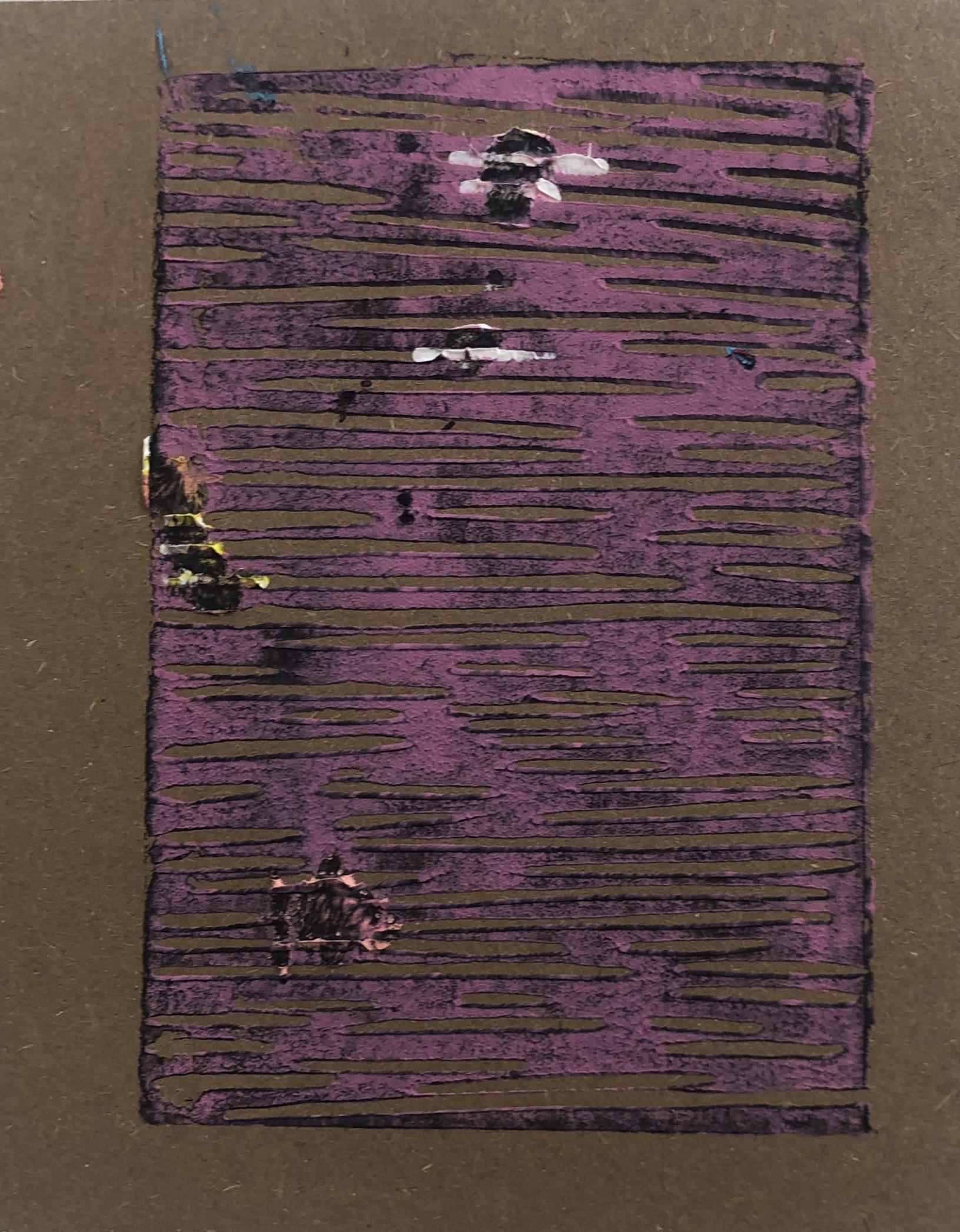
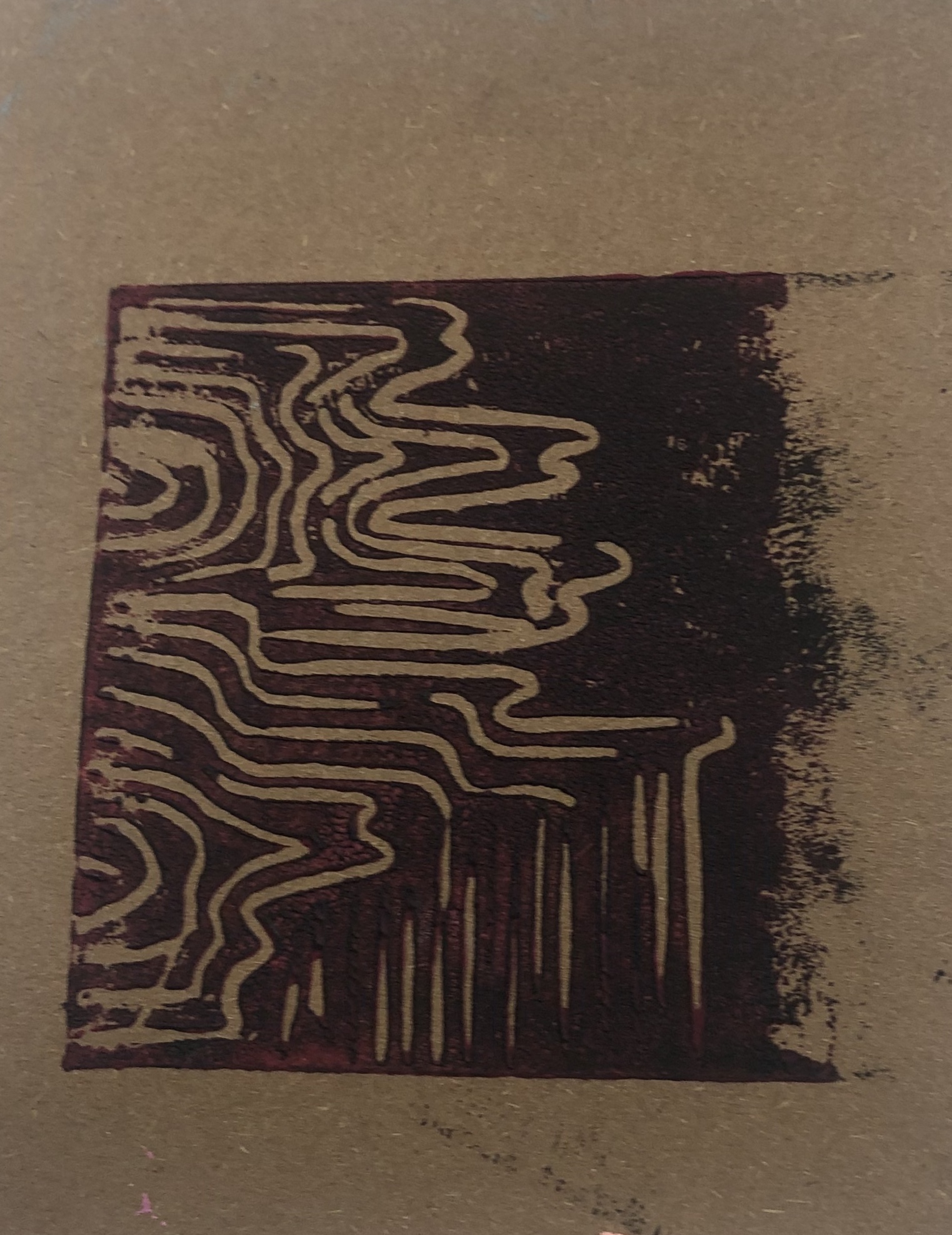
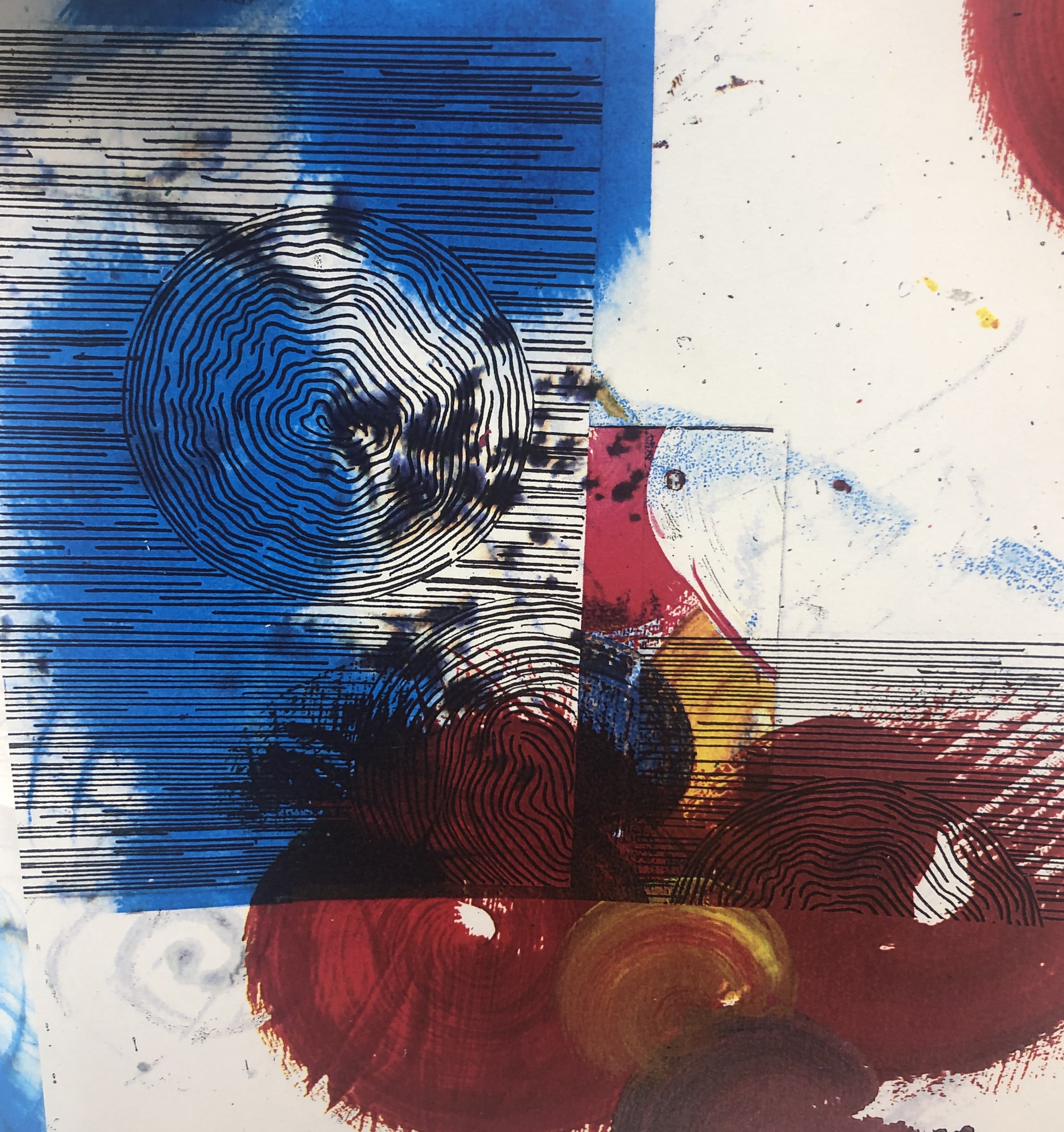
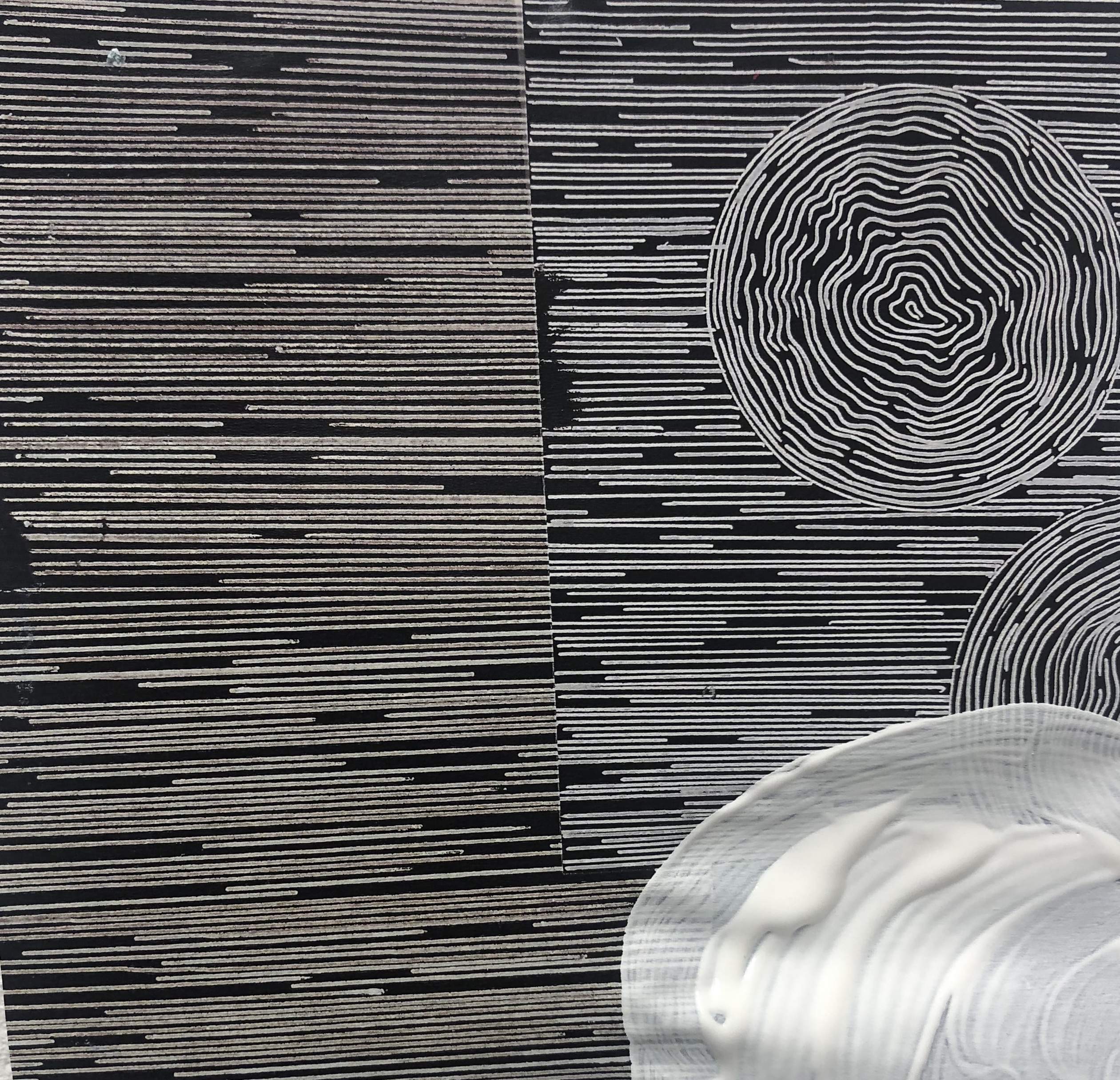
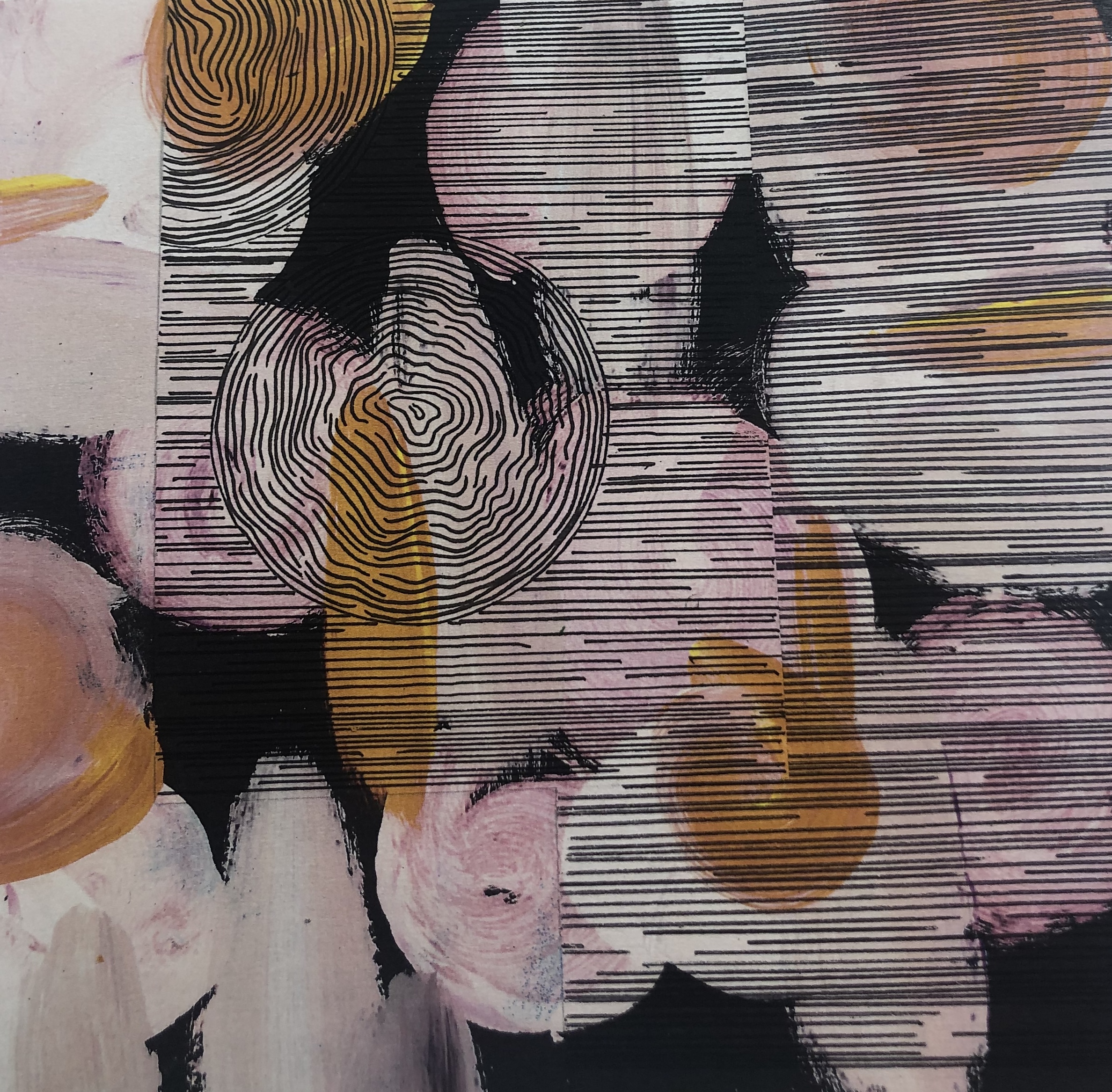
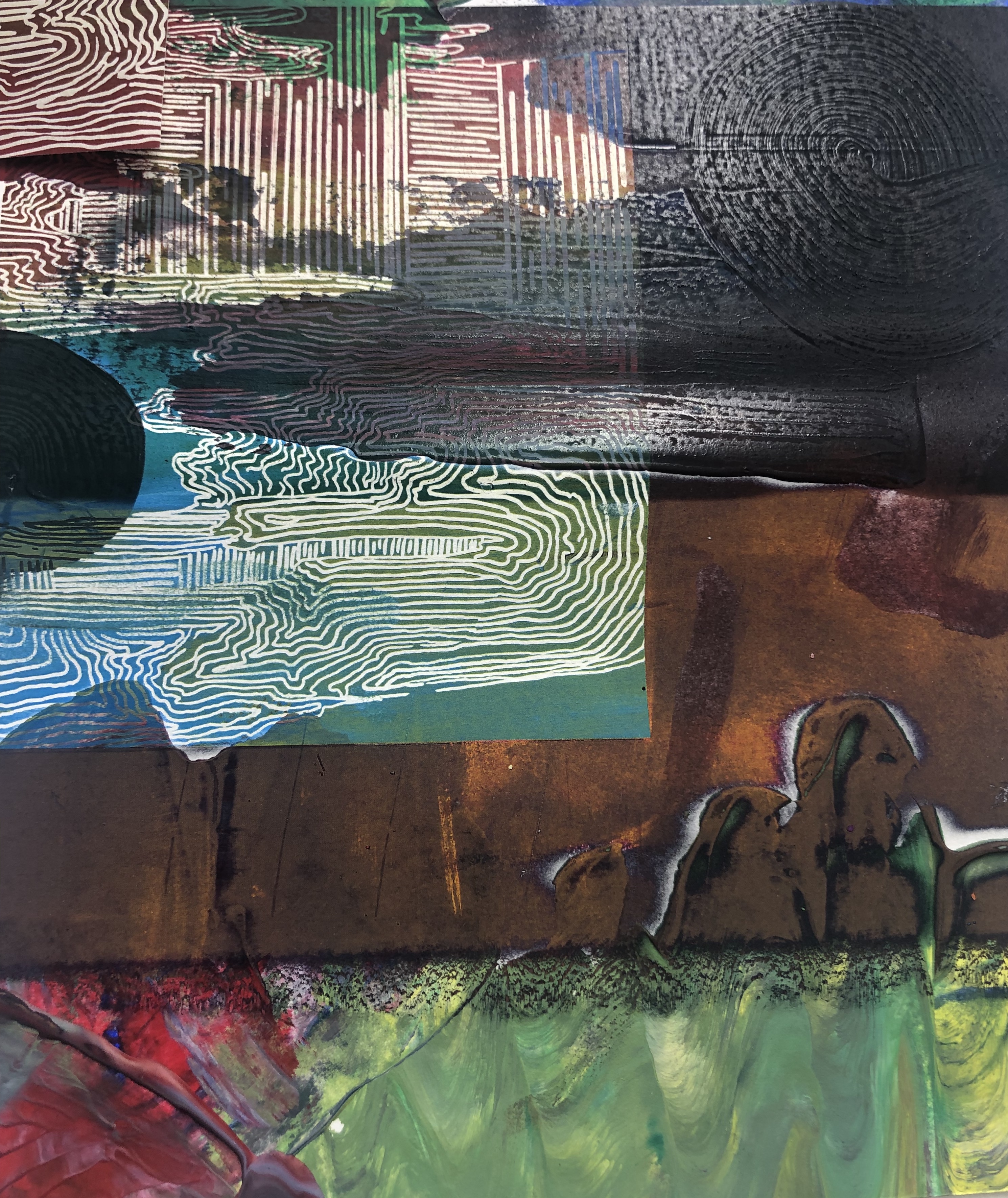
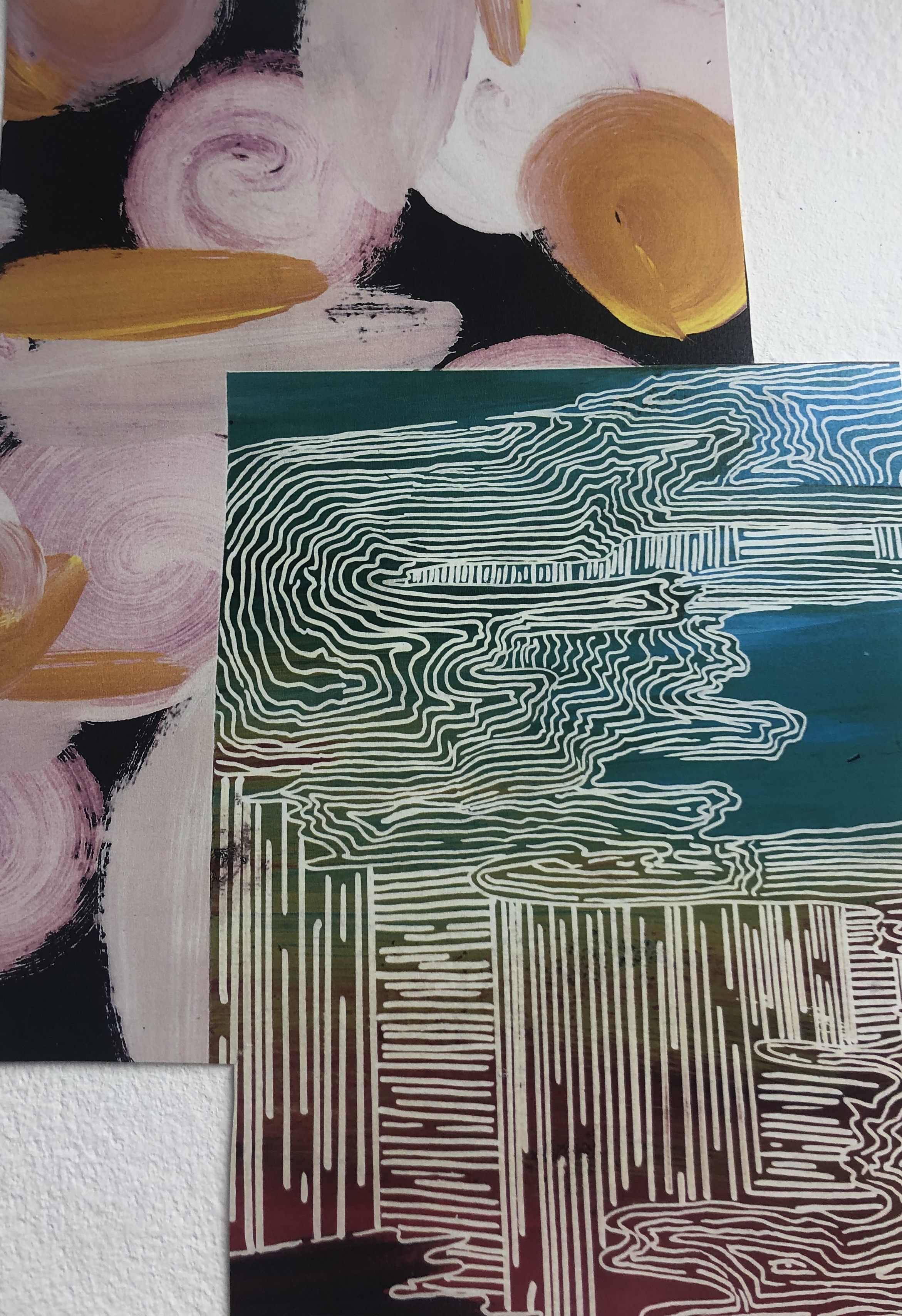
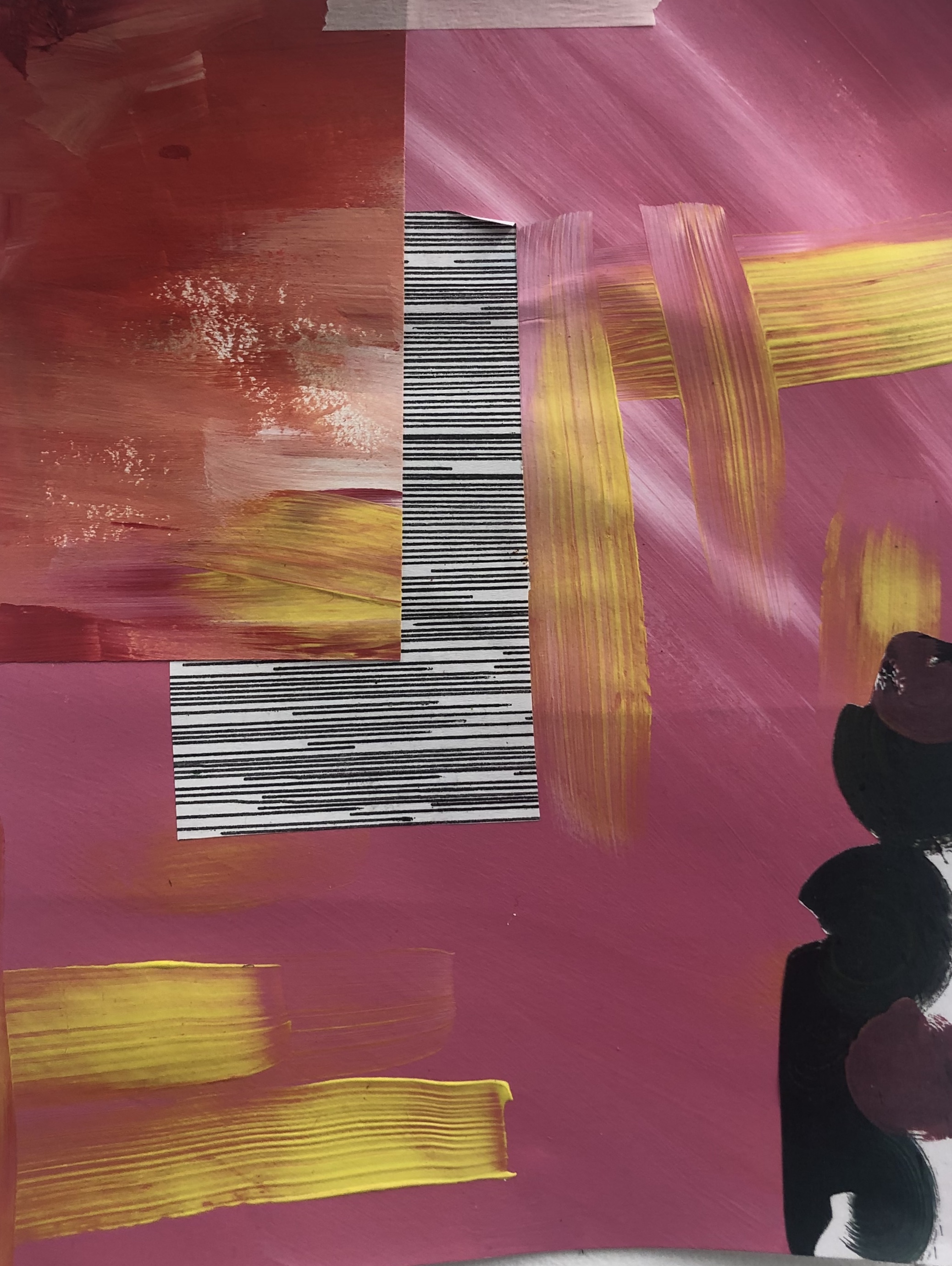
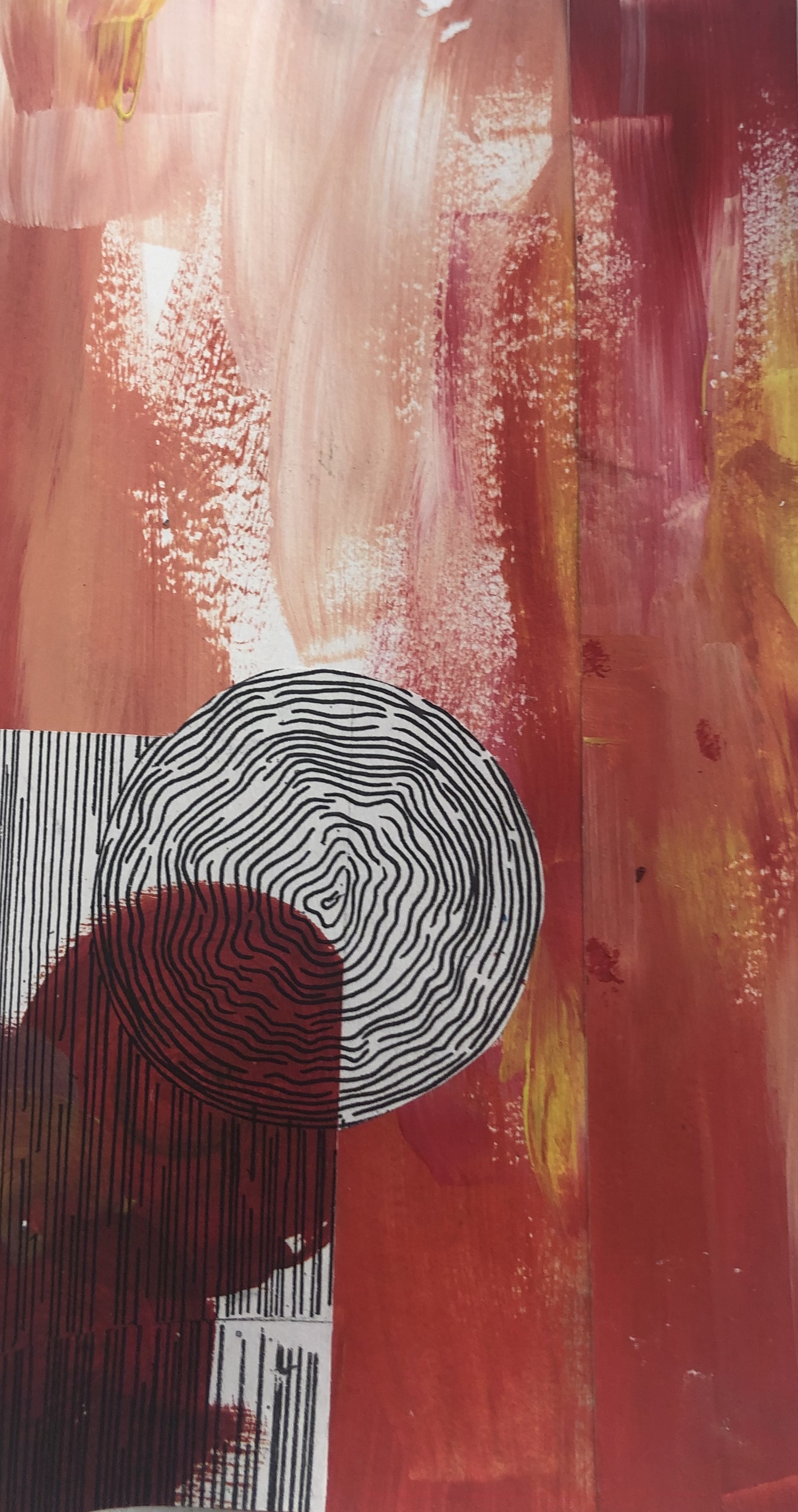
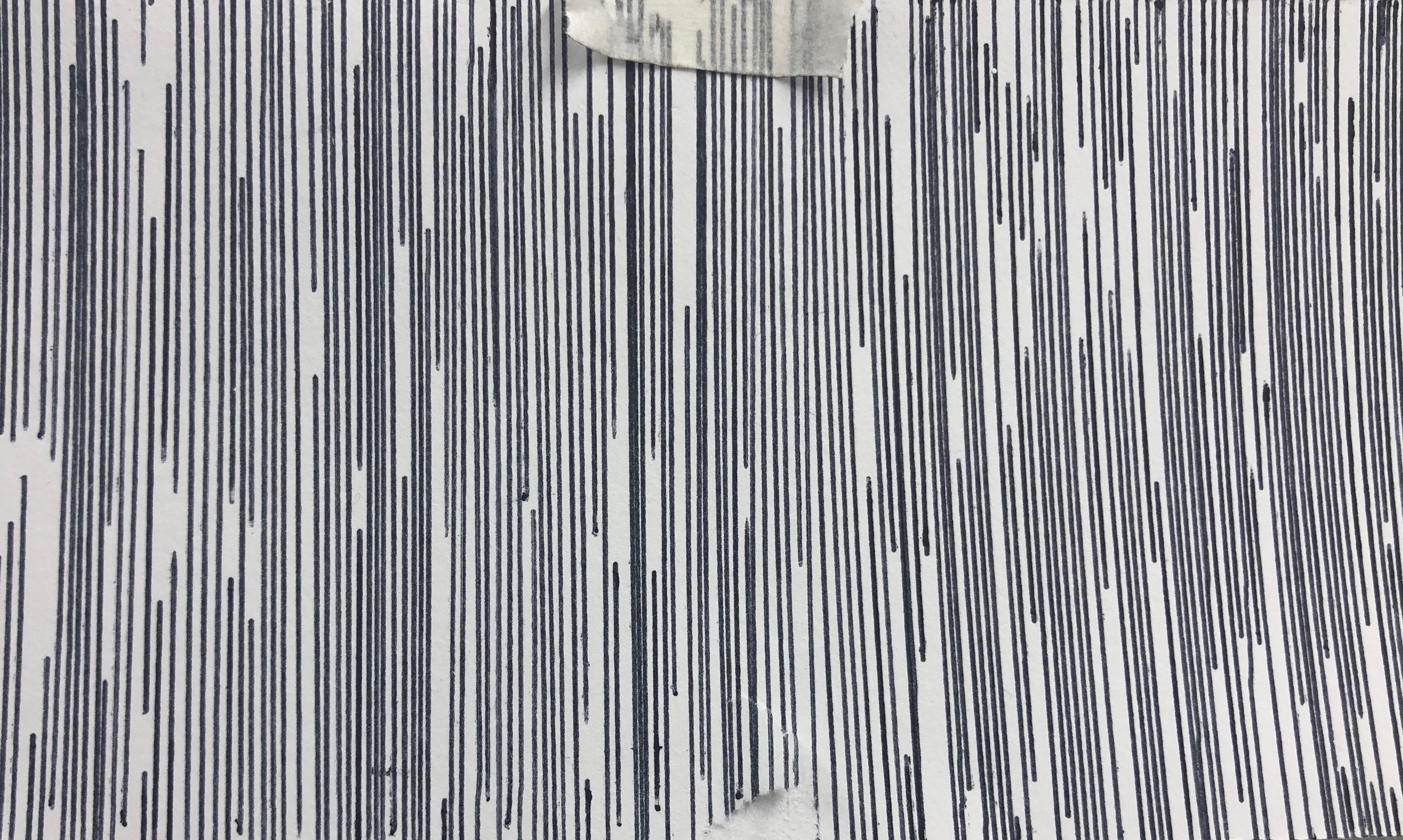
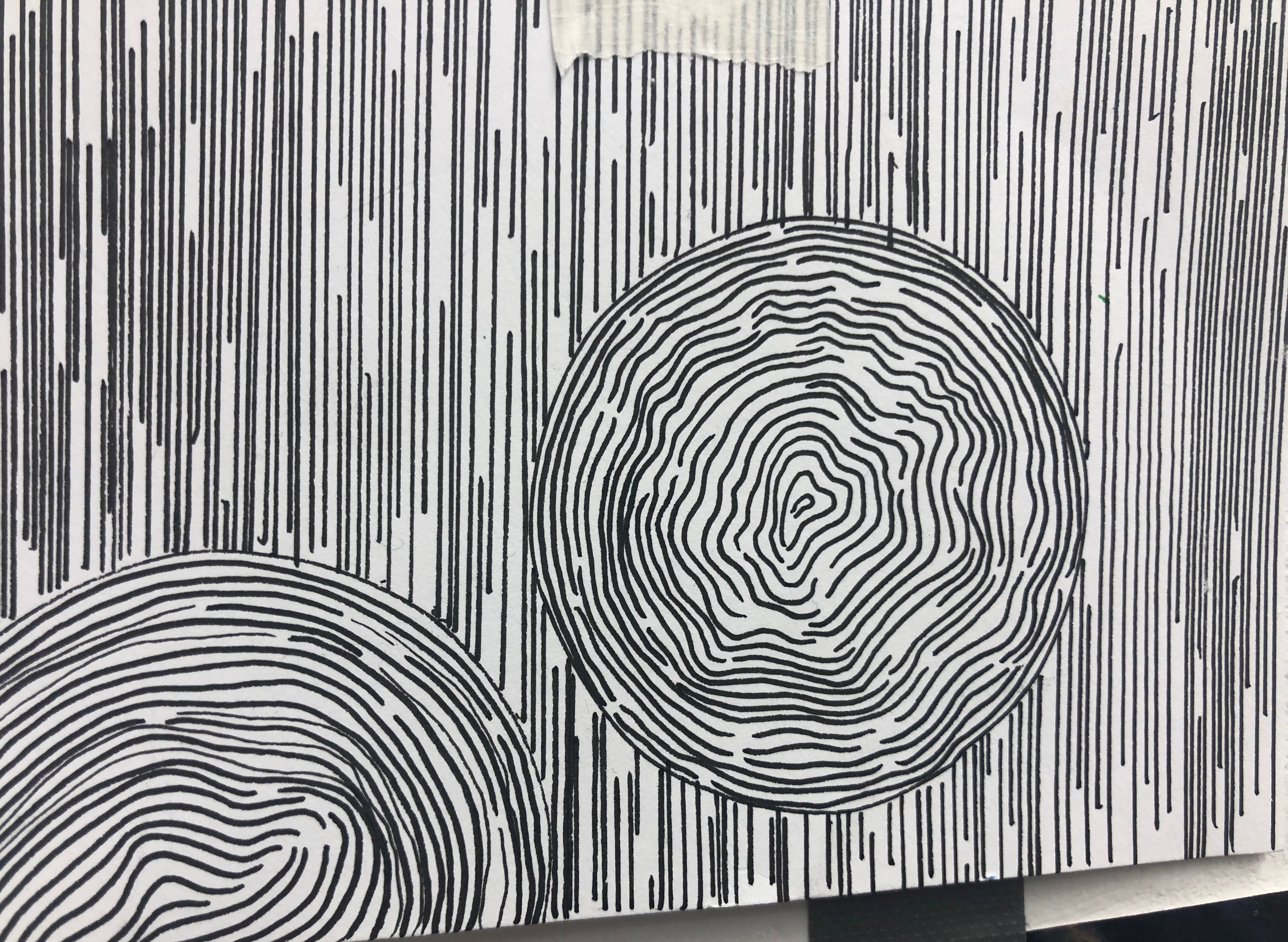
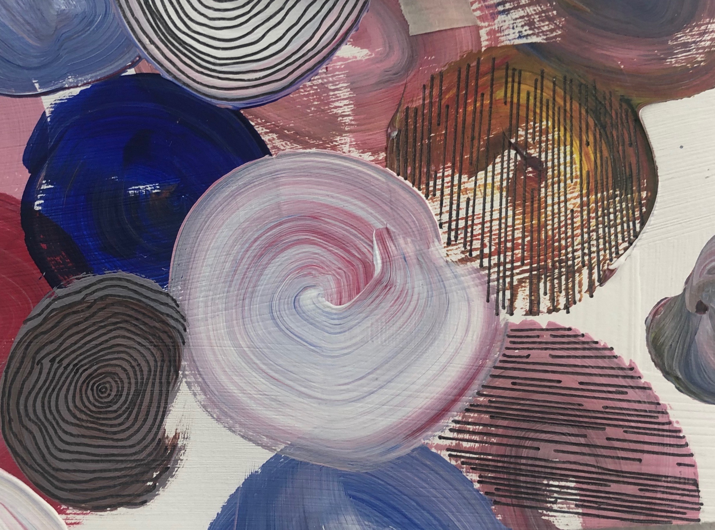
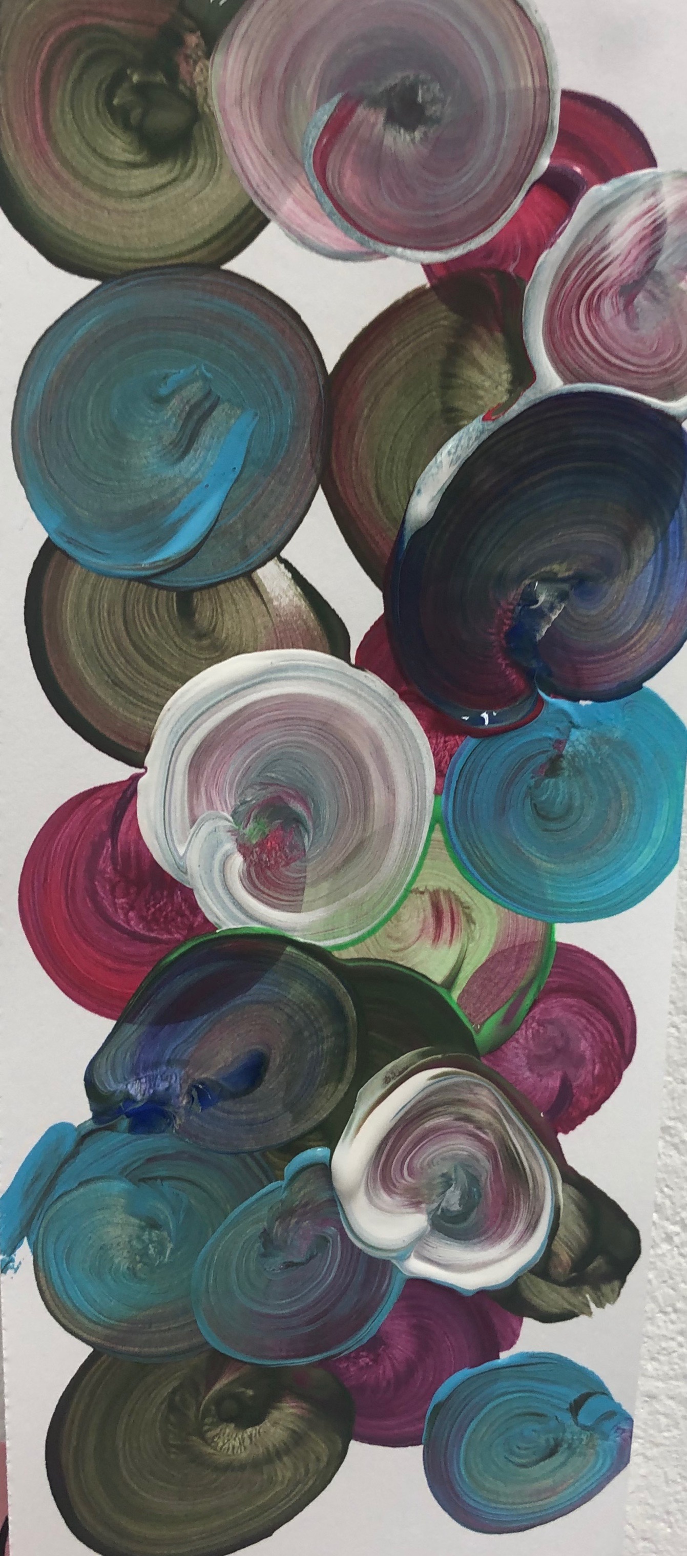
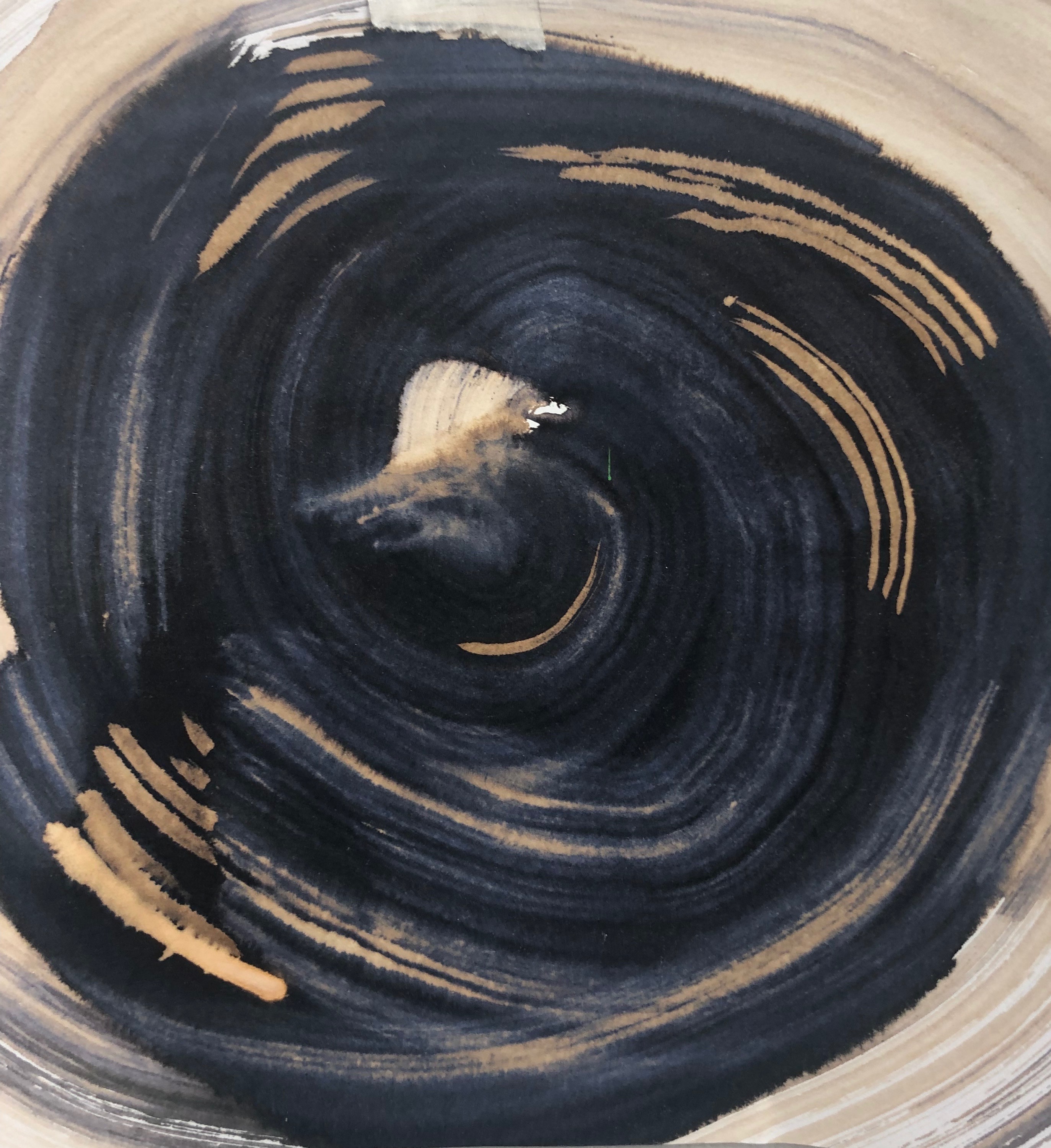
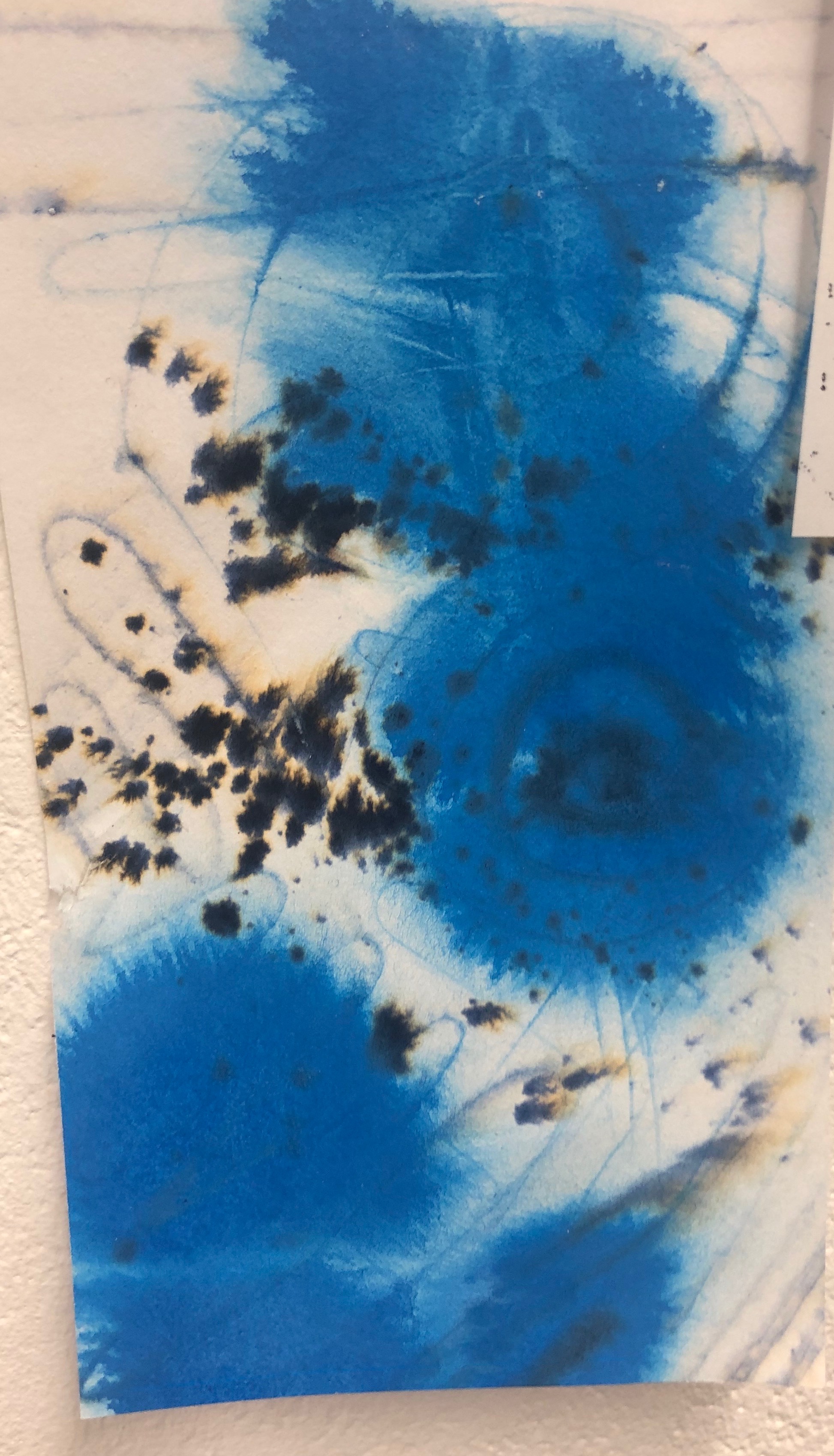
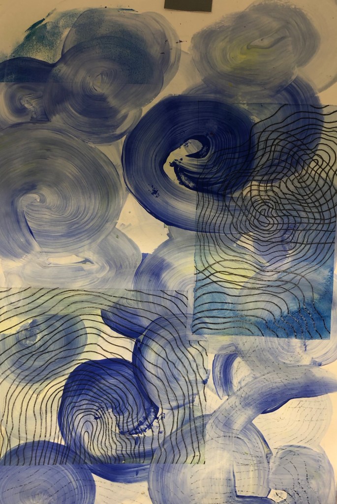
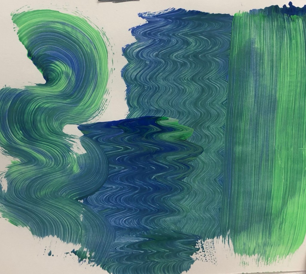
I started off with drawing a simple straight line drawing and repeating it, to which I find to be very effective as the small gaps in the patterns also make a patterns. I then went on to do another patterns with straight lines, but added a circle. I find the two patterns really nice and decided to base my mains patterns off these and how ca I create this patterns in different 2D media. I started off experimenting with acrylic paint, ink and bleach. I did like the effect the bleach had, however the colour of the ink and bleach, I didn’t feel went well with my work so decided to focus mainly on the acrylic and paint a large piece of just strikes in colours I feel was calming, that being; blues, green and yellow. With the acrylic paint, I started with making simple circle shapes, to get a lined texture and also random stokes to see what certain pressure might effect the outcome of the pattern being created. Even though I found the colours and the patterns made with acrylic were nice, it was boring. So, I decided to draw on top using maker pen and recreate the strain line patterns and a more wavy patterns, which was very successful and would like to use this more in the experimenting proses.
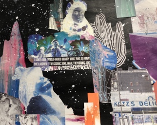
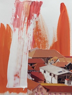
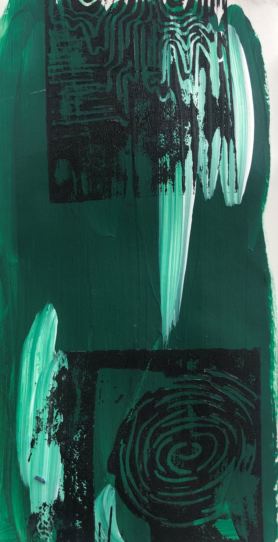
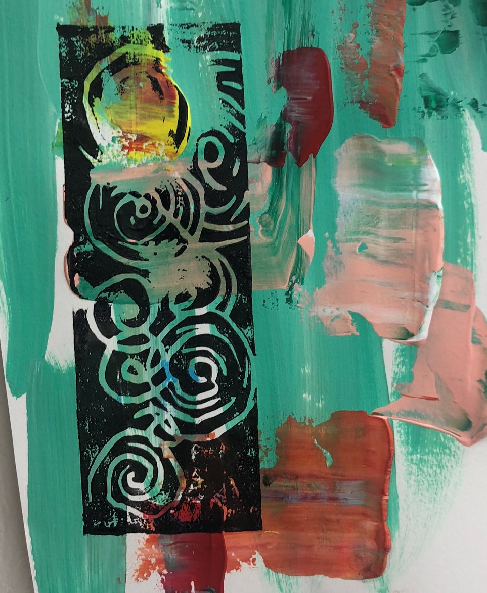
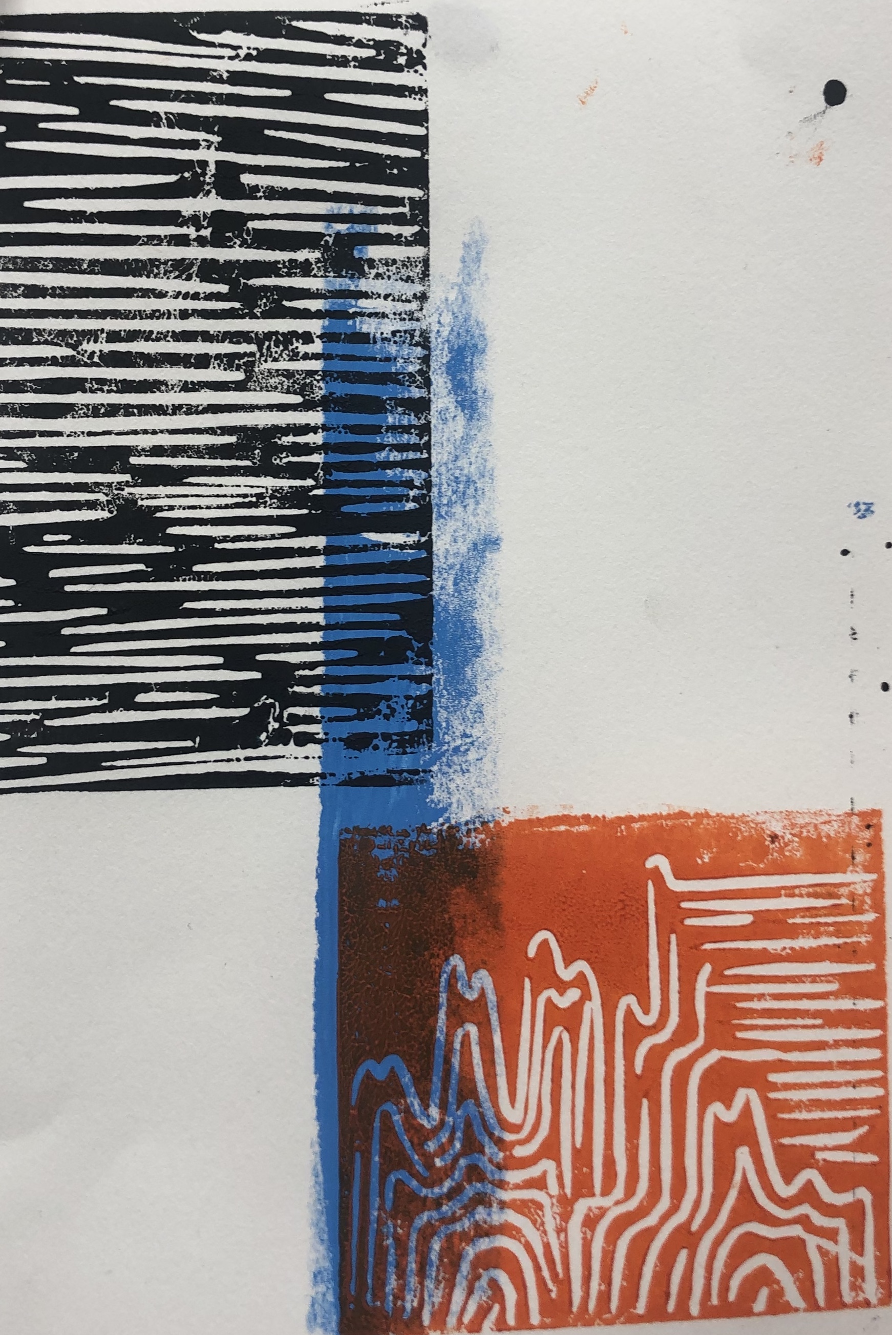
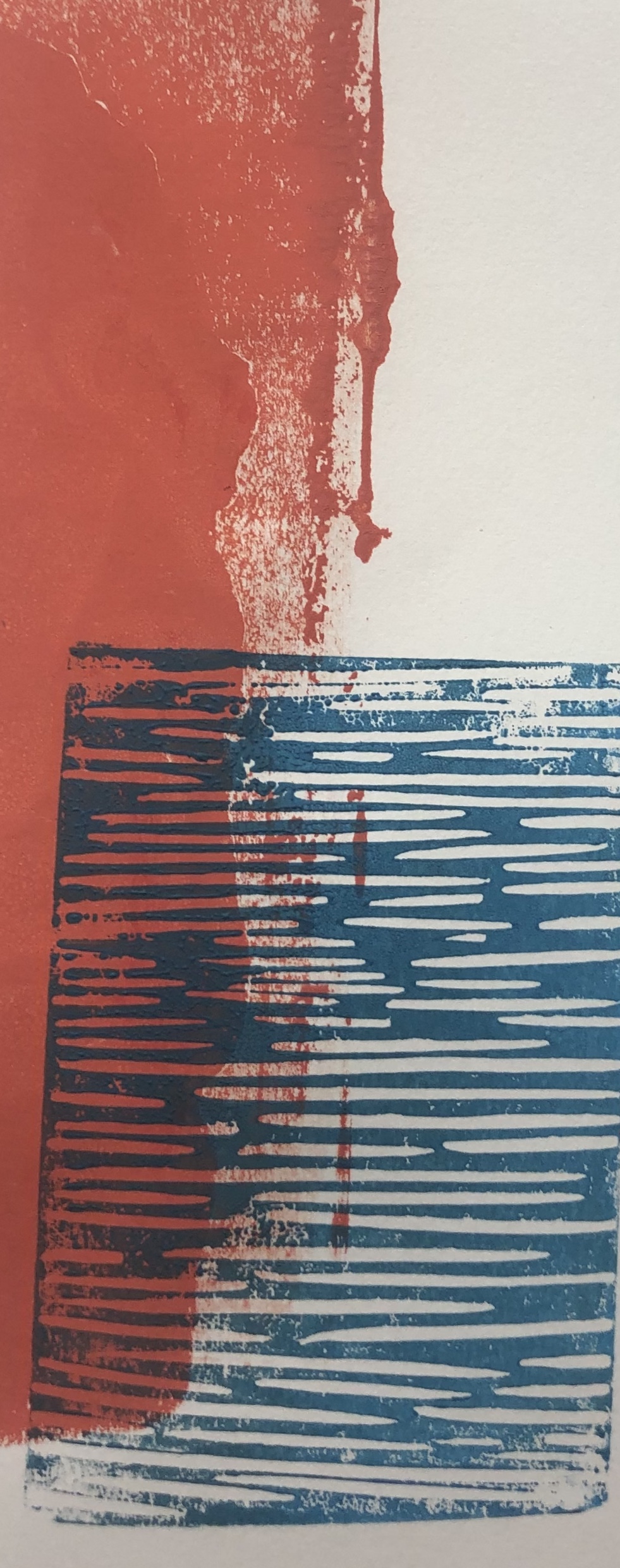
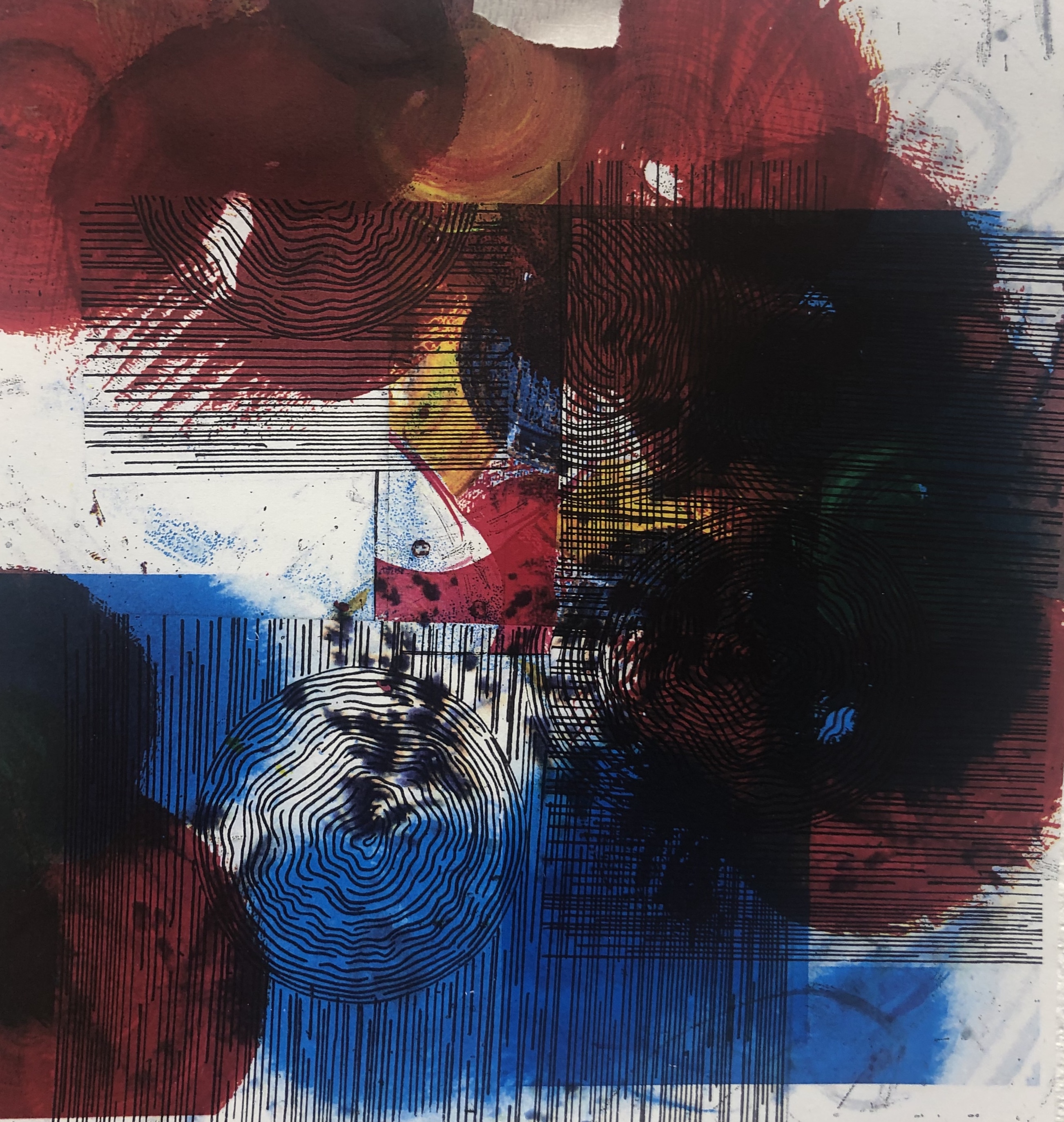
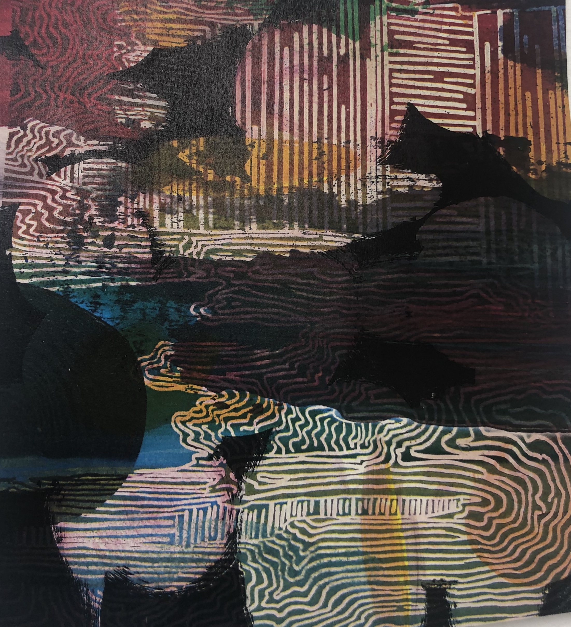
I don’t plan on abandoning the beach and ink pieces as they could be effective if printed in a negative colour or layered. The pieces that had been created were successful and my next objective is to experiment with layering through using the printer and collage.
DAY TO DAY PART 2

For the final brief of The Day Today I was away on holidays so I didn’t stick to the brief I instead wanted to see what would inspired me while on holiday. I noticed the loose patterns and shapes that the water created and I decided I wanted to explore more of that. I started of with some loose patterns and found the repeating circular lines really effective, so experimented with larger circular brush motions in acrylic, I like how the brush hair created lots of lines. I then went on to draw onto of the circle with a stick to create some sort of line drawing of the waves. I found this really effective and tried it out with different colours and layered it, however once doing that I found it quite messy. I then did multiple circles in blue tones and then with printer copied some lines onto it. I found this really effective and interesting as you can change the colour of the paint in the printer. I definitely would to use this in future pieces. I would like to do more layering with paint and with the printer. I feel this could become an interesting sculpture piece, if I was to use light, thin materials and maybe to try using sound? I really enjoyed doing this I feel I could really experiment more with the piece I have.


