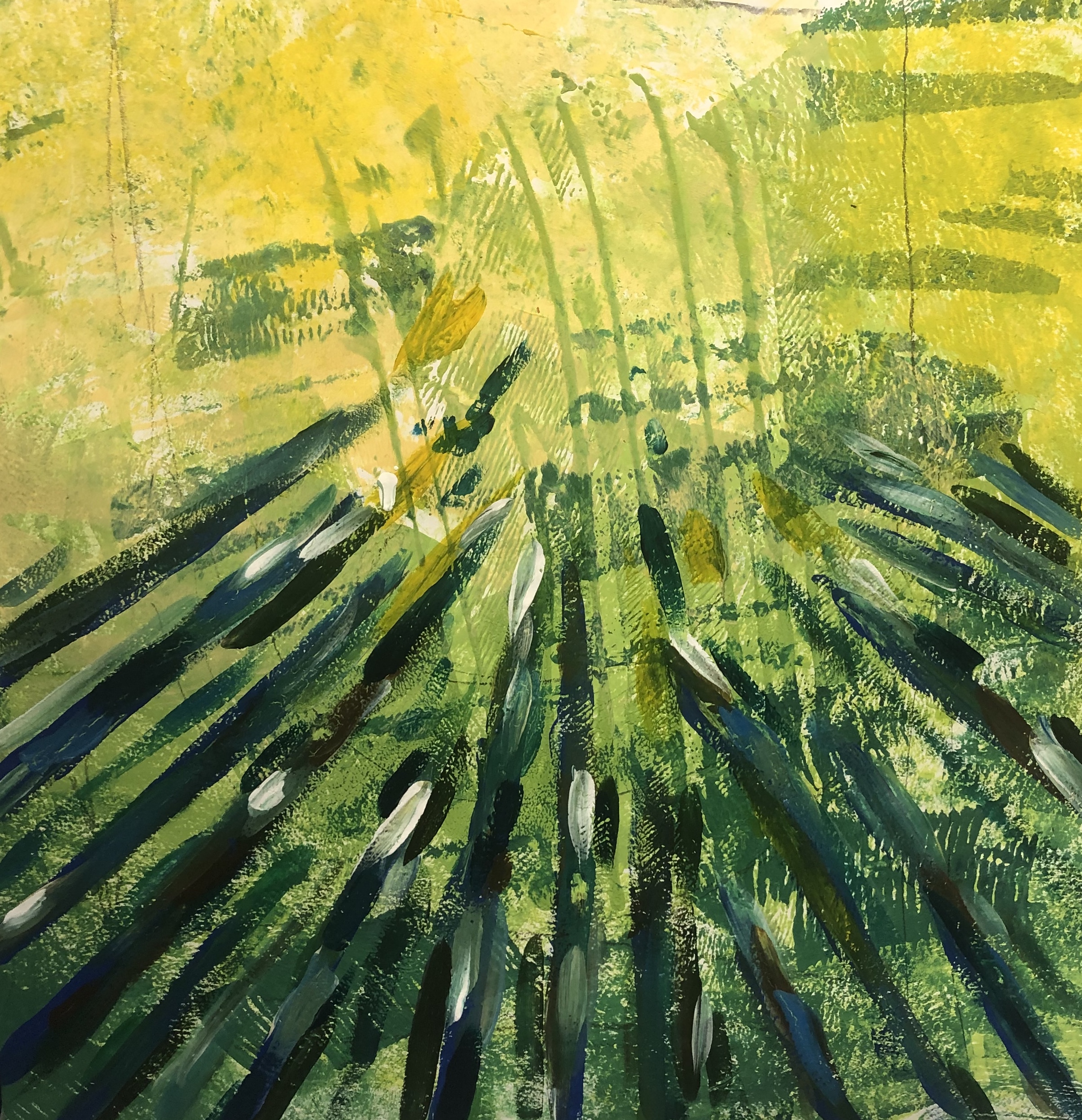
I gathered pictures of trees with sunlight shining through, as I feel it connects to the previous pieces I’ve done due to the lines created. I decided to use similar colours as the source pictures and wanted to recreate the pictures but in a abstract way as I feel it will help me to understand compositions and I wanted to experiment with negative space and understand it more.

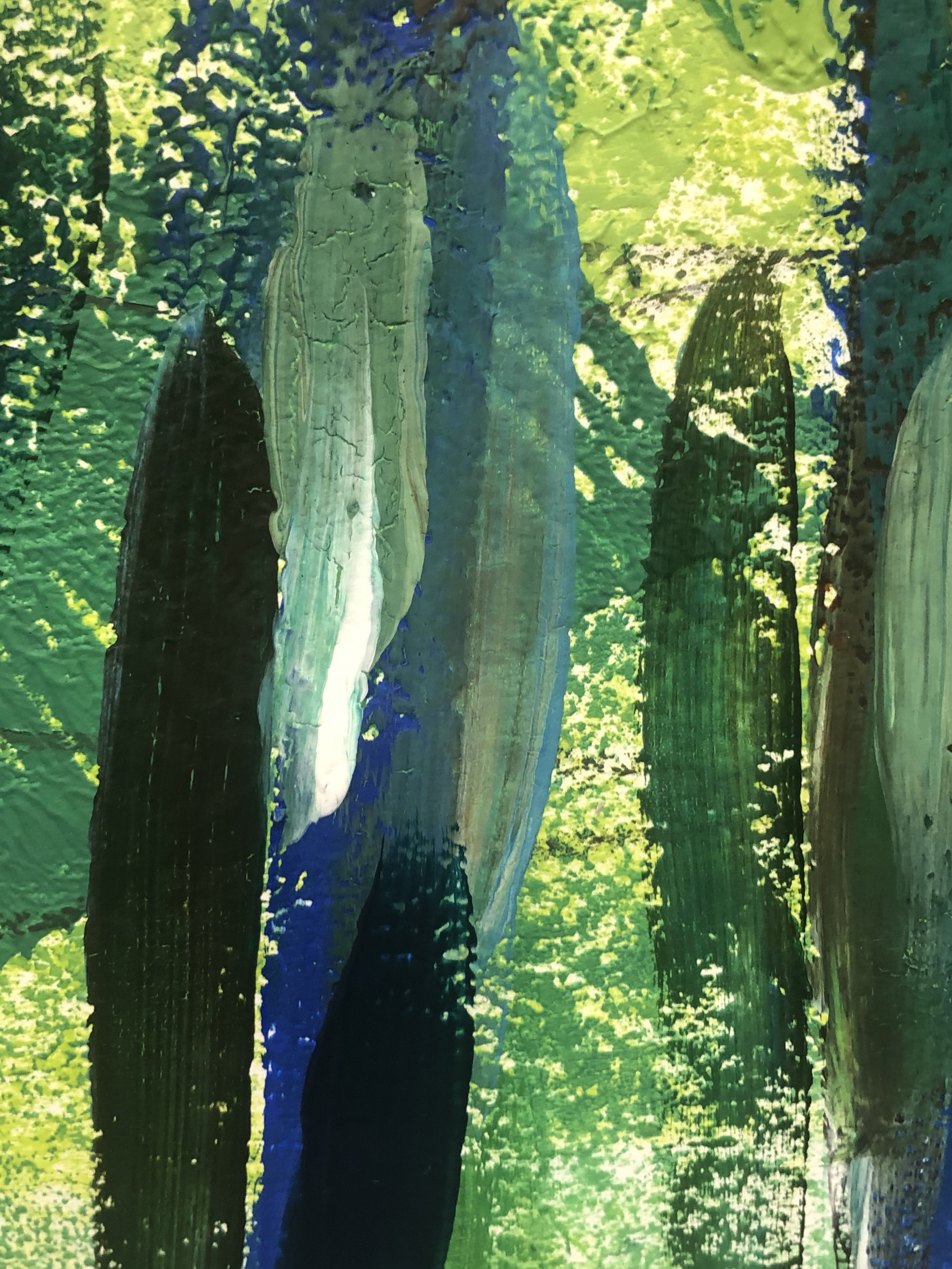
I wanted to recreate the source picture as I feel it will help with understanding contrasting colours due to the extreme light tones and dark tones. I originally wanted to just ave the lines in a dark blue, however I feel I made the piece too flat so I added a more range of colours and light tones against the darker tones to add more depth. With the strong constrast on the light and dark colours it makes the the piece less flat.
I was going to have the lines going all around the outer piece, but I wanted to see if the negative piece at the top works better. I do feel it was the right choice to leave the top open, but I plan on doing a piece with a more crowed surrounding and use opposite colours compared to this current piece.