Categories
Graded Unit

FUTURA2000 (LEONARD McGURR) 1955-present

Born in New York, McGurr started off doing illegal graffiti on subway trains in the early 1970s and by the 1980s, had work showed in the Fun Gallery, along side artists Jean-Michel Basquiat and Keith Harring. McGurr then went on to tour with the Clash and perform graffiti with then on stage. In 1985 he attended to first meeting for the graffiti and urban art movement and currently, now works as a successful graphic artist and gallery artists.

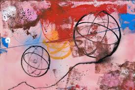
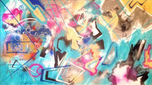
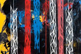
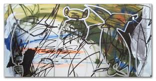
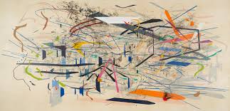
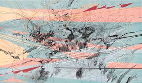
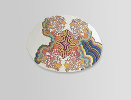
When looking at Futura’s work, I really like the colours and the combination of graffiti and abstract art that can be seen in his work. In a lot of his work, Futura uses contrasting colours when it comes to the foreground and background, which I personal really like and connects to my personal interests in art.

Categories
Graded Unit

JEAN-MICHEL BASQUIAT (1960-1988)

Born and based in New York, Jean-Michel Basquiat was from Haiti and Puerto Rican decent. Basquiat started off doing graffiti on the streets of New York under the name SAMO, and then decided to go with his real name Jean-Michel Basquiat and quickly grew to fame in to 1980s.

Since reading the book ‘Widow Basquiat” by Jennifer Clement, I’ve been very inspired by the work at Jean Michael Basquiat. In his work, I like the use of layering in colours and the variety of colours being used. I find his artwork to be some sort of collage piece. In the book ‘Widow Basquiat”, it said that a lot of time Jean-Michel would copy quotes from cartoons to cereal boxes and paint the quotations into his artwork. I would like to try this with my own work as I feel it connects well with my project as I’m surrounded by those quotations every day at the moment. As my work id very childlike, I feel Basquiat is a good influence to look at.

Categories
MajorProject1

JULIE MEHRETU

Her word is inspired by the layers of New York City, the underground and the towers throughout the city.

I really like the colours that Mehretu uses in her work and the lines she creates. Also how her work layered and only after looking at her work do you notice the details in each layer.

Categories
MajorProject1

M.J 1 – PRT 11

I’ve been experimenting a lot with more soft and pastel colours. I wanted to try more colours that I wouldn’t personally go for, so I decided to try neon. By mixing printing inks, I created a green/yellow neon colour that I mono printed as a base for compositional pieces. When doing the pieces focusing on good and bad compositions, I did a lot of sharp, thick brushstrokes, which I liked, however I wanted to try more delicate curvier lines. I used the golden ratio rule for the first piece and then used the rabatement of rectangle rule for the second, to practice at using negative space. I started off with just using black, as it would be effective against the bright neon, however I felt the black was too dark and heavy, so I decided to add purple to add depth and balance the black. For the second piece, I decided to add blue to see if the brightness of the blue against the purple and black could work. I feel it didn’t work due to the contrasting colours, but I did like the composition.

Categories
MajorProject1

M.J1-ARTISTS, COLOUR/COMPOSITION

I’ve been researching a lot on artists that use colour and compositions as a main in their work. The artist that has mainly influence me is Jules Olitski, and his skill in using colour, also Morris Louis, and his ability to manipulate paint and composition.

JULES OLITSKI – Born in 1922, Olitski was an American painter, printmaker and sculptor. Olitski focuses colour and how the surface can change the process of the colour. I really like the vibrant colours being used and the shapes also.

MORRIS LOUIS – Born in 1912. In the 1950s Louis became one of the earliest exponents of Colour Field. Louis spent a lot of I’m time in Baltimore and Washington D.C. I like how be moves the canvas to manipulate the paint, and the lines that are created in the process.

FRANK STELLA – Born 1936, Stella focuses on geometric lines and vibrant colours. I like the compositions that Stella uses and how he can make it look illusion like. Also the use of lines and how some lines can create a new direction.

Categories
MajorProject1

M.J 1 – PRT 2

Since the start of the major project, I’ve been researching dreams and daydreaming. The stages that you dream, and the biology behind daydreaming.However, I haven’t produced any art work, so I decided to make several pieces that I feel represent dreaming. I experimented with watercolour, ink and pens. I really liked the outcome of my art work, and I think it will turn out well, when I combine it with science research to do with dreams. I do feel, however that my piece were looking flat, so I decided to add acrylic paint with a palette knife, which added to the outcome.

Categories
MajorProject1

M.P1 – PRT 1

For our new project we have eight weeks to develop and produce work that goes along with a theme of our choice or we can choose a theme from a list of themes that the lecturers have provided.

To start, I did around four mind maps with ideas and then quickly made a responses to the ideas that I felt I could develop more. As my main focus was to produce work, I took the easiest media to produce said art. I painted a surface with acrylic paint, and collage pictures from the internment and arranged them in a composition I felt was effective. I do like the pieces I made, however I feel that the themes may turn out to be a dead end or that I might go in a similar direction of my 2D project.

The three main ideas I would like to look further into is the idea of Dreams and psychology and if you can manipulate them?, the idea of maps, and the places I have lived in, and tying that in with my childhood, and the last idea I would like the research is the different opinions on religion and the Queen between my generations and the older generation ( people born in 1930). I plan on researching the ideas thoroughly and making responses to them.

Categories
conceptual

CONCEPTUAL-PRT4

Cildo Meireles is a Brazilian conceptual artist. He is known for his installations, many of which express resistance to political oppression of Brazil. His works are often dense and large, to encourage a phenome logical experience through the viewers interaction.

This has to be my favourite piece of art currently. I feel the sound aspect of the sculpture really makes the piece more immersive. Each radio was turned to a different part of the world, creating a murmured and jumbled sound. The tower is to represent The Tower of Babel, where people built a tower in hope to reach heaven, however God did not agree with this decision and made everyone speak different language, so the building of the tower could no longer carry on.

Categories
conceptual

ECHOIC MEMORY CON-PRT3

When thinking of memory and what else of be seen as memory. I feel sound can be a large role in memory and how it can represent or remind you of a particular memory. I started to look into Echoic Memory which I feel is really interesting, on a mental side.

Categories
2DPractice

HANNELINE VISNES

Hanneline Visnes is a Norwegian artist, that now lives in Glasgow. Hanneline’s work is very influenced by cultural and historical sources, including patterns and textiles from Europe, Persia and china. In most of her work you can usually see birds, jewellery and flowers. I like to the colours used in her and how she works on wood most of the time, using oil paints. The complicated patterns against the plain background really makes, not only the patterns but the colour as well eye-catching.

Design a site like this with WordPress.com
Get started