Categories
MajorProject1

M.J 1 – PRT 8

I decided to created larger scale of ink pieces to try and get more pieces with line patterns. I feel this could be good bases for when I look into composition layouts. With the left over ink on the palette I used a brush to created shapes and then mono printed it. I really like the outcome and feel it could be interesting if I were to use this technique when painting.

Categories
MajorProject1

M.J 1 – PRT 4

Following from the work I did last week, I looked at composition and contrasting colours with background. With the primary colour compositions I did, I then experimented with a darker background. I created the darker colour by mixing red and green. I did like the outcome, however I feel I need the shapes to be more persice. From the brushstrokes, I bypassed them through the printer on to work, and made it negative. I really liked the colours and composition of layering. The prints also have a great texture.

Categories
MajorProject1

M.J 1 – PRT 3

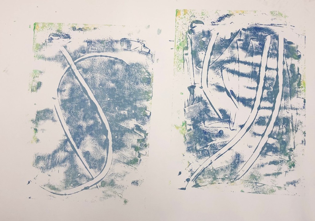
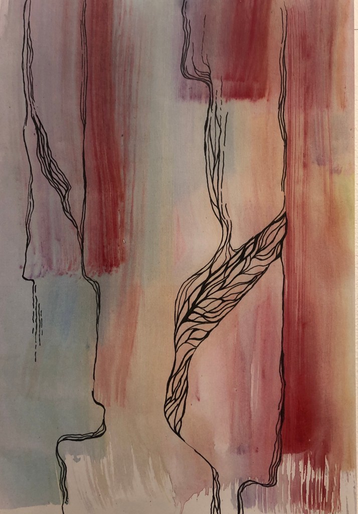
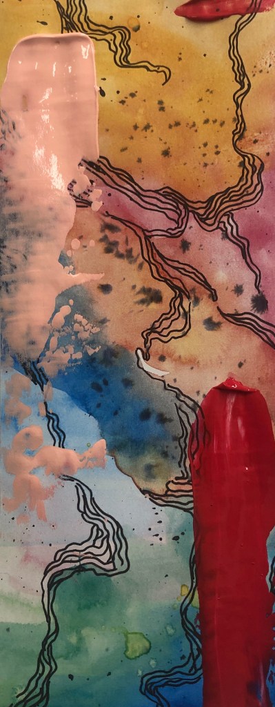
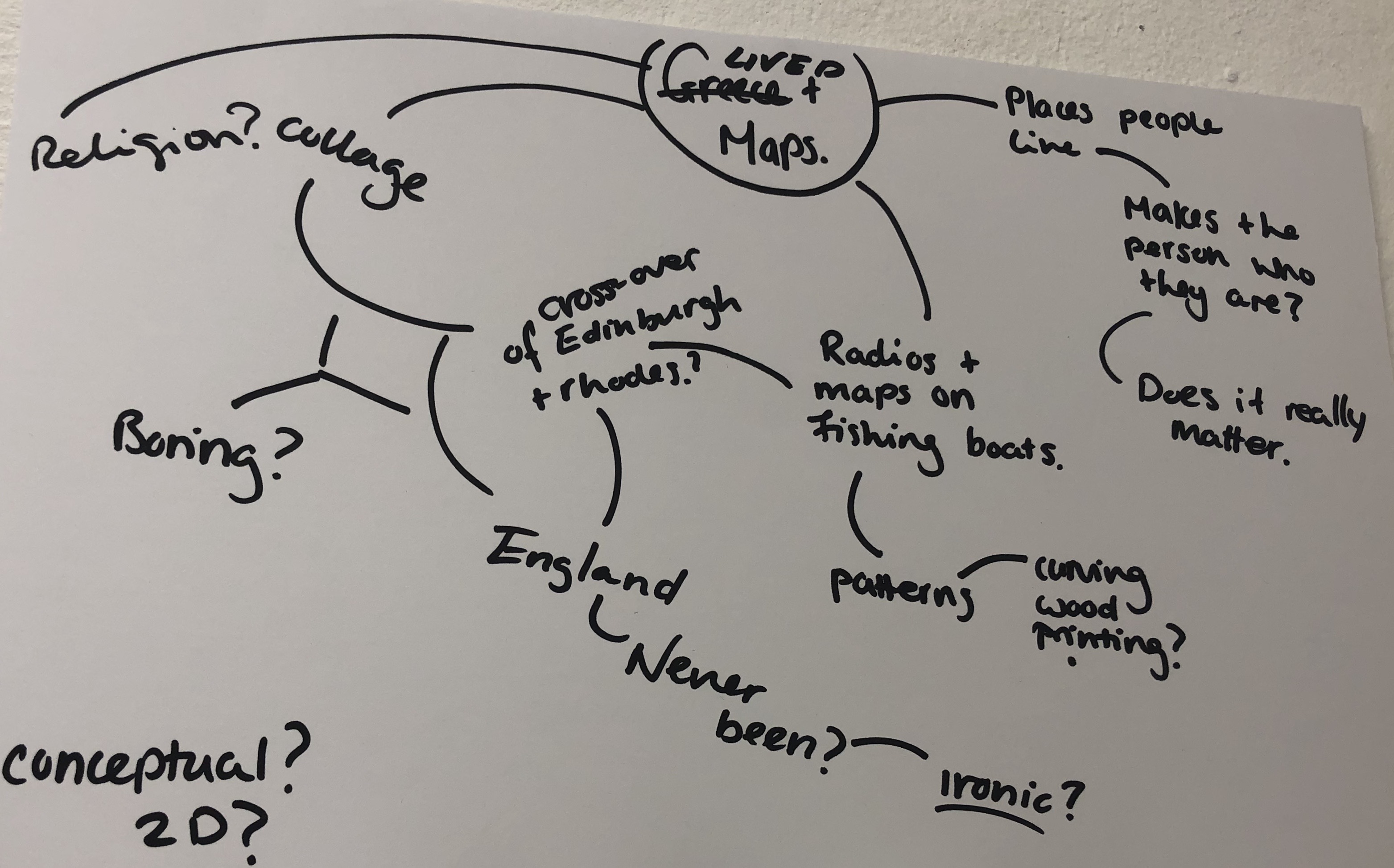
From the feedback and discussion I had with my lecturer and fellow students, I’ve decided to change my theme. I’ll now be looking at colour, line and composition, focusing more at 2D media, like printmaking, Lino Cut and Mono Print. I decided to change themes because I really enjoy working with colour and line and would like to explore it more.

I began to look into colour theory and the physics behind colour. However, what caught my eye was a teacher gave a pallet of colours, stating that the colour combinations were harmonious. By when getting feedback from the class, the students thought the the teachers’ combination were not harmonious. The teacher then told the students to come up with their own harmonious combination.

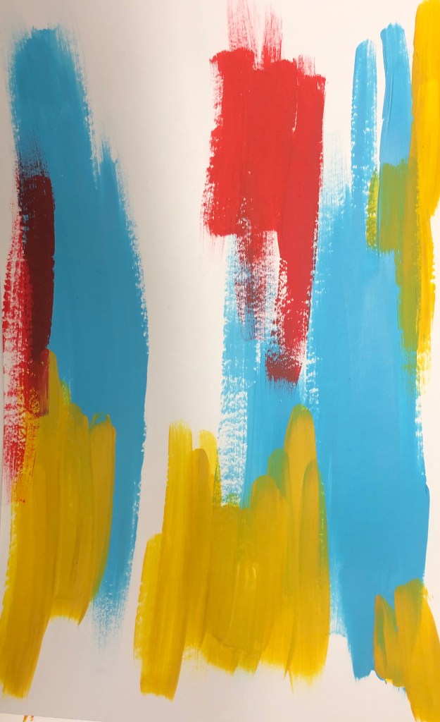
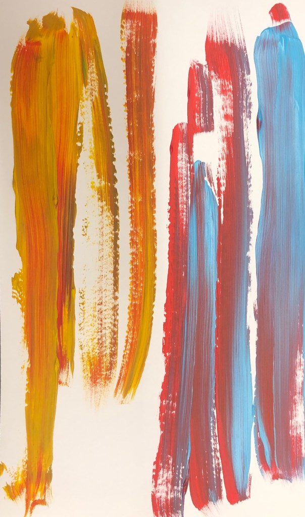
I decided to go with primary based colours, yellow, red, and blue. From the paintings by Frank Stella, I really liked the compositions, and layers on squares, I decided to experiment with colour and compositions by changing the colours, but keeping the same composition. Even though I liked the composition, I felt the white background made the colour dull in a way, I felt there wasn’t enough contrast.

Categories
MajorProject1

M.J 1 – PRT 2

Since the start of the major project, I’ve been researching dreams and daydreaming. The stages that you dream, and the biology behind daydreaming.However, I haven’t produced any art work, so I decided to make several pieces that I feel represent dreaming. I experimented with watercolour, ink and pens. I really liked the outcome of my art work, and I think it will turn out well, when I combine it with science research to do with dreams. I do feel, however that my piece were looking flat, so I decided to add acrylic paint with a palette knife, which added to the outcome.

Categories
MajorProject1

M.P1 – PRT 1

For our new project we have eight weeks to develop and produce work that goes along with a theme of our choice or we can choose a theme from a list of themes that the lecturers have provided.

To start, I did around four mind maps with ideas and then quickly made a responses to the ideas that I felt I could develop more. As my main focus was to produce work, I took the easiest media to produce said art. I painted a surface with acrylic paint, and collage pictures from the internment and arranged them in a composition I felt was effective. I do like the pieces I made, however I feel that the themes may turn out to be a dead end or that I might go in a similar direction of my 2D project.

The three main ideas I would like to look further into is the idea of Dreams and psychology and if you can manipulate them?, the idea of maps, and the places I have lived in, and tying that in with my childhood, and the last idea I would like the research is the different opinions on religion and the Queen between my generations and the older generation ( people born in 1930). I plan on researching the ideas thoroughly and making responses to them.

Categories
conceptual

CONCEPTUAL-PRT5

With Miereles’s Sculpture piece in mind, I would like to do a piece based on radio and what they can represent. Different types on radios or speakers and have a different effect depending at the person. For example, if you were to present a very old radio of the 1950s, it can hold a memory, different from a radio of the present. Also, radio may be able to represent culture on current times. I would like to delve into this idea.

I cut out and stuck on to paper four different types on radios in no particular order. I like the contrast on each radio, however in the future I would like think more into the types on radio and the representation on each radio and why.

Categories
Daytodaypart2

DAY TO DAY PART 2

For the final brief of The Day Today I was away on holidays so I didn’t stick to the brief I instead wanted to see what would inspired me while on holiday. I noticed the loose patterns and shapes that the water created and I decided I wanted to explore more of that. I started of with some loose patterns and found the repeating circular lines really effective, so experimented with larger circular brush motions in acrylic, I like how the brush hair created lots of lines. I then went on to draw onto of the circle with a stick to create some sort of line drawing of the waves. I found this really effective and tried it out with different colours and layered it, however once doing that I found it quite messy. I then did multiple circles in blue tones and then with printer copied some lines onto it. I found this really effective and interesting as you can change the colour of the paint in the printer. I definitely would to use this in future pieces. I would like to do more layering with paint and with the printer. I feel this could become an interesting sculpture piece, if I was to use light, thin materials and maybe to try using sound? I really enjoyed doing this I feel I could really experiment more with the piece I have.

Categories
Daytoday

THE DAY TODAY 5

For the final of day of the week long project “The Day Today”, I decided to do a piece based on an article about LGBT asylum claimers being rejected. By the list given in the article of what countries the LGBT claimers were from, many of the flags of said countries had green in them, so I painted the background green. I personally don’t like the outcome of this piece as I feel it’s too literate and the composition is boring. If I was to do this again, I would like to have add more colours to the background and more layering to add texture. To delve more into LGBT flags would also be interesting.

Categories
Daytoday

THE DAY TODAY 4

As I was reading the newspaper for todays article I noticed a page with a man saying how he eats red meat everyday, and the benefits of this. Underneath this article there was a smaller Coolum about how being vegan has a 22% chance of heart disease and where meat eaters are at higher risk. Turning a page there was a advert for chicken at cheap prices. I decided to just start making objects with wire straight instead of planing. With wire and tape I attempted to make a heart, but didn’t like the final outcome. With seeing the Cut and Paste Exhibition yesterday I wanted to do collage so I painted the background green, since the colour is associated with health and yet disease. I wanted to show the irony and the ways of consumerism in the media when it comes to being healthy and what to eat. I was going to attach the heart I made to the centre of the collage piece, but decided against it and instead painted a pepper, but it could also possibly be a heart. This would have to be my most least liked piece I’ve done this week. I don’t like the colours or composition, and I feel it would of been better if I made a larger heart and collaged on the heart instead of just a piece of paper. It was however good to go out of my comfort zone from planning and just creating, I do feel it helped me to experiment more open minded and would like to start working that way more often.

Categories
Daytoday

THE DAY TODAY 3

For the third day of the current project “The Day Today” I choose an article about the riots happening in Hong Kong and how the bill has been lifted. As I was reading the article I started to doodle things that first came to mind, that being the outline of china and the Bauhinia Blakeana flower, which you can see on Hong Kong’s flag. I then went into a more detailed flower with the outline of china, however I decided to paint the land blue, due to police spraying rioters with blue dye. With the blue contrasting with the colours of the flower, it makes the piece stand out. As many people in Hong Kong were trying to hide their identity, I decided to write “Anonymous”, I wanted to try and recreate a young Childs’ writing to represent that the majority of the rioters were youths. For a final detail and to show technology and connecting with the rest of the world, I decided to add the dial code. If given the chance I would like to retcreate this piece and do it as a collage, with a real Bauhinia Blakeana flower and add recites to it, as Hong Kong is known for technology and shopping. It would also be more effective I feel if it were a larger scale. The current final outcome however, I do like even as a sketch to base of a piece from in the future.

Design a site like this with WordPress.com
Get started