Categories
cap2 studioproject1 StudioProjects2

SELF GEN PROJECT PRT 18

I feel pretty stuck on what to focus on when it comes to my project. I don’t really know what I truly want to show. I decided to look into the actually history of the buildings.

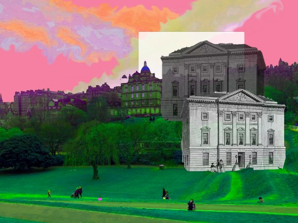
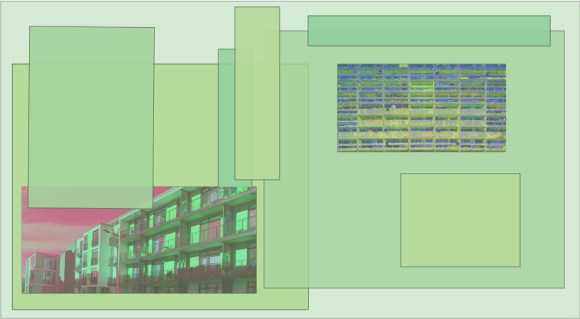
I found a old sketch of the Royal Bank of Scotland building located on St. Andrews Square. That building was the first building to be built there, due to overcrowding in the Old Town. I then included the Bus Station that is also located in St. Andrews Square and then the row of shut down businesses in Leith Walk. I wanted to show new development in away and how Edinburgh has been a city that has constantly developed. This can be a positive thing, like for the Bus Station which is always busy and the bank, but also a negative, like for the independent businesses that where shut down due to that.

I’m not entirely sure if the message came across, but I definitely want to delve deeper.

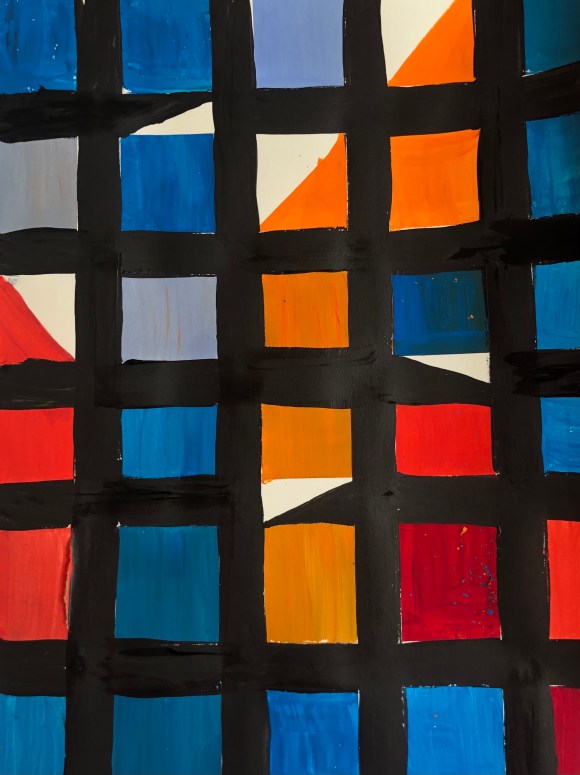
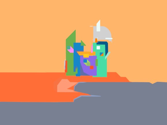
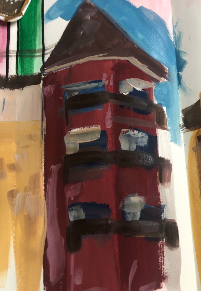
The next two pieces are all mainly experimental, with little meaning. I mainly focus on practising with layering and changes the colours of the pictures. I really like working with layering.

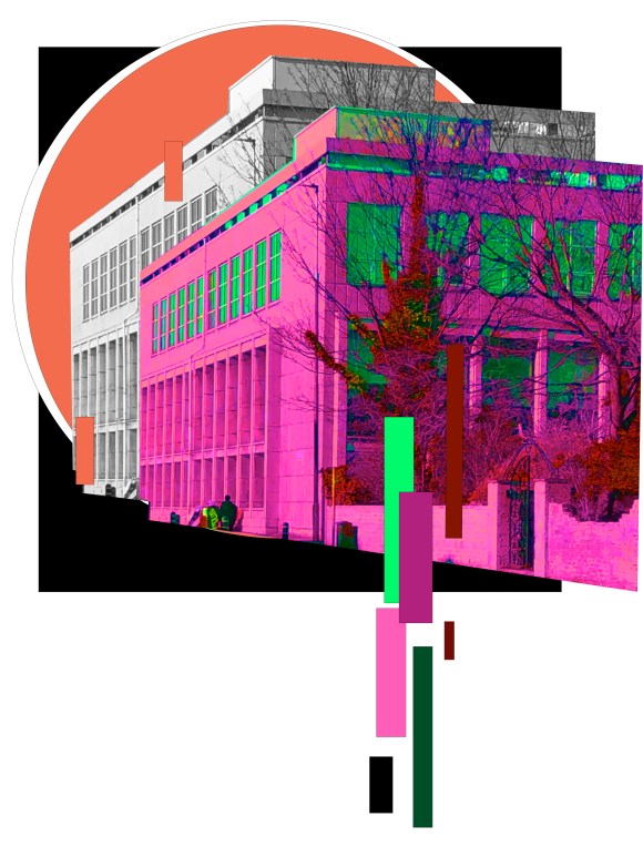
The fourth is also a sketch from the building of St.Andrews Square when new development first happened. The main focus of that piece of the layering of multiple shapes and then I decrease the occupancy. I really like effect and the effective it can give.

Categories
cap2 studioproject1 StudioProjects2

SELF GEN PROJECT PRT 16

I felt the previous artwork I made was a successful and with the shapes create from the “buildings”, I decided to trace around the shapes with a white brush and change the background to a dark blue. I wanted to recreate a simpler aesthetic to blue-prints. I felt this connected well with my current theme as it’s how building plan are drawn.

I don’t believe that the “blue-print” are a piece in its self, but maybe more as a base that I can layer on a future piece.

Categories
cap2 StudioProjects2

SELF GEN PROJECT PRT15

I found a painting by Sarah Morris that I really likes. I enjoyed the sharp shaping and the bright colouring. Once seeing it and taking the painting in, I then quickly painted a similar piece as a form of warming up. when looking at my own warm up piece I did, I really noticed the triangles, and reminded me of the different building shapes. I then decided to play around with creating a city form shapes. I decided to do it in bright colours as I wanted to focus also on the contrast and how putting two colours together can create depth.

The first piece, I did and the composition are of no particular city as at the time I wanted to experimented with the composition and colours. The second building piece is of the apartments on Western Harbour Drive in Granton. I feel that scenery is very known in the city and I always go past it when going to college.

Categories
cap2 StudioProjects2

SELF GEN PROJECT PRT 14

I’ve been really enjoying playing around with the colours on adobe photoshop. I did one pieces, where I focus on changing the colours. I really like the final outcome as I enjoy the contrast and with the black background, it allows the foreground colours to really pop. However, I decided to make another piece, similar as I liked the original tones in the actually picture of said building, but this time only is the tone range of the building. One I created the second piece. I found it amazing the complete different atmosphere to get for each one. With the first, more colourful piece, I feel energised and intense, but looking at the second, more beige colours, I felt more calm. I was really happy with the outcome and was proud with feeling I felt when admiring the artworks as I feel you can get that some atmosphere when looking around a city or a building.

Categories
cap2 StudioProjects2

SELF GEN PROJECT PRT12

Started playing around with photoshop, after I went around the city and did a small shoot of buildings. I really enjoyed making these and loved the outcome. These pieces are base experiments and plan on working on doing more detailed pieces. I really like the layering look and strong contrast of detail when it comes to the shapes.

Categories
cap2 StudioProjects2

SELF GEN PROJECT PRT11

I was curious on what would be the outcome if I were to paint buildings, but in the colour of flowers. I really like the paintings by Jose Trujillo so I decided to experiment with a similar colour range.

I really with the texture that’s created with the bricks and the contrasting colours. It’s very effective and bright. However, with so many colours the painting could become very busy and messy. I added the Lino print that I created for my previous pieces. I fell it adds a lot to the piece.

Categories
cap2 StudioProjects2

SELF GEN PROJECT PRT10

Feeling really inspired by the work of Peter Brown. I decided to walk around my city and do quick sketches of buildings and when I got home, I painted from memory. In the future I want to go out of draw fully to painting on the spot.

I really enjoyed doing this and felt my technique in layering and depth are improving. I do want to do the same again, however instead use bright vibrant colours, usually seen on flowers as I feel that goes well with my theme, but also could produce an interesting outcome.

Categories
cap2 StudioProjects2

SLEF GEN PROJECT PRT9

Compared to my last piece I much prefer this piece. I think the colours are more effective together and I also feel the composition is more better placed. I added the brick pattern at the side of the artwork as I didn’t want to create too much of a contrast anywhere else in the painting. I then decided to paint with railings slightly green because I do want to start thinking about incorpaterting nature, so added then green. I do like the green, I feel it adds a surrealistic vibe. I also decided to districtly add architectural lines to add detail.

By adding the lines, it reminded me of blue prints, which you usually see when looking at building plans. I thought this could be interesting to combine with the nature aspect of the theme.

Categories
cap2 StudioProjects2

SELF GEN PROJECT PRT8

From the last piece of artwork that I previously done. I wanted to focus a little on creating a brick-like pattern. Looking into my sketchbook, I found a doodle I done with layering and colours. I felt this pattern really fit well with my current project as there’s a layering connection. Big city, croweded, many layers of buildings and adding with matching colours. I then created a small pallet that then matched the building in this next piece.

Categories
cap2 StudioProjects2

SELF GEN PROJECT PRT 7

I walked around the around of Leith Walk and photographed any buildings that took my ineterest. I really notices the amount of buildings in the city and would like to look more into incorporating layers in my project. I then collaged certain buildings and layered and paint around them. I took inspiration from Serj Fedulov and his work. I do feel this piece is quite busy, but I do plan in continuing with this as I feel it could develop into something further. I am just painting on paper, but I would like to try canvas as I feel it could look better.

I wanted to experimenting creating that layering of brick look. I do like the effect and the look, however I feel the placement and compassion is all wrong.

Design a site like this with WordPress.com
Get started