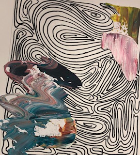
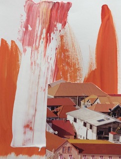
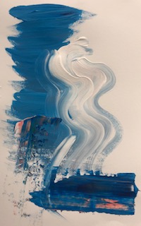
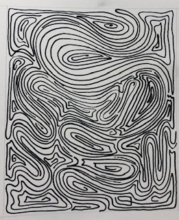
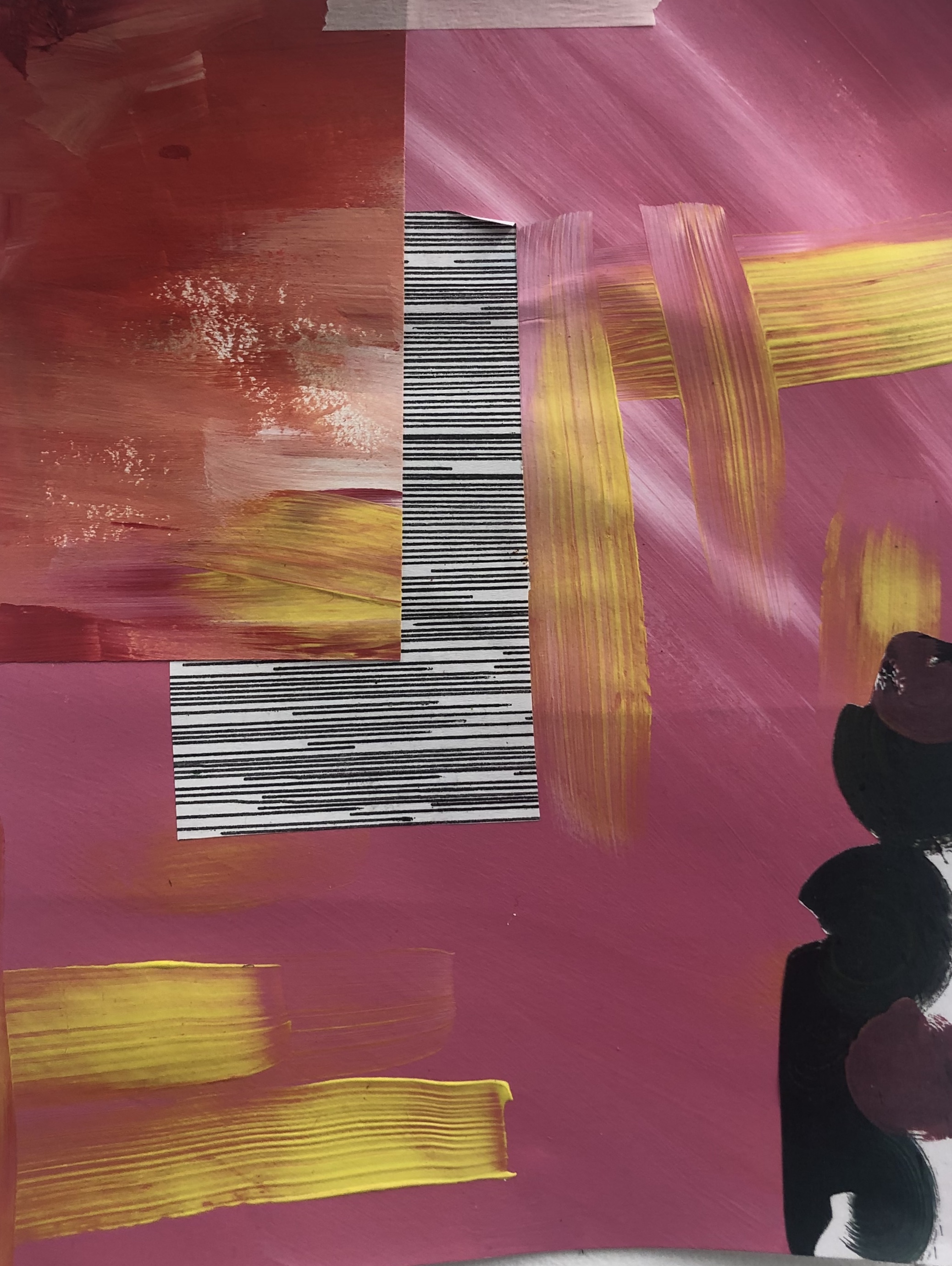
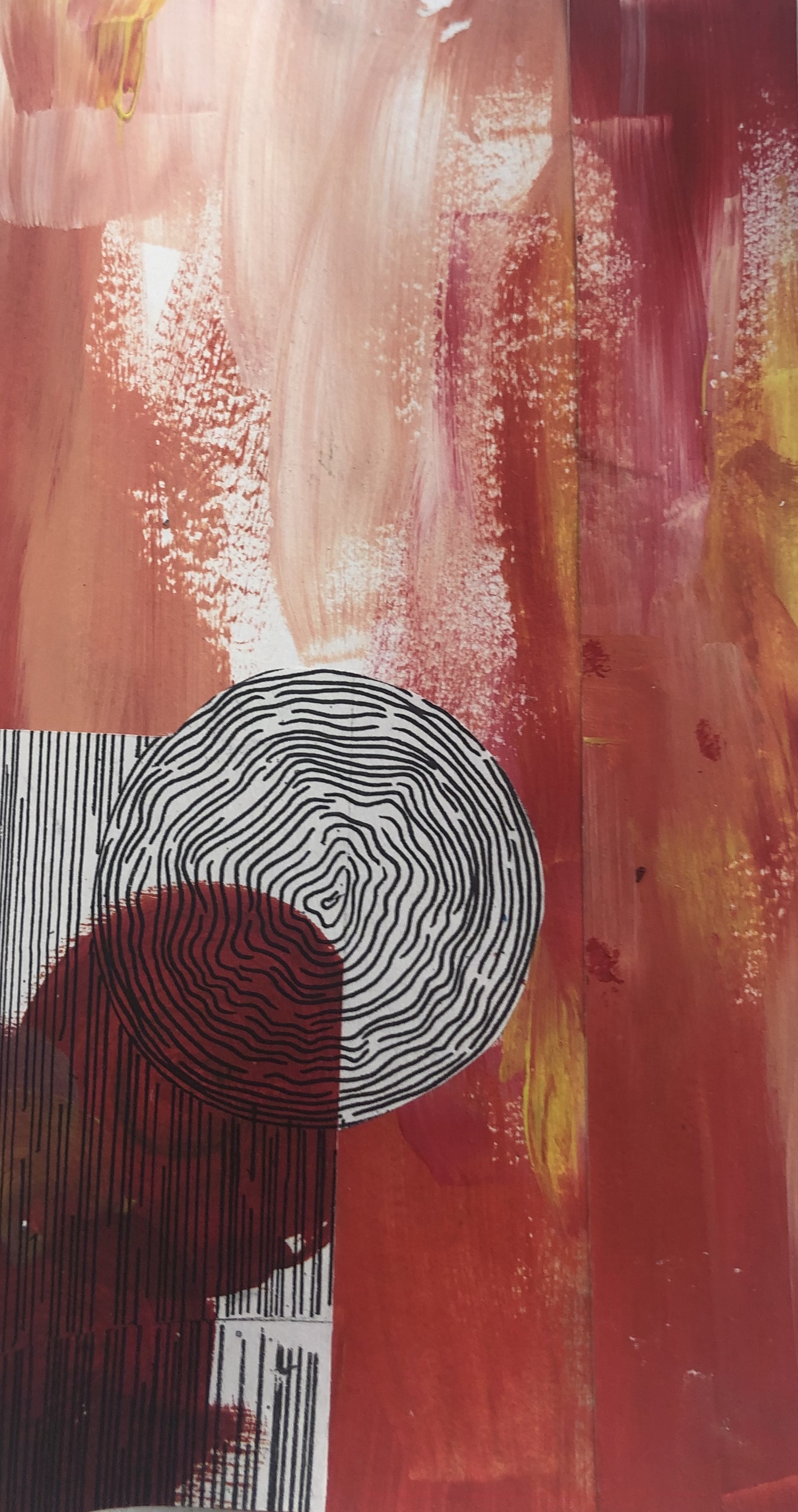
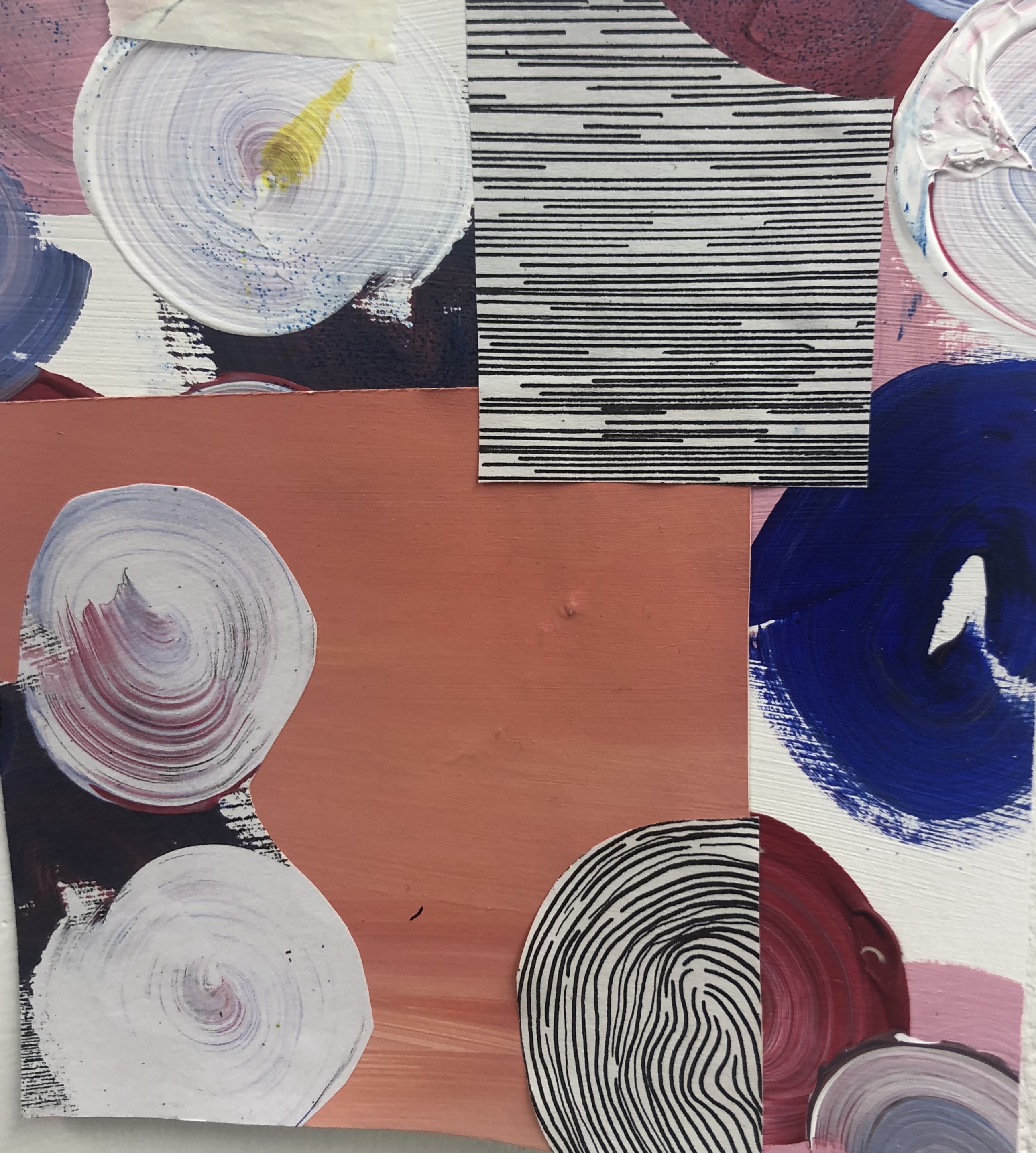
I started off with just doing simple collage compositions with magazine cut outs onto paper. I wanted to incorporate my current theme with collage, so I cut out acrylic brushstrokes that I prepared the other day and used them. The cut out brushstrokes gave the collage pieces a photoshop look and gave the pieces depth. I then went on to use the line drawings as background and then brushstrokes as a foreground, but I feel it didn’t look great, just messy. Maybe if I do a less detailed line drawing it might be more effective. I did however like the thick layered acrylic as a background and it looked very effective and I will definitely be using this in the future.
Tag: collage
2D COLLAGE – PRT 1
This week we are looking at collage. I started off with creating small line drawings for the foreground of the pieces. I then decided to layer that print on top of a piece I did when we were experimenting with printmaking. I really like the effect of the line patterns and the colour of the print in the background, it would be interesting if it was turned negative. I then went on to create bases with acrylic paint and layered them with the patterns created. I noticed however that my collage pieces had a acrylic background and a pattern in the foreground, I wandered what would happen if I switched it around. For this I created line drawings as bases and tomorrow I plan to experiment with the negative printer techniques and switching the patterns and acrylic. I feel I was very successful today and started off well.
2D PRACTICE PRT. 2
From what I had made from my previous work, I started looking into collage and the contrast between block colours and patterns. Looking at some of the work by Robert Rauschenberg, I wanted to experiment with collage and printing. I started off with creating a base background with acrylic paint and then layered print copies of the line drawings I had done. Like a lot of John Cages work, I tried to think about negative space and how it can effect the outcome if a piece, I feel I did well with the negative space in the pieces. However I would have wished they were in bigger scale. I do feel they were successful and I really find the straight line pattern really effective with the textured background.


