Categories
cap2 StudioProjects2

SELF GEN PROJECT PRT15

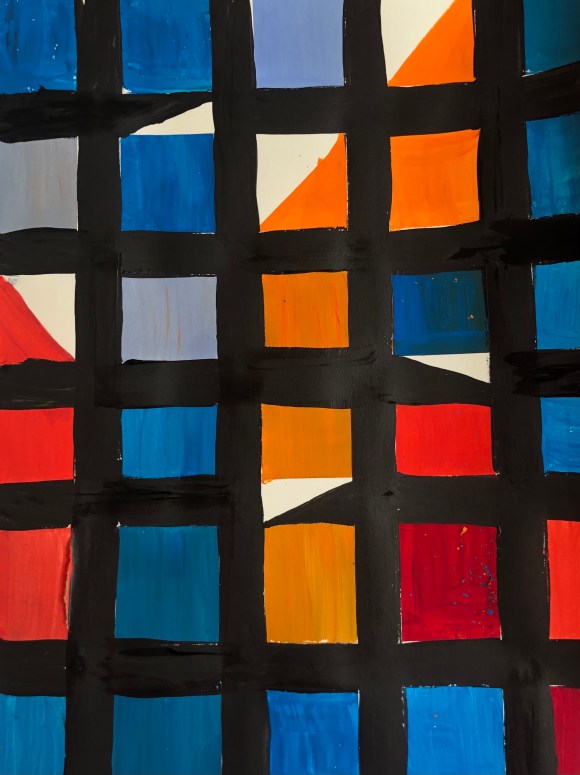
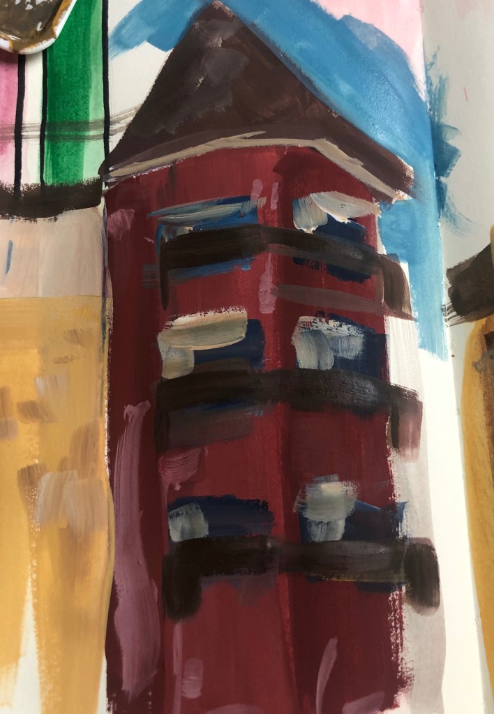
I found a painting by Sarah Morris that I really likes. I enjoyed the sharp shaping and the bright colouring. Once seeing it and taking the painting in, I then quickly painted a similar piece as a form of warming up. when looking at my own warm up piece I did, I really noticed the triangles, and reminded me of the different building shapes. I then decided to play around with creating a city form shapes. I decided to do it in bright colours as I wanted to focus also on the contrast and how putting two colours together can create depth.

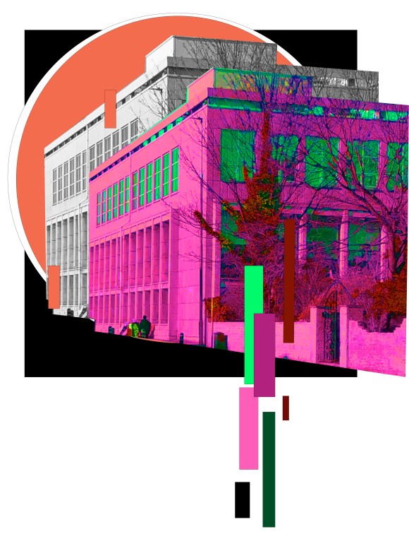
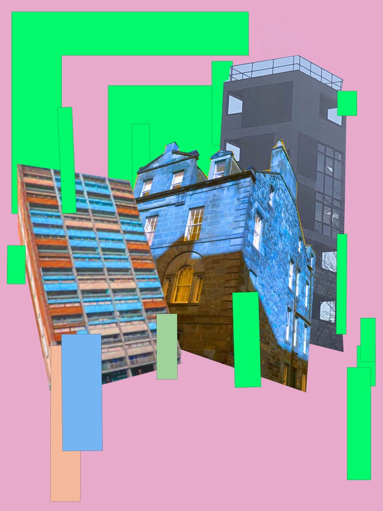
The first piece, I did and the composition are of no particular city as at the time I wanted to experimented with the composition and colours. The second building piece is of the apartments on Western Harbour Drive in Granton. I feel that scenery is very known in the city and I always go past it when going to college.

Categories
cap2 StudioProjects2

Sarah Morris

Born in England on June 20, 1967, Morris went to study at Cambridge and Brown Universities before attending the Whiteney Independent Study Program. Morris is both a painter and filmmaker, seeing the two medias as interconnected in a way. Morris describes the two media processes as “two sides of the same coin.”, creating the paintings and films simultaneously. She is best known for a abstract painting that feature bright colour fields and graphic line work, often referencing aspects of architecture and taking titles from bureaucratic institutions.

Categories
cap2 StudioProjects2

SELF GEN PROJECT PRT 14

I’ve been really enjoying playing around with the colours on adobe photoshop. I did one pieces, where I focus on changing the colours. I really like the final outcome as I enjoy the contrast and with the black background, it allows the foreground colours to really pop. However, I decided to make another piece, similar as I liked the original tones in the actually picture of said building, but this time only is the tone range of the building. One I created the second piece. I found it amazing the complete different atmosphere to get for each one. With the first, more colourful piece, I feel energised and intense, but looking at the second, more beige colours, I felt more calm. I was really happy with the outcome and was proud with feeling I felt when admiring the artworks as I feel you can get that some atmosphere when looking around a city or a building.

Categories
cap2 StudioProjects2

SELF GEN PROJECT PRT 13

Continuing with experimenting with photoshop and collage. I started looking at changing the colours of the buildings to create a more vibrant look. I really like how the piece stands and how the colour contrast. I decided to add a lot of squared shapes because I want to represent the brick element, especially when thinking about Edinburgh and the majority of the city is made from stone, cement etc bricks. I also added the shapes as I fell it allows the piece to be geometric as in Edinburgh there’s a lot of new construction, built in a modern contemporary style.

Categories
cap2 StudioProjects2

SELF GEN PROJECT PRT12

Started playing around with photoshop, after I went around the city and did a small shoot of buildings. I really enjoyed making these and loved the outcome. These pieces are base experiments and plan on working on doing more detailed pieces. I really like the layering look and strong contrast of detail when it comes to the shapes.

Categories
cap2 StudioProjects2

LYNETTE JACKSON

Lynette Jackson is an American artist, she does contemporary photography, with the help of her smartphone. Through designs, graphics and architecture, she portray incredibly modern work and unveils a new side of artistic creation.

I really like Jackson’s pieces and the layering and the contrast of detailed shapes with simple shapes.

Categories
cap2 StudioProjects2

SELF GEN PROJECT PRT11

I was curious on what would be the outcome if I were to paint buildings, but in the colour of flowers. I really like the paintings by Jose Trujillo so I decided to experiment with a similar colour range.

I really with the texture that’s created with the bricks and the contrasting colours. It’s very effective and bright. However, with so many colours the painting could become very busy and messy. I added the Lino print that I created for my previous pieces. I fell it adds a lot to the piece.

Categories
cap2 StudioProjects2

SELF GEN PROJECT PRT10

Feeling really inspired by the work of Peter Brown. I decided to walk around my city and do quick sketches of buildings and when I got home, I painted from memory. In the future I want to go out of draw fully to painting on the spot.

I really enjoyed doing this and felt my technique in layering and depth are improving. I do want to do the same again, however instead use bright vibrant colours, usually seen on flowers as I feel that goes well with my theme, but also could produce an interesting outcome.

Categories
cap2 StudioProjects2

PETER BROWN

Peter Brown is a British Impressionist who paints a range of landscapes, cityscapes and still life. I really like the layered, and blended texture that is created and the quick look of his pieces.

I do want to spend more time practicing on drawing cityscapes and I have ideas for incorporating natures and colours.

Categories
cap2 StudioProjects2

JOSE TRUJILLO

Jose Trujillo is a Mexican artist that now resides in America. Trujillo is a Impressionist painter, who likes using colours and looks at the movement and feel of a painting.

I really like the extreme strokes Trujillo creates and the bright, contrast of colours. It reminds me of nature and of flowers and I thought this would be a good idea for creating an artwork around city buildings. I like Trujillo’s city paintings, but I would like to go further and use very contrasting colours, certain colours that represent flowers or nature native to the city. I look forward to experimenting with the ideas created by Trujillo’s influence.

Design a site like this with WordPress.com
Get started