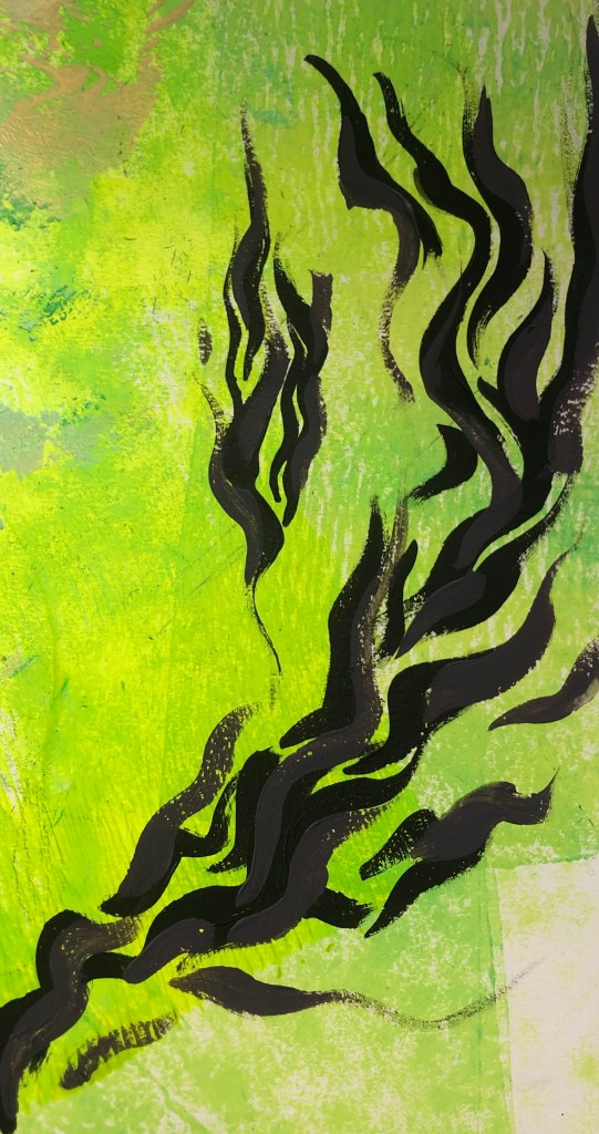
I’ve been experimenting a lot with more soft and pastel colours. I wanted to try more colours that I wouldn’t personally go for, so I decided to try neon. By mixing printing inks, I created a green/yellow neon colour that I mono printed as a base for compositional pieces. When doing the pieces focusing on good and bad compositions, I did a lot of sharp, thick brushstrokes, which I liked, however I wanted to try more delicate curvier lines. I used the golden ratio rule for the first piece and then used the rabatement of rectangle rule for the second, to practice at using negative space. I started off with just using black, as it would be effective against the bright neon, however I felt the black was too dark and heavy, so I decided to add purple to add depth and balance the black. For the second piece, I decided to add blue to see if the brightness of the blue against the purple and black could work. I feel it didn’t work due to the contrasting colours, but I did like the composition.
Categories