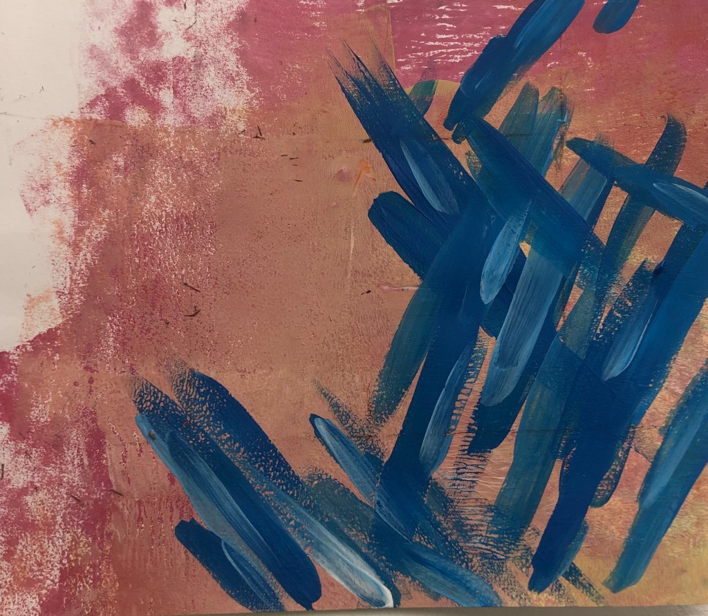
- GOLDEN RATIO RULE
In the first picture, I used the golden ratio rule to plan out the composition. For the colours, I decided to use darker tones compared to the background or opposite colours that contrast well.

2. GOLDEN RATIO AND SYMMETRY
I experimented with using the golden ratio rule and symmetry. I went with using contrasting colours. However I feel this wasn’t successful since the colours don’t go well together. I feel this would be a better piece if there was more negative space.

3. RABATMENT OF RECTANGLE AND GOLDEN RATIO
I wanted to use these two rules to see if I can balance negative space with a more busier space. I liked the colours that I used and the layout of the piece. I feel the colours go well with the background.
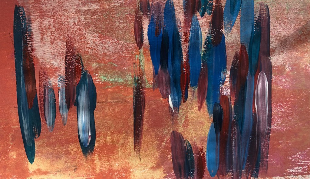
4. RULE OF THIRDS
This is my favourite piece. I feel the colours really make the piece stand out, since there’re contrasting colours. I decided to add more lighter tones of blues to give the piece more depth.
I also looked rabatement of rectangle for the piece and the effects that negative space can have on a piece.