Categories
2DPractice

2D PRACTICE – PRT 7

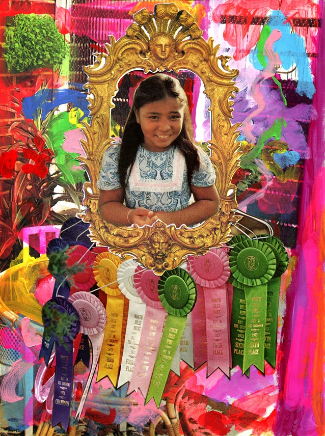
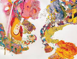
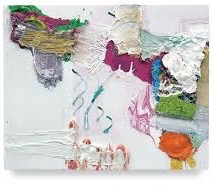
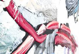
With my previous work in mind, I feel it was a step back in development. I really liked the collage work id done, so I decided to combine the two. I added magazine cut outs onto a painted base, but I added the layered patterned pieces id don’t the other day. I really like the look and I also added thick acrylic strokes, which gave the pieces a space look. I plan on doing more of collage in different scales and experiment with layering through printer as that can lead to new ideas.i feel this was successful and I don’t feel like I’m at a block. I would like to experiment more with Lino print as that was really interesting to work with.

Categories
2DPractice

HANNELINE VISNES

Hanneline Visnes is a Norwegian artist, that now lives in Glasgow. Hanneline’s work is very influenced by cultural and historical sources, including patterns and textiles from Europe, Persia and china. In most of her work you can usually see birds, jewellery and flowers. I like to the colours used in her and how she works on wood most of the time, using oil paints. The complicated patterns against the plain background really makes, not only the patterns but the colour as well eye-catching.

Categories
2DPractice

MINNA GILLIGAN

From Melbourne, Australia. Gilligan graduated in 2012 and has worked for Urban Outfitters, Nasty Gal and many more popular fashion companies. Gilligan primarily works with paint, drawing and collage. She has a very unique style which usually has a child like style. her work mostly presents personal encounters and represents past and future. I like how Gilligan uses contrasting patterns and vibrant colours. With so much content in her work, it makes her art work clustered and busy, the very opposite of John Cage’s work. There also seems to be a humour element in her work, especially with her collage work. When it comes to my own work, I aim to have some sort of negative space, but I would like to try and have no negative space and see the outcome. What would the atmosphere be like? I find Gilligan’s work very loud and fun, where as I find Cage’s calming. it would be interesting to see if I can keep a calming element to my work with no negative space.

Categories
2DPractice

ROBERT RAUSCHENBERG

Born in America 1925, Rauschenberg was an artist and graphic artist. Rauschenberg experimented in all medias, like sculpture, painting, printmaking and collage. I am perticualy fond of his collage work. The colours that are used and the position create interesting composition because of the contrast in patterns and colours. There also seems to be a repeat of structure in some of his piece. I like how Rauschenberg has a mix of collage pictures, patterns and just plain block colours. I find this really effective, especially with the small bursts of greens and blues against the pink and reds. I would like to look more in colours and the opposites of colours.

Categories
2DPractice

JOHN CAGE

John Cage was an American, born in 1912 and was known for being a composer, music theorist and artist. Most of his work consists of loose lines, negative space and lines. When creating a piece, Cage will listen to music and paint what he feels, making a lot of his work emotional. I find his work very calming because of the colours used and the loos-ness of the brushstrokes. Most of his work is made by using watercolour, which gives a faded look. Negative space has a lot great importance to his pieces as it makes the patterns/lines more effective and eye-catching. Also, the patterns guid you around the paintings. If the paintings where more filled it would too busy and over whelming, I feel. with repeatedly layering thin lines, he creating an effective piece, I would like to experiment with this in my own work and try different paper for a background, as I have only been using white coloured paper and feel it would be interesting to use a more beige colour for collage.

Categories
2DPractice

Pia Fries

One artist that I’ve been looking into is Pia Fries. A lot of her work consists of thick layers of paint and negative space. She also uses watercolour and sharp quick brushstrokes. When it comes to colour Pia uses vibrant, contrasting colours. With the backgrounds of her work being white her work is very eye-catching. She has also used collage and it can sometimes seem like a painting, I would like to try and create collages that seem like paintings. I like how she uses negative space and the loose patterns in her work. The sharp brush strokes with thick layers of paint create depth and texture. When experimenting with my work, especially with acrylic I try to thick of Pia Fries, especially with her use of negative space.

Design a site like this with WordPress.com
Get started