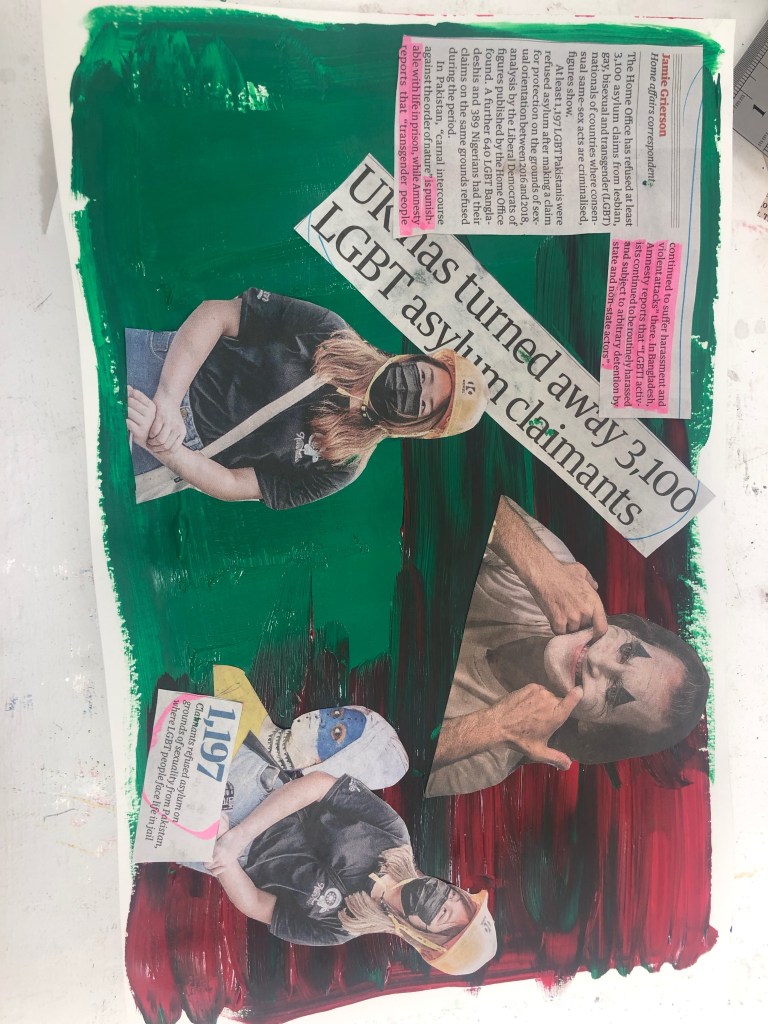
For the final of day of the week long project “The Day Today”, I decided to do a piece based on an article about LGBT asylum claimers being rejected. By the list given in the article of what countries the LGBT claimers were from, many of the flags of said countries had green in them, so I painted the background green. I personally don’t like the outcome of this piece as I feel it’s too literate and the composition is boring. If I was to do this again, I would like to have add more colours to the background and more layering to add texture. To delve more into LGBT flags would also be interesting.
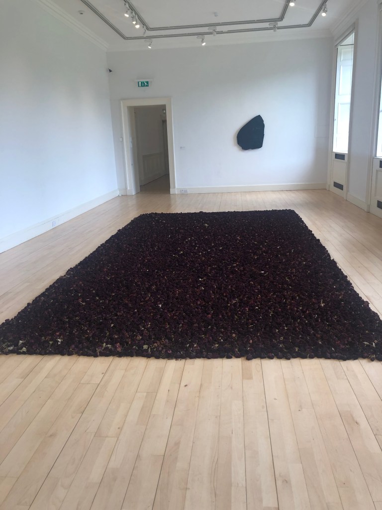
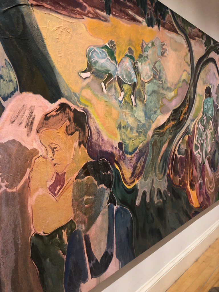
Went to Modern Art Gallery One and Two, to see the contemporary art collection and The Cut and Paste Exhibition. I really enjoyed the Cut and Paste exhibition, however my favourite pieces were from the contemporary art collection. One of my favourite pieces was by Anya Gallaccio. Anya Gallaccio does a lot of sculpturing and is known to associate her work with symbolic connections to history, culture and politics. Her installation “Red on Green” is of 10,000 roses is a rectangle shape in the middle of the room. The thing I noticed was the smell of the roses and the strong colour of the roses. If I was to think of what movement it would be in, it would be contemporary, maybe dadaism, due to it being a found object and the theme I feel would destruction, as the roses are slowly dying. My second artist was Charles Avery, to which he had an installation of an old projector, projecting animated birds and with the shadow of the outlined box, it gives the illusion of the birds being trapped inside. This could be in the movement of surrealism, with the theme of fantasy. Michael Armitage’s piece is oil paint on lumbago bark cloth. I love the colours that were used and is in the contemporary movement, however I feel it could be surrealism. My fourth piece was by Francis Campbell and I would say in the movement of impressionism. The pice was painted when Francis was in Venice. I love the thick brushstrokes visible and the fact you can still see the wood panel the it was painted on.
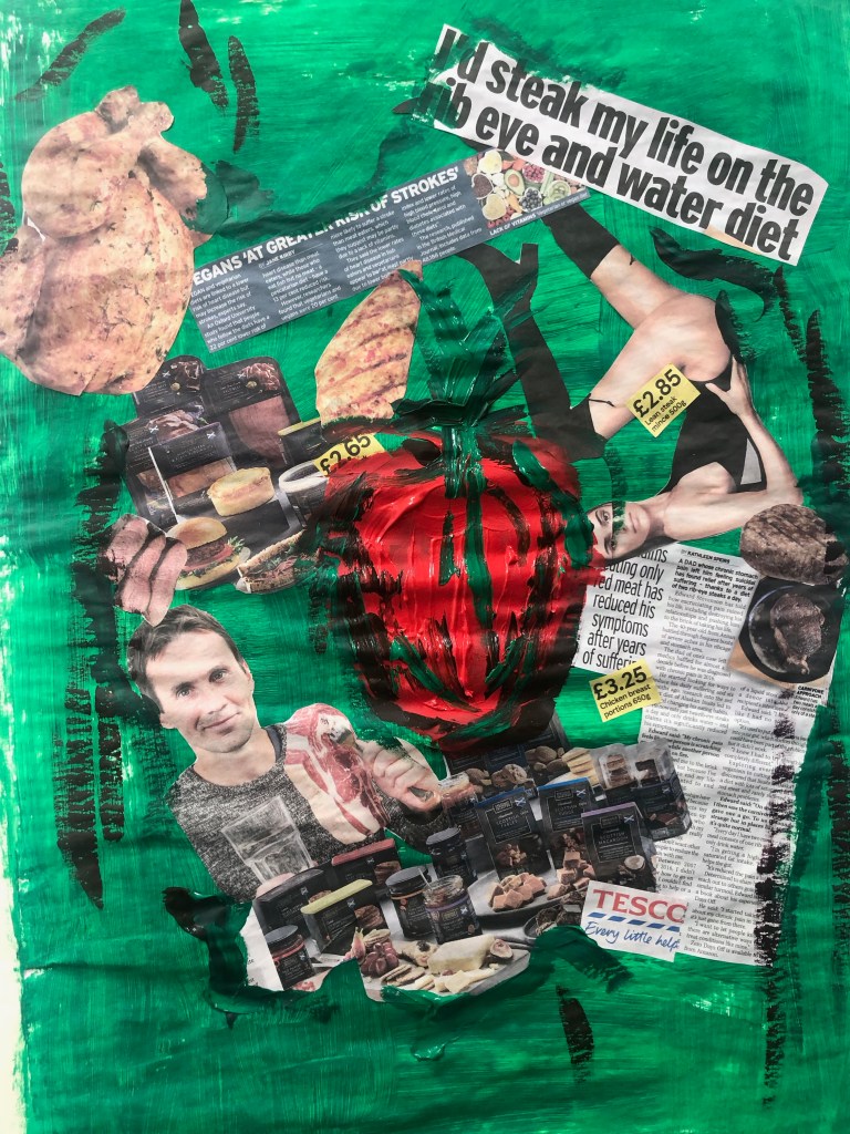
As I was reading the newspaper for todays article I noticed a page with a man saying how he eats red meat everyday, and the benefits of this. Underneath this article there was a smaller Coolum about how being vegan has a 22% chance of heart disease and where meat eaters are at higher risk. Turning a page there was a advert for chicken at cheap prices. I decided to just start making objects with wire straight instead of planing. With wire and tape I attempted to make a heart, but didn’t like the final outcome. With seeing the Cut and Paste Exhibition yesterday I wanted to do collage so I painted the background green, since the colour is associated with health and yet disease. I wanted to show the irony and the ways of consumerism in the media when it comes to being healthy and what to eat. I was going to attach the heart I made to the centre of the collage piece, but decided against it and instead painted a pepper, but it could also possibly be a heart. This would have to be my most least liked piece I’ve done this week. I don’t like the colours or composition, and I feel it would of been better if I made a larger heart and collaged on the heart instead of just a piece of paper. It was however good to go out of my comfort zone from planning and just creating, I do feel it helped me to experiment more open minded and would like to start working that way more often.
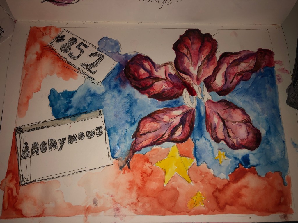
For the third day of the current project “The Day Today” I choose an article about the riots happening in Hong Kong and how the bill has been lifted. As I was reading the article I started to doodle things that first came to mind, that being the outline of china and the Bauhinia Blakeana flower, which you can see on Hong Kong’s flag. I then went into a more detailed flower with the outline of china, however I decided to paint the land blue, due to police spraying rioters with blue dye. With the blue contrasting with the colours of the flower, it makes the piece stand out. As many people in Hong Kong were trying to hide their identity, I decided to write “Anonymous”, I wanted to try and recreate a young Childs’ writing to represent that the majority of the rioters were youths. For a final detail and to show technology and connecting with the rest of the world, I decided to add the dial code. If given the chance I would like to retcreate this piece and do it as a collage, with a real Bauhinia Blakeana flower and add recites to it, as Hong Kong is known for technology and shopping. It would also be more effective I feel if it were a larger scale. The current final outcome however, I do like even as a sketch to base of a piece from in the future.
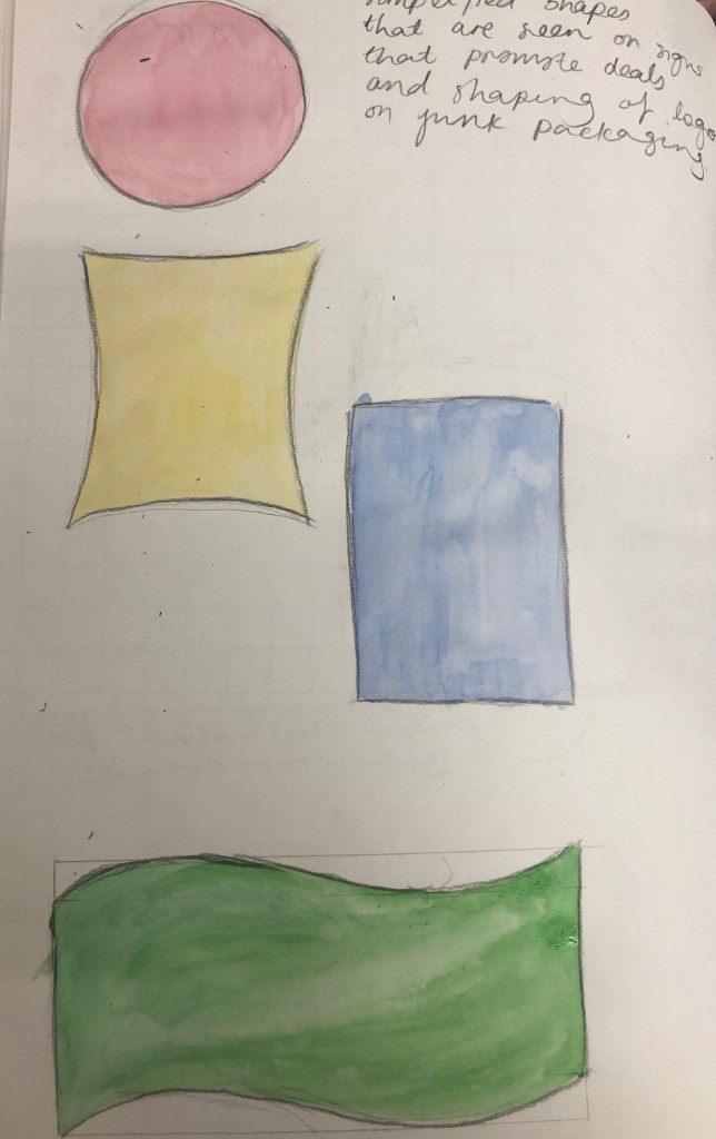
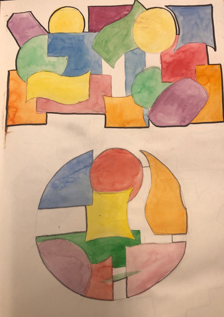
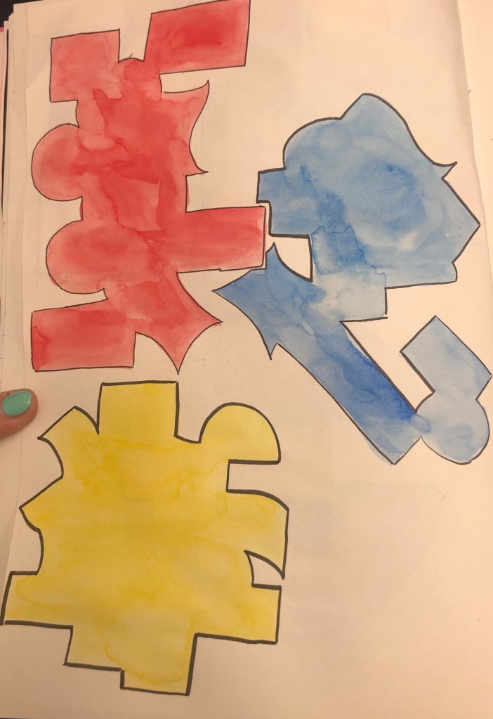
For the second day of our week long project “The Day Today”, I read an article regarding obesity in children of around the ages four and five. In the article, many parents blamed the “Buy One Get One Free” deals that are popular in Uk supermarkets. Most of these deals are associated with unhealthy foods like crisps, chocolate, ect. The first thing that caught my eye was the shapes of the unhealthy snacks. I started to simplify them and colour them in frequent used colours in snack packaging. By overlapping, I was hoping to recreate the amount of deals you see in supermarkets, however I liked the outline shape that the shapes made. With only then focusing on what the outline was and then colouring them I feel the final shapes reminded me of jigsaw pieces. With this project I experimented more, rather than focusing too much on having a final pice, which I feel helped me develop my ideas more. I would have liked to further go on and look into logos and how we see them as shapes. I feel this turned successful and I could further develop this into an interesting piece.
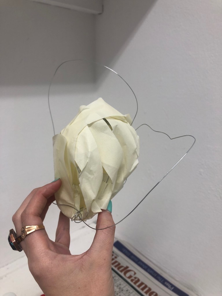
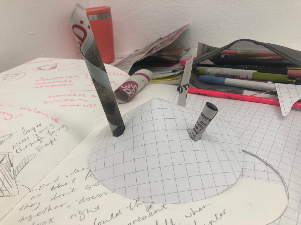
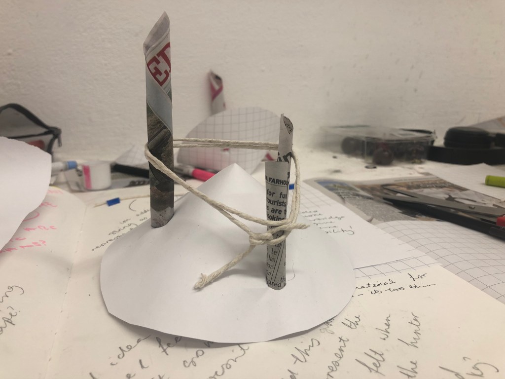
For the project “The Day Today” we must create a piece of any media in response to an article that catches our eye in the local newspaper. The article that caught my eye was about trophy hunting in Africa and how British families go on holiday and hunt monkeys. I wanted to create a 3D piece that has contrasting shapes so the piece has an uncomfortable feel, like something is not right. This is the feeling I felt when seeing the article imagine of a man holding a dead monkey. What caught my eye was the opposites of man made object being the gun and the natural world being the money.I started with making paper cones to try and replicate fangs. By tightly rolling cylinder shapes with newspapers to make a similar shape like a gun. Having the cylinders going through the cones it represents the guns killing the animal. I then experimented with different types of paper that can hold more shape. The string is to show the connection that humans and monkeys have with having 90% similar DNA. I further on went to try with different textures by layering paint. The final outcome itself was not successful, however I feel the experimenting went well and I feel I should have developed more than rather focus on having a final piece.
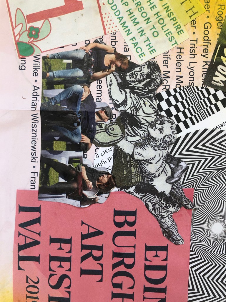
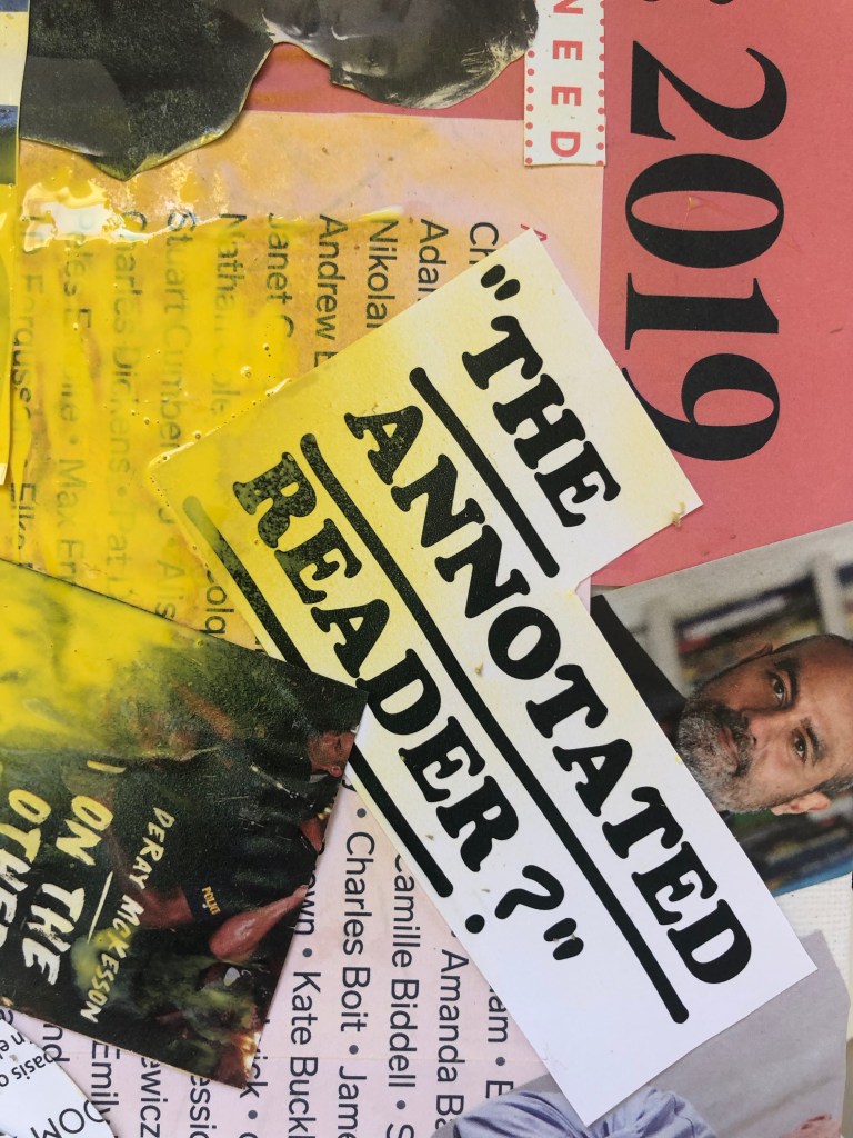
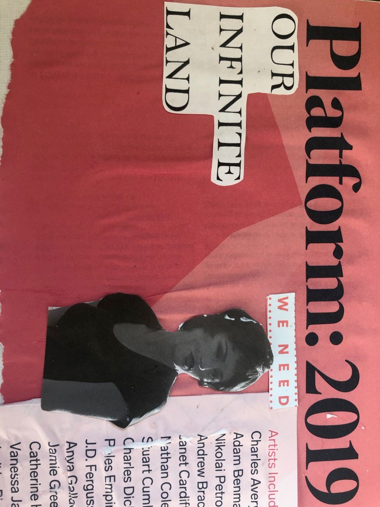
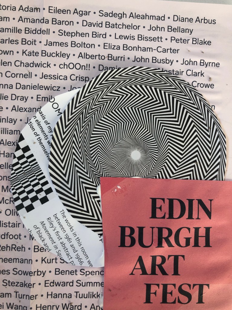
During summer we were given the task to create two pieces of art that represent one of the titles: ‘For sale’, ‘Our Land, and ‘Here and Now’. I decided to combine the titles ‘Our Land’ and ‘Here and Now’ and base that of what I saw during the fringe this year in Edinburgh. Throughout the summer I collected leaflets and free fringe magazines and used them to create a collage piece. I wanted to stick to colours that I saw a lot of during the fringe, that being: reds, yellows, blacks and greens. By layering texts repeatedly it creates a busy and messy look to which I wanted as when you walk through the streets in Edinburgh during the fringe many people are trying to grab your attention. I feel this was a successful piece and feel that the final outcome really showed how I see the fringe. However if I was to do this piece again I would have liked to add more paint and maybe do it on a larger scale with more over lapping.